Exercise 5.1: Further thoughts
Since having a discussion with my tutor about my work for Part 4, and completing Exercise 5.3, I have had further thoughts on my choice of image for this exercise.
My tutor commented on my use of vignetting to emphasise the central part of the image in some of my images for Exercise 4.4. I defended the use of this as I was trying to emulate the style of the landscape images from my Google search, rather than the content. He suggested I consider trying to produce “flat” images and cited the work of artists like the New Topographics and Fay Godwin, who showed landscape as the camera showed it, rather than manipulated.
Exercise 5.3 made me consider how we look at an image, our eye passing over all of it and returning to certain parts. Techniques such as vignetting and strong classical compositions (“rule of thirds” etc) can draw the eye to the centre of the image so strongly, we do not notice other parts of the image.
With these thoughts in mind, I considered the images I showed for Exercise 5.1. My final choices of the monochrome images. While these are coherent and I think quite striking, I was concerned they did not really show what I was trying to achieve.
I have slightly altered the image with which I was less happy, Woodhead-18. I have adjusted slightly to remove darkening in the bottom left corner. I said I thought this too “fussy”. However having looked at it repeatedly, I think it is a better image than I initially thought.
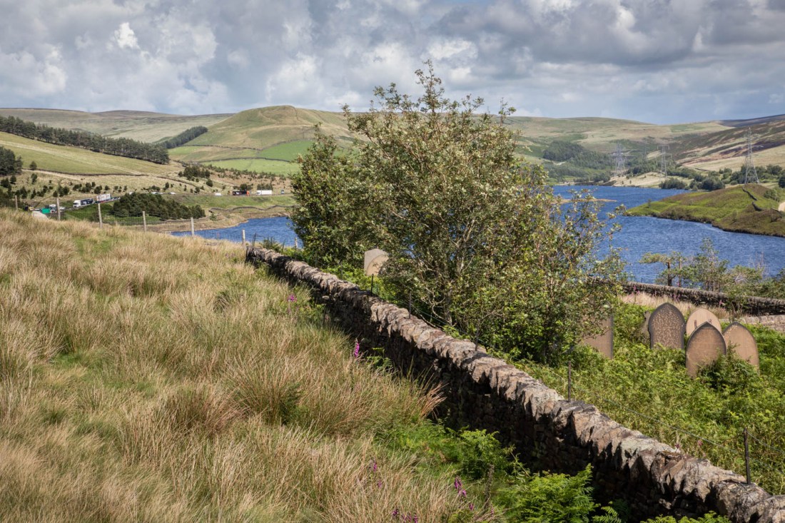
The strong line of the wall provides a clear separation between the churchyard (albeit overgrown) and the field where the labourers were buried. The background has detail that makes the eye move around – the lorries to the left and the pylons carrying cables to the disused tunnels.
Overall this seems a more interesting image than the monochrome ones.

2 thoughts on “Exercise 5.1: Further thoughts”