Assignment 5: Revision

Assignment 5: Revision

I have had a discussion with my tutor about Assignment 5 and my approach to it. I have documented this in a post summarising my feedback.

In summary:

In terms of my images chosen for Assignment 5, Andy suggested that a mixture of images in portrait and landscape formats was not so effective. He also thought that the portrait orientated images were less effective in depicting the landscape I was trying to show.

He made some suggestions about re-working this Assignment in terms of selecting landscape orientated images, and I will rework this in the light of these comments.

He also made a general comment about the way images are displayed on the website, arranged vertically. As we tend to read horizontally, he suggested ways in which the images could be shown side by side, as they would be in a gallery. He suggested this should be a consideration for my submissions for assessment.


I have re-examined the images I shot for this assignment and looked particularly at the ones in landscape format. There are a number of other images which I could include, as well as some I showed in my earlier post, but chose not to include.

Other images not shown before include these:


My tutor suggested I could show the images in pairs, side by side, and illustrated this with these two:


The rusty bucket from the machinery to the left of one image, mirrors the stone structure to the right of the other. I have made a selection of ten images which can be arranged in pairs like this.

So my revised selection is the following:

14 August 2020: Video meeting with Andy Hughes Assignment 5

Video meeting with Andy Hughes: 14 August 2020

Feedback on Assignment 5 – Photography is Simple

I had submitted Assignment 5: Photography is Simple to my tutor and this meeting was to provide feedback on that work. In addition Andy offered advice about preparing my submission for assessment, and about my next and future modules.

Feedback on Assignment 5 and Course work for Part 5

Andy commented on some of the images I had included in Exercise 5.1 Viewpoint, in particular Image Woodhead 18 (reworked),which I had included after thinking more about it. He agreed with my final conclusions about this image and drew my attention to the content of the image which he thought was one of its strengths (i.e. the grave stones/ field and wall, and then in the distance the line of trucks and the electricity cables). He also thought the positioning of the bush in the middle of the image was a strength – rather than it being to one side as more conventional composition might suggest. I think it was this aspect of the image which initially led me to reject it.

In terms of my images chosen for Assignment 5, Andy suggested that a mixture of images in portrait and landscape formats was not so effective. He also thought that the portrait orientated images were less effective in depicting the landscape I was trying to show.

He made some suggestions about re-working this Assignment in terms of selecting landscape orientated images, and I will rework this in the light of these comments.

He also made a general comment about the way images are displayed on the website, arranged vertically. As we tend to read horizontally, he suggested ways in which the images could be shown side by side, as they would be in a gallery. He suggested this should be a consideration for my submissions for assessment.

More General Developmental Suggestions

Andy made some suggestions about other artists whose work I should study.

These included David Hockney’s video work, The four seasons (NGV Melbourne, 2017).

He also referred me to events organised by CAST, the Cornubian Arts & Science Trust; with particular reference to the presence of mining in the landscape.

In addition the work of artists during the period 1910 – 1940 such as Graham Sutherland, Paul Nash, Barbara Hepworth and Henry Moore, exemplify some non-photographers use photography in their work and the scarring of the landscape from mining and other uses.

He suggested that my sense of advocacy for the landscape is an aspect which could be further developed in future work, and considered other ways I could use other techniques to explore the landscape.

One suggestion was to look at juxtaposing map extracts with my images to explore the form of the image.

Preparing for Assessment

Andy summarised the submissions I will need to make, and made suggestions about my selection of creative work to submit.

He suggested that the 10-20 items of work would be best selected from Assignments 1 and 5, and made suggestions about selection of these.

To Do

Following this meeting there are a number of tasks I have to do, including preparation for assessment. These include.

Revise final images for Assignment 5

Research other artists

  • David Hockney’s video work, The four seasons (NGV Melbourne 2017).
  • The work of CAST, the Cornubian Arts & Science Trust
  • Graham Sutherland
  • Paul Nash
  • Barbara Hepworth
  • Henry Moore

Use of other techniques to explore the landscape/ juxtaposing map extracts with my images

References

References to the works cited in this post are found in my separate post “References”

Assignment 5: Assignment Notes

Assignment 5: Assignment Notes

The following is a submission to accompany my images and summarises my approach to the assignment and my reflections on it. Many of the points I discuss here are considered in more depth in my learning log at https://ap231photography.com/.


The Brief

The brief for this assignment included “..Take a series of 10 photographs of any subject exploring the theme ‘Photography is Simple’. Each photograph should be a unique view; in other words, it should contain some new information..” The course notes also suggest that “you should just feel comfortable with your subject… it should say something about you”

In these notes I will explore how I have attempted to answer that brief.


My Subject

The images of the “Peak District Landscape” I found for Exercise 4.4, portray the landscape of the moors as an idealised wilderness with little reference to the influence of man in managing the landscape as I experience it living close by. The images include stereotypical features and make no reference to the mining and quarrying, the collection of drinking water and grouse shooting for which the moors are managed.

What I intended the images to show are features within the landscape which indicate these activities. In this way I hoped to better represent my own experience of the moorland landscape.

“Photography is Simple”

I attempted to address the theme of simplicity by making the images when I went walking on the hills near my home. I went out not with the specific aim of making the images but to experience the environment in a walk. I tried to capture subjects as I came across them and the resulting images are therefore my own reaction to the landscape.

In this way the process of making the images was more spontaneous than the creation of the images for other assignments. I used a variety of equipment, depending on what I could carry for the length of the walk planned. I also had little idea what I would come across and had to react as I saw something.

My Influences

On reflection I had very few overtly conscious influences. However I was trying to depict the landscape as I experience it and not a stylised version. Thus in this respect a main influence is the work of Fay Godwin; particularly her series “Our Forbidden Land” showing man-made structures in the landscape, and a less conventionally attractive side of the British landscape. Similarly the work of photographers such as Robert Adams, and others in the exhibition “New Topographics: Photographs of a Man-Altered Landscape” show the landscape as it is, not how we might imagine it.

Reflections

One of the main learning points I have drawn from this assignment, is not so much about photography itself, but about how I look at the world around me. I think I started this process with the first assignment in this course, which made me look at where I live and how that is a product of its history and changes of use over years.

It is this process of looking at how the parts of the environment create the whole which has begun to influence me, and, I hope, my work. Those parts of the environment which build up into the whole may be due to changes in use over time, as was the case in my “Square Mile” assignment; or its use simultaneously for different functions, as is the case with these present images.

Another point on which I have reflected is that my assignment notes for this assignment are much shorter and less wordy than for any of the other assignments. My initial reaction to this is that I have not written enough or considered enough research and background reading. While this may well be the case, I am very conscious that I was trying to make this “Simple” and by so doing make my images more spontaneous and automatic, drawing on the influences and experience I have gained over this course in a more subconscious way. I think this relates to my concern which I raised with my tutor that my work is not so visually strong and does not always fully express what I intend as well as I can express it in words. My previous assignments I have had a lot of ideas which I have expressed in writing, and this is not reflected in the quality of the final images – I think best exemplified by “The Decisive Moment”.

In the end I am very pleased with these final images, I think they do indeed show what I intended and I would hope that I am moving towards better representing my ideas visually rather than verbally.


Assignment 5: Some Reflections

Assignment 5: Some Reflections

I have presented my images in a previous post, and will consider here how I have met the brief “Photography is Simple”.

I set out with the aim of presenting images which depict the use of the landscape of the Peak District moors and show that as I experience it, not an idealised version such as those I found in my google search. I tried to show images in the same way as Fay Godwin or Robert Adams and others might. I made the images intending to present them in colour rather than monochrome as these photographers did. Thus superficially the images look very different.

For example this image, Crowden 14, to me, depends on the colour of the rusting metal contrasting with the surroundings, and in monochrome does not make that point as well.


However overall when the images are shown in monochrome, there is a resonance with the work of the photographers which influenced me.

The simplicity of this assignment is however probably not immediately visible to the observer. The images were made in response to my own reaction to the environment with little specific planning as I did not know what would catch my attention as I walked. On two occasions I was accompanied and did not have long to capture the image so it was a more automatic process during which I used accumulated experience both technical and artistic for the composition.

Each of the images shows a different aspect of man’s influence and use of the environment – in that respect I think each image is a unique view and contains new information.

Personal Reflection

One of the main learning points I have drawn from this assignment, is not so much about photography itself, but about how I look at the world around me. I think I started this process with the first assignment in this course, which made me look at where I live and how that is a product of its history and changes of use over years.

I think this is illustrated with this image from that assignment which shows a moorland stream, against which a cotton mill was built and then on the foundations of that, modern flats.

2018-08-21 Glossop EYV-4
Glossop Brook near Calico Court and the base of old mills

It is this process of looking at how the parts of the environment create the whole which has begun to influence me, and, I hope, my work.

Those parts of the environment which build up into the whole may be due to changes in use over time, as was the case in my “Square Mile”assignment; or its use simultaneously for different functions, as is the case with these present images.

Another point on which I have reflected is that my assignment notes for this assignment are much shorter and less wordy than for any of the other assignments. My initial reaction to this is that I have not written enough or considered enough research and background reading. While this may well be the case, I am very conscious that I was trying to make this “Simple” and by so doing make my images more spontaneous and automatic, drawing on the influences and experience I have gained over this course in a more subconscious way. I think this relates to my concern which I raised with my tutor that my work is not so visually strong and does not always fully express what I intend as well as I can express it in words. My previous assignments I have had a lot of ideas which I have expressed in writing, and this is not reflected in the quality of the final images – I think best exemplified by “The Decisive Moment”.

In the end I am very pleased with these final images, I think they do indeed show what I intended and I would hope that I am moving towards better representing my ideas visually rather than verbally.

Assignment 5: My Images

Assignment 5: My Images

Methods

I made my images on three occasions when I went walking on the hills near my home. The walks were not with the specific aim of making these images but were walks I would be making anyway. As I indicated in my previous post, I was trying to capture subjects which I came across which indicated the extensive management of this landscape.

Two walks were with other people, and I did not spend long selecting the viewpoint and taking several shots of the same object. On these walks I used a compact camera, a Canon Powershot G7x Mkii, which is lightweight and easily carried. The last walk I was alone and able to devote more time to photography. As I was not walking fast or far, I used heavier equipment, my Canon EOS 5D Mk4 with a 24mm prime lens and a 24-105mm zoom. All shots were hand held.

I shot the images in RAW and have cropped all to a consistent 5×7 aspect ratio.

I have made contacts of all the images prepared for this assignment at

Contacts Ass5 all


Selection of Images

I have made a selection based on a number of factors.

Overall I wanted to produce a set of images which include reference to the uses of the moorland such as mining and quarrying in the area, grouse shooting, and the collection of water. As I indicated in my previous post “My aim is to include reference to some of these aspects of the landscape; to show that the moors are not a wild wilderness, but managed and not all the features to be found are conventionally attractive.”

The brief says that “each photograph should be a unique view; in other words, it should contain some new information, rather than repeat the information of the previous image.” I have interpreted this to select each image to show a different aspect of the landscape’s use rather than multiple images of similar subjects.

Where I have multiple images of the same subject from different positions, I have made my selection based on exposure and other technical qualities of the image, as well as the viewpoint offering a satisfactory composition which places the subject into the landscape.

According to these criteria I had a final selection of 15 images out of 75 in total. I eliminated 5 of these. For example these two are of similar subjects, so I only include one way marker stone in my final selection.


I excluded this of the sheep, as although sheep farming is a major activity and influence on the landscape, we are familiar with  the sheep in the landscape and they do not appear so incongruous.

2020-08-02 Crowden-18
Crowden 18


These images I excluded as I do not think the composition is as strong as others which I have included.

My final selection therefore includes subjects which relate to mining and quarrying, leisure activity, water collection, farming, grouse shooting. I believe they all show objects which appear initially incongruous in their setting, but that is only because we expect a landscape as represented by the idealised images in my google search, rather than those based in reality.


Photography is Simple: My 10 Images:

2020-07-25 Bleaklow-8
Bleaklow 8
2020-07-25 Bleaklow-19
Bleaklow 19
2020-07-30 Cock Hill-1
Cock Hill 1
2020-08-02 Crowden-2
Crowden 2
2020-08-02 Crowden-14
Crowden 14
2020-08-02 Crowden-27
Crowden 27
2020-08-02 Crowden-30
Crowden 30
2020-08-02 Crowden-39
Crowden 39
2020-08-02 Crowden-48
Crowden 48
2020-08-02 Crowden-54
Crowden 54

Assignment 5: Photography is Simple

Assignment 5: Photography is Simple. My Approach

Brief

“The final assignment is an open brief. Take a series of 10 photographs of any subject exploring the theme ‘Photography is Simple’. Each photograph should be a unique view; in other words, it should contain some new information, rather than repeat the information of the previous image.

In your assignment notes explore how you think you’ve answered the brief.”

The notes for this also include the statement

“For now, though, you should just feel comfortable with your subject. It should say something about you and, in the end, you like it!”

My Subject

I had started thinking about this for some time, before I started this course, however over the last few months I have developed my ideas a little more.

Searching for images of the “Peak District Landscape” for Exercise 4.4, made me aware that many of the images appearing in a Google search portray the landscape of the moors as an idealised wilderness with little reference to the influence of man in managing the landscape as we experience it. The first two pages of images appearing in the search are these:


I note that the lighting is uniformly bright and colours appear to be enhanced. The scene includes what might be considered stereotypical features of the Peak District such as colourful heather, outcrops of rock, millstones (the characteristic rock is Millstone Grit). Inclusion of farming references are confined to a few sheep, well tended fences and gates.

There is no reference to the extensive mining and quarrying in the area; to the grouse shooting for which the moors are managed – the grouse fed, and the heather burned to provide food for the young birds; to the collection of water for a supply to the large conurbations nearby.

My aim is therefore to produce a set of images which include reference to some of these aspects of the landscape; to show that the moors are not a wild wilderness, but managed and not all the features to be found are conventionally attractive.


My Influences

My main influence in these images is the work of Fay Godwin. In particular images such as these show man-made structures in the landscape.

However her series “Our Forbidden Land” also show man-made structures in the landscape, they are less conventionally attractive and show a particular aspect of the British Landscape, such as:


Similarly the work of photographers such as Robert Adams, and others in the exhibition “New Topographics: Photographs of a Man-Altered Landscape” show the landscape as it is, not how we might imagine it. For example

Schoolyard, Ramah 1968. Robert Adams


While the subject matter is different I am trying to achieve an appearance of the image more like those images, than the highly processed landscape images I found in my Google search. The other element I tried to incorporate was a suggestion from my tutor to achieve a “flat” appearance of the images, with uniform lighting across the image.


Photography is Simple

The brief for this Assignment is to explore “the theme ‘Photography is Simple’.. each photograph… should contain some new information

It should say something about you and, in the end, you like it!”

The subject matter I have chosen is important to me – I enjoy the landscape in all its forms and appreciate that what we experience is a result of how it has been used for hundreds of years. It is this theme I tried to explore in my first assignment, The Square Mile. So I think the assignment does say something about me.

It will be simple because I will be making the images on walks, not all of which have been with the express purpose of getting the images for this, instead I will react to the landscape as I see it. I will therefore be using simple, compact and light photographic kit that I can carry easily.

References

References to the works cited in this post are found in my separate post “References”

23 July 2020: Video meeting with Andy Hughes Assignment 4

Video meeting with Andy Hughes: 23 July 2020

Feedback on Assignment 4 – Languages of Light

As I have indicated in my posts reviewing my learning objectives, I had asked for a video feedback for Assignment 4.

In addition to getting feedback on that assignment I had a few points I wanted to discuss with my tutor.

These were:

  1. I will be submitting my assignments for assessment in the next weeks and I wanted to check whether any further re-working of these is needed.
  2. While I have used the OCA format for my learning log, I have modified it a little and want to check if this is the correct format. I am also aware that some of the posts are quite long, and wondered if some of these are going off the point of the course
  3. The last point is something I have been aware of, particularly since Assignment 3. I think I can express my intentions and the aims of my work verbally, but this is not expressed as effectively visually. I believe that in general my work is not so visually strong and does not always fully express what I intend as well as I can express it in words.

We had a lengthy video call which was very helpful. Andy made a number of points.

Andy was complimentary about my learning log and documentation of the work. He said he thought I had completed the coursework thoroughly. He gave as an example the account I gave of the technical aspects of light in my write up of the assignment, and the photographs of the set up for my studio work.

We had a general discussion about “quality of light” and he referred me to a Radio 4 programme with Oliver Stone in which he described using the “golden hour” for filming. He also referred to the cultural references to light, and humans’ innate fear of shadows and darkness. As an example he referred me to look at a painting Hunt in the forest by Paolo Uccello.

One of the points Andy made in our discussions which I found very interesting was his concept that photography is “subtractive” whereas other visual arts media are “additive”; ie a painter starts with an empty canvas and adds to it to create the image, whereas a photograph shows everything in a scene, and photographers often remove elements from that in order to emphasise others aspects.

Andy referred me to the work of a number of painters with particular reference to their use of colour. These were Paul Nash, Eric Ravillious and John Piper.

With regard to the exercise, Egg or Stone, Andy referred to the concept of object orientated ontology and the writing of Timothy Moreton , and which if I understood correctly, suggests that inanimate objects exert an influence on us. Thus my choice and selection of that particular stone was influenced by the stone. I am sympathetic to this view, as I did indeed choose the stone while out walking, and chose it as a piece of gritstone. I have referred to this in my write up of the exercise, and would suggest that the course notes which say “we recommend that you choose a natural or organic object such as an egg or stone rather than a man-made object. Man-made or cultural artefacts can be fascinating to light but they’re already authored to some degree” do not address that element of choice we have in choosing even a natural object.

With regard to my next assignment Andy gave me suggestions as to sources to examine for influence. These included, Allan Sekulla, Fish Story and Between the Net and the Deep Blue Sea (Rethinking the Traffic in Photographs)

Our discussions had addressed the first two points I needed to ask about. I raised my concern that my work is not so visually strong and does not always fully express what I intend as well as I can express it in words. Andy agreed with this, but appeared to regard my recognition of this as a positive point. He said it is very common for visual artists to have this concern and my recognition of it is a good starting point for further development.

Suggested sources to research

Oliver Stone, Radio 4 Documentary

Hunt in the forest by Paolo Uccello.

Paul Nash, Eric Ravillious and John Piper

object orientated ontology and the writing of Timothy Moreton

Foam and Self Publish Be Happy

Allan Sekulla, Fish Story and Between the Net and the Deep Blue Sea (Rethinking the Traffic in Photographs)

Click to access Sekula_Allan_2002_Between_the_Net_and_the_Deep_Blue_Sea.pdf

Languages of Light: Analysis

Languages of Light: Analysis

(The following is the text from the submission I am required to make with my images for Assignment 4. It is a precis of other posts in my learning log which expand on these topics.)

While “beauty” is a subjective term, I have considered the statement by Mary Richardson, following her attack on the Rokeby Venus (From the Rokeby Venus to Fascism Pt 1: Why did suffragettes attack artworks?, s.d.)

Richardson is quoted as saying “Justice is an element of beauty as much as colour and outline on canvas”

I have extended this argument to concerns in contemporary society, where environmental issues should be prominent. Thus I have suggested “an artificial light source could only be considered to demonstrate “beauty” if it does not harm the environment”, either by using excessive and unnecessary energy, and/or contributing to light pollution. I have found this a difficult concept to incorporate into my images, but have attempted to do so.

Influences:

The influences I have consciously tried to incorporate into my work include those of Sally Mann and Rut Blees Luxemburg.

Sally Mann refers to “the refulgence or the reflection when light and water interact” (Rong and Mann, 2013), albeit with respect of images made in daylight. However this is also the case with artificial light. “Refulgence” incorporates the qualities of “splendour, brightness, radiance…shining with or reflecting, a brilliant light; radiant, resplendent, gleaming…”

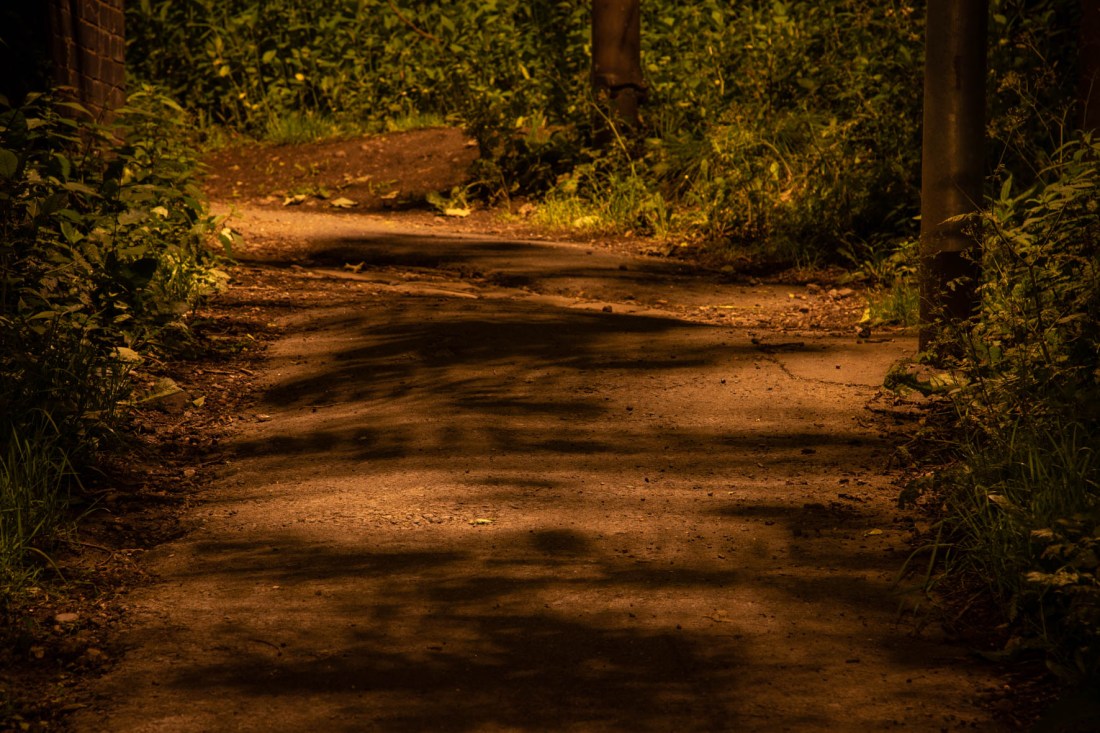
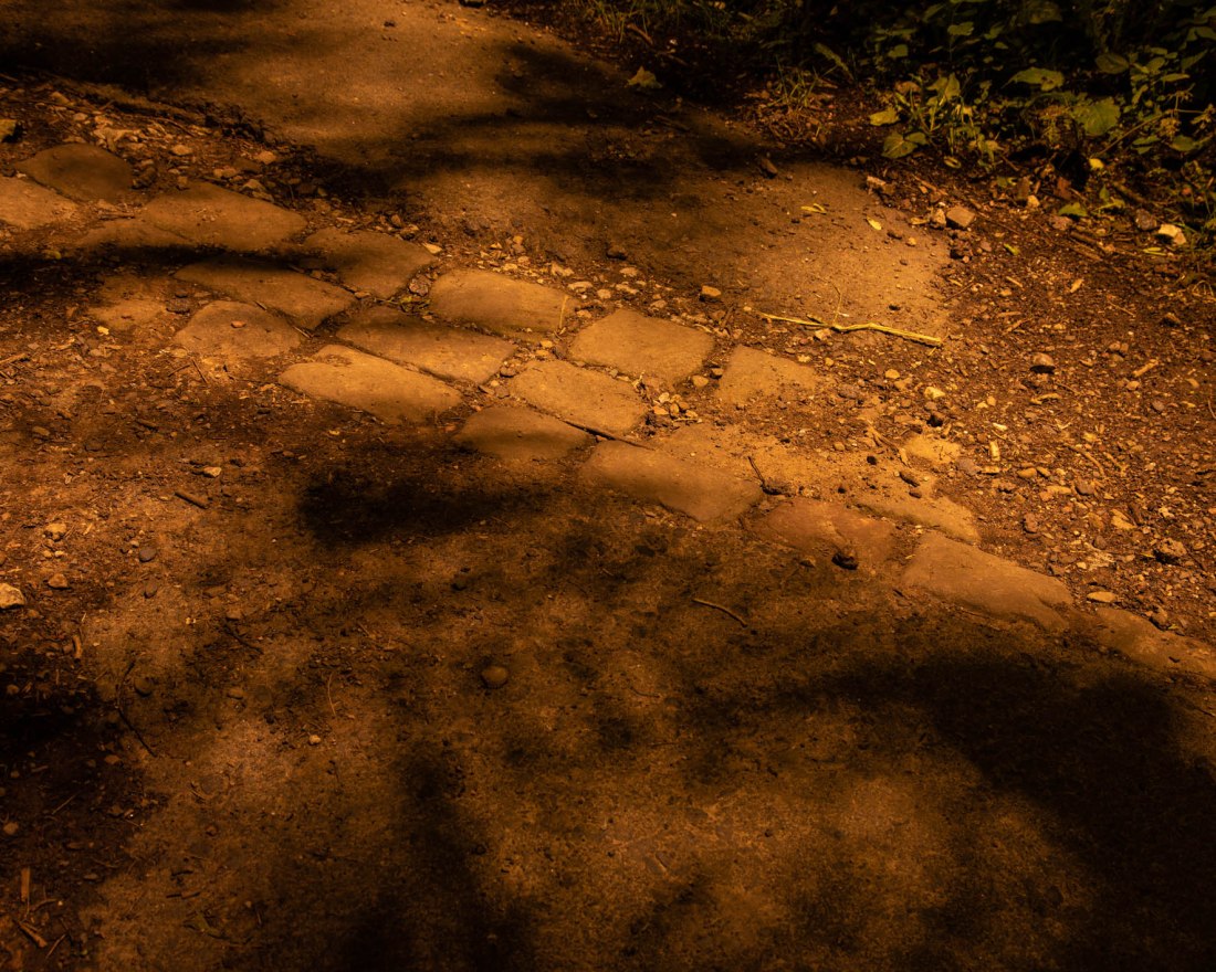
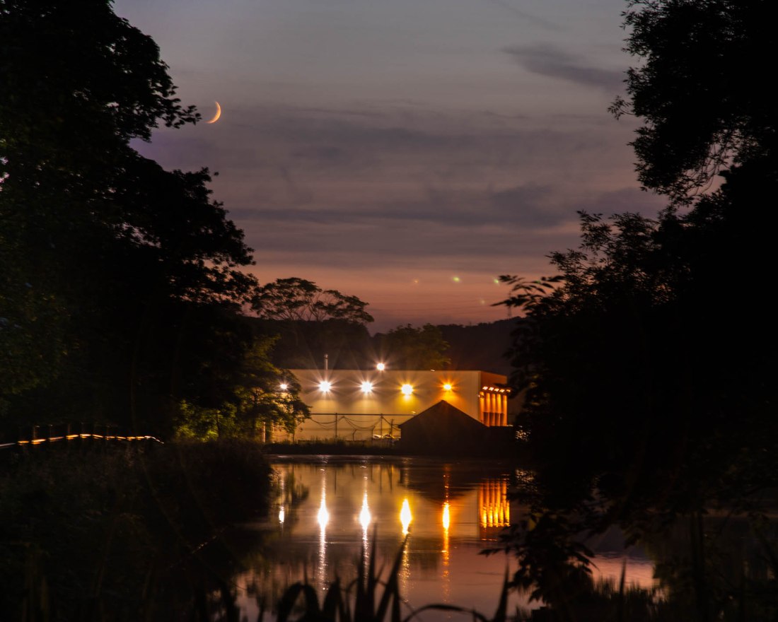
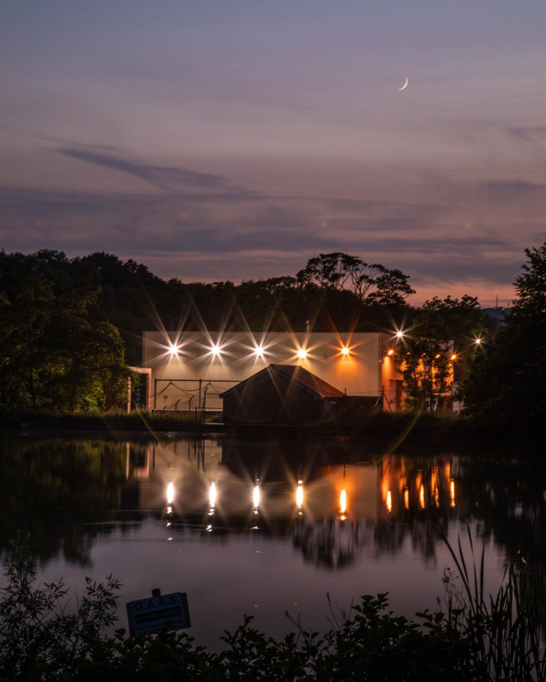
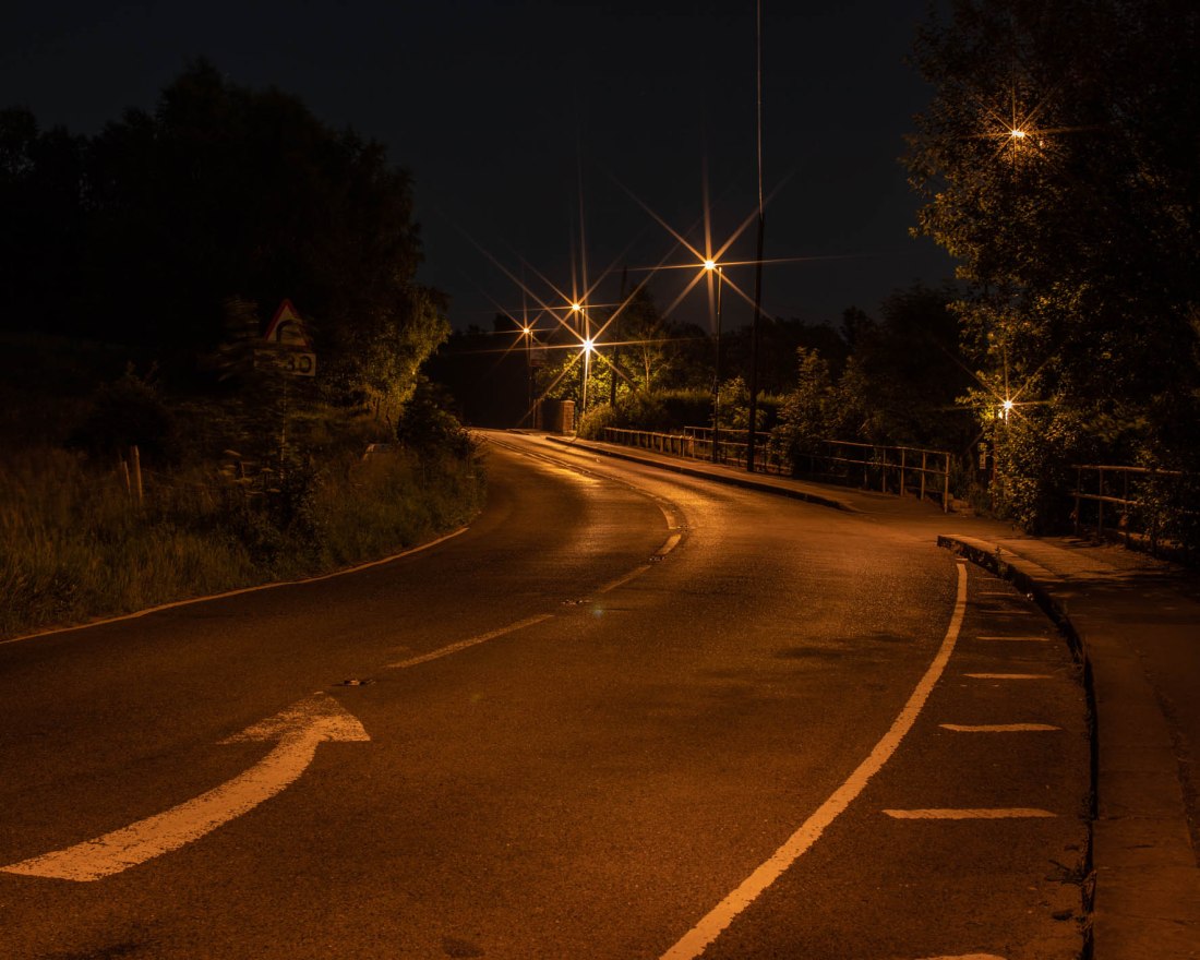
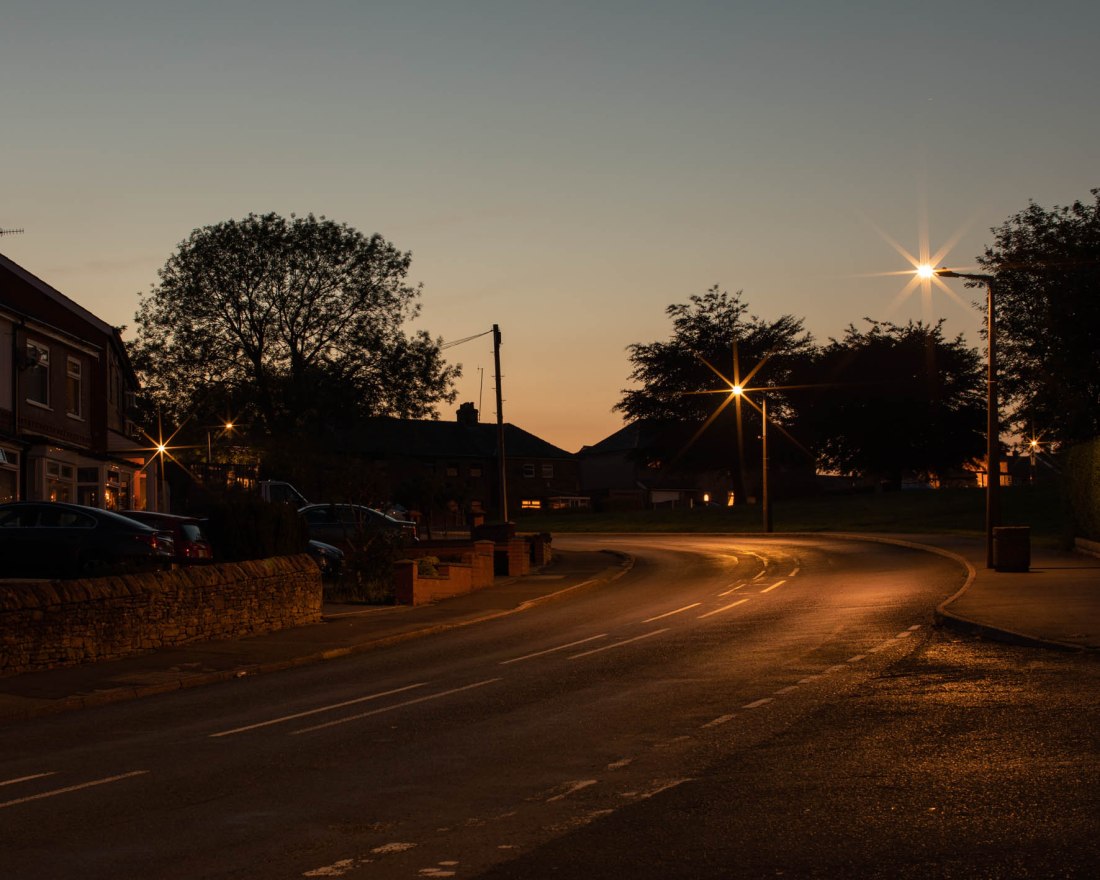
It is this quality of the light in Rut Blees Luxemburg’s series,”Liebeslied: My Suicides” (Luxemberg and Duttman, 2000) which I hoped to emulate. In addition, Rut Blees Luxemburg’s images of night-time London, have a distinctive colour palette, with a very marked orange overtone to many of the images which is different from how I perceive night-time scenes illuminated by street lighting. I aimed to try and establish the reason for this and to incorporate it into my images.

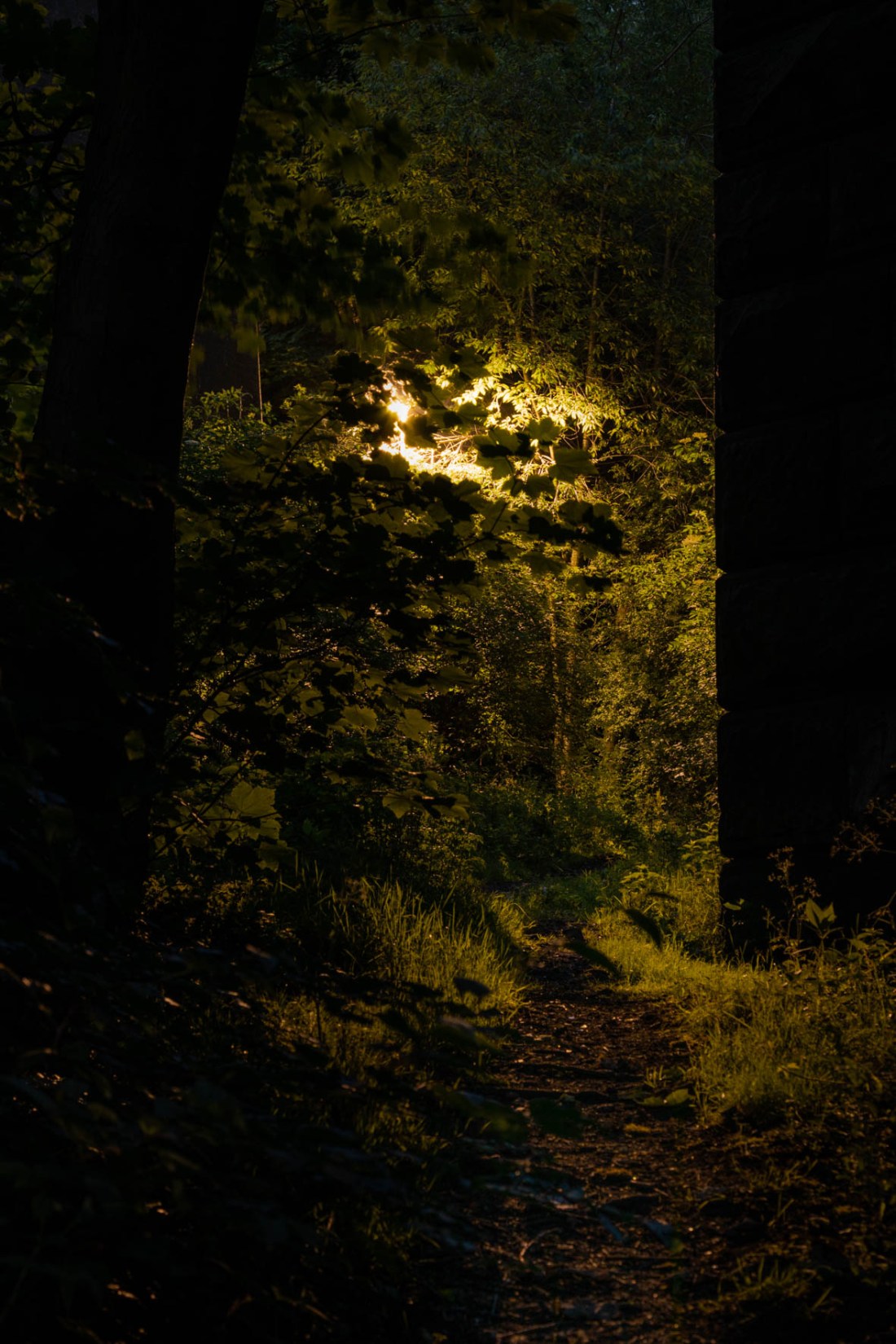
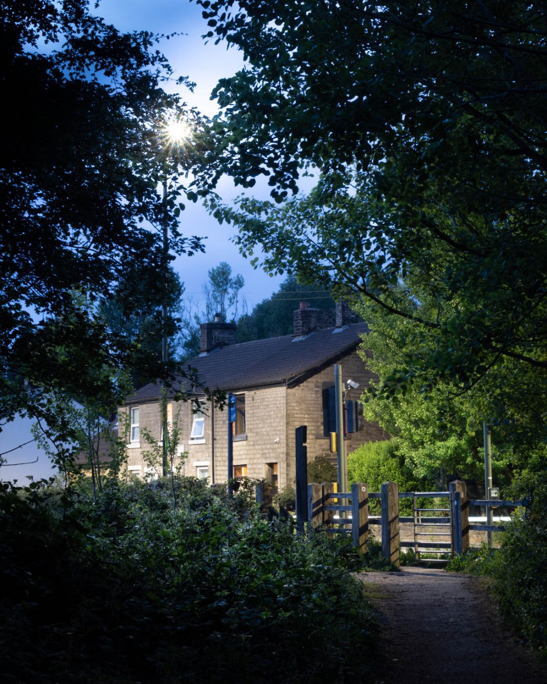
The work of Duncan Hill, in particular his series “Night Topographics”, includes images with a similar colour palette but also add a distinctive feeling of unease, very empty of day to day life expected in a scene during the day. Other images of trees illuminated by street lighting show the foliage in a different aspect. This is also the case for images made by Matthew Murray from his series, “Saddleworth” created by lighting “the landscape with artificial lighting, external lights, torches, car headlights” (Murray, 2017). I aimed to capture the unusual appearance of foliage when lit from unexpected directions.

I wanted to develop the assignment from the original exercise by

Better capturing “the beauty of artificial light” -particularly with regard to the construct of beauty I have suggested above

Capturing more of the interaction between the light and water, and the reflection of lights from different surfaces as it creates interesting patterns, unique to the night time

Overall, when I reviewed my exercise I realised many of the images were of artificial lights, not images made by artificial light. In many if not most of the images made by those photographers I cite, the actual light source is not seen… My overall aim is to make images using the artificial light to illuminate the scene.

Methods

I used a slow ISO value to obtain high-quality images which would most faithfully express the quality of light I was trying to capture, as a result of this long exposure times were necessary with a tripod.

I wanted to capture all the qualities of the light, including colour, so I used my digital camera as I am not equipped to use colour film at the present.

Colour Balance setting was a major consideration for my methodology. I had made all the images for Exercise 4.2 using “auto” setting for white balance. However some of the resulting images were somewhat disappointing as this setting tended to make the image look as if it had been made in daylight. I wanted to try and capture more about the quality of the artificial light and what it adds to the scene as it would otherwise be illuminated. I chose to use a custom white balance setting for my images. This involved setting the white balance for the light conditions after sunset, without any influence of artificial light. In this way, any “colour cast” would actually be the light that the artificial light had added to the scene.

Images were shot in RAW and edited in Lightroom. Adjustments were confined to cropping and local exposure adjustments. No changes were made to the coloration.

My Images


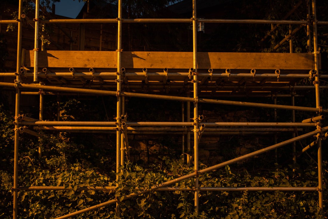
I noticed that LED Lights cast a distinctive shadow due to having several light sources together. These lights might be considered to demonstrate “beauty” by being more energy efficient than others.

Images EYV Ass 4-40, EYV Ass 4-41, EYV Ass 4-44, EYV Ass 4-46 and show different aspects of this patterning.

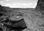
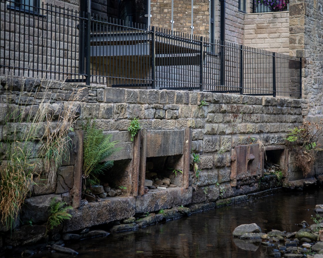
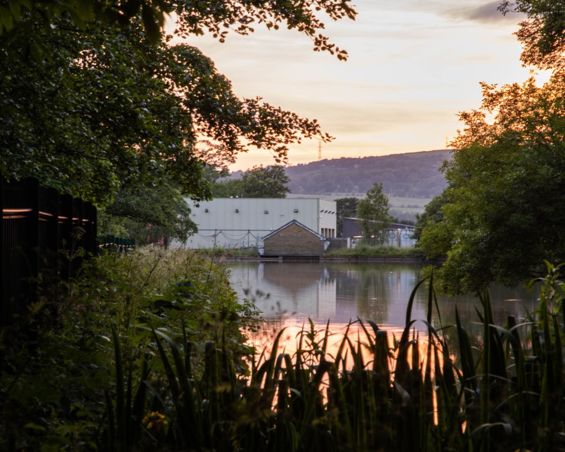
The interaction of light and water is shown in images EYV Ass 4-37 and EYV Ass 4-29. However the lit area at the visible end of the industrial site is a lorry wash, not in use at that time so it is difficult to justify these images meeting my criteria for beauty.

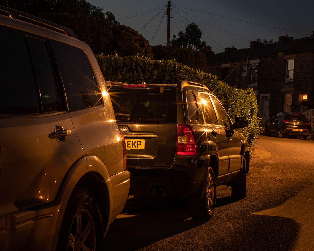
EYV Ass 4-4 shows the reflections of lights on parked cars.

The unusual appearance of foliage when lit from unexpected directions is shown in images EYV Ass 4-40 and EYV Ass 4-34.

Images EYV Ass 4-1, EYV Ass 4-6, and EYV Ass 4-2 are attempts to capture the feeling of being present at night when everywhere is quiet and deserted, and the light gives a different appearance to common scenes.

Making these images has involved a great deal of experimentation on my part, this was a new direction for me. I think that while I have had to use imagination to imagine what the scene would look like at night, I actually learned as I went along that the image my camera produced was distinct and differed from the daylight scene in ways I found difficult to predict at first. I am not sure how inventive I have been, these are all taken in the immediate vicinity of my home.

References

References to cited work is in my post “References” in my learning log at ap231photography.com

Assignment 4: Languages of light 3

Assignment 4: Languages of light 3

In this post I will describe the final images submitted, and the strengths and weaknesses of particular photographs and the project as a whole.

I made the images on shoots on two separate occasions. Contacts for the shoots are here.

Contacts 23 June 2020

Contacts 26 June 2020

Of these images I selected a number that I believe fulfil the ways I set to develop the assignment from Exercise 4.2.

These areas for development are:

“I do not think I have addressed “the beauty of artificial light” in these images”

LED street lights with many light sources in the array, gave a very distinctive pattern of shadows.

“I would like to try and capture more of the interaction between the light and water”

“the reflection of lights from different surfaces creates interesting patterns, unique to the night time”

These elements all relate to the idea of refulgence of the lights, which I would like to capture more.

The pools of different types of light on the ground here make patterns which could be the subject for further exploration”

This relates to this part of one of my images..

“…many of the images were of artificial lights, not images made by artificial light…

My overall aim is to make images using the artificial light to illuminate the scene.”


Patterns of shadows from LED Lights

I noticed this pattern of shadows from the foliage, seen in the foreground of this image.

2020-06-23 Glossop EYV Ass4-40
EYV Ass 4-40


This I have also shown in these taken nearby.

2020-06-23 Glossop EYV Ass4-44
EYV Ass 4-44
2020-06-23 Glossop EYV Ass4-46
EYV Ass 4-46


Interaction of Light and Water/Reflections

I identified this location and viewpoint which I thought would be enhanced by the artificial lights from the industrial buildings later in the evening. (This image is not part of my submission)

2020-06-23 Glossop EYV Ass4-10
EYV Ass 4-10


The final images I selected are these:

2020-06-23 Glossop EYV Ass4-37
EYV Ass 4-37
2020-06-23 Glossop EYV Ass4-29
EYV Ass 4-29

While these are striking images and might be considered to show a type of beauty, the brightly lit area at the visible end of the industrial site is a lorry wash, not in use at that time. In fact there was very little activity on the site during the time I was taking photographs, so it is difficult to justify these images meeting my own criteria for beauty, that an artificial light source could only be considered to demonstrate “beauty” if it does not harm the environment, either by using excessive and unnecessary energy, and/or contributing to light pollution”.

I also tried to capture the reflections of lights on parked cars, as I indicated in Exercise 4.2.

2020-06-25 Glossop EYV Ass4-4

EYV Ass 4-4


Using the artificial light to illuminate the scene

Developing the idea I had from the work of Duncan Hill, to look at how the lights illuminate foliage I made these images.

2020-06-23 Glossop EYV Ass4-40
EYV Ass 4-40
2020-06-23 Glossop EYV Ass4-34
EYV Ass 4-34


The other principle I saw from Duncan Hill is the feeling of being present at night when everywhere is quiet and deserted, and the light gives a different appearance to common scenes. These images try to capture that.

2020-06-25 Glossop EYV Ass4-2
EYV Ass4-2
2020-06-25 Glossop EYV Ass4-6
EYV Ass 4-6
2020-06-25 Glossop EYV Ass4-1
EYV Ass 4-1

The notes indicate I should evaluate my images against the criteria for creativity – imagination, experimentation, invention.

Making these images has involved a great deal of experimentation on my part, this was a new direction for me. I think that while I have had to use imagination to imagine what the scene would look like at night, I actually learned as I went along that the image my camera produced was distinct and differed from the daylight scene in ways I found difficult to predict at first. I am not sure how inventive I have been, these are all taken in the immediate vicinity of my home.


Assignment 4: Languages of light 2

Assignment 4: Languages of light 2

In this post I will describe my technical approach and the methods I have used.

Camera set-up

My experience with Exercise 4.2 I learned that I needed to use a slow ISO value to obtain high-quality images which would most faithfully express the quality of light I was trying to capture – ie the refulgence, the brightness and radiance of the light and its reflections. As a result of this long exposure times were necessary with a tripod.

I wanted to capture all the qualities of the light, including colour, so this necessitated my using my digital camera as I am not equipped to use colour film at the present. A second consideration is that the digital camera provides a more immediate feedback and allows me to assess the exposure immediately.

Images were made with a Canon EOS 5D Mk4 and either a 24-105mm zoom lens or 50mm f1.2 prime.I selected apertures of between f8 and f16 to enable a deep depth of field as this seemed appropriate for the compositions I was aiming for.

Exposures were made according to the camera metering, set to centre-weighted average, and then adjusted if needed.

Colour Balance

This was a major consideration for my methodology.

I had made all the images for Exercise 4.2 using “auto” setting for white balance. However some of the resulting images were somewhat disappointing as this setting tended to make the image look as if it had been made in daylight.

An example of this is.

2020-06-03 OCA Ex4-2-13
2020-06-03 OCA Ex4.2 #13 ISO125, f/11 30.0sec

Here the foliage and buildings appear just as they might do in the daylight even though it was made about one hour after sunset. I felt that this setting of my camera failed to capture the experience of viewing the scene at night with artificial light.

Although I am fairly familiar with the principles of white balance, in particular from experience of taking photographs by ambient light underwater, I revised my knowledge by referring to a recommended textbook (Diprose and Robins, 2012).

Visible light is part of the spectrum of electromagnetic radiation which encompasses what we know as radio waves, microwaves, infra-red radiation, ultra-violet radiation, X-rays and gamma rays. It just happens that through evolution our eyes are sensitive only to electromagnetic radiation of wavelengths in a restricted range, “visible light”. Within that range, we perceive different wavelengths as being of different colours. While the wavelengths of light can vary continuously, we perceive the colours as distinct and discrete, due to the way the light receptors in our eyes are constructed. There is nothing inherently “red” about electromagnetic radiation which we perceive as red light, it is rather that it triggers responses from light sensitive cells which are interpreted by us as red.

White light is composed of all wavelengths of electromagnetic radiation in the visible range, but different light sources have different combinations of these. So when there is a preponderance of longer wavelengths (ie reds and orange) we see this as a “warm” light. Conversely when there is a preponderance of blue and violet wavelengths this seems a “cool” light. This is referred to as “colour temperature”, which in turn relates to a theoretical black object radiating light as it is heated, we are familiar with the idea of heating a piece of metal which starts to glow red and as it gets hotter, brighter.

As photographers we have to take photographs in various types of light. “Daylight” might be the light of a clear blue sky, dominated by short wavelength blue light – so is considered a cool light. Conversely, around sunset and sunrise the light has more red and orange (due to passing a longer distance through the atmosphere, which filters out the blue wavelengths). Rather confusingly the “cool” light of the blue sky would be assigned a colour temperature around 10000K, a hotter temperature than the “warm” light of sunset which would be of the order of 5000K.

Artificial light sources also have this range of colour temperatures. So that an incandescent household bulb will have a warm light (≈3000K), while fluorescent tubes may be cooler (of the order of 5000K).

We do not always perceive this difference. Our eyes and brain adjust to the light source, and we tend not to notice the difference unless the light sources of different temperatures are adjacent to each other. Our cameras however do not make this adjustment and show the light source as it is, and as a result colours may not appear how we perceive them.

The white balance correction allows us to adjust for this; either by specifying a colour temperature or picking a pre-set corresponding to a type of light. Once that is set, white objects appear white, without a colour cast corresponding to the type of light.

An alternative is the Auto White Balance setting. The Canon website (V and Canon Europe Ltd 2002-, s.d.) describes this. “ Auto White Balance works by evaluating the scene and deciding the most appropriate white point in it. The setting works reasonably well if the colour temperature of the ambient light is between 3,000-7,000K. However, if there is an abundance of one colour in the image, or if there is no actual white for the meter to use as a reference, the system can be fooled, resulting in an image with a colour cast.

For Exercise 4.2, I used Auto White Balance. While this did not result in a colour cast, some of the resulting images did not reflect the appearance of the scene as I saw it. One example of this is this image which looks like it has been taken during the day, rather than an hour after sunset.

I wanted to try and capture more about the quality of the artificial light and what it adds to the scene as it would otherwise be illuminated. I chose to use a custom white balance setting for my images. This involved setting the white balance for the light conditions after sunset, without any influence of artificial light. In this way, any “colour cast” would actually be the light that the artificial light had added to the scene.

Post-processing

Images were shot in RAW and edited in Lightroom. Adjustments were confined to cropping and local exposure adjustments. No changes were made to the coloration.


References

References to the works cited in this post are found in my separate post “References”