My tutor commented on my use of vignetting to emphasise the central part of the image in some of my images for Exercise 4.4. I defended the use of this as I was trying to emulate the style of the landscape images from my Google search, rather than the content. He suggested I consider trying to produce “flat” images and cited the work of artists like the New Topographics and Fay Godwin, who showed landscape as the camera showed it, rather than manipulated.
Exercise 5.3 made me consider how we look at an image, our eye passing over all of it and returning to certain parts. Techniques such as vignetting and strong classical compositions (“rule of thirds” etc) can draw the eye to the centre of the image so strongly, we do not notice other parts of the image.
With these thoughts in mind, I considered the images I showed for Exercise 5.1. My final choices of the monochrome images. While these are coherent and I think quite striking, I was concerned they did not really show what I was trying to achieve.
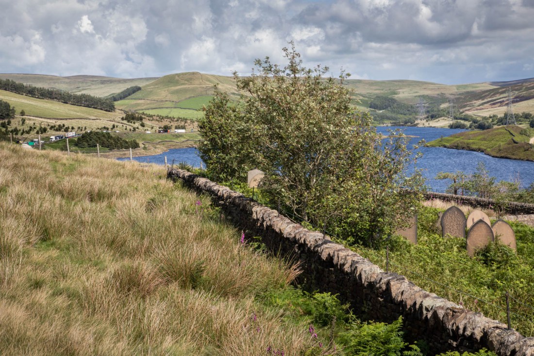
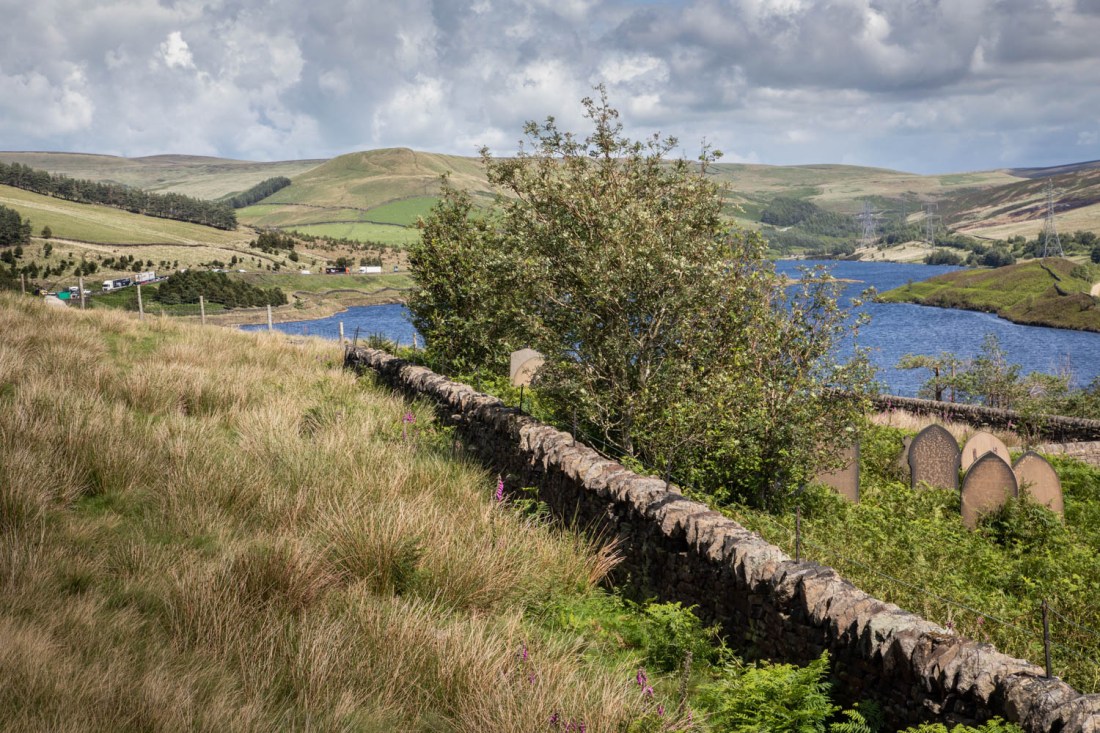
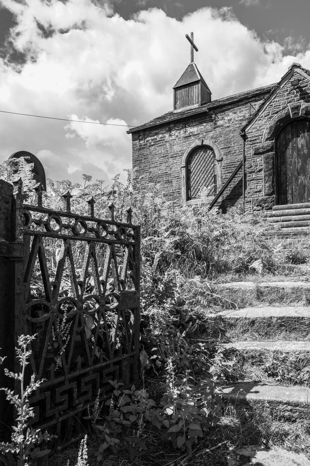
I have slightly altered the image with which I was less happy, Woodhead-18. I have adjusted slightly to remove darkening in the bottom left corner. I said I thought this too “fussy”. However having looked at it repeatedly, I think it is a better image than I initially thought.
Woodhead 18 (reworked)
The strong line of the wall provides a clear separation between the churchyard (albeit overgrown) and the field where the labourers were buried. The background has detail that makes the eye move around – the lorries to the left and the pylons carrying cables to the disused tunnels.
Overall this seems a more interesting image than the monochrome ones.
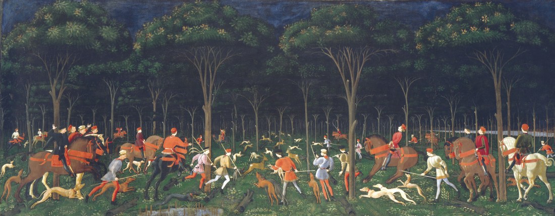
I was referred to this work by my tutor in response to my images of the Woodlands Valley Plantation which I included in my images for Exercise 4.1.
Hunt in the Forest, Ucello
The Hunt in the Forest (also known as The Hunt by Night or simply The Hunt) is a painting by the Italian artist Paolo di Dono; his nickname, Uccello (‘Bird’), alludes to his depictions of the natural world. He was celebrated in his lifetime as a master of perspective, and of animals and landscape. The painting is an early example of the effective use of perspective in Renaissance art, with the hunt participants, including people, horses, dogs and deer, disappearing into the dark forest in the distance. (THE HUNT IN THE FOREST, s.d.)
My tutor suggested I look at this with a view to examining his use of perspective, but also to explore the nature of shadows and the iconography of shadows as mysterious and dangerous places. My images which most closely resemble the viewpoint and perspective of Ucello, include these
Woodlands Valley Plantation 01
Woodlands Valley Plantation 02
However as the light is coming through the trees, these images seem less mysterious than images such as this, where we are looking into the darkness of the forest.
Woodlands Valley Plantation 01
Woodlands Valley Plantation 03
References
References to the works cited in this post are found in my separate post “References”
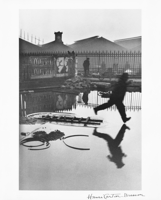
“Look again at Henri Cartier-Bresson’s photograph Behind the Gare Saint-Lazare in Part Three. Is there a single element in the image that you could say is the pivotal ‘point’ to which the eye returns again and again? What information does this ‘point’ contain?
Include a short response to Behind the Gare Saint-Lazare in your learning log…”
A Google search for images of “Henri Cartier-Bresson Behind the Gare Saint-Lazare” gives several results and they differ slightly in the shading and density of the reproduction of the shadows. While this may in part be a function of the reproduction of a print on a webpage, some of the variation may be due to the printing process as there are different dates given as to when the print was made.
Behind the Gare Saint-Lazare (1932) Henri Cartier-Bresson, Gelatin silver print, 17 1/2 × 12 in
This image is titled on the website as “Henri Cartier-Bresson, Behind the Gare Saint-Lazare (1932), Gelatin silver print, 17 1/2 × 12 in” and is I believe one of the older versions, and I assume truer to the original intention of HCB in making this image.
Is there a single element in the image that you could say is the pivotal ‘point’ to which the eye returns again and again?
My eye is consistently drawn to the figure of the man striding into the puddle – his forward foot has not hit the water yet, but his posture indicates he is committed to his leap, as shown in this part of the image:
Behind the Gare St Lazare 1932 – detail
It is his unbalanced position that contains the key information of that “point” he is in motion, but the outcome of that is as yet unknown.
In my consideration of “The Decisive Moment”I referred to the concept of “peripeteia”, from the Greek meaning “dramatic moment”. Bate (Bate, 2016) described this as “the striding foot indicates a future event, caused by the past, whose outcome is anticipated by what we see in the picture.”
I think it is the uncertainty as to what might happen next which fascinates us (or at least me) and keeps drawing me back to that point. I would suggest that the story of a man stepping into a puddle is a classic image in the slapstick comedy of silent film and so widely known that we are aware of it almost subliminally. An example of this is in this clip of a Hal Roach comedy with Oliver Hardy cameo from the 1920s, a few years before HCB produced his image, (Hal Roach comedy clip with Oliver Hardy cameo in 1920s. | Huntley Film Archives, s.d.). I cannot upload video to this site but the relevant section of this is at
But these do not draw our eye and fascinate us as much as this one though. There are other elements of the image which I believe cause this.
The example of the image which I show above, has been printed in such a way as to emphasise the line of the railings behind the jumping man. The background buildings show a gradation of density from the top (darker) to behind the railings (lighter) and the line of the railings is more obvious and frame the man. Similarly the water is not featureless, but there are objects showing above it. These curves are then echoed by the ripples at the left end of the ladder from which he jumps, as seen here:
Behind the Gare St Lazare 1932 – detail
The water is, however, generally smooth and this enhances its mystery – how deep is it, there are no clues.
There is enough interest in the background that after a while our gaze is drawn to the posters, the other figure and the surface of the water. But these are not so intrusive as to detract from the foreground figure.
Overall I find the image itself fascinating, but more so is the way it was made. My experience of trying to complete “The Decisive Moment” using 35mm film cameras was to increase my admiration for both the technical aspects of this as well as the compositional aspects.
References
References to the works cited in this post are found in my separate post “References”
“Select an image by any photographer of your choice and take a photograph in response to it…
Add the original photograph together with your response to your learning log.”
The notes refer to an essay by Barrett, (Barrett, 1997) originally published in (Goldblatt and Brown, 1997). In this essay Barrett suggests that we interpret pictures according to three different types of information: information in the picture, information surrounding the picture and information about the way the picture was made. He calls these the internal context, the external context and the original context.
“Internal context includes the picture, its title, if it has one, date, and maker. External context refers to the picture’s presentational environment. Original context refers to the picture’s causal environment, namely, that which was physically and psychologically present to the maker at the time the picture was taken.” (Barrett, 1997)
Method
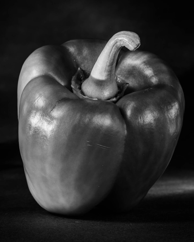
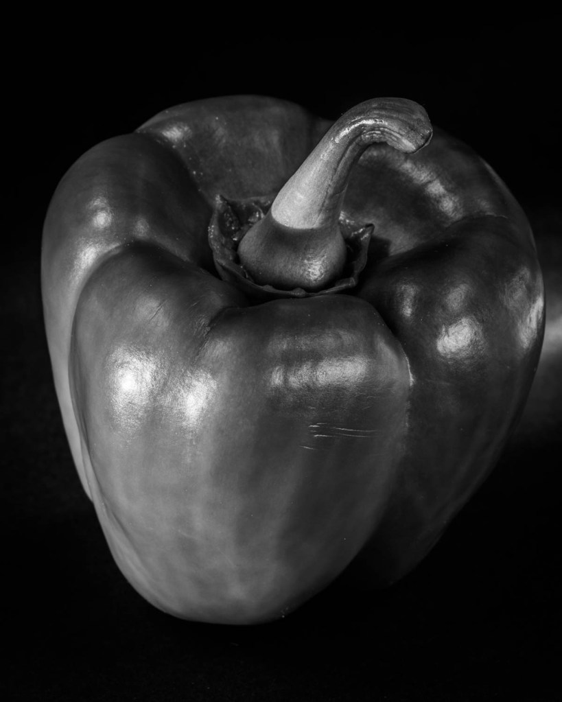
I chose to photograph a series of peppers in response to the Image, “Pepper No. 30” by Edward Weston.
Pepper No. 30, Edward Weston (1930)
I used a set I had made for Exercise 4.3, and had the same camera settings and equipment as I used in that exercise.
I wanted to emulate the lighting of the pepper which Weston had achieved by photographing it inside a shiny metal funnel. In Weston’s image the pepper appears illuminated on all sides and has reflections from its surface on all the visible surfaces.
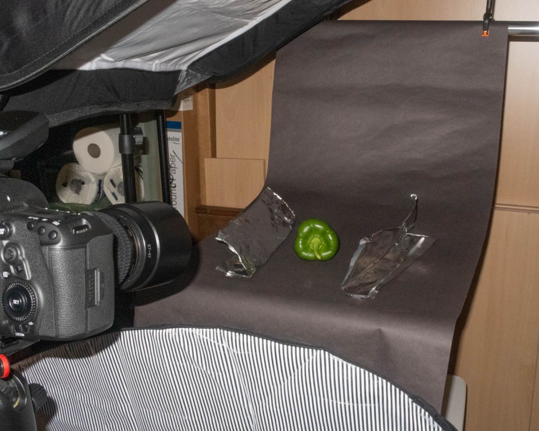
To attempt to replicate this I used a set with a large softbox almost directly over the pepper, and another, smaller, to the side. I made reflectors of aluminium foil on either side of the pepper which were angled slightly upwards, and another reflector in front of the camera. This set is shown in this image.
I converted the images to monochrome to replicate the image of Weston, and enhanced the contrast, otherwise there were no other post-processing manipulations.
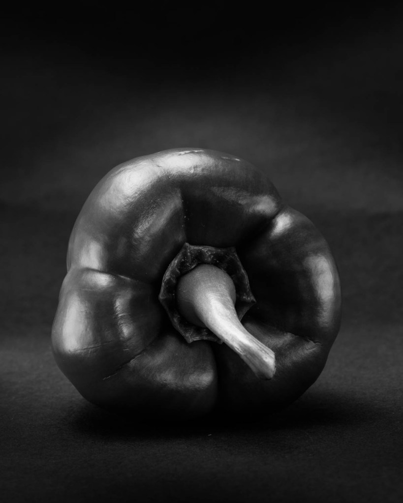
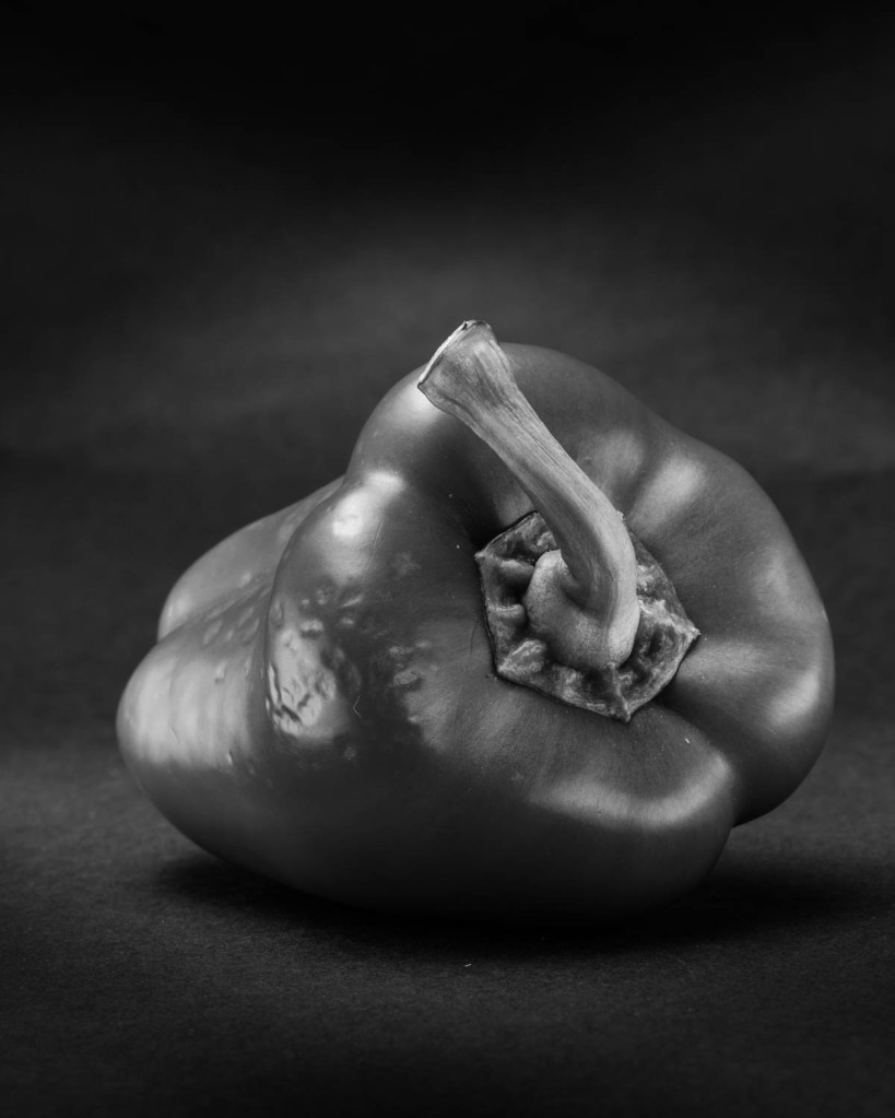
I chose these final images.
Pepper 241
Pepper 239
Pepper 227
Pepper 225
I am most pleased with this one, and think that it has captured the lighting effect Weston achieved.
Pepper 235
My images however all are readily seen as peppers and lack the abstraction achieved by Weston. I think that this may be because of the form of my peppers; they are classic pepper shaped and therefore acceptable to the supermarkets!
I have previously included in my learning log images in homage to Willy Ronis, Man Ray, Fay Godwin and Don McCullin. I have commented on these at the time of the post regarding my context for them.
References
References to the works cited in this post are found in my separate post “References”
“The camera for me is more a meter that measures the distance between myself and the other” Alexia Clorinda, quoted in the course notes.
On her website, Alexia Clorinda, describes herself as “an art historian, cultural critic, photographer, lecturer and independent researcher”. Her methods are described there as a “set of method and vocabularies informed and envisioned by collaborative work across chronologies, geographies and practices”(Alexia Clorinda, s.d.). My brief study of images and her projects indicate that her work involves valuing the contribution and experience of her subjects, regardless of their backgrounds.
The notes also cite the work of Ariella Azoulay, who describes the act of taking a photograph and relationship between photographer and subject as an “encounter… never entirely in the sole control of any one of them”.
I found this a key concept, and one I had become aware of but never articulated so clearly. I noticed this watching the TV video of Don McCullin at work, where he engages with his street subjects and they have some degree of choice in how they portray themselves. Similarly in his lecture, Peter Aitchison described also engaging with his subject and not “stealing the photograph” with telephoto lenses.
Brief
“Use your camera as a measuring device. This doesn’t refer to the distance scale on the focus ring. Rather, find a subject that you have an empathy with and take a sequence of shots to ‘explore the distance between you’. Add the sequence to your learning log, indicating which is your ‘select’ – your best shot.
Look critically at the work you did by including what you didn’t mean to do. Include the mistake, or your unconscious, or whatever you want to call it, and analyse it not from the point of view of your intention, but because it is there.”
My Subject
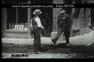
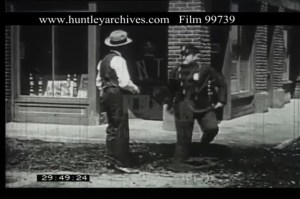
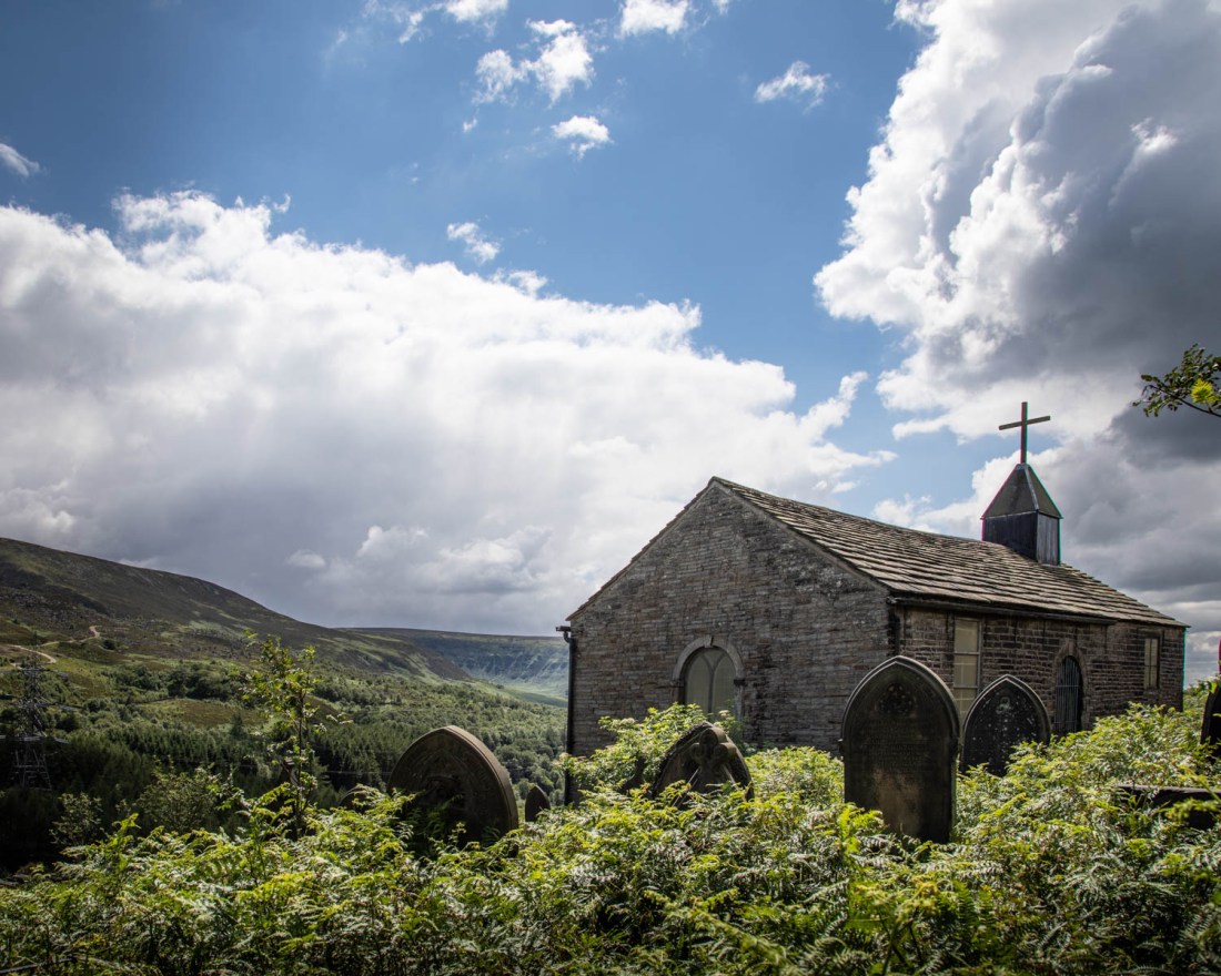
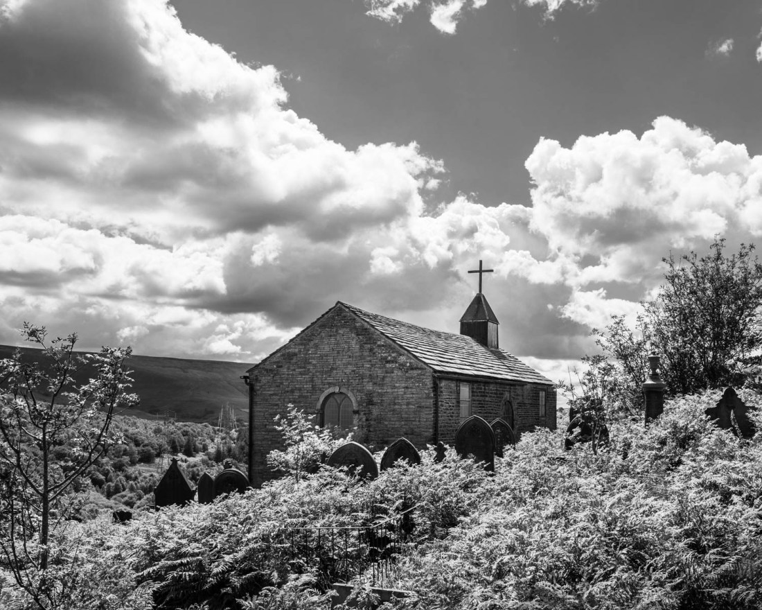
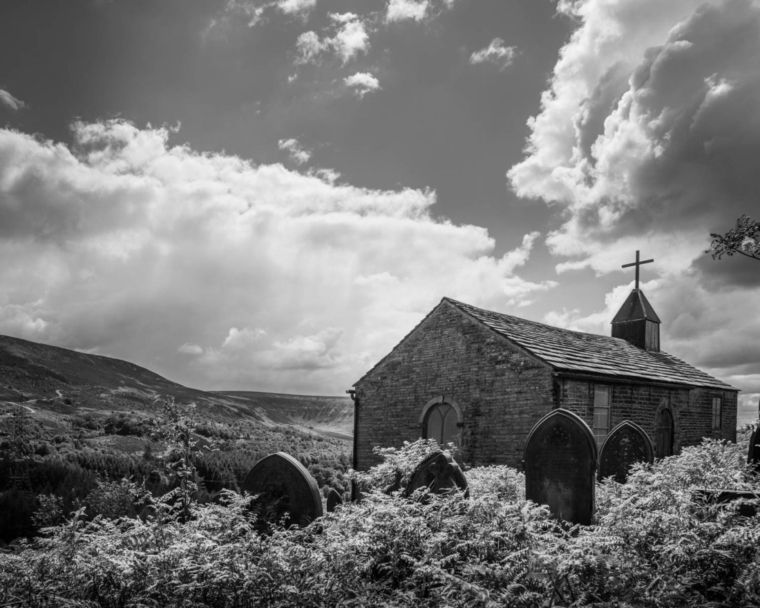
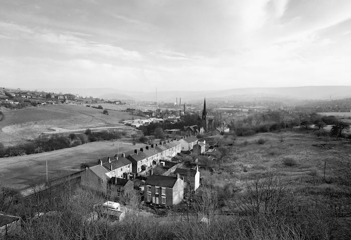
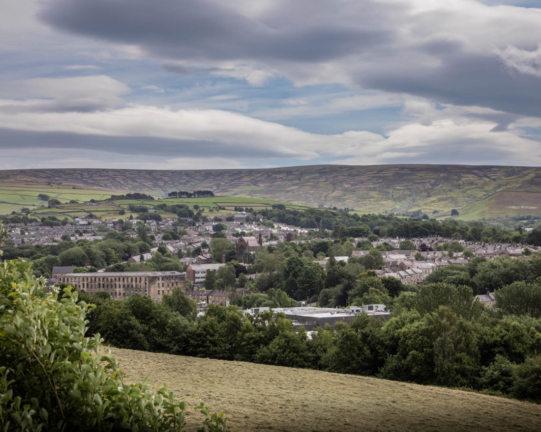
I have chosen to take photographs around St James’ Church, Woodhead. This is an isolated chapel, now only used very occasionally, situated near the trans-Pennine road over Woodhead pass. Nearby is the site of the first railway tunnel through the Pennines linking Manchester and Sheffield. Work began on it in 1839, and was carried out by itinerant labourers, many of whom were Irish immigrants. These labourers and their families lived in temporary huts high on the moors. There were many accidents during the building of the tunnel and many labourers died. There were also outbreaks of disease such as cholera in the camps, killing many of the families. These people were buried in unmarked graves in St James’ church yard, although it is rumoured that the Irish Catholics were buried in unconsecrated ground behind the church yard. (Higgins, 2017)
The original rail tunnel and two later parallel tunnels were closed in 1981, but the adjacent road has heavy use from lorries. Bizarrely, there are now calls to improve rail links across the Pennines although it is unlikely this tunnel will re-open as it is the route for electric cables.
I want to capture in this exercise some reminder of the labourers who built the trans-pennine link. They were poorly treated in life and now forgotten, although their construction seems to be what is now needed.
My Intention
I wanted to make images that captured the isolation of the chapel and graveyard. In addition, that it is largely forgotten and overlooked; yet it is adjacent to a busy road, which today takes the traffic that would otherwise go through the nearby disused rail tunnels.
My initial thoughts are that this may be a suitable subject for conversion to monochrome, as this will be reminiscent of old photographs, but also distance the viewer from the real subject and landscape.
Methods
I shot this using my DSLR, on a day with sunny intervals and showers. As a result the images are all quite brightly lit.
I have made a contact sheet of all the images I shot, and have selected a number for post-processing. I based this selection on the technical quality of the image and the composition, as well as how closely the image demonstrated the qualities I had aimed for.
Post processing was done with Lightroom and involved cropping and local adjustment of exposure. For the monochrome images I adjusted the contrast to result in a satisfying image.
My Images
My initial selection was these colour images.
Woodhead-10Woodhead-28-2Woodhead-13
I had tried to include the busy road, and this is the only one which seemed to work.
Woodhead-18
However overall, to me this seems to be too fussy and the road is too distant to be of significance.
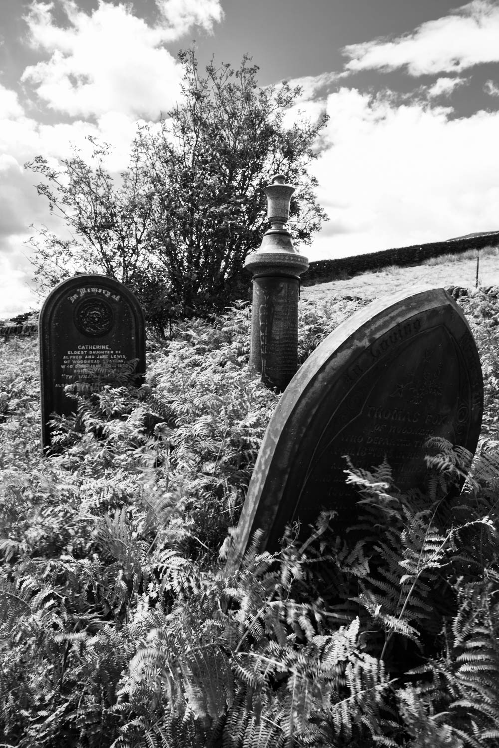
The graveyard is very overgrown and all the graves are difficult to find. I did not find any gravestones of the labourers (apparently marked as from “Woodhead Tunnel”) but most are probably unmarked. All the graves are overgrown and look untended and forgotten, and it is this aspect which I think altered my approach to the exercise. If the graves of people who had been local residents with friends and families in the area are so forgotten, how can we expect anything more for those of the temporary residents with different cultural backgrounds.
Woodhead-36Woodhead-28Woodhead-13-2Woodhead-10-2
The monochrome images remove the bright colours of the sunny day and add to the atmosphere of neglect and decay. While this is obvious in the images of the church, my select is this of the overgrown graves of local residents.
Woodhead-30
(note added 26/7/20) I have had further thoughts about this exercise and added a further post in light of later exercises and discussions with my tutor.
References
References to the works cited in this post are found in my separate post “References”
The course notes cite a quotation from Flusser (Flusser, 2000) “Ideology is the insistence on a single viewpoint thought to be perfect”
The course notes say “any photograph as defined by a point of view: both in the sense of where the photographer stood to take the photograph, but also as saying something particular about the world that could also be said in a different way, from a different point of view.”
I found this an important concept, one with which on reflection I have been struggling for some time and I think is part of my major motivation to enroll on this course. The suggested dichotomy between “where the photographer stood” and “saying something particular about the world” is at the core of what I want to better understand.
I have found over the years that it is easy to get preoccupied with the technical side of photography, and once I felt I was reasonably competent have been seeking new motivation and understanding of the work of photographers whose work I have come across. I have opinions about the subjects of much of the work I have shown in the earlier parts of this course; the difficulty I have is in knowing how to express that in the image. This section of the course will, I think, present interesting and difficult challenges.
References
References to the works cited in this post are found in my separate post “References”
“Make a Google Images search for ‘landscape’, ‘portrait’, or any ordinary subject such as ‘apple’ or ‘sunset’. Add a screengrab of a representative page to your learning log and note down the similarities you find between the images.
Now take a number of your own photographs of the same subject, paying special attention to the ‘Creativity’ criteria at the end of Part One…
Add a final image to your learning log, together with a selection of preparatory shots. In your notes describe how your photograph or representation differs from your Google Images source images of the same subject.”
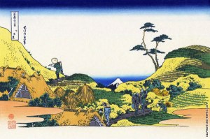
The course notes for this exercise indicate that one of the aims of this exercise is to demonstrate a personal response and willingness to experiment. The example subject discussed is different approaches to photographing Mount Fuji.
I have looked at the portfolio, “Mount Fuji” by Chris Steele-Perkins. He comments on the portfolio that:
“The work considers the place of Mount Fuji, the iconic symbol of Japan, in our modern times, and references the works of the great Japanese artists, Hokusai Katsushika and Utagawa Hiroshige, whose series of woodblocks, 36 Views of Mount Fuji, were a record and commentary on Mt Fuji in relation to the society of their times; the early to mid 1800′s. The images were constructed in a way that Fuji was ever-present, ‘observing’ the landscape and society around it, a discipline I have continued.”
This idea of Fuji “observing” in an ever present way is apparent in Hokusai’s image “Below Meguro”. When seen against this image by Hokusai, Steele-Perkins’ image “Preparing Rice Fields near Gotemba” makes complete sense with the present day farmers going about their business, not paying attention to the iconic mountain in the background, in the same way as the farmers in Hokusai’s print.
Preparing Rice Fields near Gotemba; C Steele-Perkins
Below Meguro; 36 Views of Mount Fuji, Hokusai
The notes also refer to the approach by John Davies in his series “Fuji City”. My reading about the work of Davies indicates that a substantial body of his work has involved documenting the industrial and post-industrial landscape of Britain. Against this background, his series Fuji City, begins to have a different meaning, in which again Mt Fuji, is a backdrop to the industrial landscape.
Davies is quoted on his website as being “not so much interested in entertaining an audience or providing vehicles for escape but in delivering a highly crafted detailed image conveying a sense of reality. A reality that shares a recognition of aspects of urban living. But importantly, making images of a landscape that attempts to question our acceptance and perception of the inevitable consequences of living in a post imperialist society and within a post industrial landscape”.
In his series “Green and Pleasant Land”, Davies made images of the landscapes in the immediate vicinity of my home and of locations which I have photographed. This includes this image of Dinting Vale, taken close to my house, from the viaduct I photographed in this image.
Dinting Vale, John Davies
I thought that Davies’ images in this series are documentary in their representation of the industrial and urban landscape. They are depictions of the landscape, and as such differ from the depiction of the human experience of living in these environments such as those I have shown in this blog from photographers such as Don McCullin and Ian MacDonald.
My Approach to the Brief
I have chosen “Peak District Landscapes” as my broad category for this exercise.
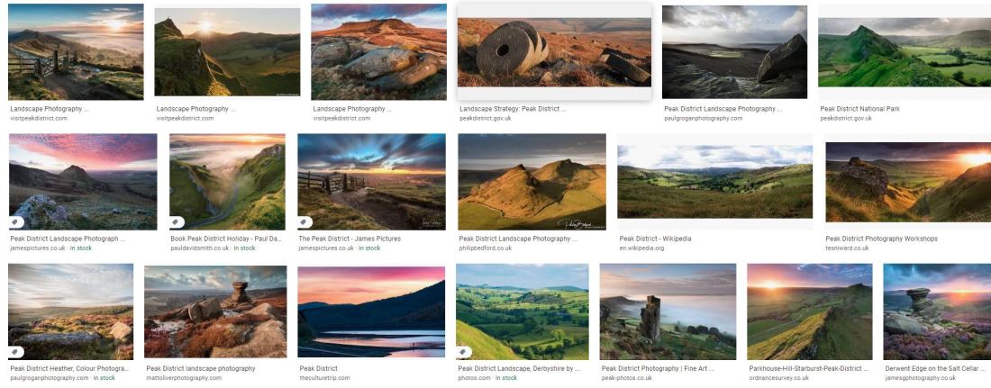
A Google search for images using this term results in these images and many similar.
Sample images from Google search for “Peak District Landscapes”
These images all show a very rural image, generally without any buildings, or, if they are present, exclusively farm buildings. The landscape is of the moorland, with vibrant colours of the vegetation. Almost all the images include examples of the gritstone outcrops which are common and a hallmark of this landscape. That rocky outcrop, may be replaced in the image by millstones, produced from that millstone grit.
These images to me seem to be created with the intention of “entertaining an audience or providing vehicles for escape”(Davies, s.d.) In terms of what I have so far understood about aesthetic codes, all these images appear to represent pictorialism. The lighting is dramatic and the colours intense. While they capture some aspects of the rural Peak District, to me they only show one aspect.
The Peak District has been a managed landscape for hundreds of years. The land has supported agriculture and mining, and in the last couple of centuries, grouse shooting. Since the industrial revolution, the moorlands of the High Peak have been very close to large centres of population and industry. Perhaps because of this latter point, it has been the site of high profile events to gain better access to open spaces, away from the industrial cities. In particular the Kinder Mass Trespass, is generally considered to have been the first of a series of actions leading to the foundation of the UK National Parks and the Countryside and Rights of Way Act of 2000 (Wikipedia contributors, 2020).
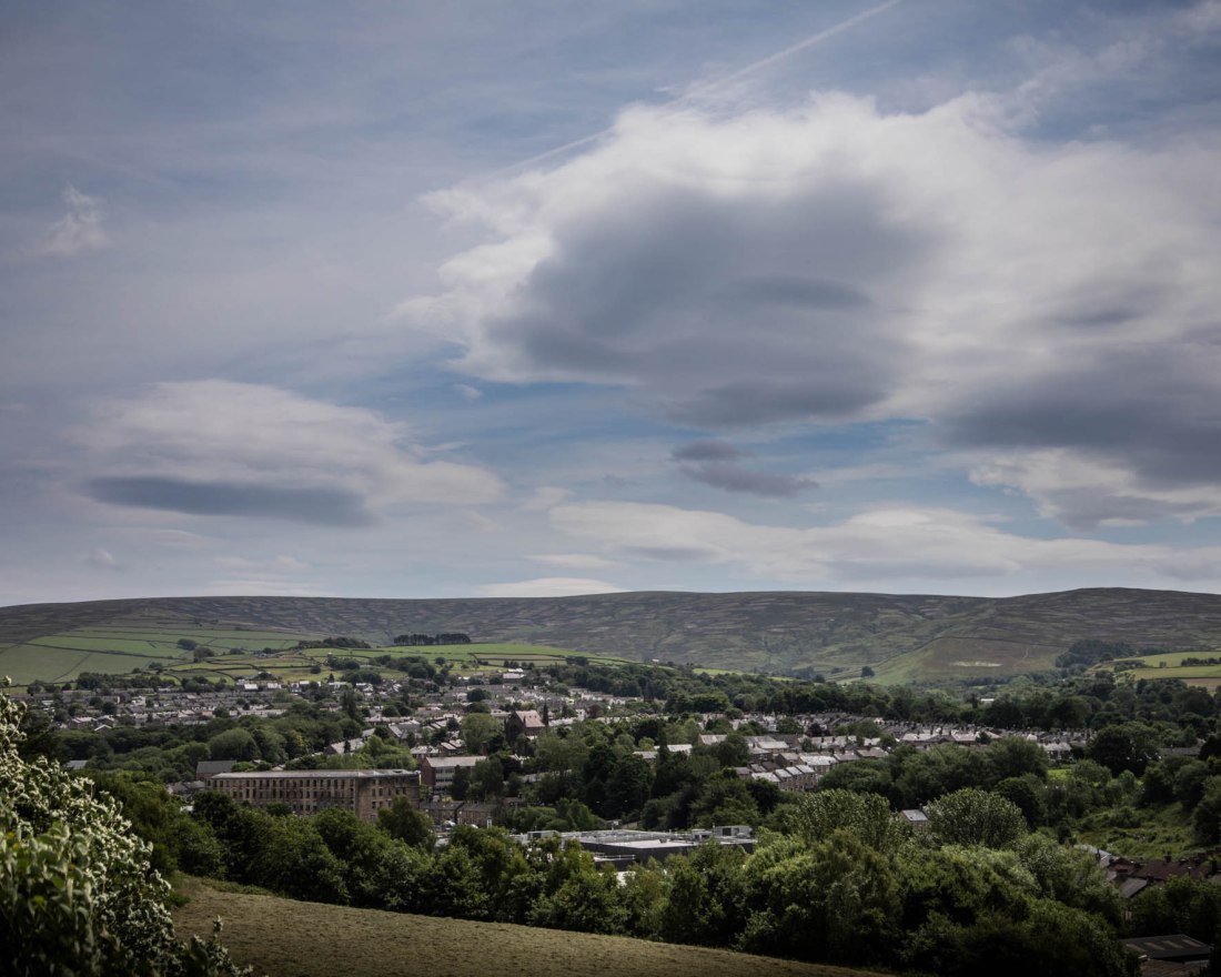
My approach to this exercise is to try and show the Peak District landscape from the perspective of those living in the industrial centres who would aspire to spend time on the adjacent moorlands.
I have tried to create landscape style images. Rather than have the moors used as a backdrop, “ever-present, ‘observing’ the landscape and society around (them)” (Chris Steele-Perkins; Mount Fuji, s.d.), I wanted to create an image more like the industrial landscapes of John Davies.
Method
I have used a digital SLR for these images, but also used a medium format film camera to capture the similar scenes in monochrome with film. Those images will be the subject of a later post.
From these I have selected these which I think show how the moors encircle the now post-industrial town. As such they perhaps do not encapsulate the contrast between the working environment and the rural open space.
Closer to that aim are these with modern industrial units in the foreground.
2020-06-22 Glossop#252020-06-22 Glossop#24
Overall I think the images go some way to what I was aiming for. However, in retrospect it may have been more effective to have gone into the town and had the moors in the distance, more like Steele-Perkins has positioned Fuji in his images. However the images do share a style and expansive viewpoint in common with the images of “Peak District Landscapes” I found on the Google search.
References
References to the works cited in this post are found in my separate post “References”
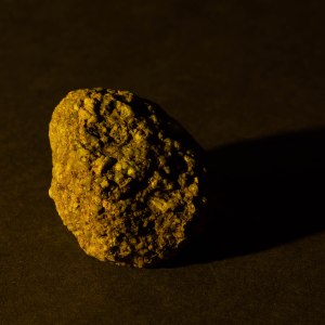
I conducted a second shoot using the same equipment and set-up as Shoot 1, with the intention of exploring the effect of colour a little more. I used two speedlights at angles either side of the object, and modified the colour of each with green, red, yellow and blue gels.
The change to the settings I made for these images was to set the camera to custom white balance and adjust that for an image of white card illuminated by both flashes. (The card can be seen in the contacts. The contacts for the shoot are at:
With the custom white balance set, the object illuminated by two flashes without gels shows its “natural” colours.
Ex 4.3 #204
I attempted to mix a white light with a blue and yellow light, using a yellow gel on one, and a blue gel on the other.
Separately these lights give this effect:
Ex 4.3 #208
Ex 4.3 #209
And together, there is a blue shadow to the right, and yellow shadow to the left. The central part of the object, where the lights overlap, is not quite as when shot is a white light, but is more like that than either alone.
Ex 4.3 #211
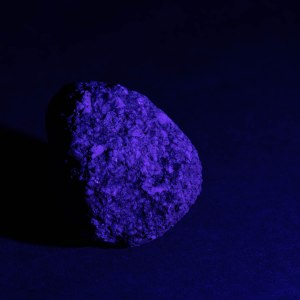
The other image which I think is worth reproducing here is a similar arrangement with green and red light. The contrast between the colours here emphasises the texture of the stone and to me, does add a further dimension to characterising the roughness and granularity.
Ex 4.3 #229
Next steps
Having read the notes for the course and for the later exercises, I am aware that Exercise 5.2 – “Homage” requires me to “Select an image by any photographer of your choice and take a photograph in response to it”.
I have already described the image “Pepper No 30” by Edward Weston found the lighting in this very unusual, rendering the pepper an abstract aspect.
Pepper No. 30, Edward Weston (1930)
I have used the set I have built and the lighting arrangements to photograph a series of peppers in response to Weston’s image and will develop these to form the basis of my images for exercise 5.2.
“Use a combination of quality, contrast, direction and colour to light an object in order to reveal its form. …
The important thing is to aim for four or five unique shots – either change the viewpoint, the subject or the lighting for each shot.
Add the sequence to your learning log. Draw a simple lighting diagram for each of your shots showing the position of the camera, the subject and the direction of the key light and fill.”
Methods
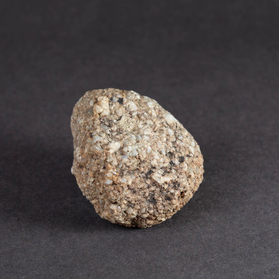
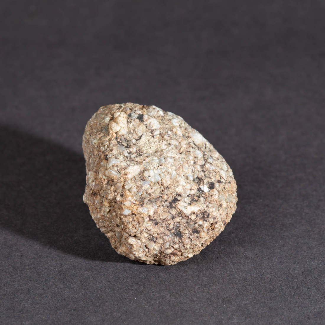
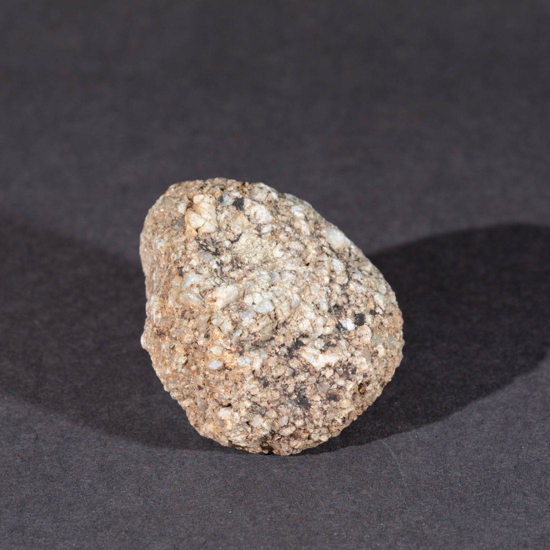
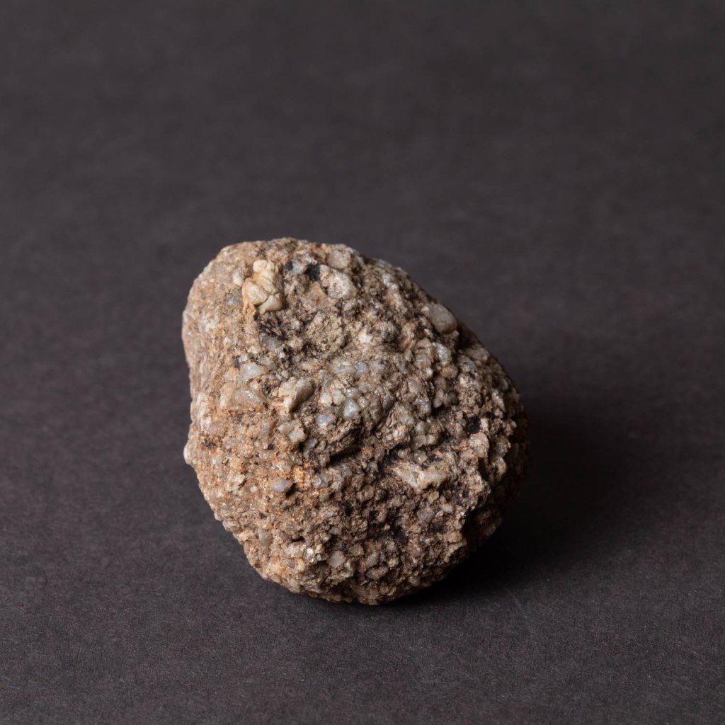
Object:
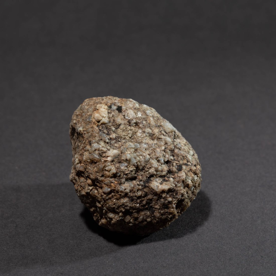
The object I chose to photograph was a rounded stone, about 120mm along its longest dimension. This stone is from a stream bed on the hills locally and is of the local gritstone. I chose this as the coarse texture of the stone has significance in its previous use for making mill-stones (“Millstone Grit”). In addition the gritstone edges of this area of the Pennines was the site of origin of an expansion in rock-climbing in the UK in the 1950’s. The texture of the rock led to particular style and techniques. It is this texture which I hope to explore in the images.
Equipment
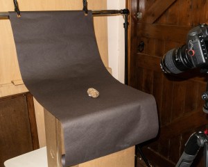
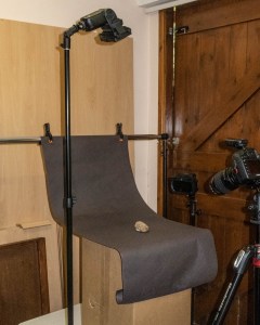
Set: I began by creating a set on which to photograph my object. I have used a background of dark grey paper with a curve to manage the “horizon line” as suggested in the course notes. The positioning of the set allowed me to arrange the lighting around the object. As shown in these images.
Ex 4.3 Studio set 1
Ex 4-3 Studio set – lighting example
Camera etc:
Camera – Canon EOS 5D Mk4
Lens – 100mm macro
Flash – 2 x Nissin Speedlights with radio control and various modifiers including softboxes (700mmx700mm and 200mmx150mm)
Settings:
Manual setting for camera in all shots
Manual control of flash for all shots
ISO 100
Auto white balance for the first series (altered later to custom white balance)
Post-processing
Images were shot in RAW and processed in Lightroom. The only manipulation was cropping to a square format.
Technique
The technique adopted is to have a camera setting which results in a black image by the ambient light, without flash. In this way I can then increase the intensity of the flash to create the image and have complete control of the light sources producing the image.
The first series of images I took were all with one camera position with a lens to object distance 400mm
To try and create a very soft light from large light sources, I used two flashes at either side of the object both fitted with softboxes. The following is from my notebook made at the time:
This resulted in an image in which the visible part of the stone is almost uniformly illuminated. The coarse texture of the stone is apparent only because of the alteration in colouration. The overall shape of the stone is not apparent as there is very little shading of any part of it.
Ex 4.3 #22
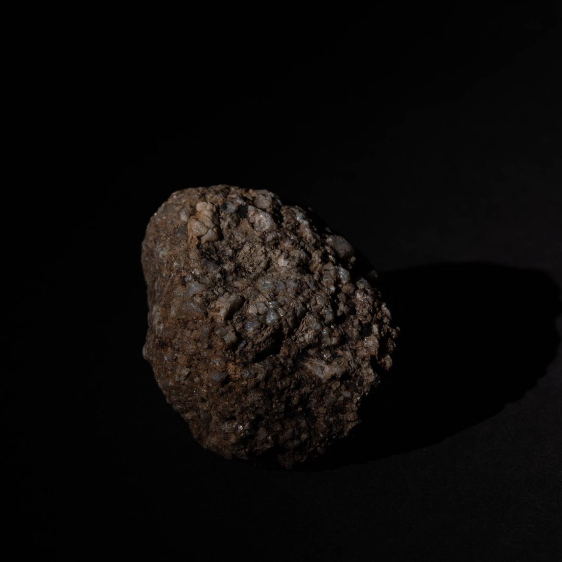
Removing the softbox from the flash to the right of the object (as viewed from the camera position) results in a stronger shadow to the left side and the left side of the stone is now in shadow.
However the right side of the stone lacks more detail and seems harshly lit.
Ex 4.3 #25
Removing both soft boxes now causes the object to cast a hard shadow with well demarcated edges on the background to both sides.
Ex 4.3 #27
When only one light without softbox is used to the left of the object a hard deep shadow is cast to the right. This hard shadow is also seen on the surface of the object, throwing the granulations into stark contrast. (Image 30). With the same position of lighting and adding the large softbox, the sharpness of these shadows is reduced (Image 28) and detail in the shaded side of the stone can be seen.
Ex 4.3 #30
Ex 4.3 #28
Direction
Putting one of the lights directly over the object causes a different appearance, with the main shadow falling below the object and the granulations of the surface being less clearly defined.
Ex 4.3 #45
The light was directed to a restricted area of the subject and this enhanced the demarcation from the background.
Ex 4.3 #35
Colour
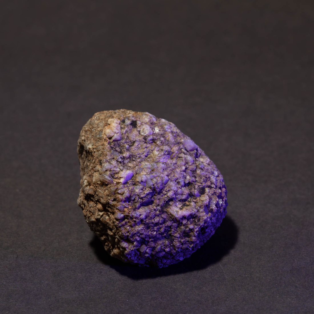
In all these images I have set the white balance to “Auto White Balance”. I made a few images putting coloured gels in front of the flash, but realised this may be a mistake, as the white balance setting will aim to correct a colour cast and adjust the entire image to an average as if illuminated by white light.
I will repeat this exercise with a custom white balance.
However, the images I did create just show a colour cast to the object – although adding a magenta gel to the flash to the right, does create a colour contrast between the sides of the object.
Ex 4.3 #50
While this is an interesting effect, I am not sure it adds anything to my understanding of the stone.
This project is about the use of studio lighting and the course notes refer to four aspects of lighting under the control of the photographer:
Quality
Contrast
Direction
Colour
The notes elaborate on some of this.
Quality
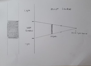
“at its most basic it can be described as the simple distinction between hard and soft light”
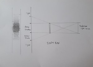
This is defined as whether the light casts hard or soft shadows, and in turn is controlled by the size of the light source relative to the subject.
I have thought a little about this and the diagrams below help me understand how this is. A small point light source is hidden from a large area behind the object – the shadow and the margins of the shadow are well demarcated. However a large light source, like a softbox casts a light across its entire length. Thus there will be an area of the shadow which is illuminated by increasingly greater amount of the light source, and the edge of the shadow area is therefore diffuse.
Point light source
Softbox illumination
The notes refer me to the work of Jean-Baptiste Huynh. On his website (Jean Baptiste Huynh – Site officiel, s.d.) are examples of images created in the studio, illuminated by soft lighting. He has applied this technique to a range of subjects – plants, insects, parts of the body, nudes and portraiture. He also uses colour and monochrome for this.
In my reading about studio lighting for still life, I used a recommended textbook (Diprose and Robins, 2012), which in turn referred me to the work of Edward Weston and in particular his image Pepper No. 30. This image was apparently lit by placing it in a metal funnel, ((Weston and Newhall, 1961) as cited in (Wikipedia contributors, 2019)). It is this technique which results in the characteristic lighting effect.
Pepper No. 30, Edward Weston (1930)
The other artist referred to in the course notes is Irving Penn. The notes refer to his work illuminated by the light of a skylight only. Briefly researching his work I have learned that he was noted as one of Vogue magazine’s top photographers. His biography on website of The Irving Penn Foundation (The Irving Penn Foundation, s.d.) indicates that he developed a preference for “photographing in the controlled environment of a studio” although this was not for the management of the lighting but “where he could trim away anything that was not essential to his compositions and hone in on his subjects”.
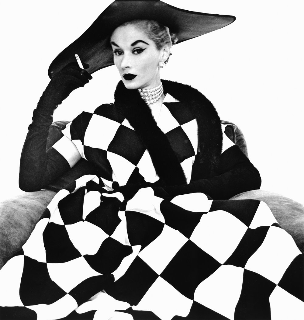
That website also refers to him in 1950 photographing the haute couture collections in Paris for Vogue. Then he “worked in a daylight studio with an old theater curtain as a backdrop”. One of the images from that time is this one, presumably shot by daylight.
Harlequin dress (Model Lisa Fonssagrives); Irving Penn 1950
However I note that the model’s face is very evenly lit, in spite of being under the brim of a large hat. Creating an even lighting in those conditions with a light source from one direction presumably has required the use of extensive reflectors.
The other aspects of the lighting the notes suggest I consider are
Contrast
This is the difference in illumination between the shadows and highlights and depends on variable lighting to illuminate the shadows.
Direction
The direction of the light determines the direction of the shadows and this can significantly alter the appearance of the subject.
Colour
The colour of the light can be altered – either directly or by the use of coloured reflectors. I have previously referred to a workshop I did on the use of speedlights for studio lighting. In this I used coloured light sources to alter the background for the subject. This is an example.
Speedlight Workshop #138
My plan for the next exercise is to build on that workshop and do the exercise with speedlight flashes, reflectors and coloured gels. In this way I should be able to alter the four parameters suggested.
References
References to the works cited in this post are found in my separate post “References”