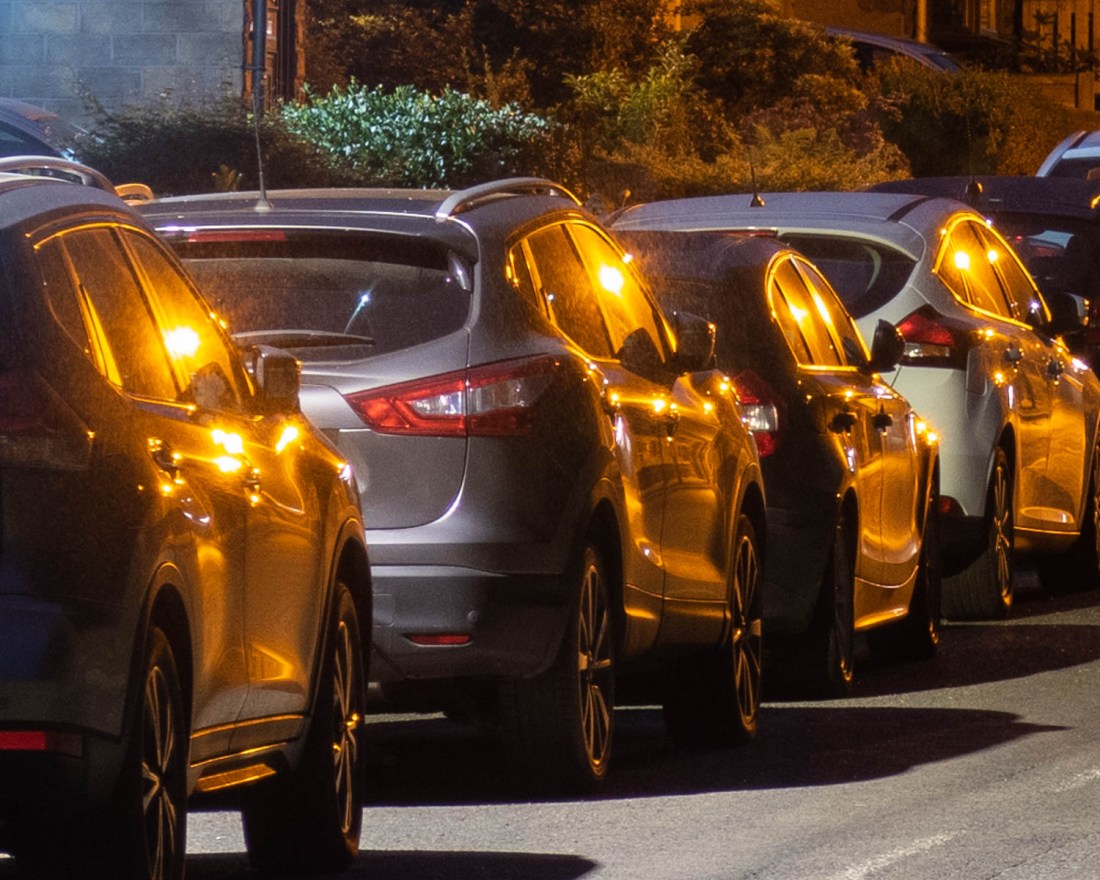
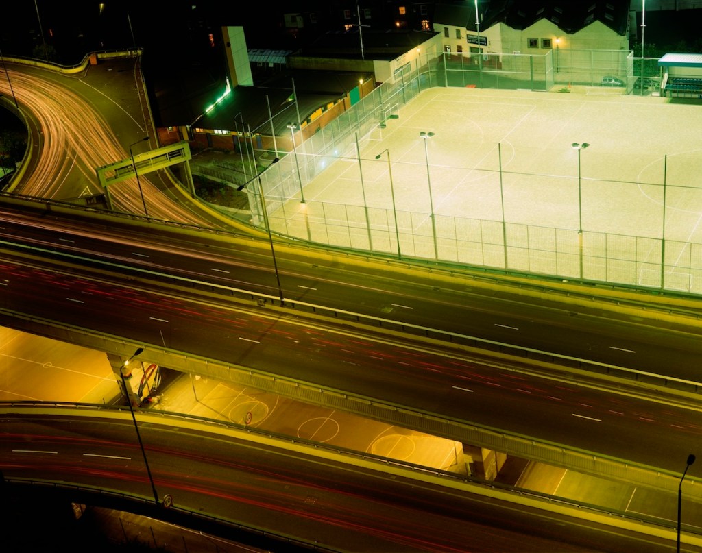
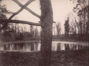
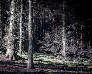
I would like to try and capture more of the interaction between the light and water, as I have highlighted previously. In a similar way, the reflection of lights from different surfaces creates interesting patterns, unique to the night time. Detail from this image shows the sort of effect that I would like to explore further in another shoot.
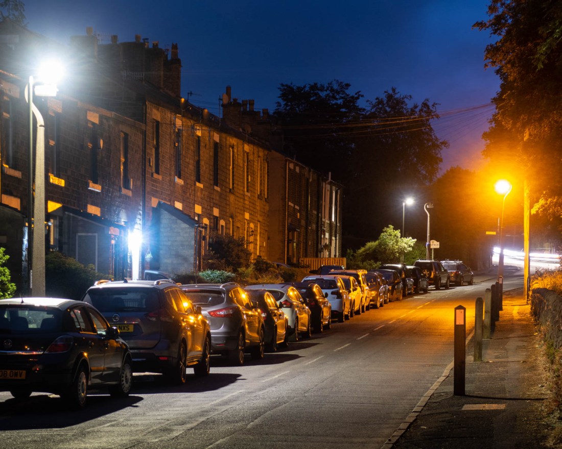
2020-06-03 OCA Ex4.2 #31
The reflections of the street lights in different colours on the parked cars gives an almost abstract feel to this.
2020-06-03 OCA Ex4.2 #31 (detail)
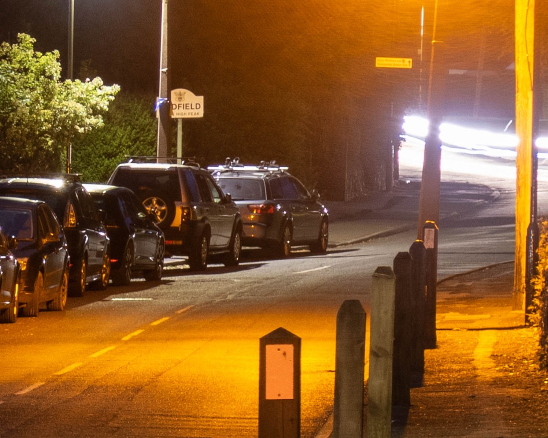
The pools of different types of light on the ground here make patterns which could be the subject for further exploration.
2020-06-03 OCA Ex4.2 #31 (detail)
These effects are reminiscent of the images of London in Rut Blees Luxemburg’s “Liebeslied: My Suicides” (Luxemberg and Duttman, 2000). It is this type of image I would like to develop more in future shoots.
“Capture ‘the beauty of artificial light’ in a short sequence of shots (‘beauty’ is, of course, a subjective term). The correct white balance setting will be important; this can get tricky – but interesting – if there are mixed light sources of different colour temperatures in the same shot. You can shoot indoors or outside and the light can be ambient or handheld flash.
Add the sequence to your learning log. In your notes try to describe the difference in the quality of light from the daylight shots in Exercise 4.1.”
I approached this exercise by taking an evening walk close to my house to make some images of scenes familiar to me, but illuminated by the street lights. In this way I was trying to see how the resulting images differed from those I might have expected when made in the daylight.
My objective here was not to create “definitive” final images, but to gain a better understanding of the technical aspects of photographing in these conditions and to examine those elements of the final images which might be used to produce a series which do indeed capture the “beauty of artificial light”.
As I wanted to explore a range of locations, and used lightweight equipment for this reason. I used a Canon Powershot G7x Mkii for these images rather than my DSLR. It still enables me to use manual, as well as aperture and speed priority shooting modes and for this exercise I used manual mode. I made the images between 2100h and 2300h GMT when sunset was at 2029h.
I used manual shooting mode with a setting of “auto white balance” for all the images. Post-processing of the images is confined to modest cropping to a 4×5 aspect ratio (chosen because I have been using 10×8 printing paper for my film work and wanted a degree of consistency with this). There are also local exposure adjustments but no alteration in the white balance or other colour adjustments.
Initially I used the camera hand-held with a fast ISO. This image shows considerable grain so at subsequent locations I used much longer exposures on a tripod.
2020-06-03 OCA Ex4.2 #6 ISO6400, f/4.0 1/60sec
In most of the images the sky is not totally black and in this it almost looks like daylight. However, the major difference in this image is the direction of the lighting, rather than any other quality of the light.
2020-06-03 OCA Ex4.2 #13 ISO125, f/11 30.0sec
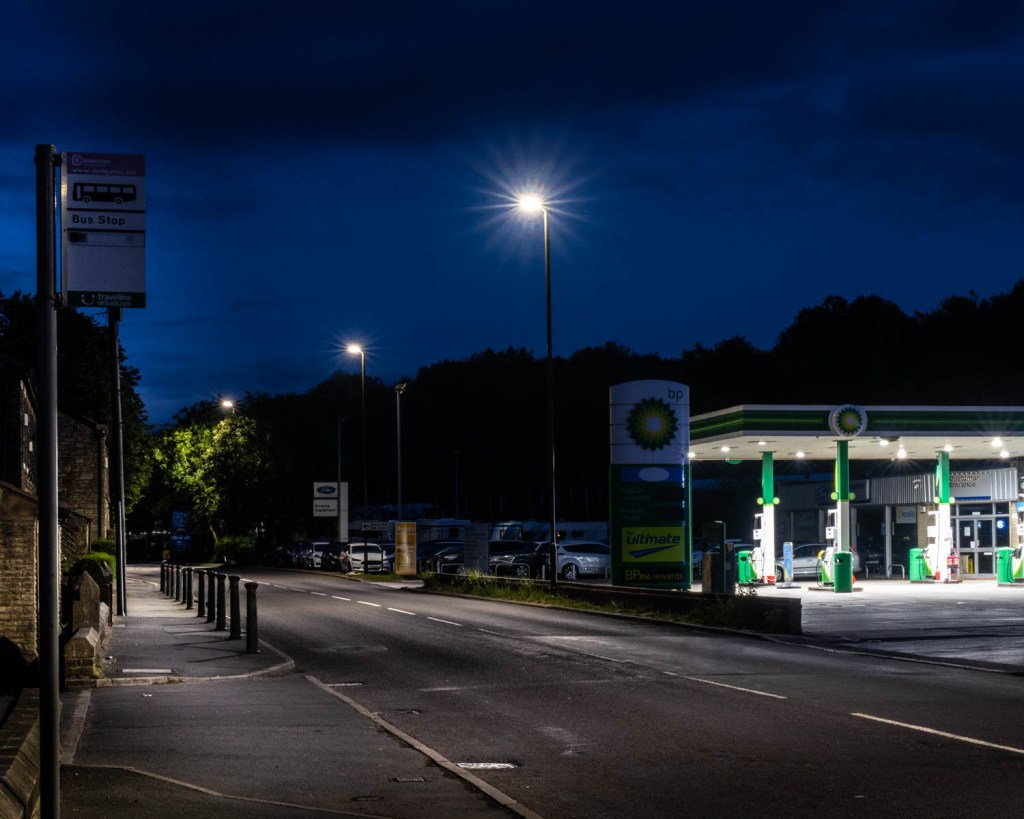
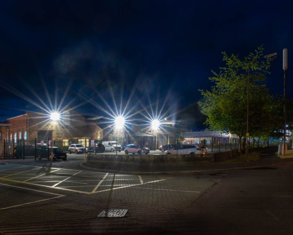
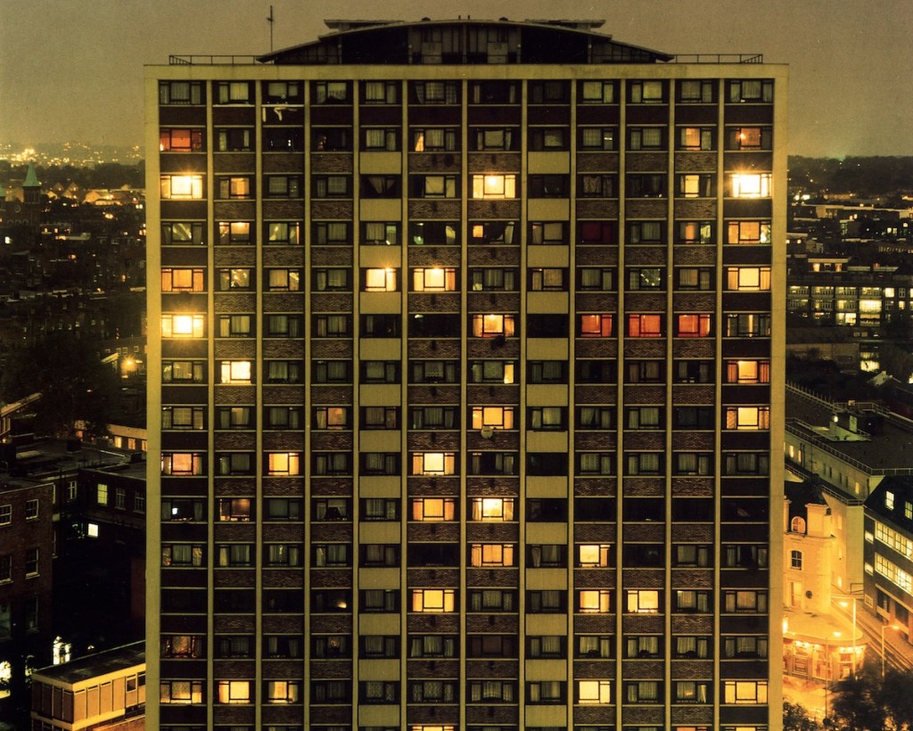
Where there are many light sources, this effect is more striking and the differences in the colour of the lights adds a difference in the mood and atmosphere of the scene.
2020-06-03 OCA Ex4.2 #16
ISO125, f/11 4.0sec
2020-06-03 OCA Ex4.2 #24
ISO125, f/5.0 15.0sec
2020-06-03 OCA Ex4.2 #27
ISO125, f/5.0 15.0sec
2020-06-03 OCA Ex4.2 #28
ISO125, f/11 15.0sec
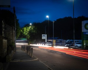
The long exposures used enabled the incorporation of the moving lights of vehicles, even though the vehicle itself does not appear in the image. This adds a different quality to the image, and an effect I think I might develop more in the future. I do not think that in these images this effect adds much.
2020-06-03 OCA Ex4.2 #22
ISO125, f/7.1 4.0sec
2020-06-03 OCA Ex4.2 #35
ISO125, f/4.0 15.0sec
2020-06-03 OCA Ex4.2 #36
ISO125, f/4.0 15.0sec
The camera makes it very obvious that different types of street light have very different colour qualities, and this golden effect is reminiscent of that in the images of Rut Blees Luxemburg. The reflections of the lights from parked vehicles and pools of light and dark give these images a mystery and I think show a type of beauty of which we are not normally aware.
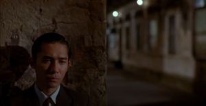
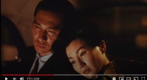
The course notes for this section attribute the phrase “the beauty of artificial light” to the cinematographer, Christopher Doyle who the notes say, “recommended studying the ‘beauty of artificial light’ on people’s faces.” I was unable to find the source for this quotation, but did look at his film, “In the Mood for Love” (Dir Wong Kar Wei, 2000). This film set in Hong Kong, is shot almost entirely in artificial light, either in-doors or at night. Indeed, the lighting of the faces is very atmospheric, and conveys some of the emotional content of the scenes. Such as these stills which I selected
The Mood For Love – Capture 1
The Mood For Love – Capture 2
The Mood For Love – Capture 3
The Mood For Love – Capture 4
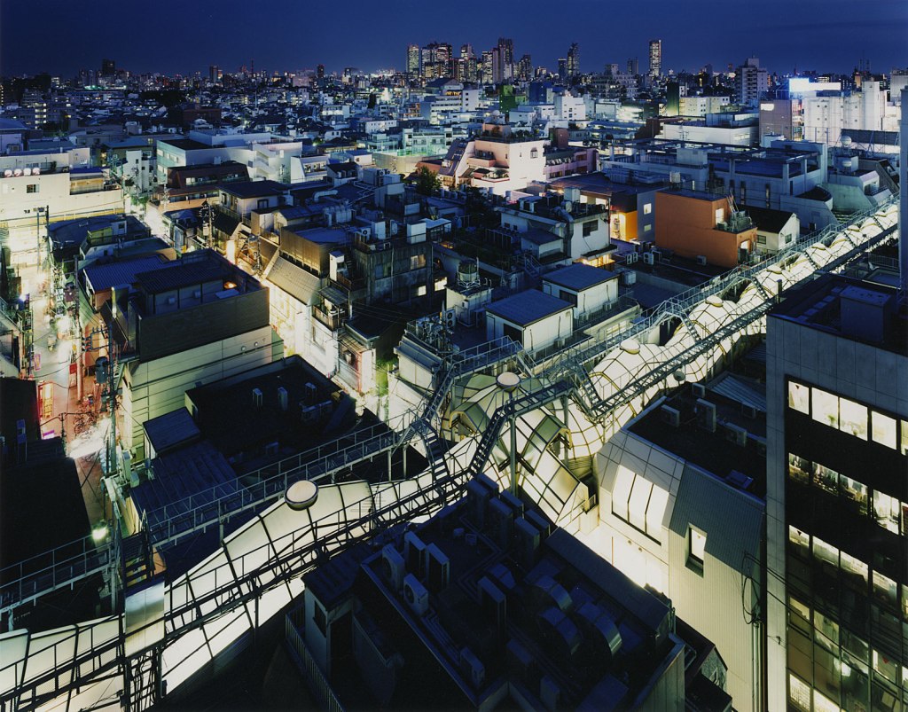
The course notes direct me towards examining the work of Sato Shintaro, and his series “Night Lights”.
Night Lights 29, Sato Shintaro
These are a series of images of the Tokyo streets, illuminated by neon signs. The images are all bright and colourful, even though shot at night.
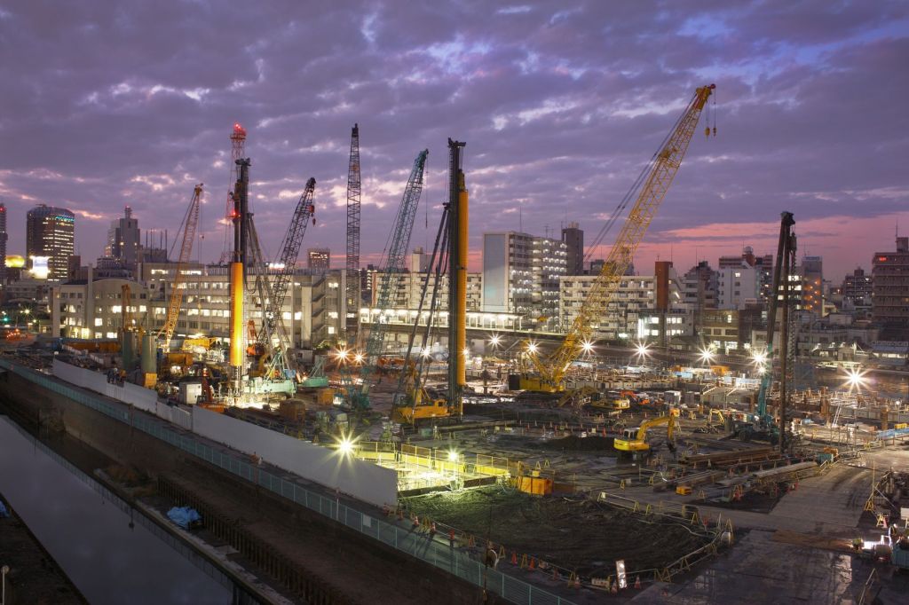
Shintaro also has made images of Tokyo lit by a combination of artificial light and the dawn or dusk light of the sky, in his series, “Risen in the East” and “Tokyo Twilight Zone”. Such as:
Risen in the East – Tokyo Dec 10 2008, Sato Shintaro
Tokyo Twilight Zone – Tokyo 2006, Sato Shintaro
Personally I found a greater resonance with these images as I think they show a greater degree of subtlety in the colouration and depiction of the city. However I recognise that the vibrant bright primary colours of the neon street signs serve to depict a vibrancy of the city itself.
The images of neon signs in Tokyo may soon be a thing of the past, as reports about Hong Kong suggest (Fernández, 2018). Like Tokyo, Hong Kong has had a proliferation of neon signs, but regulations have made it more and more difficult for these to remain and they are being replaced by LED lights.
A point which I did not highlight in my record of my research for the last exercise, “Daylight”, is that as well as emphasing the importance of “the quality of the air and light (as being)…so layered, complex, and mysterious”, Sally Mann also refers to “the refulgence or the reflection when light and water interact” (Rong and Mann, 2013). This is also the case with artificial light.
Rut Blees Luxemburg has made many images of London at night, all lit with artificial light from street and other lighting.
A Modern Project, 1996; Rut Blees Luxemburg
Towering Inferno, 1995; Rut Blees Luxemburg
However in her series “Liebeslied: My Suicides” (Luxemberg and Duttman, 2000) she also examines the interaction between the light and water. “From rain collecting in gutters, to overspill from the Thames, water exists as an emblem of this throughout.” (Abel-Hirsch, 2018).
A Girl From Elsewhere, 2000; Rut Blees Luxemberg
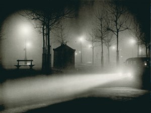
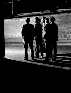
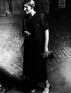
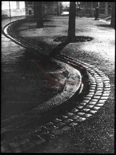
The course notes refer to the work of Brassai , and in particular his book “Paris by Night”. While many of the images in this record the life of the city at night and its inhabitants such as these.
From Paris Nuit, Brassaï
From Paris Nuit, Brassaï
From Paris Nuit, Brassaï
From Paris Nuit, Brassaï
There are others which also look at the almost abstract images created by the reflection of light on wet surfaces, in a manner developed many years later by Rut Blees Luxemberg.
Open Gutter, From Paris Nuit, Brassaï
References
References to the works cited in this post are found in my separate post “References”
‘Layered, complex and mysterious…’ is a quote from American photographer Sally Mann from an interview for Chinese Photography magazine in 2010, and reproduced on American Suburb X website (Rong and Mann, 2013). In this interview Mann describes how she perceives the difference between the quality of the light in the Southern states of the USA, as compared to the “North”. I interpreted her use of the term “North” here to refer to the northern states rather than the far north and high latitudes of the Arctic regions.
In this interview Mann emphasises her aims as being “less interested in the facts of a picture than in the feelings” and that “the facts don’t have to be absolutely sharp. I can get information across by appealing to viewer’s emotions.” (Rong and Mann, 2013)
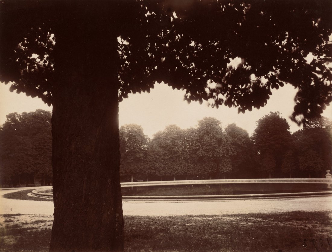
The mysterious feeling she achieves in some of her work seems to be exemplified by her images of “Southern Landscapes”, such as this image, Deep South 03.
Deep South 03, Sally Mann
In this monochrome image the composition is achieved with areas of light and deep darkness, the shadows suggesting mystery. However the light areas of the image are hazy and unclear suggesting a mist.
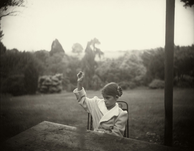
I would argue that she achieves a similar effect in some of the images in her series “Family Pictures”, such as this Family Pictures 12.
Family Pictures 12, Sally Mann
The background is similarly hazy and the light of the landscape diffuse. Whereas the subject is lit by a much more direct light on her hair.
However I also note from the extended biography on her website (Mann, 2020), that many of her black and white, have been created with photography’s antique technology. She has used an 8×10 bellows camera, and a variety of printing processes to produce pictures that “almost seem like hybrids of photography, painting, and sculpture”. In her 2010 interview she also says that “there is no coating on the lens of my old camera, which permits a much softer and more luminous light”.
It seems to me that Mann is achieving her objectives of communicating emotional and spiritual aspects of a subject by the use not only photographing with the optimal light for her intention but this is enhanced by the choice of equipment and techniques.
The course notes refer me to the work of Atget. The notes (p 83) cite Washington’s National Gallery of Art website as describing his late photographs, as:
“frequently marked by subjective light and deep shadows. Often made early in the morning, these pictures – such as Parc de Sceaux – use light and shadow to create a mood rather than to describe a place”
I was unable to find this description of his work on that website (Eugène Atget, 2020). I have, however, found other descriptions of his late work and his approach to lighting conditions which indicate this technique:
“Among the qualities that characterize Atget’s work are… a willingness to work in a wide variety of lighting conditions, even (especially during the last five years of his life) shooting almost directly into the sun, a practice that was religiously avoided by conventional photographers.”(Szarkowski, 2020)
This is illustrated by this image, where shooting into the sun gives deep shadow behind the foreground tree.
Saint-Cloud, Eugène Atget
Other images of the parks have similar qualities to those I have shown above by Mann. Here the lighting also enhances a mood, rather than providing a documentary description of a scene as in Atget’s earlier work.
Parc de Sceaux 2, Eugène Atget
Parc de Sceaux 02, Eugène Atget
Like Mann, Atget used equipment and techniques which also enhanced that approach and added to the emotion and subtlety of the scene..
“Atget used a large view camera that held 7 x 9 inch glass negatives, standard when he began to photograph but antiquated by the end of his career, when smaller and more versatile cameras were available. He developed the negatives in his workroom and contact-printed them in sunlight on the roof of his apartment building. He usually printed on albumen papers, even well after most photographers had abandoned the process in favor of platinum and silver papers.” (Eugène Atget, 2020).
This is distinct from the approach of Michael Schmidt described in the course notes which quote from an interview with Schmidt in Camera Magazine #3, March, 1979. (Editorial @ ASX, 2010).
In the interview, Schmidt states his aims as “to achieve a maximum of objectivity and thus create a photograph which possesses credibility and authenticity as a document”.
Unlike Mann in particular, he sets out to create images such that “The viewer must allow the objects portrayed in the photograph to take their effect upon him without being distracted by shadows or other mood effects.”
He achieves this by photographing in a neutral diffused light. Furthermore he shoots in black and white.
“I prefer black and white photography because it guarantees the viewer a maximum amount of neutrality within the limits of the medium. It reduces and neutralizes the coloured world to a finely nuanced range of greys, thus precluding an individual way of seeing (personal colour tastes) by the viewer. This means that the viewer is able to form an objective opinion about the image from a neutral standpoint independent of his subjective colour perception. He is thus not emotionally distracted.” (Editorial @ ASX, 2010)
These principles are illustrated by images from his portfolio for the 2014 Pris Pictet, Lebensmittel (Michael Schmidt | Prix Pictet, 2013), such as this.
“Taking the photography of Mann, Atget or Schmidt or a photographer of your own choosing as your starting point, shoot a number of photographs exploring the quality of natural light. The exercise should be done in manual mode and the important thing is to observe the light, not just photograph it. In your learning log, and using the descriptions above as your starting point, try to describe the quality of the light in your photographs in your own words.”
In addition to the work of Mann, Atget and Schmidt, the course notes for this exercise also refer to a light with no mystery described by Brian Catling in the fantasy novel, The Vorrh (Catling, 2012)
‘The vulgar gate of the day gives no quarter and its insistent brightness will tell lies about all, forcing the subtlety back into the interiors of trees and the other side of the sky.’
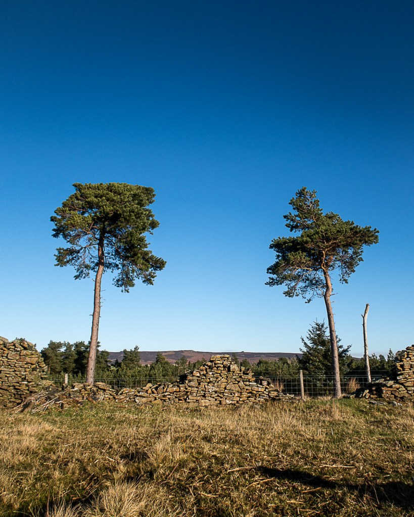
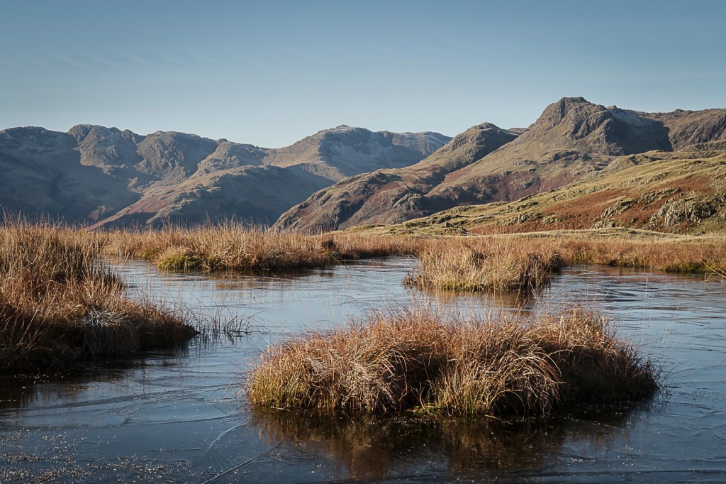
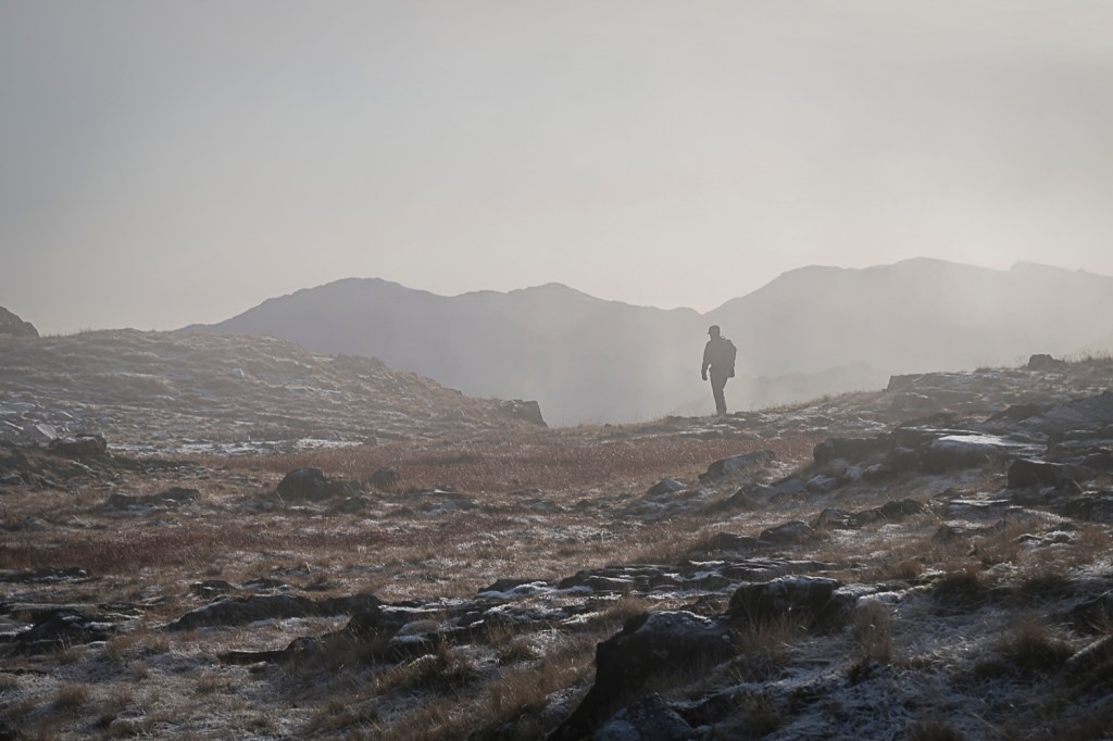
I have taken a series of images to address this exercise, all taken on hill walks in the Lake District and Peak District in winter. The contacts for these shoots are at
The light during the day on both these occasions was bright and the weather clear. As a result the light in many of the images has, to me, the characteristics of that light described by Catling. It is an “insistent brightness” and there is no subtlety in the image – nothing is hidden or mysterious about these images.
Wooler Knoll 01
Wooler Knoll 02
Langhow Tarns 01
Woodlands Valley Plantation 01
The colours are bright and intense, and the shadows do not seem to hold any mystery.
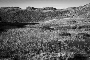
Rendering this type of image into black and white enables a contrasting pattern to emerge and I like to think of this as similar to images made by Fay Godwin (whose work I have described elsewhere in the blog).
Langdale 02
Reedy Loch. Fay Godwin (NSMM 1994/5015/95)
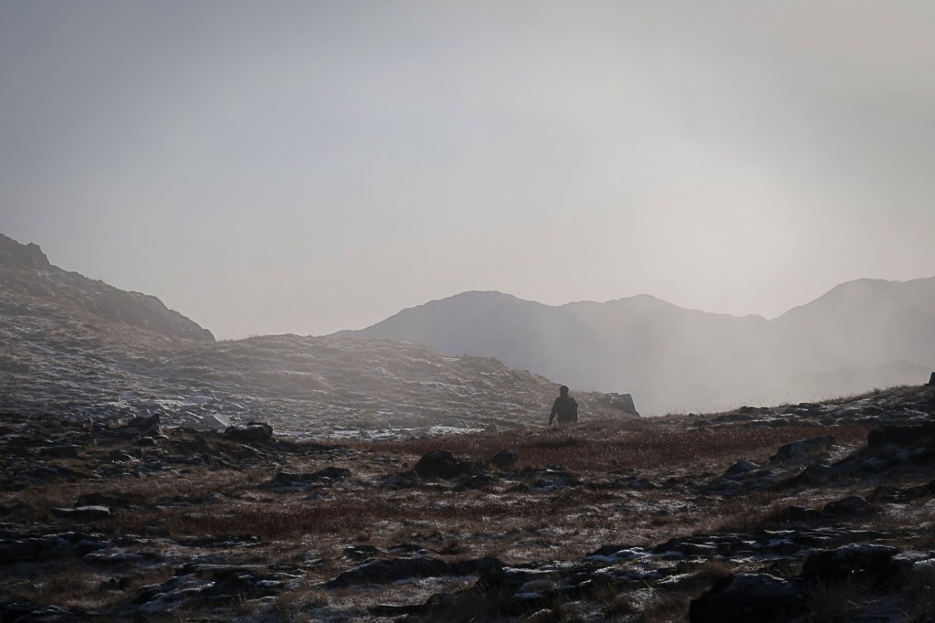
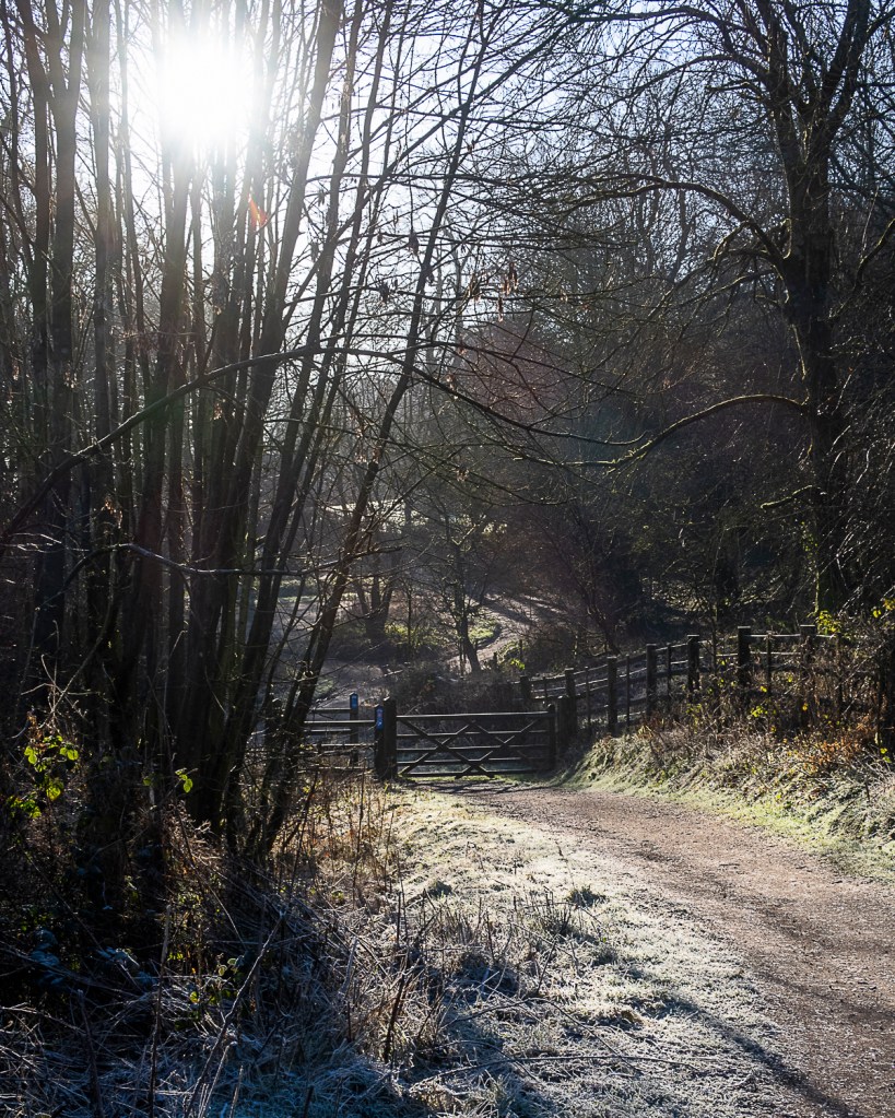
However on the same days and in different settings a more subtle image can be found. Drawing on the technique of shooting into the sun used by Atget, more nuanced images can be achieved.
Langdale 01
Langdale 03
Derwent Valley Way 01
In these images the contrast is reduced and the colours muted – reducing the amount of information in the image. This in itself adds to the mystery of the image and allows the observer to add their own interpretations to the image.
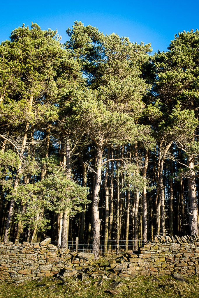
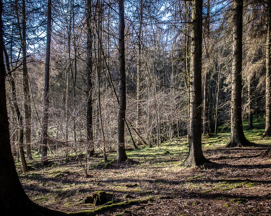
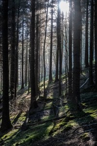
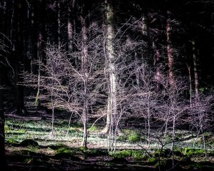
Finally, I have a small series in plantations where the light is altered by being diffused through the trees. Here there is more mystery, reminiscent of the images by Mann.
Woodlands Valley Plantation 01
Woodlands Valley Plantation 02
Woodlands Valley Plantation 03
Woodlands Valley Plantation 01
I note however that all the images I have produced here are on digital cameras and are sharp without the degradation of the image that the equipment and techniques used by Mann (and Atget) produces. I would argue that the atmosphere in their images is a combination of the use and representation of the light together with the loss of detail associated with their techniques.
References
References to the works cited in this post are found in my separate post “References”
Light metering
Part 4 of the course begins with a suggested exercise to complete “If you’re not completely sure how your light meter works…”
When I first started using a DSLR, I completed a course with the Jessops academy which included discussions about metering. This included the various metering modes available on the cameras – on mine these are
• Centre weighted average
• Evaluative
• Partial
• Spot
In addition we completed an exercise of photographing a white card using exposure determined by the camera – the result was a grey image.
Metering 1: White card photographed with automatic exposure control. Exposed for the white card only.
Histogram for image “Metering 1”
Whereas when the metering was made for a grey card and then the image of the white made at the exposure, the card appears white.
Metering 2: White card photographed with automatic exposure control. Exposed for a grey card.
Histogram for image “Metering 2
Having completed these exercises I feel I am confident with the basic skills of the use of exposure metering, and exposure lock in order to be able to expose the image for which I aim. This is of particular importance with my film cameras as I am unable to confirm the correct exposure on site and only on developing the film. For this work I use three types of exposure metering: my 35mm SLRs have through the lens metering, I also use a hand held meter (for the medium format camera) and then I often check the exposure with the meter in my DSLR.
I receive the British Journal of Psychiatry each month. The editors “are always looking for interesting and visually appealing images for the cover of the Journal”.
I received the January 2020 copy while working on Part 4 of this course “Languages of Light”. The cover has a reproduction of a painting, The Corridor by Jill Chaloner.
Chaloner is described in the Journal as “an East Anglian artist trained at the Norfolk Painting School who previously worked as a Consultant Psychiatrist in the NHS for 20 years”. (B J Psychiatry (2020) 216(1): A2).
She describes the painting: This painting arose out of memories of working and training in several old asylums, Claybury, Bexley and Warley hospitals among others. Also at the back of my mind was a paper I read in the yellow Journal more than 30 years ago entitled “The Corridor People”. It was a study of patients whose main activity was daily wandering in the main hospital corridor and who were not in receipt of any other “therapy”. It was argued that their seemingly purposeless activity could in fact be part of a healing process. In my picture though the human figures seem to inhabit deep darkness, bright light is never far away hinting at the possibility of transformation.
Like Chaloner, I trained and worked in an old asylum, Bexley Hospital. The subjects of the painting and their situation has a resonance for me. In terms of how Chaloner depicts this, I was struck by the use of bright light and deep shadow. This is not only visually appealing and adds to the interest of the image, but is also here used as a metaphor for chronic mental illness and recovery.
I include this post in my consideration of my assignment as an additional way artists use light – as a metaphor.
Robert gave a presentation expanding on the concept of “improbable images” as described in the course notes. This is based on the principles outlined by Vilem Flusser in “The Philosophy of Photography”.
That is, the concept of the photograph alters from that of the memento (“people who look at a photograph naively photographs represent the world”) to a more generalised unique type of image (“representation of the world no longer depends on direct experience but on interpretation of previous images or representations that already exist”).
As a result of this meeting and the works discussed my objectives are
Read Flusser’s book “The Philosophy of Photography”
Examine the works of the artists discussed
Steele-Perkins
Tomasz Windland
Re-examine Hokusai’s work
Later thoughts on the meeting
Overnight I thought more about the meeting and some of the issues Robert had raised.
Some of the images Robert showed included areas of white, lacking detail, and he emphasised the importance of these in the composition, adding a sense of ambiguity to the overall image. This reminded me of the concept of “kindly vacancies” introduced by John Ruskin in his work “On Modern Painters” and referred to by Rachael Talibard in the talk I heard her give.
Robert had made many of his images with film and he emphasised the ability of film to enable the photographer to make images other than those which are our original intention. With digital cameras we are able to review the image immediately and may discard those that do not meet our plan, whereas some of these discarded images may have features making them of significance. This to me was reminiscent of the principle employed in the “Nine Eyes of Google Street View” by Jon Rafman, whereby captured images become art works because of the selection process by the artist.
In preparation for a forthcoming Zoom Meeting (Improbable Images – 26/11/19) I noted that this topic from Part 5 is titled differently from that in my notes.
The course notes I have been working from are version:
EYV Manual cg_ph4eyv_240117_red,
whereas “Improbable images” features in the newer version of the course notes:
EYV Manual cg_ph2eyv_180618_red_0.
Robert Bloomfield who is leading the Zoom meeting has advised me to use the later version because the images and exemplars have been updated and there are some useful case studies at the back.
I plan to follow the sequencing and numbering of exercises from the later version of the notes for Parts 4 & 5.
The notes for Part 4 begin “The assignment will ask you to select one of the exercises from Part Four to work up to an assignment submission, so please read the assignment brief before going any further.”
Assignment 4: Languages of Light
Brief:
“Revisit one of the exercises on daylight, artificial light or controlled light from Part Four (Ex 4.1, Ex 4.2 or Ex 4.3) and develop it into a formal assignment submission.”
The exercises are: Exercise 4.1: Daylight:
“Taking the photography of Mann, Atget or Schmidt or a photographer of your own choosing as your starting point, shoot a number of photographs exploring the quality of natural light.”
Exercise 4.2: Artificial Light “Capture ‘the beauty of artificial light’ in a short sequence of shots”
Exercise 4.3: Egg or stone “Use a combination of quality, contrast, direction and colour to light an object in order to reveal its form.”
My initial thoughts on this are that I will probably choose to do the “Daylight” or “Artificial Light” exercises as my Assignment submission as I have already developed a studio-lit sequence for my submission for Assignment 2. This is a learning experience and I think I will learn more if I use a different technique for this assignment.
I have recently become very aware of how ubiquitous sources of artificial light are in our environment. I have recently re-started developing and printing film. As I was about to load a film into a developing tank, I saw that I was wearing fitness tracker on my wrist which lit up as I moved, and had a green light displaying all the time, my phone was on the worktop and would light up if I was called. All round my darkroom were battery chargers and other items with LED displays.
This prompted my to do two things. The first very practically, was to remove all the light emitting objects and put them in a metal box, and cover up others with black tape; before loading my film…
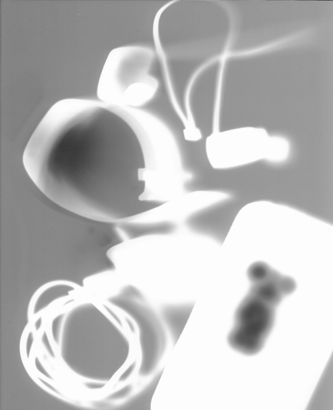
“Man Ray made his “rayographs” without a camera by placing objects-such as the thumbtacks, coil of wire, and other circular forms used here-directly on a sheet of photosensitized paper and exposing it to light.”
Another Rayograph is shown from their collection, here with those from the Peggy Guggenheim collection:
Rayograph, untitled. Man Ray. Peggy Guggenheim Collection
Rayograph, untitled. Man Ray. Peggy Guggenheim Collection
Rayograph 1922, Man Ray. From the collection of the Metropolitan Museum
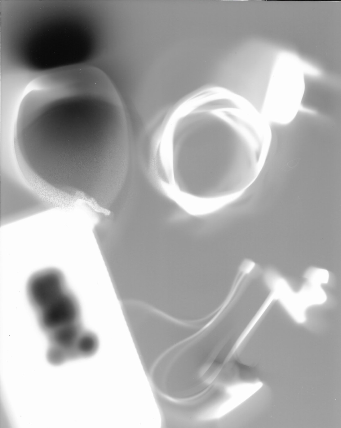
I wondered how a similar technique might be applied to modern everyday objects which themselves emit light.
Method
I selected some of the common objects which had so concerned me in the darkroom (including mobile phone, “Fitbit”, bluetooth earphones, phone charger) and arranged them on a sheet of photographic paper (Ilford Multigrade IV). I made sure the displays and LEDs were illuminated, and then exposed the paper with the objects to the light from a tablet. I then developed the paper normally.
I conducted a series of test exposures to ensure the exposure from the tablet light gave a mid-grey tone, and left the objects in place for long enough to produce a darker tone. (I was surprised as to how sensitive the paper was to the light of the tablet display (it only required a 4 second exposure from a distance of 120cm).
The final images are shown below:
2019-07-30 Image 12019-07-30 Image 2
Overall I think these show an interesting contrast to the approach by Man Ray, and show the effect of the intrinsic light of the objects. The images of Man Ray have much sharper edges to the shadows, and I think this is due to them being closely in contact with the paper. If I try this technique again, I might try to put the objects closely in contact to the surface of the paper, perhaps by pressing them down with a sheet of glass.