The Decisive Moment
The course notes say
“Before you go any further, give some careful thought to the ‘decisive moment’ debate and note down where you stand (at the moment, anyway) in your learning log.”
Thus I would suggest that there is compositional decisiveness and a narrative decisiveness. The former is illustrated by the position of the train in the image of Meudon, all the elements are arranged. But there is also a moment which is important in telling a story or hinting at it, like the position of the man with the package in the same image.
My construct of “compositional decisiveness” relates to the principles I have elaborated upon with regard to the opinions of Suler (Suler, s.d.) in a later post .
I suggested that the 10 characteristics of an image of a Decisive Moment proposed by Suler, fell into three groups:
A: The compositional elements of the image produce “balance, harmony, simplicity, and unity” (1) with “meaningful figure/ground relationship” (2) and may incorporate “a visual gap, interval, or suspension of some kind” (3). Overall the effect of this composition is to create “an element of ambiguity, uncertainty, and even contradiction”.
B. The image is captured at a “unique, fleeting, and meaningful moment” (5) in “a precisely timed, unrepeatable, one-chance shot” (6) using “an unobtrusive, candid, photorealistic image of people in real life situations” (7)
C: The final image “arouses meaning and emotion about the human condition” (8)
The first of these groups is clearly about composition while the latter ones, particularly the last, will contribute to the narrative.
Bate (Bate, 2016) links the principle of HCB’s “Decisive moment” to “an older concept from art history of telling a story in a single picture”. He describes the suggestion by Lessing, an eighteenth century dramatist and critic, that the ideal way to depict a complex event is by an image “where the past present and future of the story can be read, summed up at a ‘glance’”. He refers to the moment of this image as peripeteia, from the Greek meaning “dramatic moment”.
There is overlap between this narrative aspect and composition, as Bate acknowledges with regard to HCB’s frequent depiction of a figure whose foot is about to strike the ground. “The striding foot indicates a future event, caused by the past, whose outcome is anticipated by what we see in the picture.”
Bate cites HCB, (Images à la Sauvette, 1952) describing his concept of the Decisive Moment as “one unique picture whose composition possesses such vigour and richness and whose content so radiates outward from it that this single picture is a whole story in itself”.
My current position is that the “Decisive Moment” relies on a compositional style and reflects a particular moment describing the human condition. My aim in the next assignment is (unambitiously) to produce a series of images “whose composition possesses such vigour and richness and whose content so radiates outward from it that (each) single picture is a whole story in itself”
I will test the effectiveness of my submission against the ten criteria of Suler and the principle of Bate, that “the past present and future of the story can be read, summed up at a ‘glance’”.
References
References to the works cited in this post are found in my separate post “References”
The course notes direct me to the work of Paul Graham for a consideration of an alternative approach to the issue of the “decisive moment”.
“Paul Graham (born 1956) is an English fine-art and documentary photographer whose work has been exhibited, published and collected internationally. Graham has won the Deutsche Börse Photography Prize, the Hasselblad Award, the W. Eugene Smith Grant, fellowships from Winston Churchill Memorial Trusts, John Simon Guggenheim Memorial Foundation, and won the inaugural Paris Photo-Aperture Foundation PhotoBook Awards prize for best photographic book of the past 15 years.” (Tate, s.d.)
On reviewing Graham’s images on the Tate website I came across this:
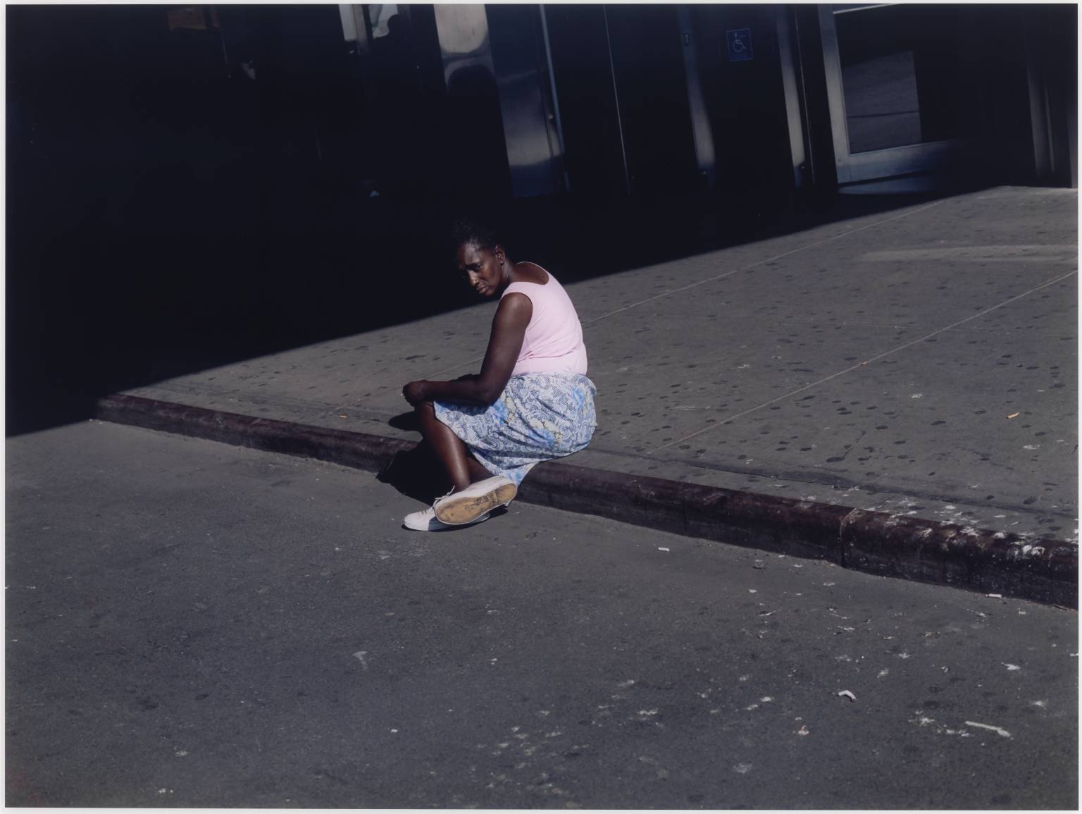
Untitled #38, Woman on Sidewalk, New York, 2002. Paul Graham
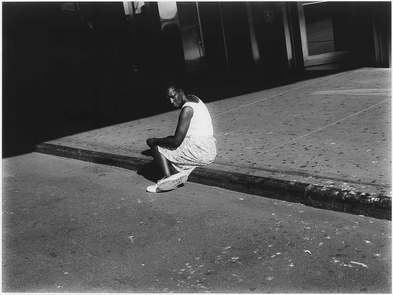
In order to better assess this image in the light of those of HCB, I converted it into black and white.
Untitled #38, Woman on Sidewalk, New York, 2002. Paul Graham. Rendered monochrome A Procter
I think it shares many features with the images of HCB. I note the strong geometric composition with a diagonal line on which the subject sits. Similarly the subject herself is sitting in a posture apparently unstaged and natural, and the photographer has captured her expression which is the striking aspect of the image. Her head is positioned, apparently carefully, in the image against the dark background. I find her expression and geometric framing very reminiscent of HCB and his principles for producing images of the “decisive moment”.
Similar to my comments on the earlier image, I find it hard to agree with Pantall’s assertion that these are images of “a street with moments so decisively indecisive that we don’t really know what we are looking at or looking for.” (Pantall, s.d.)
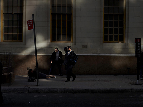
Present 17. Paul Graham
This image of a woman who has fallen on the sidewalk has a formal compositional plan with the bold line on the wall behind the subjects. The woman is positioned in the image so her body is divided by the pole, but her head is clearly adjacent to a grill on the wall behind. The heads of the passers-by are carefully positioned to maximise the illumination and the woman herself has “conveniently” fallen into a pool of light. The photographer here captures the gesture of the outreached hand of the man apparently trying to help her up. This sensitive gesture, is at odds with Pantall’s descriptions of urban life as represented by Graham.
“There are a fair few hostile glances in The Present, and a fair bit of blindness, disability, poverty and wealth. The people are… not glamorous or striking or eccentric, but rather they’re harried, harassed and distant; no relationships were struck in the making of this book. These people could be anywhere; they stride purposefully along streets that hold no attractions to jobs that hold no attractions, their faces set into grimaces of urban stress.”
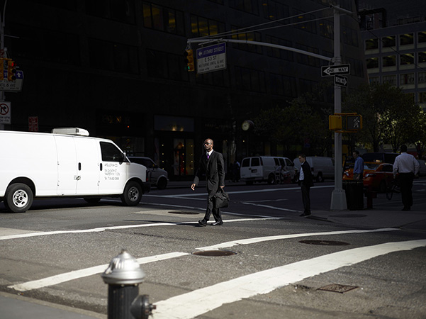
People do indeed “stride purposefully” but in many cases they are captured in a moment which has much in common with the images of HCB in terms of the carefulness and style of the composition and the directions of their gaze. This is exemplified by these.
Present 14. Paul Graham
Present 08. Paul Graham
Zouhair Ghazzal (Ghazzal, s.d.) writing about the work of HCB also emphasises the importance of gesture is these images.
“Cartier-Bresson’s most well known relics reveals the importance of bodily gestures in each one of them.”
and he considered that the work of HCB relied “instead on the juxtaposition of bodily gestures with symmetries created by light and space.”
He also considers that because of this there is a tendency in the observer to look for meaning in the image. “Hence that sudden urge, when confronted with a Cartier-Bresson image, to narrate it”. Although he considers that “An image does not narrate: it rather creates an unbridgeable abyss between itself-as-frame and the rest of the unframed world”.
Ghazzal also considers the work of other photographers, working after HCB. He considers that many do not incorporate the principle into their work. “Some of the top photographers of the last few decades, which willy-nilly did not base their photography on the decisive moment, would argue that the latter’s major weakness was precisely its sole reliance on gestures.”
However he also suggests that it is not solely the reliance on gesture which underpins this but the nature of modern urban environments. He argues modern cites either in America or Europe or the Middle East, have expanded “indefinitely, and create(ed) for the most part urban landscapes that are so monotonous and dull, that no decisive moment would be able to capture.”
Hsu, in his review (Hsu, s.d.) of the re-issue of the work by HCB, (Cartier-Bresson and Simon, 2014) , considers that the term “decisive moment” itself may be part of the problem here.
“Cartier-Bresson’s moments include not only the dynamic coordination of form, but also acts of looking that consider gesture, expression and a transient connection with his subjects. Paradoxically, the popularity of the term ‘decisive moment’ may have done Cartier-Bresson a form of disservice; while his individual photographs are very much about the ‘simultaneous recognition’ of significance and form,”
The Decisive Moment was originally published in the United States by Simon and Schuster in 1952, and simultaneously published in France by Verve as Images à la Sauvette (“images on the fly”, or “images on the run”). This French title emphasises the way the image is captured – rather than the content of the image of a particular moment.
The principles of how HCB captured his images is considered by Suler (Suler, s.d.) .
Suler also comments on the original French title of the book “In 1952 Cartier-Bresson published Images à la Sauvette, which roughly translates as “images on the run” or “stolen images.” The English title of the book, The Decisive Moment, was chosen by publisher Dick Simon of Simon and Schuster. In his preface to the book of 126 photographs from around the world, Cartier-Bresson cites the 17th century Cardinal de Retz who said, “Il n’y a rien dans ce monde qui n’ait un moment decisif” – “There is nothing in this world that does not have a decisive moment.” Suler also describes what he believes are 10 principles of the decisive moment image. These are: 1. A sophisticated composition in which the visual coalescence of the photographed scene capitalizes on the principles of Gestalt psychology to create a “prägnanz” atmosphere of balance, harmony, simplicity, and unity. 2. A sophisticated background to the subject that interacts both visually and psychologically with the subject in a synergistically meaningful figure/ground relationship. 3. The visual as well as psychological anticipation of completion and closure, which often surfaces as a visual gap, interval, or suspension of some kind. 4. An element of ambiguity, uncertainty, and even contradiction that rouses the viewer’s curiosity about the meaning or outcome of the scene depicted. 5. The capture of a unique, fleeting, and meaningful moment, ideally one involving movement and action. 6. A precisely timed, unrepeatable, one-chance shot. 7. An unobtrusive, candid, photorealistic image of people in real life situations. 8. A dynamic interplay of objective fact with subjective interpretation that arouses meaning and emotion about the human condition. 9. The overarching context of a productive photography session – or “good hour” – that starts with tension, then culminates in a personal and artistic realization that is the DM image. 10. The DM photo as a product of a unique set of technical, cognitive, and emotional skills developed from extensive training and experience in photography, as well as from a psychological knowledge of people.
It seems to me that these principles fall into distinct independent groups:
A: The compositional elements of the image produce “balance, harmony, simplicity, and unity” (1) with “meaningful figure/ground relationship” (2) and may incorporate “a visual gap, interval, or suspension of some kind” (3). Overall the effect of this composition is to create “an element of ambiguity, uncertainty, and even contradiction”.
B. The image is captured at a “unique, fleeting, and meaningful moment” (5) in “a precisely timed, unrepeatable, one-chance shot” (6) using “an unobtrusive, candid, photorealistic image of people in real life situations” (7)
C: The final image “arouses meaning and emotion about the human condition” (8)
The remaining two principles appear to me to replicate the other principles outlined. A “productive photography session… culminat(ing) in a personal and artistic realization” (9) is surely necessary for all photographic endeavours. The “technical, cognitive, and emotional skills” (10) needed are used to achieve the earlier 8 points.
Applying this to the images of Paul Graham, I would suggest that the images which I showed earlier achieve that compositional technique. They are taken also taken at a particular unrepeatable moment. Most of all they comment on the human condition in modern urban environment, as Pantall recognises (quoted above).
References
References to the works cited in this post are found in my separate post “References”
“Watch the Henri Cartier-Bresson documentary ‘L’amour de court’ (‘Just plain love’, 2001) Write a personal response to the film in the contextual section of your learning log,”
I watched this video of the documentary film:
Henri Cartier-Bresson: L’amour tout court Directed by Raphaël O’Byrne (2001) (O’Byrne, 2014)
This film consists of a series of interviews with Henri Cartier-Bresson (HCB) in which he describes influences on his work and his approach to his work. It is illustrated with some of his images and his description of these and the background to them.
There were a number of themes in the documentary which I noted and considered.
The first of these was early in the film he used the phrase “what matters is to look” and elaborated this by saying “you have to be receptive, that’s all”.
By this I understand that his work comes from an intense awareness of what is happening around him and being able to record this. He emphasised, perhaps somewhat self-deprecatingly, that “it’s always luck” and that the relationship between elements in his images are a “matter of chance”.
I suspect that even if it was a matter of chance as to whether he captured the elements in an arrangement he found satisfactory, his selection of the images for publication was actually very carefully performed. He explained that the basis of many of his images is the geometry and his arrangement of the elements is based on the Golden Number. He illustrated this with the image of Scanno, Italy 1951.
Scanno, Italie, 1951. Henri Cartier-Bresson
(But when I researched more of his images it seemed clear to me that prominent geometric forms are a common feature of many of these). Consistent with this was his emphasis that “form more than light” is important to his work.
Another prominent theme related to his principle of “being receptive” was his approach to travel; and the importance of being part of the world.
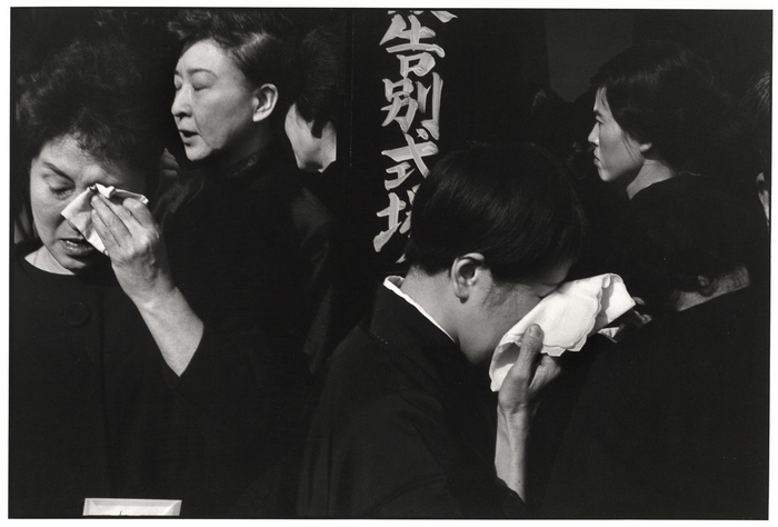
This was illustrated by consideration of his image “Funeral of a Kabuki actor, Japan”.
Funeral of a Kabuki actor, Japan. Henri Cartier-Bresson
The commentary of the film suggested that HCB “likes those that he photographs not to realise what he is doing”. This was illustrated by the comment that he painted the shiny parts of his camera black to make it less obvious (and presumably setting a fashion for all black bodied cameras which became popular in the 1970s for “serious” photographers).
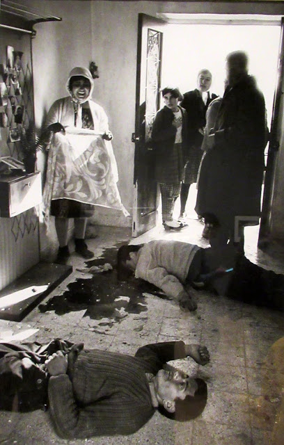
It is suggested in the film, that only in this way would those whom he photographed act normally and be spontaneous, and thereby the grief shown in this image was more genuine. However I was struck by a comparison with the image by Don McCullin, Turkish Village 1964 and McCullin’s account of making it.
Turkish Village 1964. Don McCullin
“A woman entered screaming. One of the dead was her new husband. I was standing just by him… I was looking for their blessing to continue… I started quietly taking photographs with great respect. I was allowed to continue.” Don McCullin (As quoted in Baker and Mavlian, 2019)
I think that there is little doubt that the grief shown by the woman in McCullin’s image is genuine and clearly shown. What this suggests to me is that it is less important that the subjects do not realise what the photographer is doing, but that the photographer is empathetic to the subjects and, in the same was as was emphasised in the HCB documentary, “part of the world”.
References
References to the works cited in this post are found in my separate post “References”
The brief for this exercise is: “Start by doing your own research into some of the artists discussed above. Then, using slow shutter speeds, the multiple exposure function, or another technique inspired by the examples above, try to record the trace of movement within the frame. You can be as experimental as you like. Add a selection of shots together with relevant shooting data and a description of your process (how you captured the shots) to your learning log.”
I have researched some of the artists whose work is described in this section and have made some brief posts about this.
Aim:
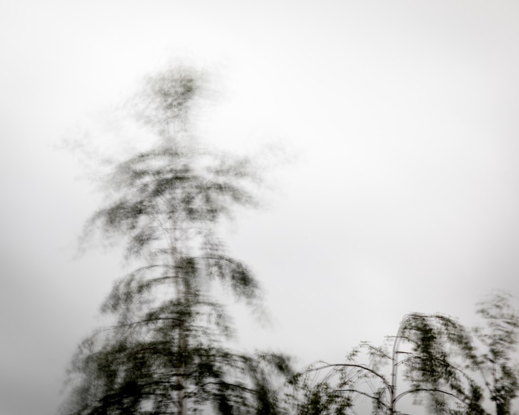
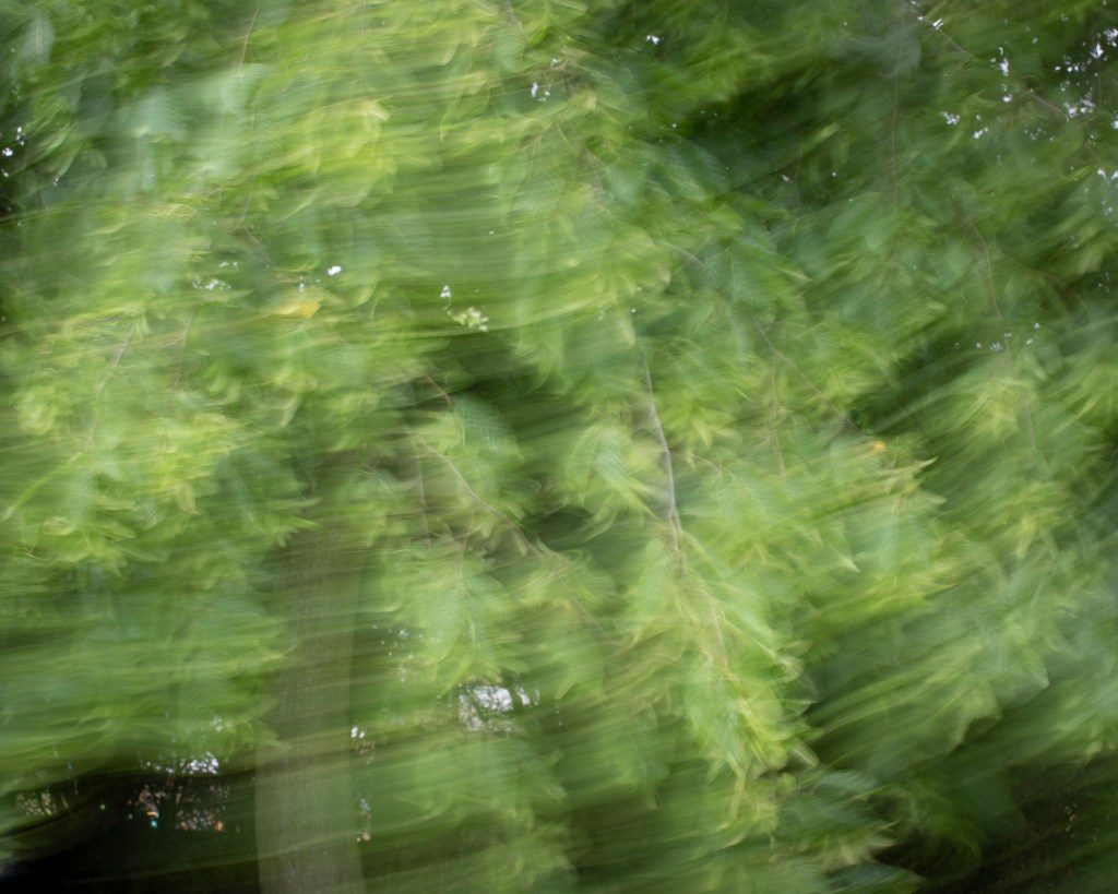
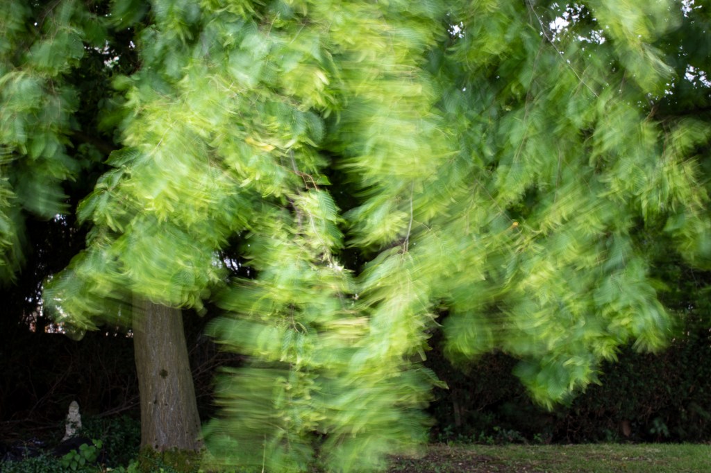
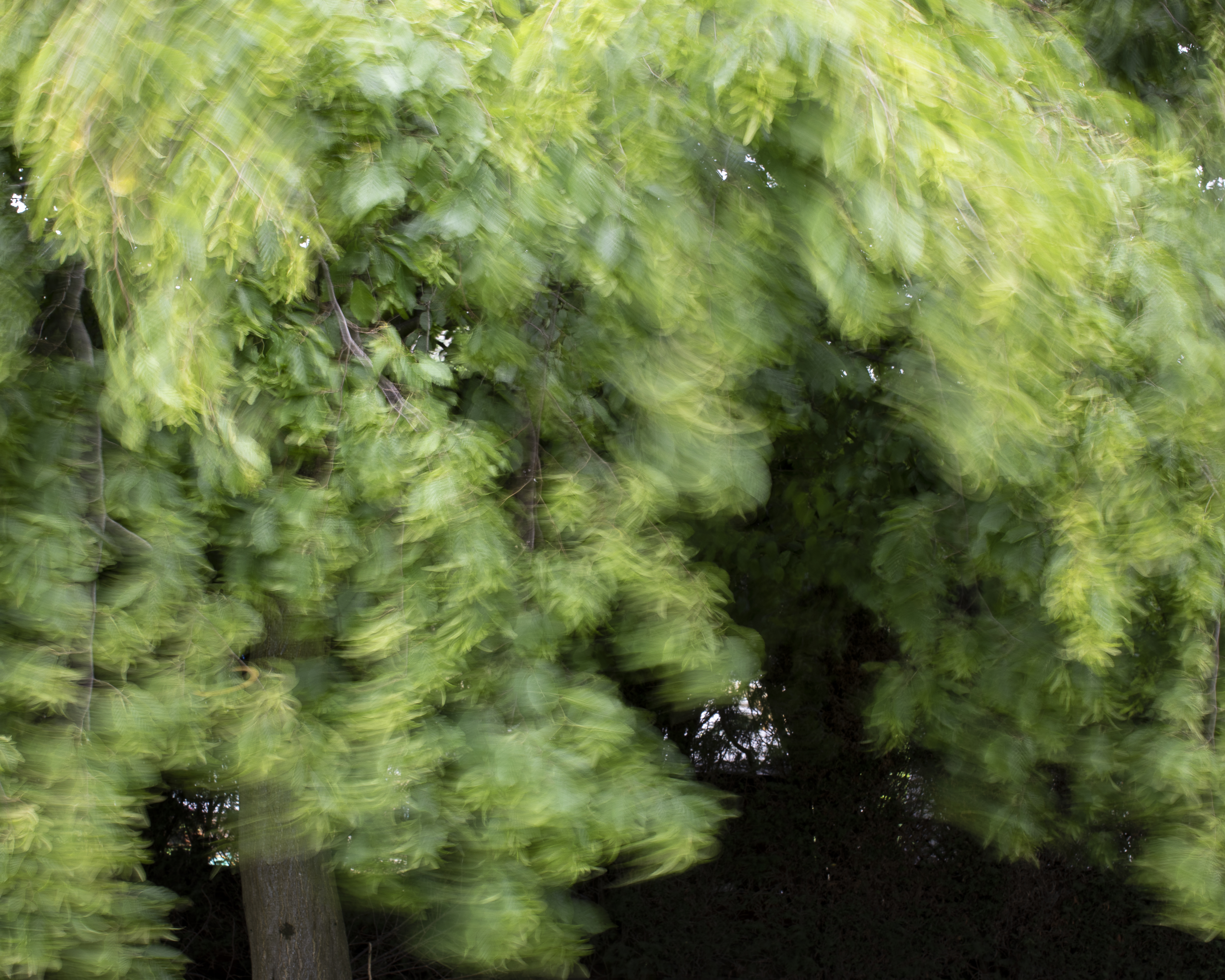
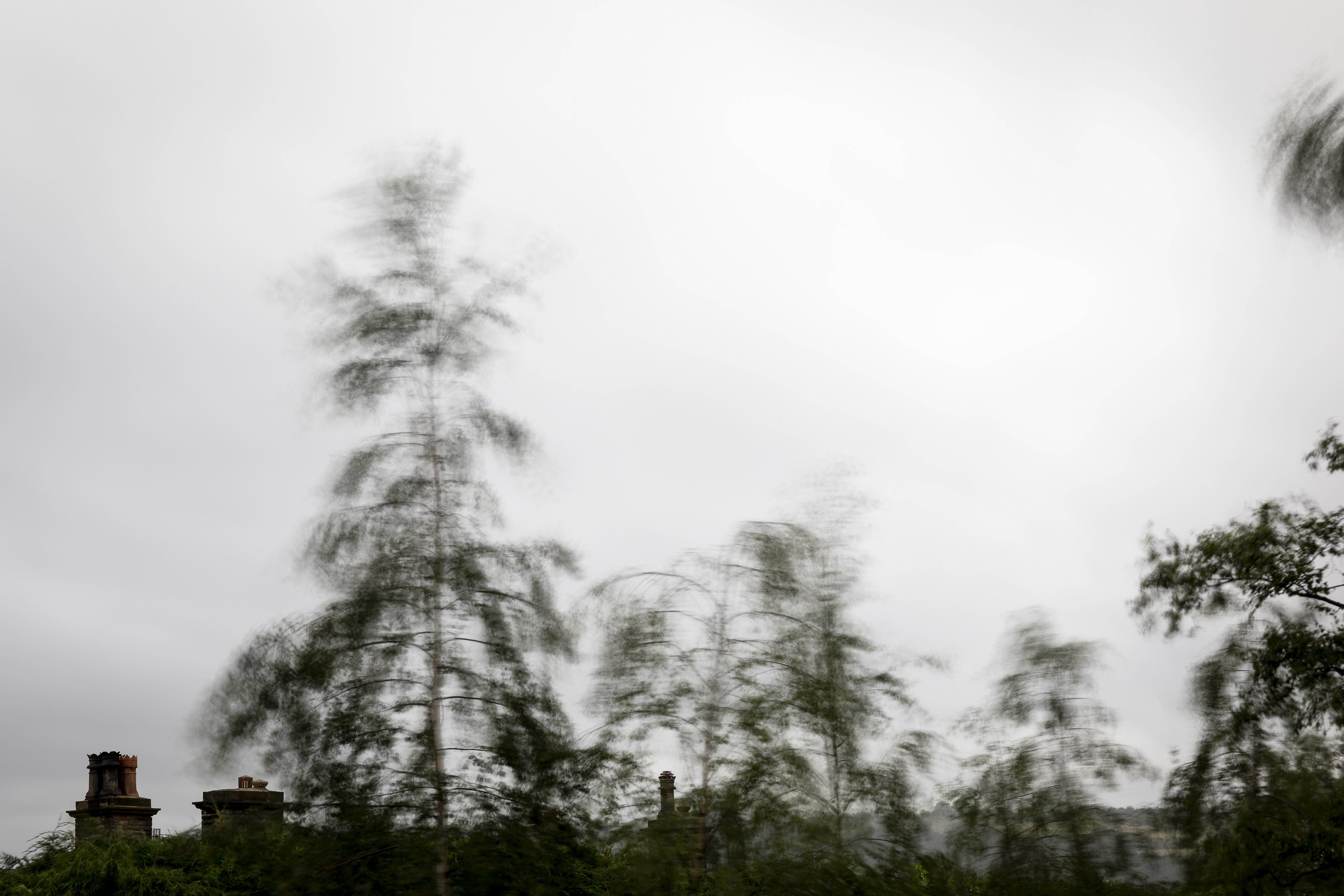
We have been experiencing very windy weather lately and I have noticed that the trees near my home move in the wind in a very characteristic and consistent pattern in the gusts of wind. I have tried to capture this pattern in a still image.
Methods:
The technique that I have used is making a moderately long exposure so that the branches of the trees are seen as a blur, but I hoped to make the image such that it was clearly recognisable but the pattern of the movement shown. The range of exposure I have used is between 1/8th second and 8 seconds, with the camera on a tripod. As the long exposures required smaller apertures than my lenses allowed, even at the least sensitive ISO setting of 100, I have also used neutral density filters of various density to allow an aperture to give appropriate depth of field.
Selection Process of Images:
The course notes indicate that: “One of the ways to communicate discernment and the development of your ideas is through the contact sheet. A digital contact sheet is just thumbnails of a sequence of shots, of course, but the important thing is that it’s an unedited sequence. Including an unedited sequence will allow your tutor to see and comment upon your selection process.
You should annotate your contact sheets. As a minimum, indicate your ‘selects’, together with relevant shooting data and brief observations. This will add significant value to a contact sheet.”
For this exercise I will describe my selection process in detail.
I initially rate my digital images as:
X – rejected (and subsequently deleted) These are images in which there are gross errors in focussing, exposure or composition such as pressing the shutter in accidentally. While I recognise these may rarely result in accidentally interesting images, on the whole these do not, as is the case in this sequence.
1* – kept in my Lightroom catalogue with appropriate key wording so they will appear in future searches. However these also have gross characteristics which mean they fail to achieve my self-imposed brief. For example they do not show the feature I was hoping to obtain perhaps because of composition, timing or other factor.
2* – also kept in my Lightroom catalogue with appropriate key wording. These generally meet my aims and I examine these in more detail in the “Develop” module of Lightroom to see how effectively they show what I aimed to. If I am happy that with or without post-processing they are suitable for sharing I then rate these as 3*
3* images in my catalogue may not all meet my brief and there is still a selection process beyond this which I will describe in relation to this exercise.
The Images for Exercise 3.2
All this images I shot with basic shooting data is in this contact sheet.
I examined the 2* images further and decided not to process these – mainly because although they show the effect I was trying to achieve, I think there are better ones.
I have chosen two subjects, the foliage of a sycamore tree which was the tree which initially attracted my to this project, and the tops of birch trees against the sky. Both of these show the movement pattern with sufficient detail to still show what they actually are. The sycamore also includes some detail of parts of the image which were not in motion and serve to accentuate the movement. The two images which I believe are the most satisfactory for this exercise are these two – for that reason.
Having looked ahead in the course notes I saw that “The Decisive Moment” was a topic for research and the basis of the third assignment. I have been thinking about the meaning of this for a while, prior to having the opportunity to read the suggested sources about this. This post reflects those initial thoughts.
As I had not read the notes for the course I initially believed I had had a unique and novel insight into the nature of this concept. That is, in making an image, the photographer moves his camera in the three spatial dimensions: to the left or right of the subject, near or far away, and from a high or low view point. In addition there is a fourth dimension of time, and the photographer chooses to open the shutter at a particular moment. The uniqueness of this fourth dimension is that whereas if he moves too far in one of the spatial dimensions, he can always move back, but this is not possible with time. There is a further consideration regarding time, and that is how long the shutter is open when creating the image, and therefore we might better think of the “Decisive Moments” rather than a moment.
Having read more about this I now realise my insight is the principle described by Flusser.
“The photographer moves within specific categories of space and time regarding the scene: proximity and distance, bird- and worm’s-eye views, frontal- and side-views, short or long exposures, etc.” (Flusser, 2012)
Examples of images where this is prominent include this by André Kertész..
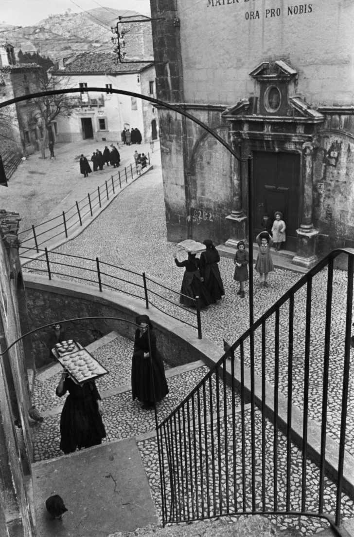
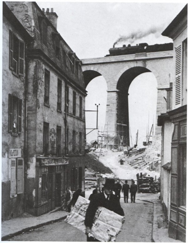
Meudon 1928, André Kertész
The image was created when the train was positioned at a compositionally pleasing place on the viaduct, AND the man with the package is prominent in the foreground. Kertész may have planned this with the aid of railway timetables, but the position of the man is probably outside his control.
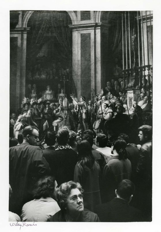
Another image where advance planning has been important is this by Willy Ronis.
Un dimanche au Louvre. Willy Ronis
He has made this image at a time when the lighting in the room matches the direction of the lighting in the painting, and there are sufficient people in the gallery to make a crowd hiding the frame of the painting. As a result it is difficult to determine which are figures in the painting and which are the viewers in the gallery.
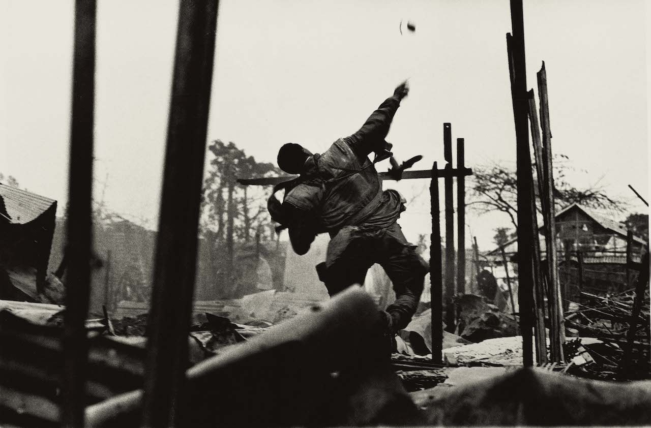
The importance of the duration of shutter opening is exhibited by this image by Don McCullin.
Grenade Thrower Hue Vietnam. Don McCullin
The slight blur of the soldier’s arm emphasises the sense of movement and dynamism in his posture. McCullin has made the image at the decisive moment To create that composition.
However this image illustrates another aspect of decisiveness about this. The description of this image demonstrates this:
“He looked like an Olympic javelin thrower. Five minutes later this man’s throwing arm was like a stumpy cauliflower, completely deformed by the impact of a bullet.” Don McCullin as quoted (Baker and Mavlian, 2019).
The moment that the image was made may have been the moment his position was identified by the sniper who shot off his hand.
Thus I would suggest that there is compositional decisivenessand a narrative decisiveness. The former is illustrated by the position of the train in the image of Meudon, all the elements are arranged. But there is also a moment which is important in telling a story or hinting at it, like the position of the man with the package in the same image.
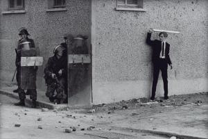
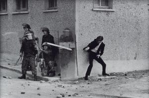
These images by Don McCullin each capture a moment, and are decisive both compositionally and in terms of the narrative.
The Bogside, Londonderry (2). Don McCullin
The Bogside, Londonderry (1). Don McCullin
The Bogside, Londonderry (3). Don McCullin
But what they really seem like to me, are stills from a video that McCullin did not make and each show the development of the interaction, and as such have a narrative quality.
References
References to the works cited in this post are found in my separate post “References”
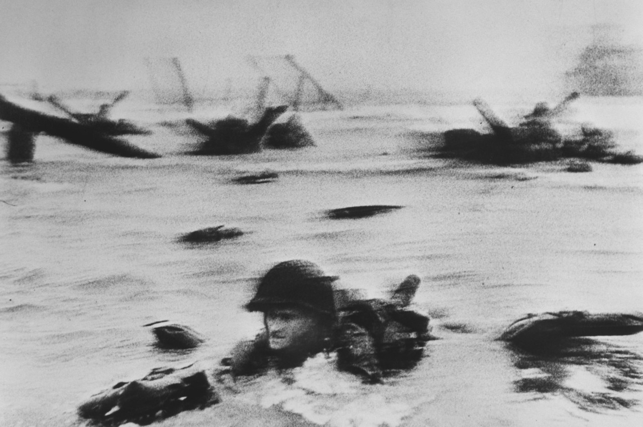
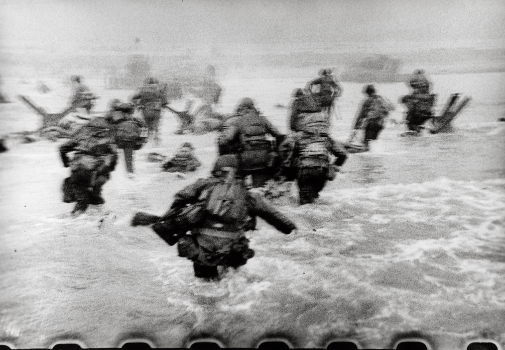
This project seems to be about ways of leaving a trace of movement within the frame as a way of depicting the sense of movement in a still image. The first example the course notes cite of this is Robert Capa’s image of an American soldier wading ashore under fire on Omaha Beach in Normandy, France on D Day, June 6, 1944.
US Troops Omaha Beach June 6 1944 Robert Capa
The notes also suggest that “the grain and blur seems to lend a sense of authenticity to the shot”, and ask why has this image become the iconic image of D Day. One element of this image which I think may be of significance is that in spite of the graininess and blur, we can see the face and expression of the soldier in the water. I have previously suggested this as an important technique in producing documentary photographs in the work of Willy Ronis and Don McCullin. By seeing the soldier (fairly) clearly, an observer can empathise with him and his position lying in the water, under fire.
I examined other images by Capa of the D Day landings and others on the Magnum website. (Capa founded Magnum Photos In 1947, with Henri Cartier-Bresson, David Seymour, George Rodger and William Vandivert. https://www.magnumphotos.com/photographer/robert-capa/ Accessed 17/6/2019)
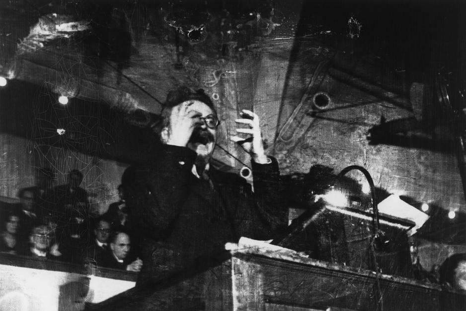
There are, as the course notes suggest, other sharp images of that day, and other images which seem to show movement and dynamism such as this image of Trotsky, which is sharp and seems more “polished”.
Trotsky Copenhagen 1937 Robert Capa
The position of his hands in this image give me a sense that they are in motion – not being held static in that position. His curled fingers give a sense of tension and the emotion with which he is speaking. There is some graininess present but this gives the sense of the low light illuminating the scene.
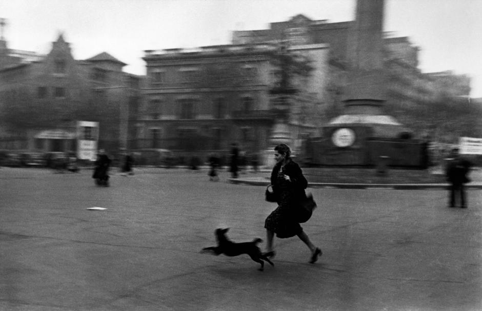
On the Magnum site, there are others which also have the same blur and grainy effect such as this taken several years before D Day during the Spanish Civil War.
Running for shelter during an air raid alarm. Barcelona 1936. Robert Capa
The background and dog is blurred, but the face of the woman is sharp giving a sense of her rush to get to the shelter.
However several of the images of D Day do show grain and blur to a great degree, like that of the soldier wading ashore. In addition there are some which include the image of the sprocket holes on the edge of the film:
US Troops Omaha Beach June 6 1944 Robert Capa
It is unclear to me why Capa does this. It seems as if he is deliberately making the image look amateurish and unpolished. An explanation is suggested. “In the rush to develop the images at the Life bureau in London, a 15 year old darkroom assistant made an error: he set the dryer too high and melted the emulsion in the negatives.” Photography the Whole Story. Ed Hacking J. Thames and Hudson (2012) pp 316 -317.
However the fact that these images were published in this state is important and I think of significance. I started looking at these images around the time of the 75th anniversary celebrations of the Day Landing. On 31 May 2019, on the Today Programme BBC Radio 4, Jonathon Dimbleby was interviewed regarding the D Day landings and coverage by the BBC and his father, Richard Dimbleby. (Today BBC Radio 4, 31/05/2019. https://www.bbc.co.uk/sounds/play/m0005f8m Accessed 17/6/19).
In this interview Jonathon Dimbleby made the point that around the time of the D Day landings, the BBC and Allied broadcasters expanded their broadcasts and their team of war correspondents. He said this was because:
“in a democracy broadcasting accurately from the frontline was widely acknowledged to be of real importance, especially with the Nazi media doing its clever best to distort the facts and to lower morale.”
It is in this context that I think Capa’s coverage should be considered. His images needed to be seen to be genuine and produced under the conditions of real combat. More technically perfect images may be seen by an observer as constructed and false. What is the point of falsifying an imperfect image!
In my reading of Capa’s biography I noted that Capa had a history of creating illusion. He was born Andre Friedmann to Jewish parents in Budapest in 1913. He moved to Paris in 1933 and met the journalist and photographer Gerda Taro. Together, they invented the ‘famous’ American photographer Robert Capa and both began to sell their prints under that name. (Gerda Taro: the blonde of brunete. N L Diu The Telegraph 09 Dec 2007)
The persona “Robert Capa” who has created a large body of work, and was introduced in December 1938 by Picture Post as “The Greatest War Photographer in the World” based on his images of the Spanish Civil War, is therefore a creation! (https://www.magnumphotos.com/photographer/robert-capa/ Accessed 17/6/2019)
A further theme that I have eluded to in my description of the work of another “war photographer”, Don McCullin, is the effect of war on the photographer. Capa’s partner, Gerda Taro, was killed in 1937, hit by a tank as she escaped a sudden attack near Brunete, and is now regarded as ‘probably the first female reporter who ever died in action’. Capa (Friedmann) was killed when he stood on a landmine while photographing for Life in Thai-Binh, Indochina, on 25 May 1954.
This was the second of these meetings I have been able to attend.
The plan for the day was:
a presentation on her work by tutor, Dr Rachel Forster (drawing and creative arts tutor)
general discussion
presentation by participants of their OCA work– three students (myself and two others presented their work). I presented the images I had put on my website for the “Frozen Moment” exercise, as the latest work I have done for my course. There was a presentation of an exercise in progress by a textile student and another of images depicting “forgetting” by a level 3 photography student.
I had several aims from attending.
These included general aims similar to those I had for the last one I attended in Leeds, which was to gain a greater understanding of studying with the OCA. In addition I had aims based on my objectives I have described in my plan
Assessment and appraisal skills – how to critically assess a piece of work, including that of others as well as my own.
There were opportunities to see photographs of the work Rachael and the prisoners had produced. I found that as these were mural paintings and so it was interesting to evaluate these. One point I was interested by was the incorporation of emotionally loaded words in wall coverings for spaces for psychological therapy/work. I have seen this in many other settings and I am unclear why it seems to be considered important in a primarily visual medium. When I asked about the rationale Rachael said it was the one element specified by the group commissioning the work (the psychology department!).
Similarly the presentation by the other students enabled me to see and discuss other styles and media of work.
Gain a better understanding of other art disciplines and influence on photographic work
I think the day has helped me primarily in this objective. In particular, the presentation and discussion led by Rachael Forster was around the development of murals and other artworks by groups of prisoners. The discussion was around the effects of art on both the observer and artists and the effect of art work on spaces.
The presentation of work by a textile student was of a medium very different from photography. However there are elements of shared understanding around colour and texture particularly, and the differences seem to be mainly in technique rather than purpose and output.
My personal development in the Assessment area of “Demonstration of creativity – Imagination, experimentation, invention”
I do think that my own development of imagination has extended by looking at examples of what can be achieved and also the use of techniques other than photography.
Another aim of the day for me was to present my own work. I wanted to be able to explain what I was trying to achieve and then get feedback on this. Up to now I have made images and while they are on my website, I have rarely actively sought reactions from others about them. There is an element of desensitisation involved in this for me. I think I do make the images to share; if I believe in them then I need to share them!!
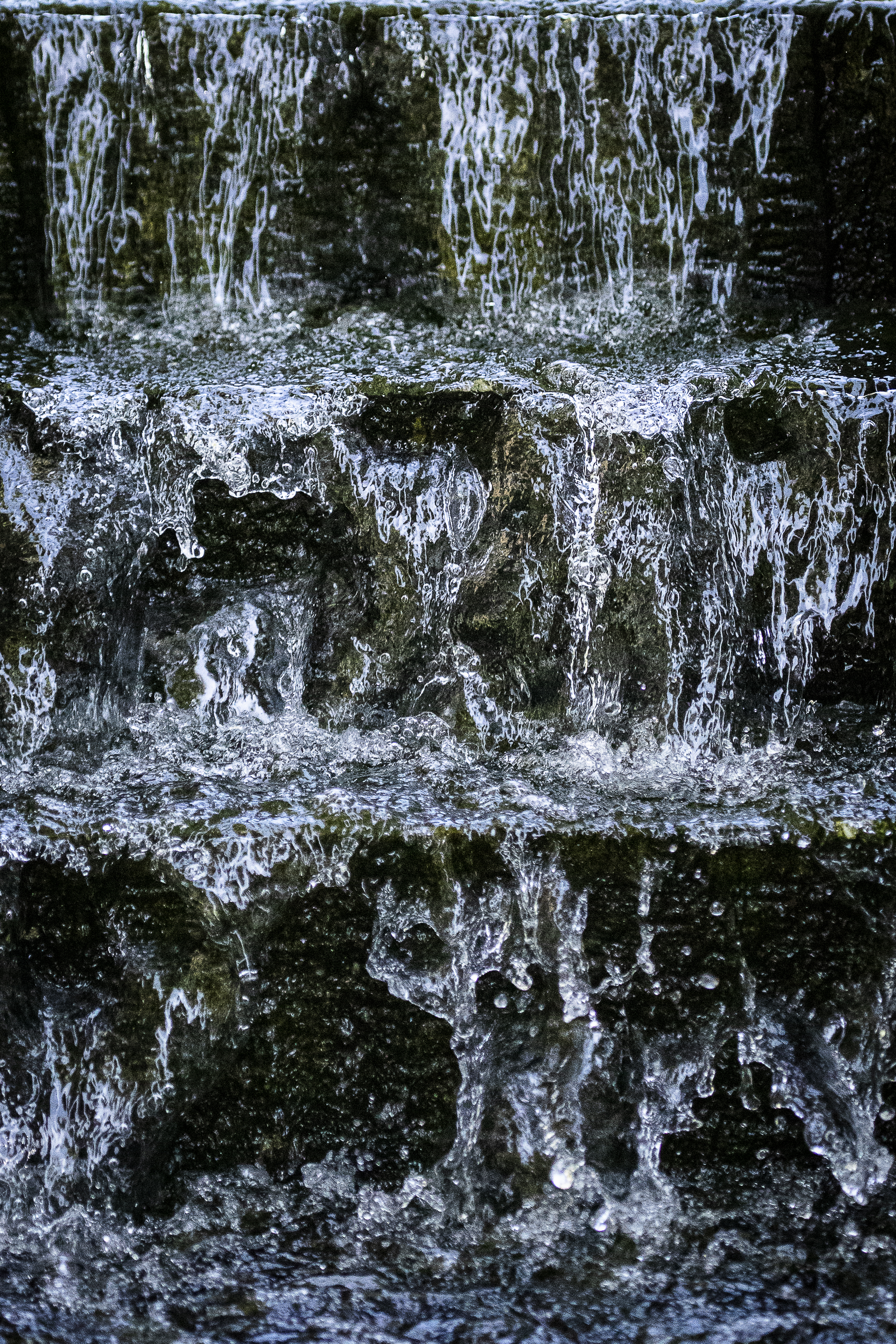
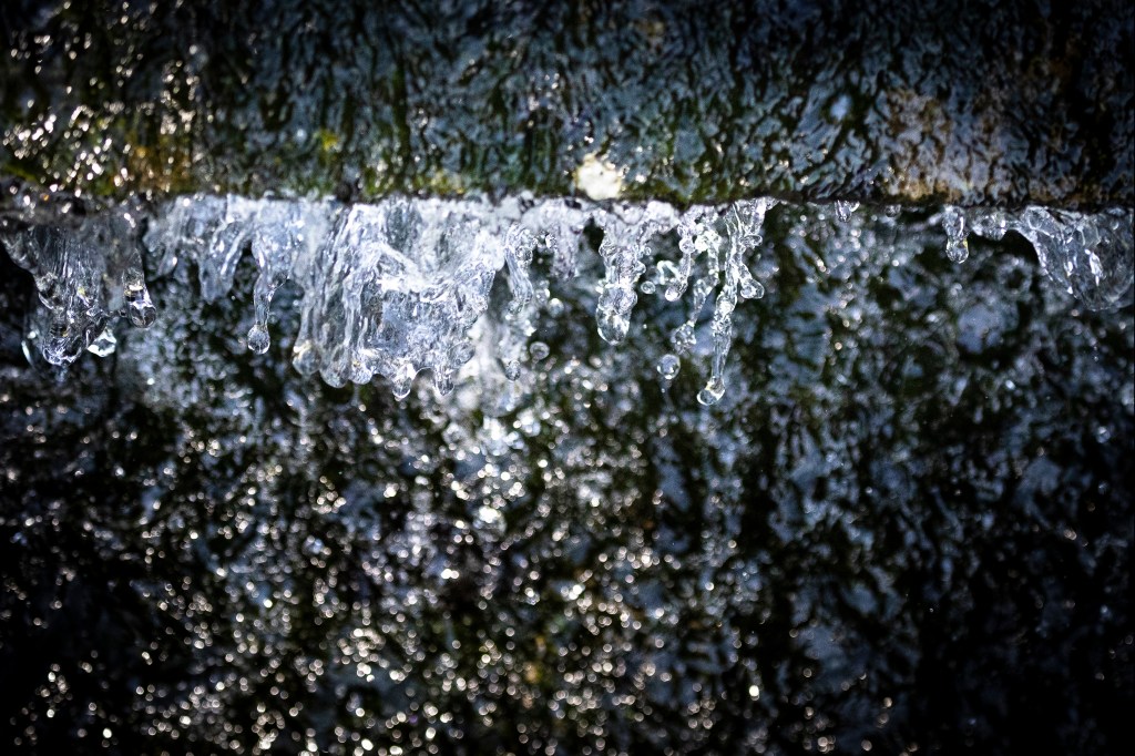
This was the first time I have done this. I think I was able to explain the rationale as to how I approached the exercise. The feedback was positive, and I was pleased that others appreciated the same aspects of the images of the fountain which I did. In particular the quality and nature of the light as it illuminated the droplets of water. The moss on the fountain has a distinct textured effect which was appreciated particularly by the textile students.
For improvement the suggestion was made to crop one of the images to make it more removed from context and more abstract. I had been thinking this myself, but kept it in to show the setting for the later pictures. However the cropped image is very effective and making it more abstract enhances the appearance of the shapes revealed by the fast shutter speed:
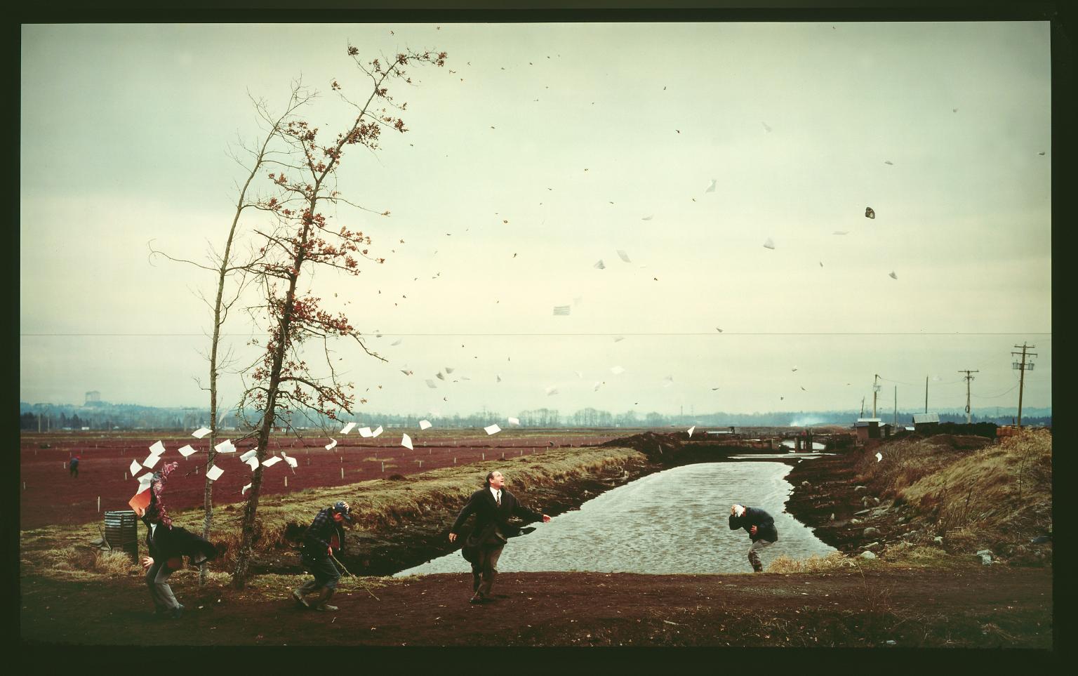
I examined some of the work by Jeff Wall, an artist whose work, Milk, is presented in the course notes. One of the other works by Wall I came across also explores the ability of the camera to freeze time. That is A Sudden Gust of Wind (after Hokusai). This image is, like Milk, also displayed in a light box, and is a collage of images made by Wall of actors in a landscape photographed over a five month period.
A Sudden Gust of Wind (after Hokusai) Jeff Wall 1993
Travellers caught in sudden breeze at Ejiri. Katsushika Hokusai
This image also captures the frozen moment as the travellers’ papers are scattered by the wind.
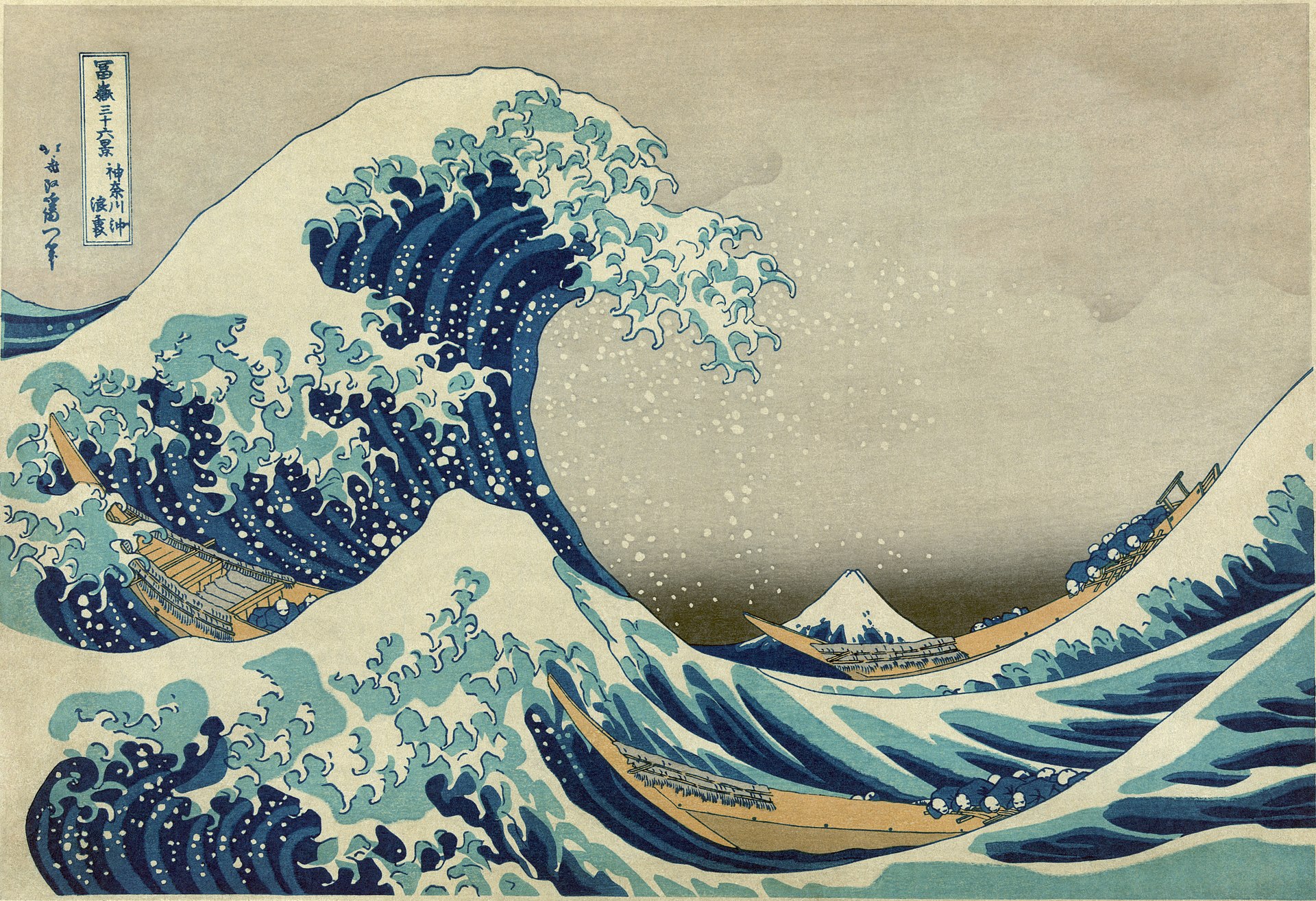
When I then investigated the portfolio of Hokusai, I came across the iconic image, The Great Wave off Kanagawa.
Great Wave off Kanagawa. Katsushika Hokusai
While I have seen this image many times before, looking at it with fresh eyes, I noted that Hokasai has captured the frozen form of the wave – the tip of the wave shows fine detail, reminiscent of the images made by Rachael Talibard.
My thought on this is that while we began this exercise in photography to see how short shutter speeds can freeze a moment and show us what we cannot otherwise see, Hokusai has achieved an understanding and, therefore, depiction of the frozen structure of the wave without this technology.
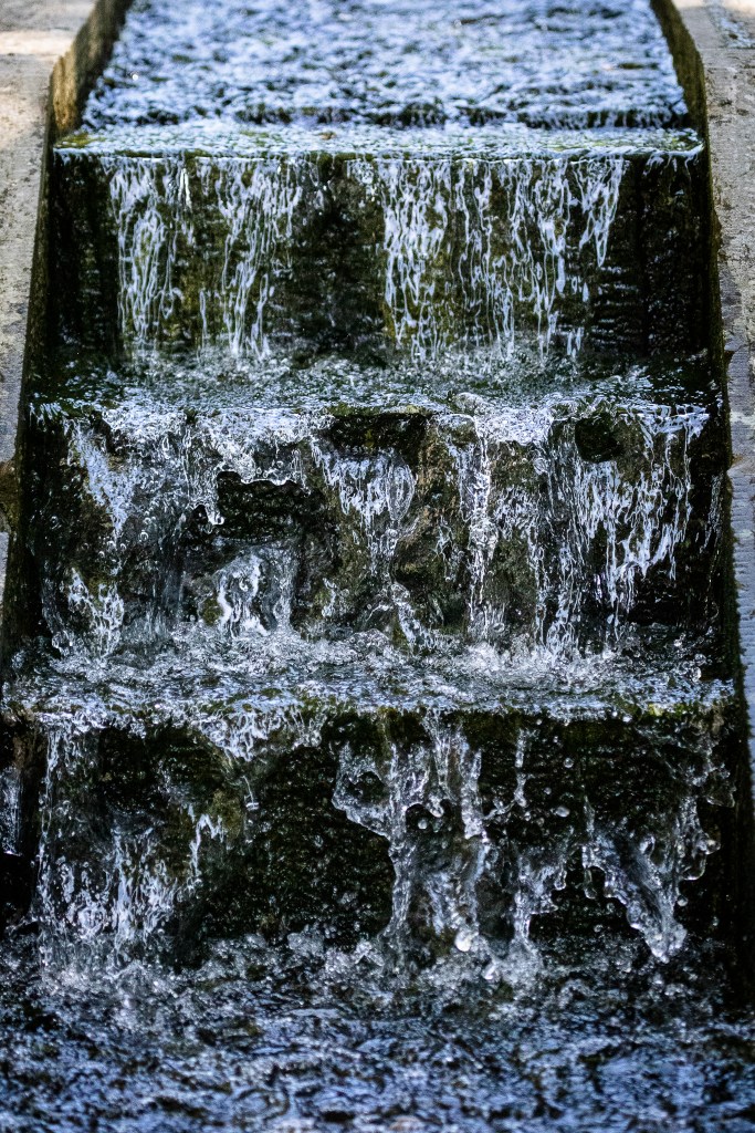
Exercise 3.1 Using fast shutter speeds, try to isolate a frozen moment of time in a moving subject. Try to find the beauty in a fragment of time that fascinated John Szarkowski. Add a selection of shots, together with relevant shooting data and a description of your process (how you captured the images), to your learning log.
I had previously experimented with trying to capture images of water dropping from my kitchen tap into a container in the sink, and lit this with flash. I attach the contacts from this exercise and one interesting image which begins to capture the shapes and forms of the splash caught in time.
However before I did more work with this approach I visited the gardens of a country house in the Lake District (Holker Hall). It had not been my intention to complete the exercise while there, but in the grounds were a number of water features It was a bright sunny day which lit the drops of water from behind in a very interesting way. I had already researched some of the work and images of Muybridge, Worthington and Edgerton. With regard to this, I was therefore somewhat familiar with the appearance of splashes and drops of water recorded by Worthington with very short shutter speeds and the more stylised images by Edgerton. I wanted to try and capture the appearance of the water in these garden features in a manner more naturalistic than I had set up in my home. I therefore made a number of images of the water as it flowed variously over the features or fell back into pools from fountains.
Methodology
I used a telephoto lens – (100-400mm focal length) to enable me to capture the splashes from some distance. I have used fast shutter speed of around 1/2500sec to freeze the movement of the water. It is my more usual practice to use a long shutter speed for images like this to show the movement of the water with blurring, so this was quite a novel approach for me. I also used high speed continuous shooting and took bursts of 3 or 4 images at a time in order to see how the splash and droplets developed and regressed. This process obvious in some of the images on the contact sheet.
I have included contact sheets of all the images I made of the water features and have labelled them with the exposure data, rather than filenames so as to better show how these were made.
I have further developed a number with cropping and local exposure adjustments and think these show the patterns in the water only revealed to us by the use of very short shutter speed freezing the water in a moment in time.