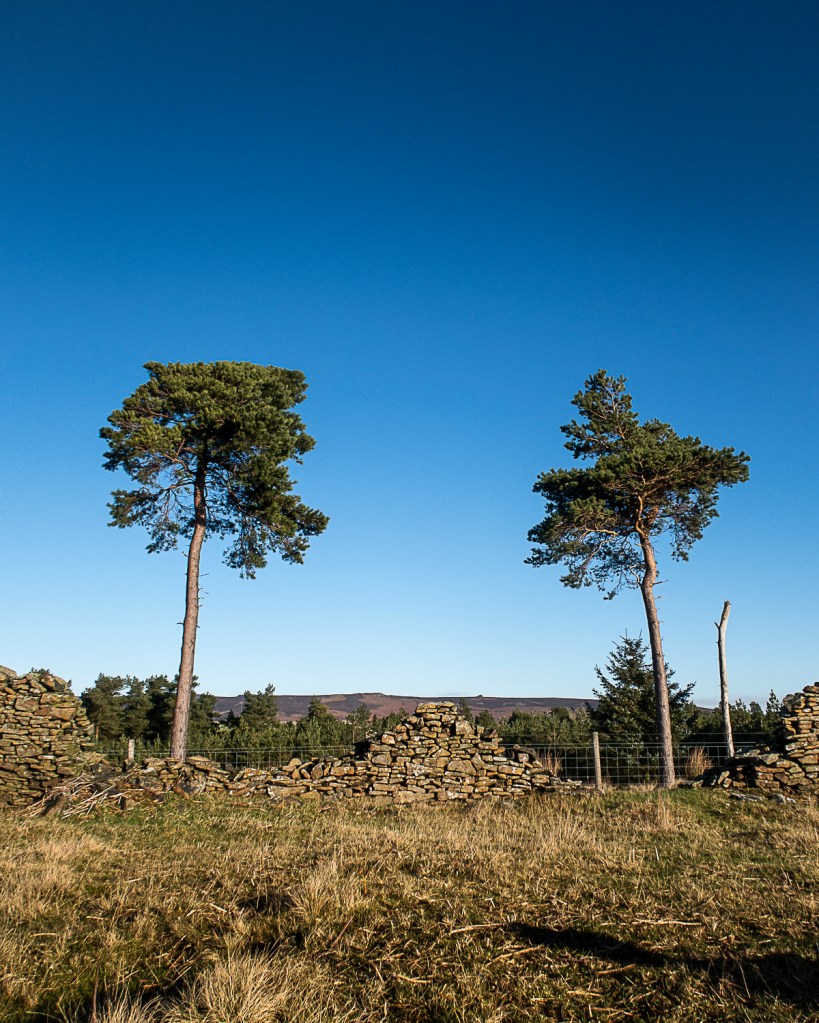
I was referred to this work by my tutor in response to my images of the Woodlands Valley Plantation which I included in my images for Exercise 4.1.
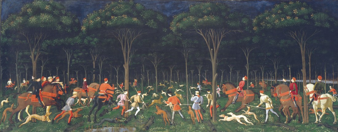
Hunt in the Forest, Ucello
The Hunt in the Forest (also known as The Hunt by Night or simply The Hunt) is a painting by the Italian artist Paolo di Dono; his nickname, Uccello (‘Bird’), alludes to his depictions of the natural world. He was celebrated in his lifetime as a master of perspective, and of animals and landscape. The painting is an early example of the effective use of perspective in Renaissance art, with the hunt participants, including people, horses, dogs and deer, disappearing into the dark forest in the distance. (THE HUNT IN THE FOREST, s.d.)
My tutor suggested I look at this with a view to examining his use of perspective, but also to explore the nature of shadows and the iconography of shadows as mysterious and dangerous places. My images which most closely resemble the viewpoint and perspective of Ucello, include these
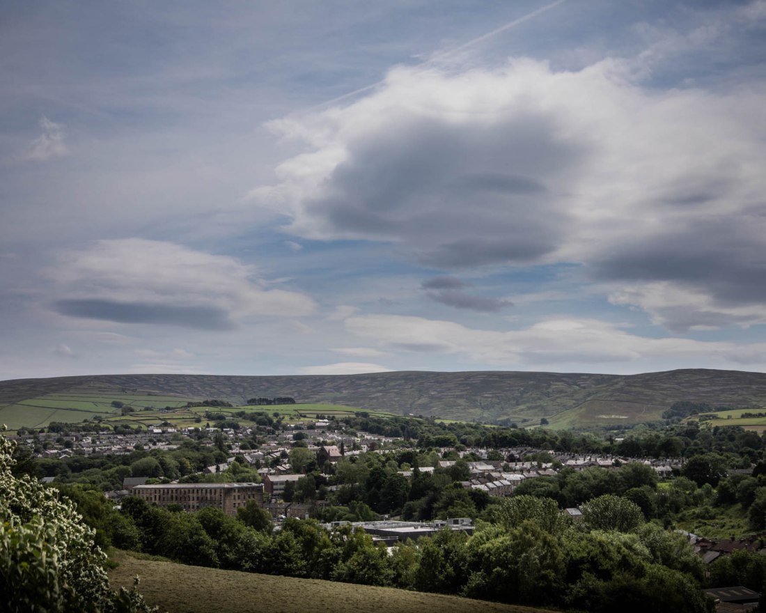
Woodlands Valley Plantation 01
Woodlands Valley Plantation 02
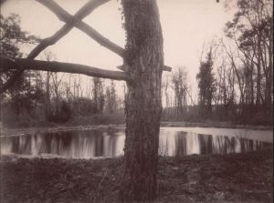
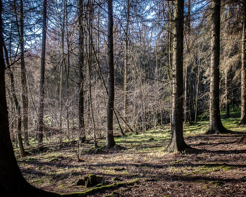
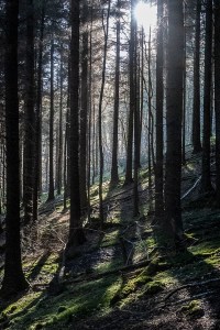
However as the light is coming through the trees, these images seem less mysterious than images such as this, where we are looking into the darkness of the forest.
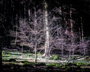
Woodlands Valley Plantation 01
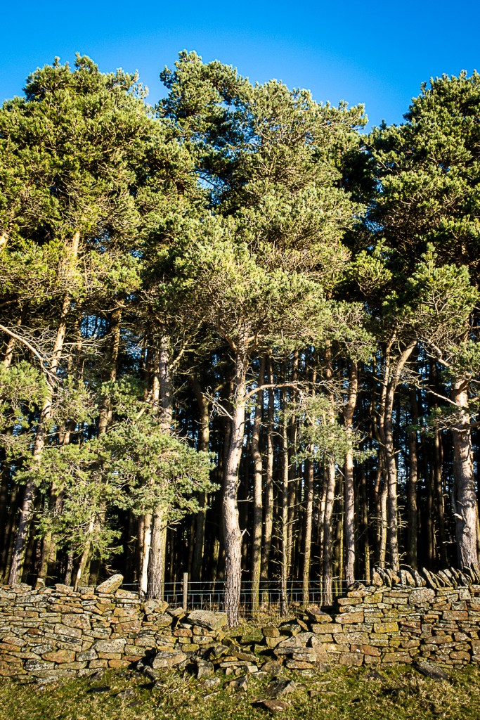
Woodlands Valley Plantation 03
References
References to the works cited in this post are found in my separate post “References”
“Make a Google Images search for ‘landscape’, ‘portrait’, or any ordinary subject such as ‘apple’ or ‘sunset’. Add a screengrab of a representative page to your learning log and note down the similarities you find between the images.
Now take a number of your own photographs of the same subject, paying special attention to the ‘Creativity’ criteria at the end of Part One…
Add a final image to your learning log, together with a selection of preparatory shots. In your notes describe how your photograph or representation differs from your Google Images source images of the same subject.”
The course notes for this exercise indicate that one of the aims of this exercise is to demonstrate a personal response and willingness to experiment. The example subject discussed is different approaches to photographing Mount Fuji.
I have looked at the portfolio, “Mount Fuji” by Chris Steele-Perkins. He comments on the portfolio that:
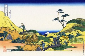
“The work considers the place of Mount Fuji, the iconic symbol of Japan, in our modern times, and references the works of the great Japanese artists, Hokusai Katsushika and Utagawa Hiroshige, whose series of woodblocks, 36 Views of Mount Fuji, were a record and commentary on Mt Fuji in relation to the society of their times; the early to mid 1800′s. The images were constructed in a way that Fuji was ever-present, ‘observing’ the landscape and society around it, a discipline I have continued.”
This idea of Fuji “observing” in an ever present way is apparent in Hokusai’s image “Below Meguro”. When seen against this image by Hokusai, Steele-Perkins’ image “Preparing Rice Fields near Gotemba” makes complete sense with the present day farmers going about their business, not paying attention to the iconic mountain in the background, in the same way as the farmers in Hokusai’s print.
Preparing Rice Fields near Gotemba; C Steele-Perkins
Below Meguro; 36 Views of Mount Fuji, Hokusai
The notes also refer to the approach by John Davies in his series “Fuji City”. My reading about the work of Davies indicates that a substantial body of his work has involved documenting the industrial and post-industrial landscape of Britain. Against this background, his series Fuji City, begins to have a different meaning, in which again Mt Fuji, is a backdrop to the industrial landscape.
Davies is quoted on his website as being “not so much interested in entertaining an audience or providing vehicles for escape but in delivering a highly crafted detailed image conveying a sense of reality. A reality that shares a recognition of aspects of urban living. But importantly, making images of a landscape that attempts to question our acceptance and perception of the inevitable consequences of living in a post imperialist society and within a post industrial landscape”.
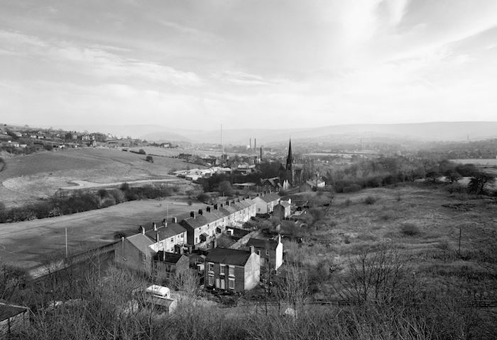
In his series “Green and Pleasant Land”, Davies made images of the landscapes in the immediate vicinity of my home and of locations which I have photographed. This includes this image of Dinting Vale, taken close to my house, from the viaduct I photographed in this image.
Dinting Vale, John Davies
I thought that Davies’ images in this series are documentary in their representation of the industrial and urban landscape. They are depictions of the landscape, and as such differ from the depiction of the human experience of living in these environments such as those I have shown in this blog from photographers such as Don McCullin and Ian MacDonald.
My Approach to the Brief
I have chosen “Peak District Landscapes” as my broad category for this exercise.
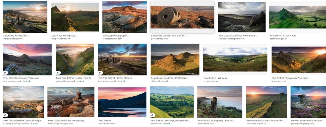
A Google search for images using this term results in these images and many similar.
Sample images from Google search for “Peak District Landscapes”
These images all show a very rural image, generally without any buildings, or, if they are present, exclusively farm buildings. The landscape is of the moorland, with vibrant colours of the vegetation. Almost all the images include examples of the gritstone outcrops which are common and a hallmark of this landscape. That rocky outcrop, may be replaced in the image by millstones, produced from that millstone grit.
These images to me seem to be created with the intention of “entertaining an audience or providing vehicles for escape”(Davies, s.d.) In terms of what I have so far understood about aesthetic codes, all these images appear to represent pictorialism. The lighting is dramatic and the colours intense. While they capture some aspects of the rural Peak District, to me they only show one aspect.
The Peak District has been a managed landscape for hundreds of years. The land has supported agriculture and mining, and in the last couple of centuries, grouse shooting. Since the industrial revolution, the moorlands of the High Peak have been very close to large centres of population and industry. Perhaps because of this latter point, it has been the site of high profile events to gain better access to open spaces, away from the industrial cities. In particular the Kinder Mass Trespass, is generally considered to have been the first of a series of actions leading to the foundation of the UK National Parks and the Countryside and Rights of Way Act of 2000 (Wikipedia contributors, 2020).
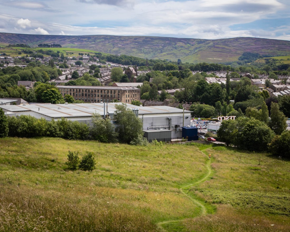
My approach to this exercise is to try and show the Peak District landscape from the perspective of those living in the industrial centres who would aspire to spend time on the adjacent moorlands.
I have tried to create landscape style images. Rather than have the moors used as a backdrop, “ever-present, ‘observing’ the landscape and society around (them)” (Chris Steele-Perkins; Mount Fuji, s.d.), I wanted to create an image more like the industrial landscapes of John Davies.
Method
I have used a digital SLR for these images, but also used a medium format film camera to capture the similar scenes in monochrome with film. Those images will be the subject of a later post.
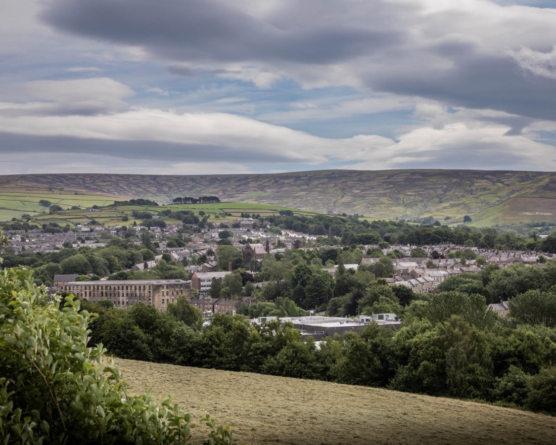
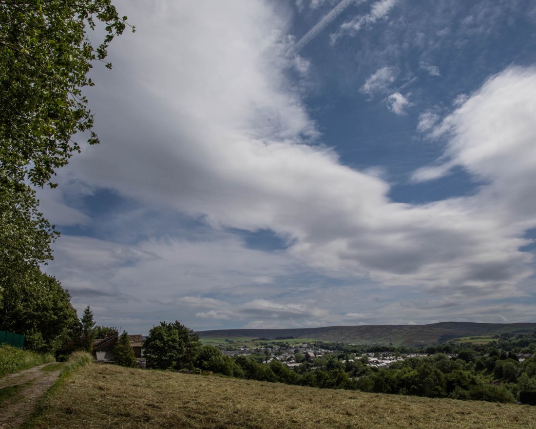
From these I have selected these which I think show how the moors encircle the now post-industrial town. As such they perhaps do not encapsulate the contrast between the working environment and the rural open space.
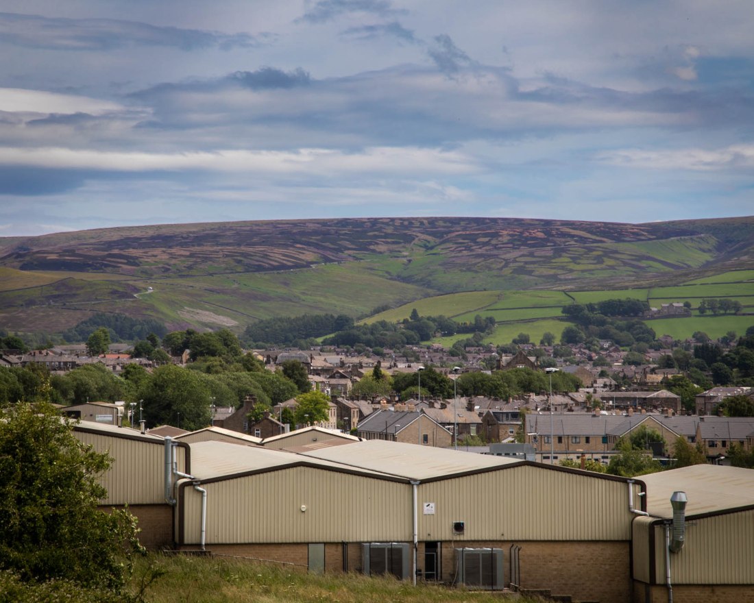
Closer to that aim are these with modern industrial units in the foreground.
2020-06-22 Glossop#252020-06-22 Glossop#24
Overall I think the images go some way to what I was aiming for. However, in retrospect it may have been more effective to have gone into the town and had the moors in the distance, more like Steele-Perkins has positioned Fuji in his images. However the images do share a style and expansive viewpoint in common with the images of “Peak District Landscapes” I found on the Google search.
References
References to the works cited in this post are found in my separate post “References”
I conducted a second shoot using the same equipment and set-up as Shoot 1, with the intention of exploring the effect of colour a little more. I used two speedlights at angles either side of the object, and modified the colour of each with green, red, yellow and blue gels.
The change to the settings I made for these images was to set the camera to custom white balance and adjust that for an image of white card illuminated by both flashes. (The card can be seen in the contacts. The contacts for the shoot are at:
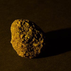
With the custom white balance set, the object illuminated by two flashes without gels shows its “natural” colours.
Ex 4.3 #204
I attempted to mix a white light with a blue and yellow light, using a yellow gel on one, and a blue gel on the other.
Separately these lights give this effect:
Ex 4.3 #208
Ex 4.3 #209
And together, there is a blue shadow to the right, and yellow shadow to the left. The central part of the object, where the lights overlap, is not quite as when shot is a white light, but is more like that than either alone.
Ex 4.3 #211
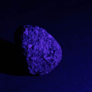
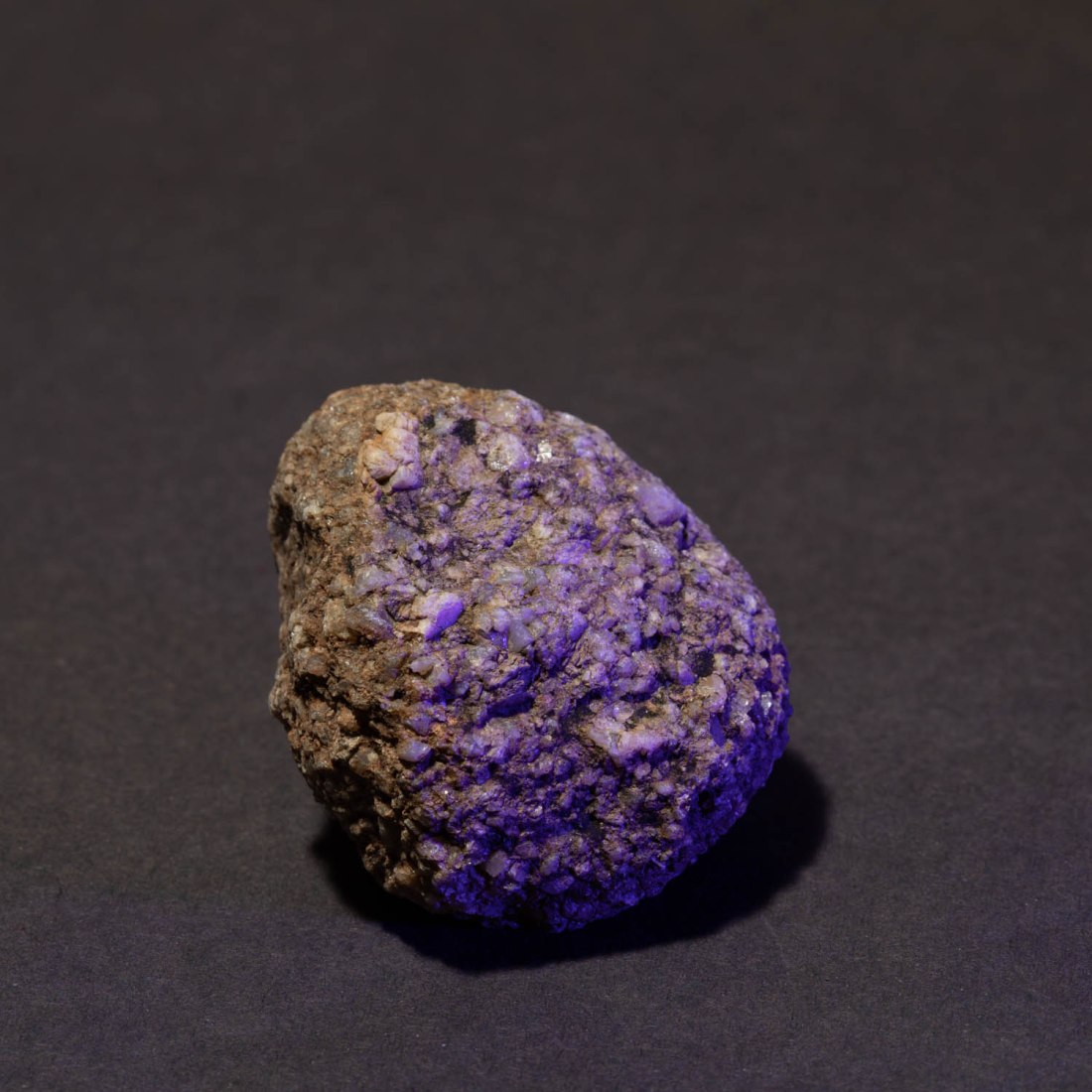
The other image which I think is worth reproducing here is a similar arrangement with green and red light. The contrast between the colours here emphasises the texture of the stone and to me, does add a further dimension to characterising the roughness and granularity.
Ex 4.3 #229
Next steps
Having read the notes for the course and for the later exercises, I am aware that Exercise 5.2 – “Homage” requires me to “Select an image by any photographer of your choice and take a photograph in response to it”.
I have already described the image “Pepper No 30” by Edward Weston found the lighting in this very unusual, rendering the pepper an abstract aspect.
Pepper No. 30, Edward Weston (1930)
I have used the set I have built and the lighting arrangements to photograph a series of peppers in response to Weston’s image and will develop these to form the basis of my images for exercise 5.2.
“Use a combination of quality, contrast, direction and colour to light an object in order to reveal its form. …
The important thing is to aim for four or five unique shots – either change the viewpoint, the subject or the lighting for each shot.
Add the sequence to your learning log. Draw a simple lighting diagram for each of your shots showing the position of the camera, the subject and the direction of the key light and fill.”
Methods
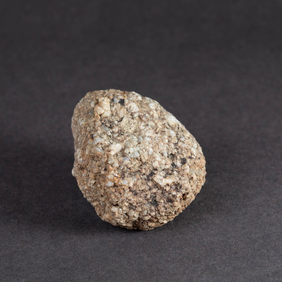
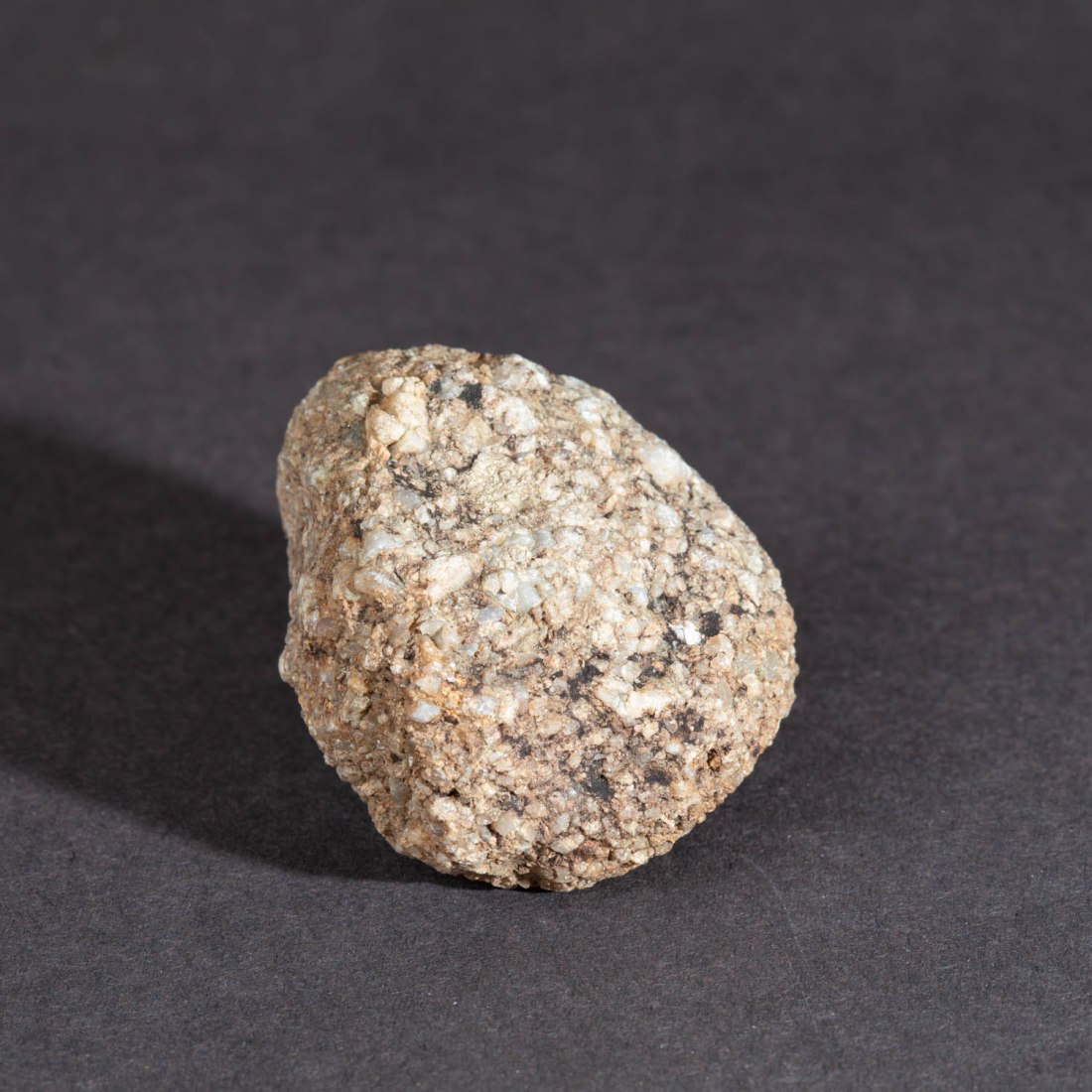
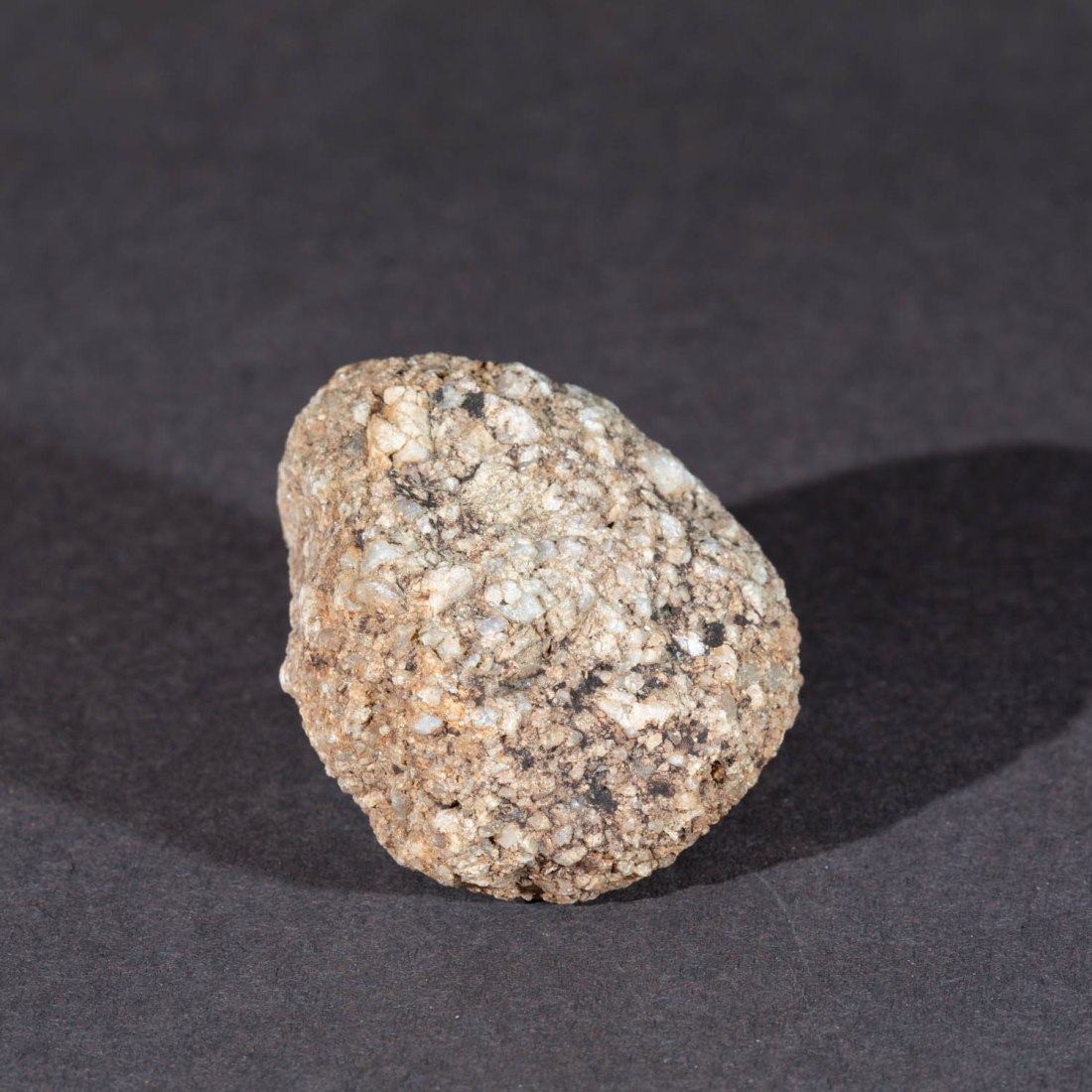
Object:
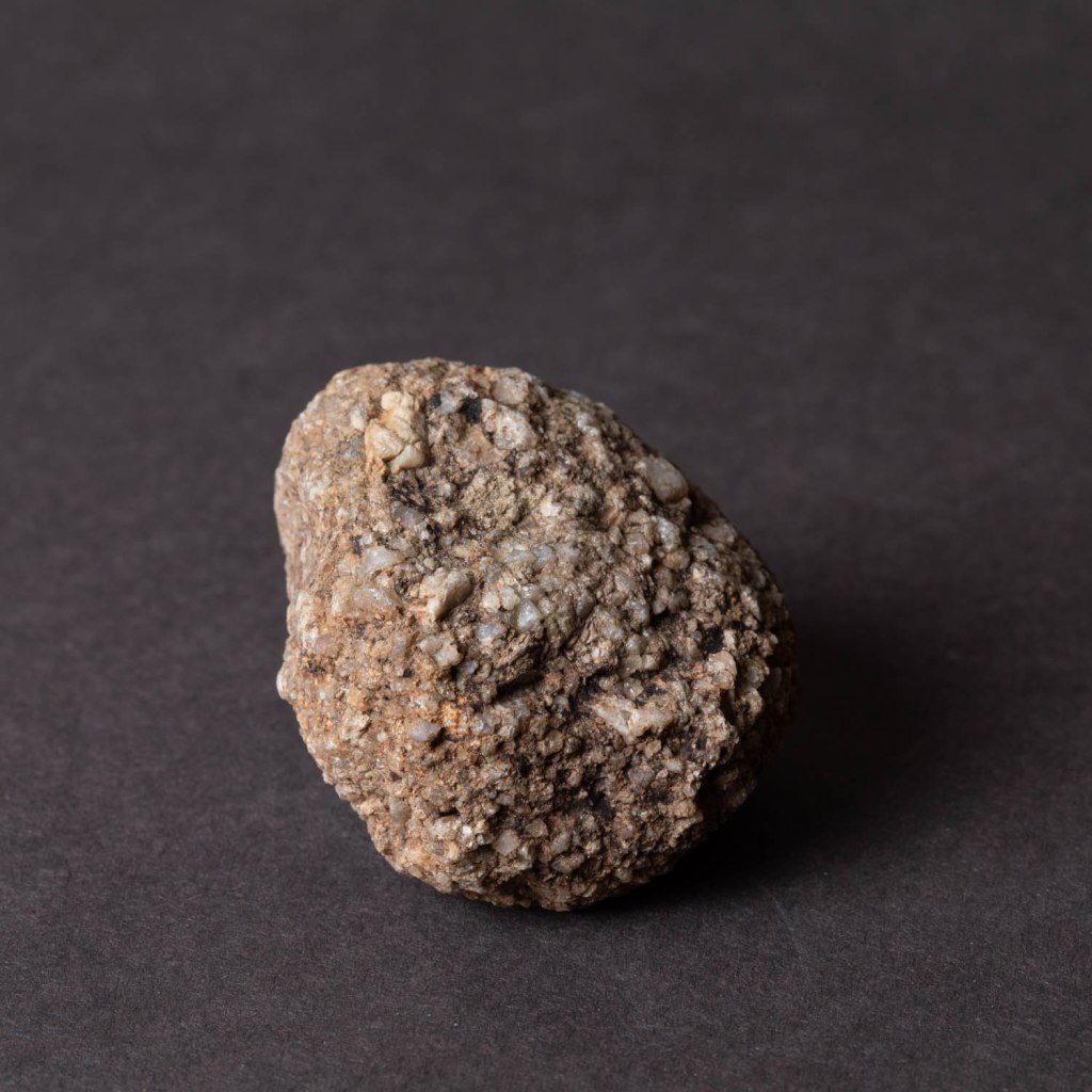
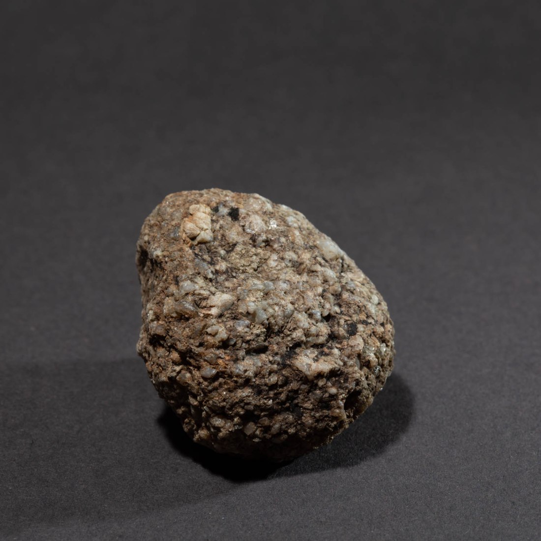
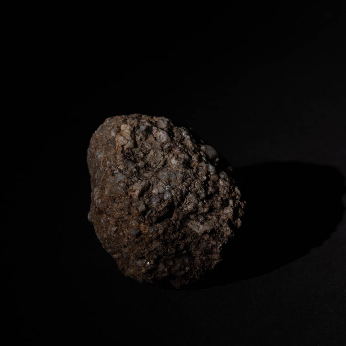
The object I chose to photograph was a rounded stone, about 120mm along its longest dimension. This stone is from a stream bed on the hills locally and is of the local gritstone. I chose this as the coarse texture of the stone has significance in its previous use for making mill-stones (“Millstone Grit”). In addition the gritstone edges of this area of the Pennines was the site of origin of an expansion in rock-climbing in the UK in the 1950’s. The texture of the rock led to particular style and techniques. It is this texture which I hope to explore in the images.
Equipment
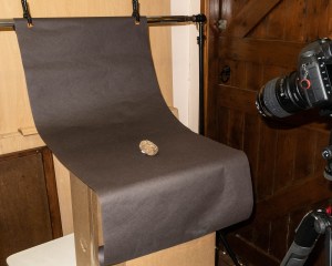
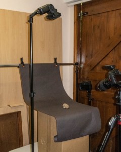
Set: I began by creating a set on which to photograph my object. I have used a background of dark grey paper with a curve to manage the “horizon line” as suggested in the course notes. The positioning of the set allowed me to arrange the lighting around the object. As shown in these images.
Ex 4.3 Studio set 1
Ex 4-3 Studio set – lighting example
Camera etc:
Camera – Canon EOS 5D Mk4
Lens – 100mm macro
Flash – 2 x Nissin Speedlights with radio control and various modifiers including softboxes (700mmx700mm and 200mmx150mm)
Settings:
Manual setting for camera in all shots
Manual control of flash for all shots
ISO 100
Auto white balance for the first series (altered later to custom white balance)
Post-processing
Images were shot in RAW and processed in Lightroom. The only manipulation was cropping to a square format.
Technique
The technique adopted is to have a camera setting which results in a black image by the ambient light, without flash. In this way I can then increase the intensity of the flash to create the image and have complete control of the light sources producing the image.
The first series of images I took were all with one camera position with a lens to object distance 400mm
To try and create a very soft light from large light sources, I used two flashes at either side of the object both fitted with softboxes. The following is from my notebook made at the time:
This resulted in an image in which the visible part of the stone is almost uniformly illuminated. The coarse texture of the stone is apparent only because of the alteration in colouration. The overall shape of the stone is not apparent as there is very little shading of any part of it.
Ex 4.3 #22
Removing the softbox from the flash to the right of the object (as viewed from the camera position) results in a stronger shadow to the left side and the left side of the stone is now in shadow.
However the right side of the stone lacks more detail and seems harshly lit.
Ex 4.3 #25
Removing both soft boxes now causes the object to cast a hard shadow with well demarcated edges on the background to both sides.
Ex 4.3 #27
When only one light without softbox is used to the left of the object a hard deep shadow is cast to the right. This hard shadow is also seen on the surface of the object, throwing the granulations into stark contrast. (Image 30). With the same position of lighting and adding the large softbox, the sharpness of these shadows is reduced (Image 28) and detail in the shaded side of the stone can be seen.
Ex 4.3 #30
Ex 4.3 #28
Direction
Putting one of the lights directly over the object causes a different appearance, with the main shadow falling below the object and the granulations of the surface being less clearly defined.
Ex 4.3 #45
The light was directed to a restricted area of the subject and this enhanced the demarcation from the background.
Ex 4.3 #35
Colour
In all these images I have set the white balance to “Auto White Balance”. I made a few images putting coloured gels in front of the flash, but realised this may be a mistake, as the white balance setting will aim to correct a colour cast and adjust the entire image to an average as if illuminated by white light.
I will repeat this exercise with a custom white balance.
However, the images I did create just show a colour cast to the object – although adding a magenta gel to the flash to the right, does create a colour contrast between the sides of the object.
Ex 4.3 #50
While this is an interesting effect, I am not sure it adds anything to my understanding of the stone.
This project is about the use of studio lighting and the course notes refer to four aspects of lighting under the control of the photographer:
Quality
Contrast
Direction
Colour
The notes elaborate on some of this.
Quality
“at its most basic it can be described as the simple distinction between hard and soft light”
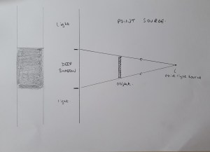
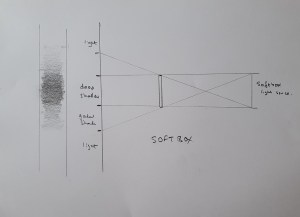
This is defined as whether the light casts hard or soft shadows, and in turn is controlled by the size of the light source relative to the subject.
I have thought a little about this and the diagrams below help me understand how this is. A small point light source is hidden from a large area behind the object – the shadow and the margins of the shadow are well demarcated. However a large light source, like a softbox casts a light across its entire length. Thus there will be an area of the shadow which is illuminated by increasingly greater amount of the light source, and the edge of the shadow area is therefore diffuse.
Point light source
Softbox illumination
The notes refer me to the work of Jean-Baptiste Huynh. On his website (Jean Baptiste Huynh – Site officiel, s.d.) are examples of images created in the studio, illuminated by soft lighting. He has applied this technique to a range of subjects – plants, insects, parts of the body, nudes and portraiture. He also uses colour and monochrome for this.
In my reading about studio lighting for still life, I used a recommended textbook (Diprose and Robins, 2012), which in turn referred me to the work of Edward Weston and in particular his image Pepper No. 30. This image was apparently lit by placing it in a metal funnel, ((Weston and Newhall, 1961) as cited in (Wikipedia contributors, 2019)). It is this technique which results in the characteristic lighting effect.
Pepper No. 30, Edward Weston (1930)
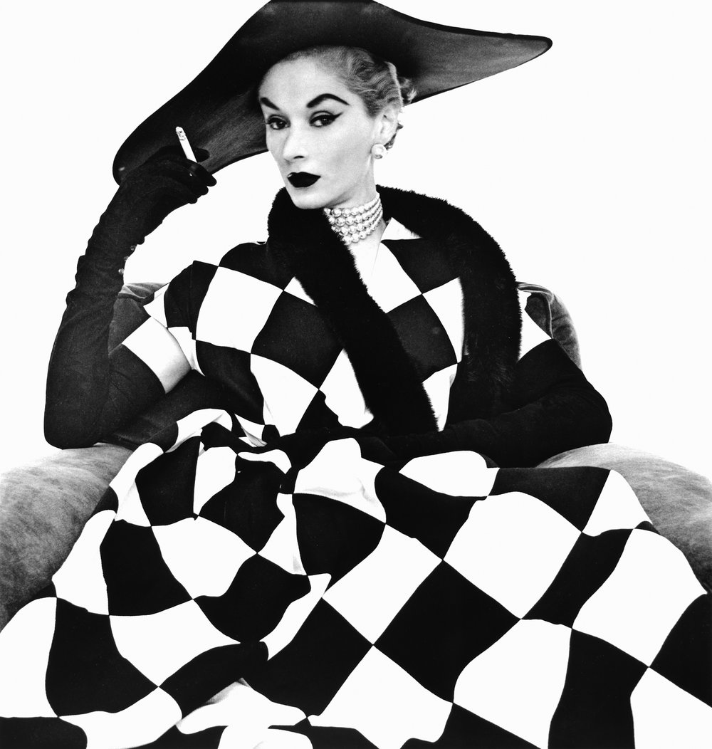
The other artist referred to in the course notes is Irving Penn. The notes refer to his work illuminated by the light of a skylight only. Briefly researching his work I have learned that he was noted as one of Vogue magazine’s top photographers. His biography on website of The Irving Penn Foundation (The Irving Penn Foundation, s.d.) indicates that he developed a preference for “photographing in the controlled environment of a studio” although this was not for the management of the lighting but “where he could trim away anything that was not essential to his compositions and hone in on his subjects”.
That website also refers to him in 1950 photographing the haute couture collections in Paris for Vogue. Then he “worked in a daylight studio with an old theater curtain as a backdrop”. One of the images from that time is this one, presumably shot by daylight.
Harlequin dress (Model Lisa Fonssagrives); Irving Penn 1950
However I note that the model’s face is very evenly lit, in spite of being under the brim of a large hat. Creating an even lighting in those conditions with a light source from one direction presumably has required the use of extensive reflectors.
The other aspects of the lighting the notes suggest I consider are
Contrast
This is the difference in illumination between the shadows and highlights and depends on variable lighting to illuminate the shadows.
Direction
The direction of the light determines the direction of the shadows and this can significantly alter the appearance of the subject.
Colour
The colour of the light can be altered – either directly or by the use of coloured reflectors. I have previously referred to a workshop I did on the use of speedlights for studio lighting. In this I used coloured light sources to alter the background for the subject. This is an example.
Speedlight Workshop #138
My plan for the next exercise is to build on that workshop and do the exercise with speedlight flashes, reflectors and coloured gels. In this way I should be able to alter the four parameters suggested.
References
References to the works cited in this post are found in my separate post “References”
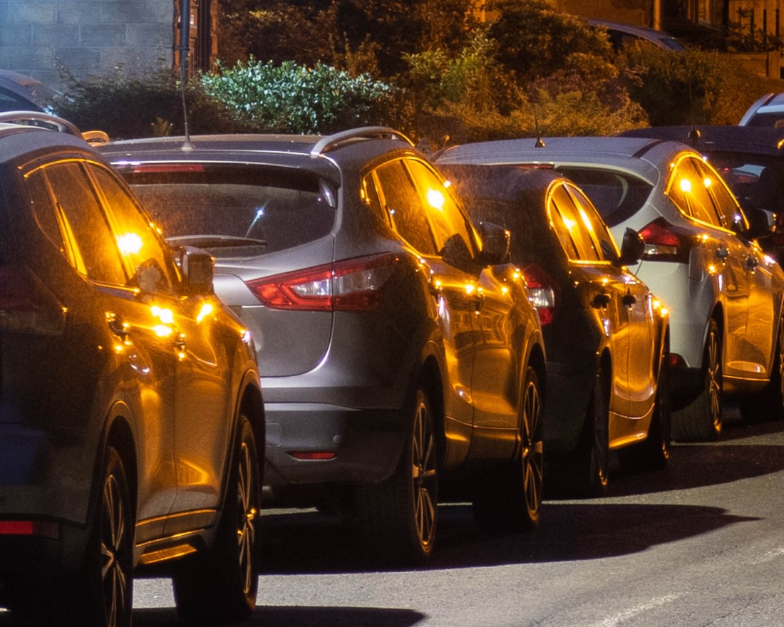
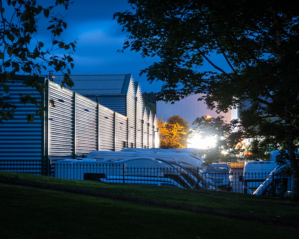
I would like to try and capture more of the interaction between the light and water, as I have highlighted previously. In a similar way, the reflection of lights from different surfaces creates interesting patterns, unique to the night time. Detail from this image shows the sort of effect that I would like to explore further in another shoot.
2020-06-03 OCA Ex4.2 #31
The reflections of the street lights in different colours on the parked cars gives an almost abstract feel to this.
2020-06-03 OCA Ex4.2 #31 (detail)
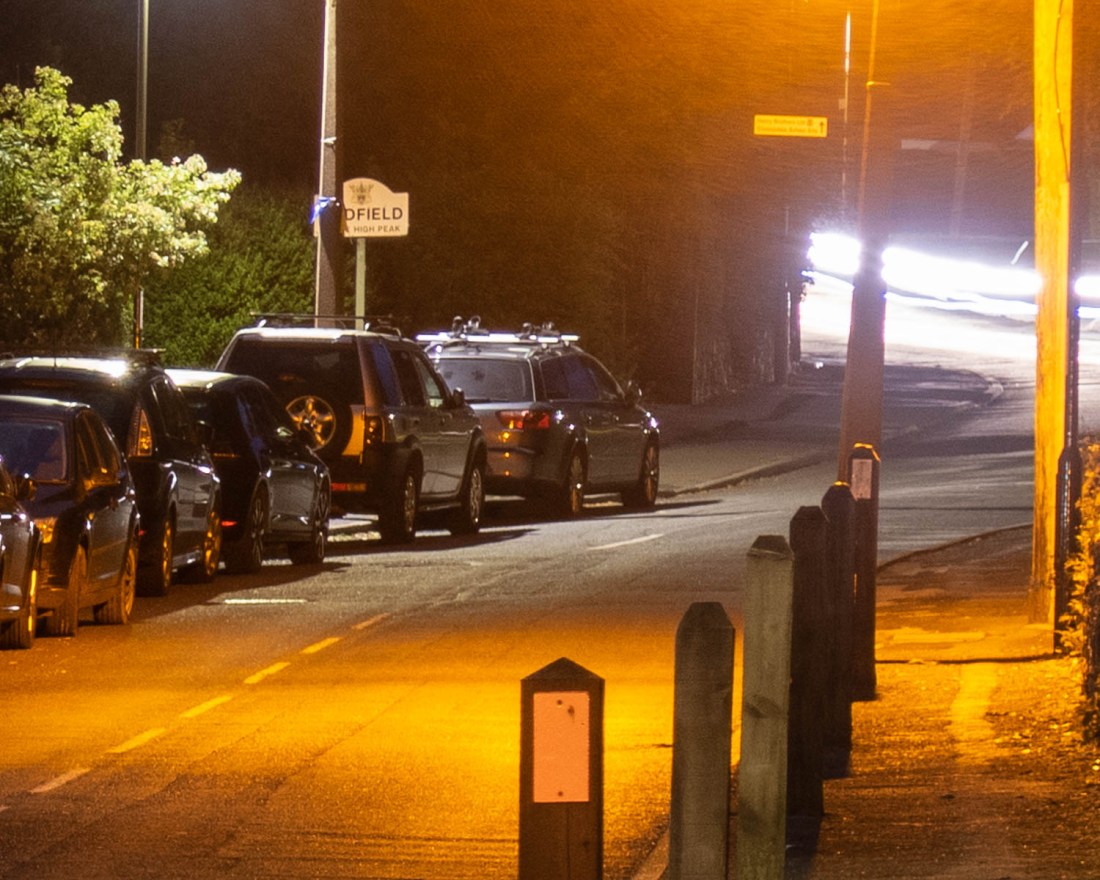
The pools of different types of light on the ground here make patterns which could be the subject for further exploration.
2020-06-03 OCA Ex4.2 #31 (detail)
These effects are reminiscent of the images of London in Rut Blees Luxemburg’s “Liebeslied: My Suicides” (Luxemberg and Duttman, 2000). It is this type of image I would like to develop more in future shoots.
“Capture ‘the beauty of artificial light’ in a short sequence of shots (‘beauty’ is, of course, a subjective term). The correct white balance setting will be important; this can get tricky – but interesting – if there are mixed light sources of different colour temperatures in the same shot. You can shoot indoors or outside and the light can be ambient or handheld flash.
Add the sequence to your learning log. In your notes try to describe the difference in the quality of light from the daylight shots in Exercise 4.1.”
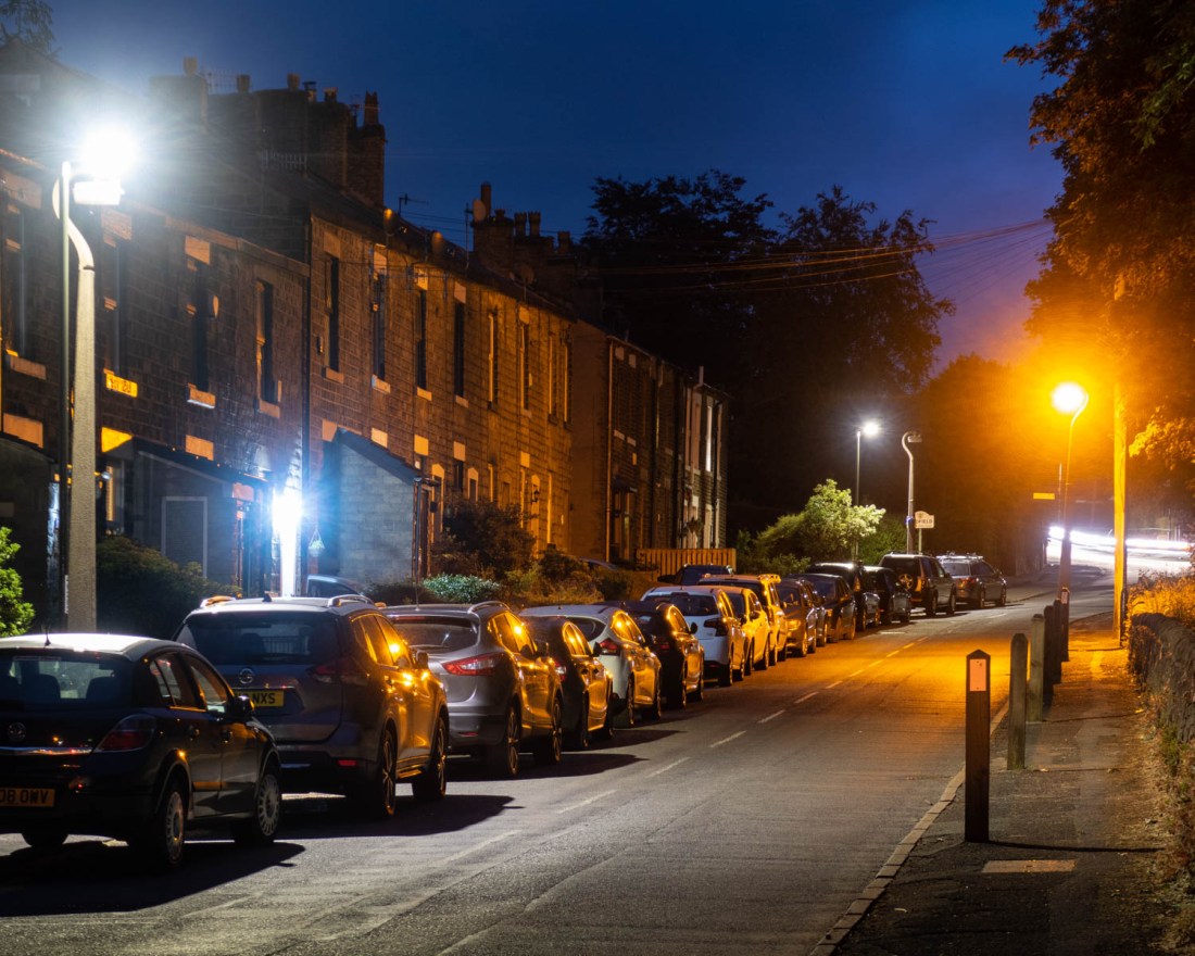
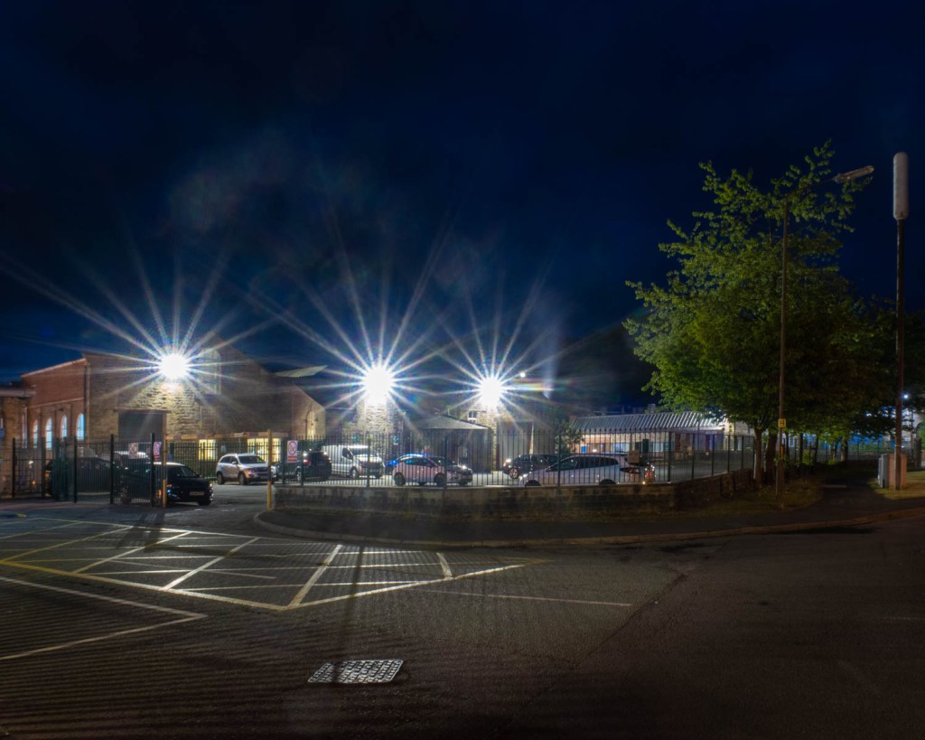
I approached this exercise by taking an evening walk close to my house to make some images of scenes familiar to me, but illuminated by the street lights. In this way I was trying to see how the resulting images differed from those I might have expected when made in the daylight.
My objective here was not to create “definitive” final images, but to gain a better understanding of the technical aspects of photographing in these conditions and to examine those elements of the final images which might be used to produce a series which do indeed capture the “beauty of artificial light”.
As I wanted to explore a range of locations, and used lightweight equipment for this reason. I used a Canon Powershot G7x Mkii for these images rather than my DSLR. It still enables me to use manual, as well as aperture and speed priority shooting modes and for this exercise I used manual mode. I made the images between 2100h and 2300h GMT when sunset was at 2029h.
I used manual shooting mode with a setting of “auto white balance” for all the images. Post-processing of the images is confined to modest cropping to a 4×5 aspect ratio (chosen because I have been using 10×8 printing paper for my film work and wanted a degree of consistency with this). There are also local exposure adjustments but no alteration in the white balance or other colour adjustments.
Initially I used the camera hand-held with a fast ISO. This image shows considerable grain so at subsequent locations I used much longer exposures on a tripod.
2020-06-03 OCA Ex4.2 #6 ISO6400, f/4.0 1/60sec
In most of the images the sky is not totally black and in this it almost looks like daylight. However, the major difference in this image is the direction of the lighting, rather than any other quality of the light.
2020-06-03 OCA Ex4.2 #13 ISO125, f/11 30.0sec
Where there are many light sources, this effect is more striking and the differences in the colour of the lights adds a difference in the mood and atmosphere of the scene.
2020-06-03 OCA Ex4.2 #16
ISO125, f/11 4.0sec
2020-06-03 OCA Ex4.2 #24
ISO125, f/5.0 15.0sec
2020-06-03 OCA Ex4.2 #27
ISO125, f/5.0 15.0sec
2020-06-03 OCA Ex4.2 #28
ISO125, f/11 15.0sec
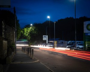
The long exposures used enabled the incorporation of the moving lights of vehicles, even though the vehicle itself does not appear in the image. This adds a different quality to the image, and an effect I think I might develop more in the future. I do not think that in these images this effect adds much.
2020-06-03 OCA Ex4.2 #22
ISO125, f/7.1 4.0sec
2020-06-03 OCA Ex4.2 #35
ISO125, f/4.0 15.0sec
2020-06-03 OCA Ex4.2 #36
ISO125, f/4.0 15.0sec
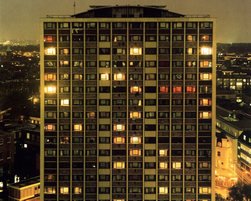
The camera makes it very obvious that different types of street light have very different colour qualities, and this golden effect is reminiscent of that in the images of Rut Blees Luxemburg. The reflections of the lights from parked vehicles and pools of light and dark give these images a mystery and I think show a type of beauty of which we are not normally aware.
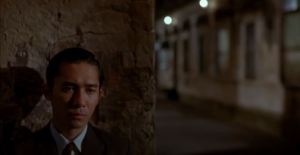
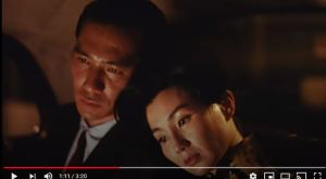
The course notes for this section attribute the phrase “the beauty of artificial light” to the cinematographer, Christopher Doyle who the notes say, “recommended studying the ‘beauty of artificial light’ on people’s faces.” I was unable to find the source for this quotation, but did look at his film, “In the Mood for Love” (Dir Wong Kar Wei, 2000). This film set in Hong Kong, is shot almost entirely in artificial light, either in-doors or at night. Indeed, the lighting of the faces is very atmospheric, and conveys some of the emotional content of the scenes. Such as these stills which I selected
The Mood For Love – Capture 1
The Mood For Love – Capture 2
The Mood For Love – Capture 3
The Mood For Love – Capture 4
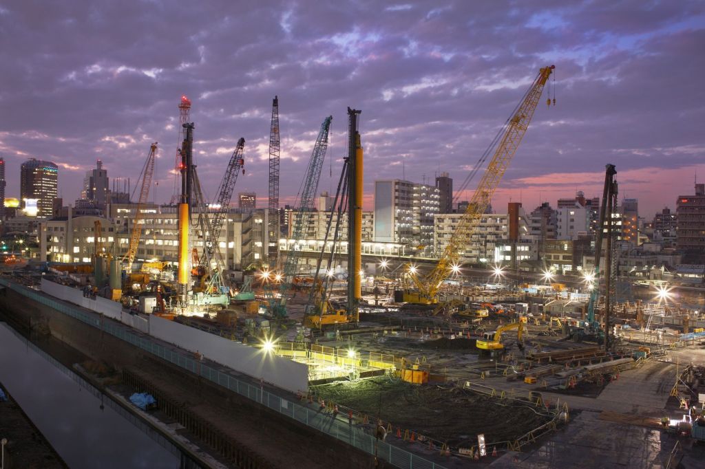
The course notes direct me towards examining the work of Sato Shintaro, and his series “Night Lights”.
Night Lights 29, Sato Shintaro
These are a series of images of the Tokyo streets, illuminated by neon signs. The images are all bright and colourful, even though shot at night.
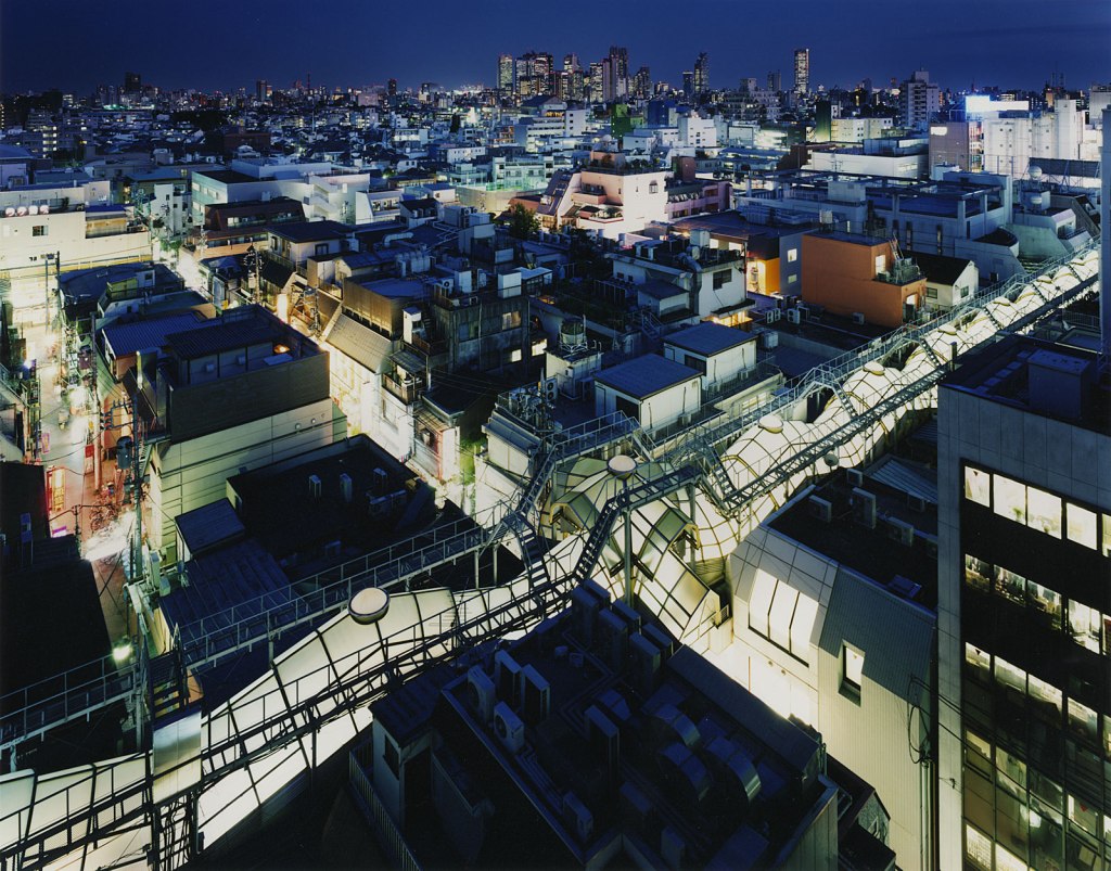
Shintaro also has made images of Tokyo lit by a combination of artificial light and the dawn or dusk light of the sky, in his series, “Risen in the East” and “Tokyo Twilight Zone”. Such as:
Risen in the East – Tokyo Dec 10 2008, Sato Shintaro
Tokyo Twilight Zone – Tokyo 2006, Sato Shintaro
Personally I found a greater resonance with these images as I think they show a greater degree of subtlety in the colouration and depiction of the city. However I recognise that the vibrant bright primary colours of the neon street signs serve to depict a vibrancy of the city itself.
The images of neon signs in Tokyo may soon be a thing of the past, as reports about Hong Kong suggest (Fernández, 2018). Like Tokyo, Hong Kong has had a proliferation of neon signs, but regulations have made it more and more difficult for these to remain and they are being replaced by LED lights.
A point which I did not highlight in my record of my research for the last exercise, “Daylight”, is that as well as emphasing the importance of “the quality of the air and light (as being)…so layered, complex, and mysterious”, Sally Mann also refers to “the refulgence or the reflection when light and water interact” (Rong and Mann, 2013). This is also the case with artificial light.
Rut Blees Luxemburg has made many images of London at night, all lit with artificial light from street and other lighting.
A Modern Project, 1996; Rut Blees Luxemburg
Towering Inferno, 1995; Rut Blees Luxemburg
However in her series “Liebeslied: My Suicides” (Luxemberg and Duttman, 2000) she also examines the interaction between the light and water. “From rain collecting in gutters, to overspill from the Thames, water exists as an emblem of this throughout.” (Abel-Hirsch, 2018).
A Girl From Elsewhere, 2000; Rut Blees Luxemberg
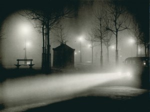
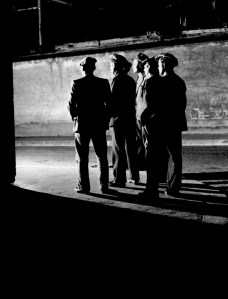
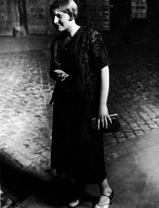
The course notes refer to the work of Brassai , and in particular his book “Paris by Night”. While many of the images in this record the life of the city at night and its inhabitants such as these.
From Paris Nuit, Brassaï
From Paris Nuit, Brassaï
From Paris Nuit, Brassaï
From Paris Nuit, Brassaï
There are others which also look at the almost abstract images created by the reflection of light on wet surfaces, in a manner developed many years later by Rut Blees Luxemberg.
Open Gutter, From Paris Nuit, Brassaï
References
References to the works cited in this post are found in my separate post “References”
‘Layered, complex and mysterious…’ is a quote from American photographer Sally Mann from an interview for Chinese Photography magazine in 2010, and reproduced on American Suburb X website (Rong and Mann, 2013). In this interview Mann describes how she perceives the difference between the quality of the light in the Southern states of the USA, as compared to the “North”. I interpreted her use of the term “North” here to refer to the northern states rather than the far north and high latitudes of the Arctic regions.
In this interview Mann emphasises her aims as being “less interested in the facts of a picture than in the feelings” and that “the facts don’t have to be absolutely sharp. I can get information across by appealing to viewer’s emotions.” (Rong and Mann, 2013)
The mysterious feeling she achieves in some of her work seems to be exemplified by her images of “Southern Landscapes”, such as this image, Deep South 03.
Deep South 03, Sally Mann
In this monochrome image the composition is achieved with areas of light and deep darkness, the shadows suggesting mystery. However the light areas of the image are hazy and unclear suggesting a mist.
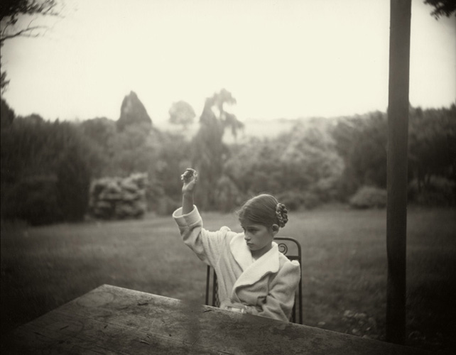
I would argue that she achieves a similar effect in some of the images in her series “Family Pictures”, such as this Family Pictures 12.
Family Pictures 12, Sally Mann
The background is similarly hazy and the light of the landscape diffuse. Whereas the subject is lit by a much more direct light on her hair.
However I also note from the extended biography on her website (Mann, 2020), that many of her black and white, have been created with photography’s antique technology. She has used an 8×10 bellows camera, and a variety of printing processes to produce pictures that “almost seem like hybrids of photography, painting, and sculpture”. In her 2010 interview she also says that “there is no coating on the lens of my old camera, which permits a much softer and more luminous light”.
It seems to me that Mann is achieving her objectives of communicating emotional and spiritual aspects of a subject by the use not only photographing with the optimal light for her intention but this is enhanced by the choice of equipment and techniques.
The course notes refer me to the work of Atget. The notes (p 83) cite Washington’s National Gallery of Art website as describing his late photographs, as:
“frequently marked by subjective light and deep shadows. Often made early in the morning, these pictures – such as Parc de Sceaux – use light and shadow to create a mood rather than to describe a place”
I was unable to find this description of his work on that website (Eugène Atget, 2020). I have, however, found other descriptions of his late work and his approach to lighting conditions which indicate this technique:
“Among the qualities that characterize Atget’s work are… a willingness to work in a wide variety of lighting conditions, even (especially during the last five years of his life) shooting almost directly into the sun, a practice that was religiously avoided by conventional photographers.”(Szarkowski, 2020)
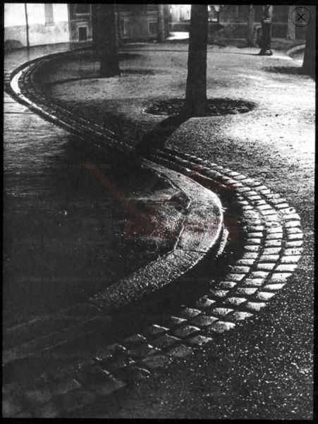
This is illustrated by this image, where shooting into the sun gives deep shadow behind the foreground tree.
Saint-Cloud, Eugène Atget
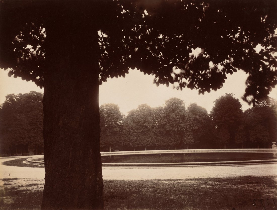
Other images of the parks have similar qualities to those I have shown above by Mann. Here the lighting also enhances a mood, rather than providing a documentary description of a scene as in Atget’s earlier work.
Parc de Sceaux 2, Eugène Atget
Parc de Sceaux 02, Eugène Atget
Like Mann, Atget used equipment and techniques which also enhanced that approach and added to the emotion and subtlety of the scene..
“Atget used a large view camera that held 7 x 9 inch glass negatives, standard when he began to photograph but antiquated by the end of his career, when smaller and more versatile cameras were available. He developed the negatives in his workroom and contact-printed them in sunlight on the roof of his apartment building. He usually printed on albumen papers, even well after most photographers had abandoned the process in favor of platinum and silver papers.” (Eugène Atget, 2020).
This is distinct from the approach of Michael Schmidt described in the course notes which quote from an interview with Schmidt in Camera Magazine #3, March, 1979. (Editorial @ ASX, 2010).
In the interview, Schmidt states his aims as “to achieve a maximum of objectivity and thus create a photograph which possesses credibility and authenticity as a document”.
Unlike Mann in particular, he sets out to create images such that “The viewer must allow the objects portrayed in the photograph to take their effect upon him without being distracted by shadows or other mood effects.”
He achieves this by photographing in a neutral diffused light. Furthermore he shoots in black and white.
“I prefer black and white photography because it guarantees the viewer a maximum amount of neutrality within the limits of the medium. It reduces and neutralizes the coloured world to a finely nuanced range of greys, thus precluding an individual way of seeing (personal colour tastes) by the viewer. This means that the viewer is able to form an objective opinion about the image from a neutral standpoint independent of his subjective colour perception. He is thus not emotionally distracted.” (Editorial @ ASX, 2010)
These principles are illustrated by images from his portfolio for the 2014 Pris Pictet, Lebensmittel (Michael Schmidt | Prix Pictet, 2013), such as this.
“Taking the photography of Mann, Atget or Schmidt or a photographer of your own choosing as your starting point, shoot a number of photographs exploring the quality of natural light. The exercise should be done in manual mode and the important thing is to observe the light, not just photograph it. In your learning log, and using the descriptions above as your starting point, try to describe the quality of the light in your photographs in your own words.”
In addition to the work of Mann, Atget and Schmidt, the course notes for this exercise also refer to a light with no mystery described by Brian Catling in the fantasy novel, The Vorrh (Catling, 2012)
‘The vulgar gate of the day gives no quarter and its insistent brightness will tell lies about all, forcing the subtlety back into the interiors of trees and the other side of the sky.’
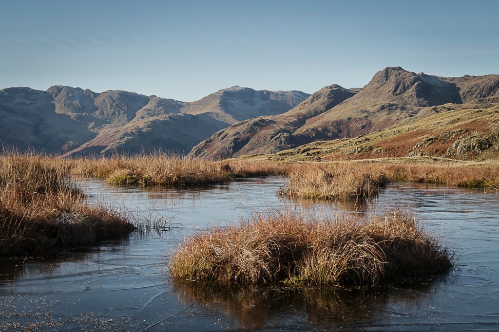
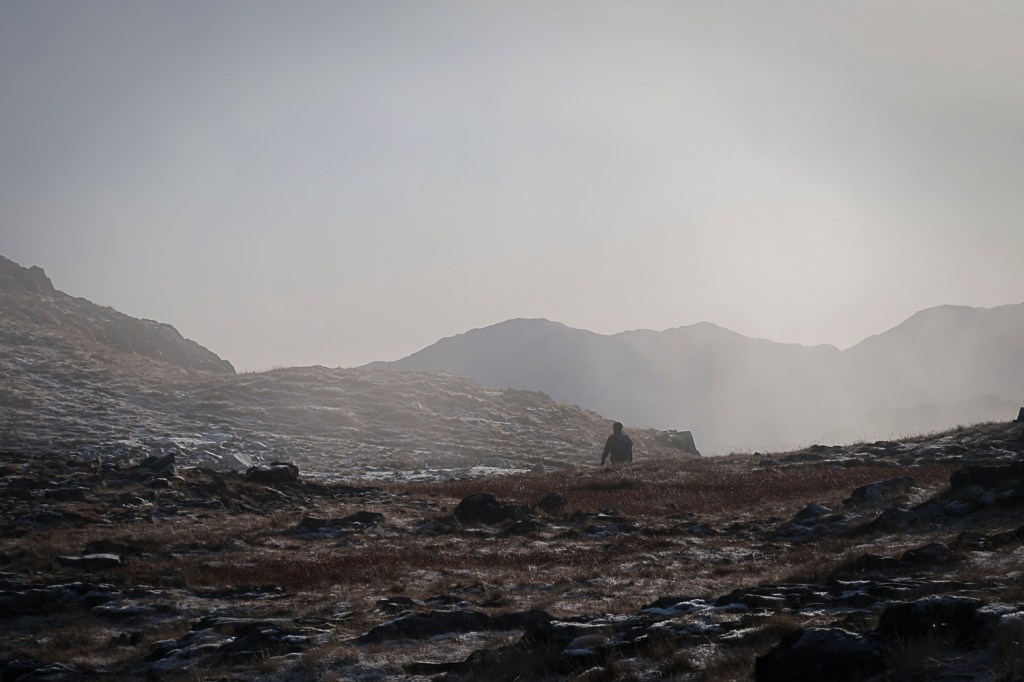
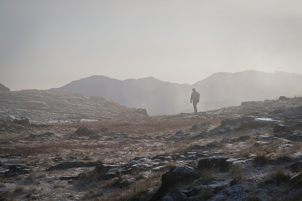
I have taken a series of images to address this exercise, all taken on hill walks in the Lake District and Peak District in winter. The contacts for these shoots are at
The light during the day on both these occasions was bright and the weather clear. As a result the light in many of the images has, to me, the characteristics of that light described by Catling. It is an “insistent brightness” and there is no subtlety in the image – nothing is hidden or mysterious about these images.
Wooler Knoll 01
Wooler Knoll 02
Langhow Tarns 01
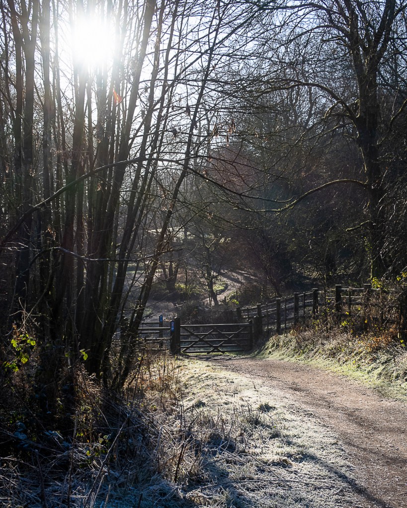
Woodlands Valley Plantation 01
The colours are bright and intense, and the shadows do not seem to hold any mystery.
Rendering this type of image into black and white enables a contrasting pattern to emerge and I like to think of this as similar to images made by Fay Godwin (whose work I have described elsewhere in the blog).
Langdale 02
Reedy Loch. Fay Godwin (NSMM 1994/5015/95)
However on the same days and in different settings a more subtle image can be found. Drawing on the technique of shooting into the sun used by Atget, more nuanced images can be achieved.
Langdale 01
Langdale 03
Derwent Valley Way 01
In these images the contrast is reduced and the colours muted – reducing the amount of information in the image. This in itself adds to the mystery of the image and allows the observer to add their own interpretations to the image.
Finally, I have a small series in plantations where the light is altered by being diffused through the trees. Here there is more mystery, reminiscent of the images by Mann.
Woodlands Valley Plantation 01
Woodlands Valley Plantation 02
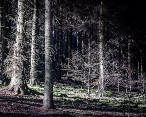
Woodlands Valley Plantation 03
Woodlands Valley Plantation 01
I note however that all the images I have produced here are on digital cameras and are sharp without the degradation of the image that the equipment and techniques used by Mann (and Atget) produces. I would argue that the atmosphere in their images is a combination of the use and representation of the light together with the loss of detail associated with their techniques.
References
References to the works cited in this post are found in my separate post “References”