My tutor commented on my use of vignetting to emphasise the central part of the image in some of my images for Exercise 4.4. I defended the use of this as I was trying to emulate the style of the landscape images from my Google search, rather than the content. He suggested I consider trying to produce “flat” images and cited the work of artists like the New Topographics and Fay Godwin, who showed landscape as the camera showed it, rather than manipulated.
Exercise 5.3 made me consider how we look at an image, our eye passing over all of it and returning to certain parts. Techniques such as vignetting and strong classical compositions (“rule of thirds” etc) can draw the eye to the centre of the image so strongly, we do not notice other parts of the image.
With these thoughts in mind, I considered the images I showed for Exercise 5.1. My final choices of the monochrome images. While these are coherent and I think quite striking, I was concerned they did not really show what I was trying to achieve.
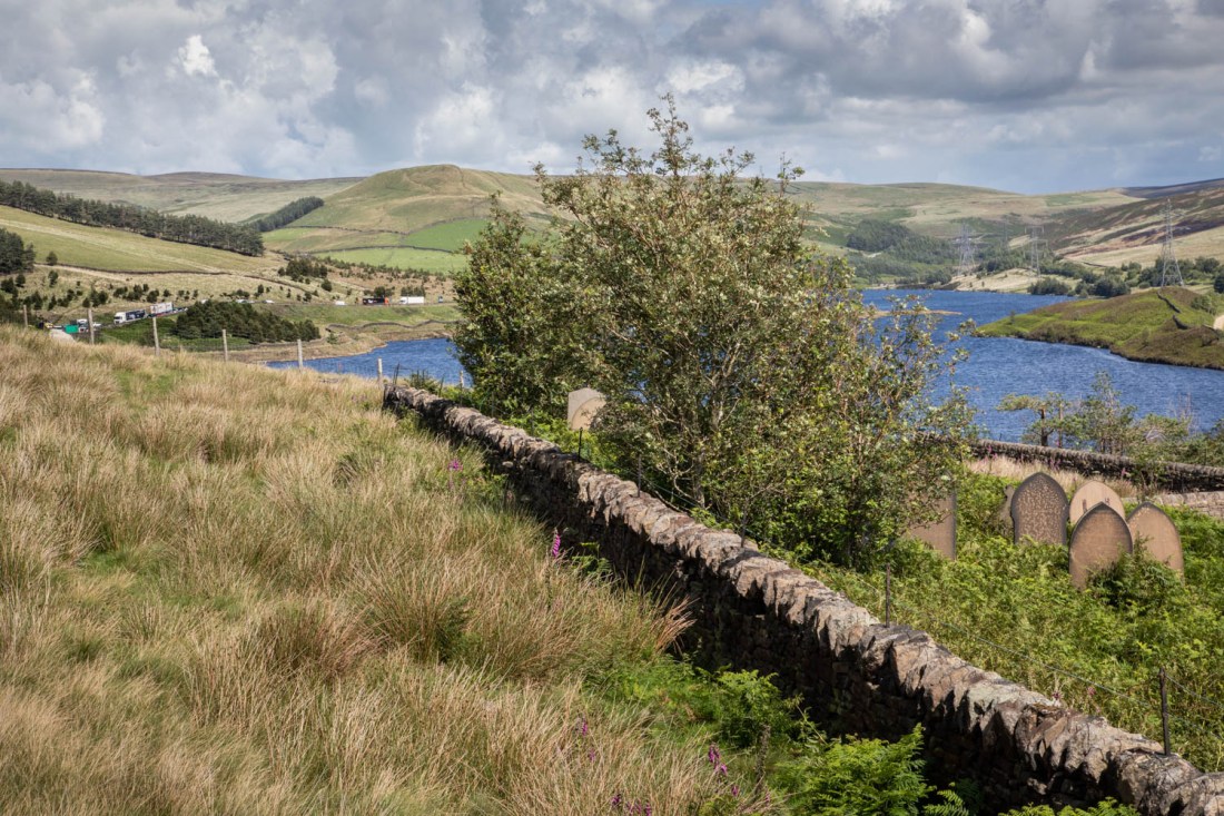
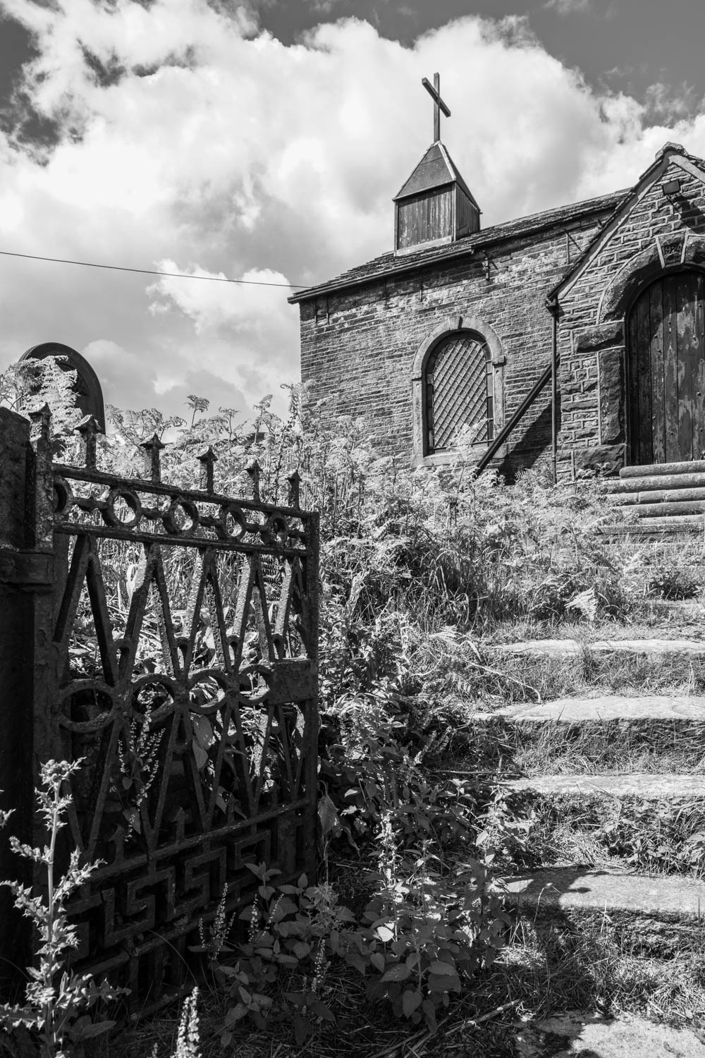
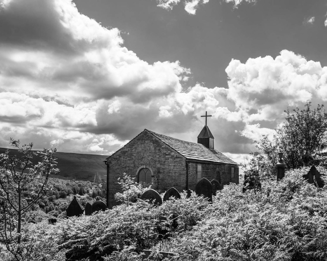
I have slightly altered the image with which I was less happy, Woodhead-18. I have adjusted slightly to remove darkening in the bottom left corner. I said I thought this too “fussy”. However having looked at it repeatedly, I think it is a better image than I initially thought.
Woodhead 18 (reworked)
The strong line of the wall provides a clear separation between the churchyard (albeit overgrown) and the field where the labourers were buried. The background has detail that makes the eye move around – the lorries to the left and the pylons carrying cables to the disused tunnels.
Overall this seems a more interesting image than the monochrome ones.
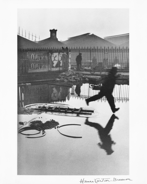
“Look again at Henri Cartier-Bresson’s photograph Behind the Gare Saint-Lazare in Part Three. Is there a single element in the image that you could say is the pivotal ‘point’ to which the eye returns again and again? What information does this ‘point’ contain?
Include a short response to Behind the Gare Saint-Lazare in your learning log…”
A Google search for images of “Henri Cartier-Bresson Behind the Gare Saint-Lazare” gives several results and they differ slightly in the shading and density of the reproduction of the shadows. While this may in part be a function of the reproduction of a print on a webpage, some of the variation may be due to the printing process as there are different dates given as to when the print was made.
Behind the Gare Saint-Lazare (1932) Henri Cartier-Bresson, Gelatin silver print, 17 1/2 × 12 in
This image is titled on the website as “Henri Cartier-Bresson, Behind the Gare Saint-Lazare (1932), Gelatin silver print, 17 1/2 × 12 in” and is I believe one of the older versions, and I assume truer to the original intention of HCB in making this image.
Is there a single element in the image that you could say is the pivotal ‘point’ to which the eye returns again and again?
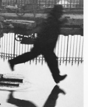
My eye is consistently drawn to the figure of the man striding into the puddle – his forward foot has not hit the water yet, but his posture indicates he is committed to his leap, as shown in this part of the image:
Behind the Gare St Lazare 1932 – detail
It is his unbalanced position that contains the key information of that “point” he is in motion, but the outcome of that is as yet unknown.
In my consideration of “The Decisive Moment”I referred to the concept of “peripeteia”, from the Greek meaning “dramatic moment”. Bate (Bate, 2016) described this as “the striding foot indicates a future event, caused by the past, whose outcome is anticipated by what we see in the picture.”
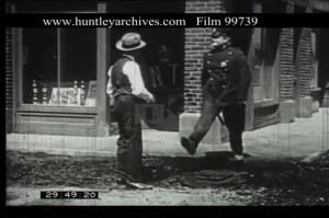
I think it is the uncertainty as to what might happen next which fascinates us (or at least me) and keeps drawing me back to that point. I would suggest that the story of a man stepping into a puddle is a classic image in the slapstick comedy of silent film and so widely known that we are aware of it almost subliminally. An example of this is in this clip of a Hal Roach comedy with Oliver Hardy cameo from the 1920s, a few years before HCB produced his image, (Hal Roach comedy clip with Oliver Hardy cameo in 1920s. | Huntley Film Archives, s.d.). I cannot upload video to this site but the relevant section of this is at
But these do not draw our eye and fascinate us as much as this one though. There are other elements of the image which I believe cause this.
The example of the image which I show above, has been printed in such a way as to emphasise the line of the railings behind the jumping man. The background buildings show a gradation of density from the top (darker) to behind the railings (lighter) and the line of the railings is more obvious and frame the man. Similarly the water is not featureless, but there are objects showing above it. These curves are then echoed by the ripples at the left end of the ladder from which he jumps, as seen here:
Behind the Gare St Lazare 1932 – detail
The water is, however, generally smooth and this enhances its mystery – how deep is it, there are no clues.
There is enough interest in the background that after a while our gaze is drawn to the posters, the other figure and the surface of the water. But these are not so intrusive as to detract from the foreground figure.
Overall I find the image itself fascinating, but more so is the way it was made. My experience of trying to complete “The Decisive Moment” using 35mm film cameras was to increase my admiration for both the technical aspects of this as well as the compositional aspects.
References
References to the works cited in this post are found in my separate post “References”
“Select an image by any photographer of your choice and take a photograph in response to it…
Add the original photograph together with your response to your learning log.”
The notes refer to an essay by Barrett, (Barrett, 1997) originally published in (Goldblatt and Brown, 1997). In this essay Barrett suggests that we interpret pictures according to three different types of information: information in the picture, information surrounding the picture and information about the way the picture was made. He calls these the internal context, the external context and the original context.
“Internal context includes the picture, its title, if it has one, date, and maker. External context refers to the picture’s presentational environment. Original context refers to the picture’s causal environment, namely, that which was physically and psychologically present to the maker at the time the picture was taken.” (Barrett, 1997)
Method
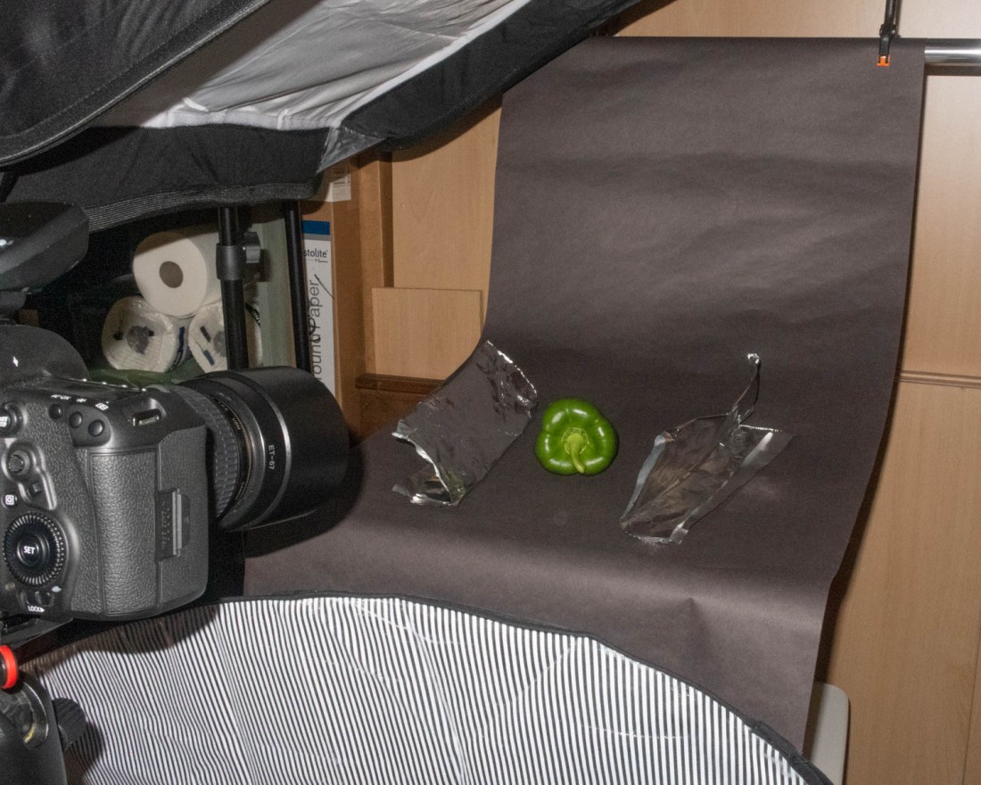
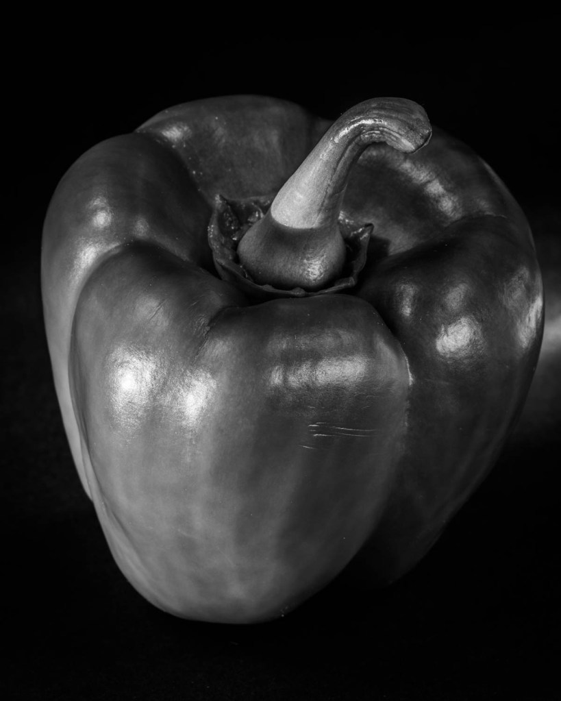
I chose to photograph a series of peppers in response to the Image, “Pepper No. 30” by Edward Weston.
Pepper No. 30, Edward Weston (1930)
I used a set I had made for Exercise 4.3, and had the same camera settings and equipment as I used in that exercise.
I wanted to emulate the lighting of the pepper which Weston had achieved by photographing it inside a shiny metal funnel. In Weston’s image the pepper appears illuminated on all sides and has reflections from its surface on all the visible surfaces.
To attempt to replicate this I used a set with a large softbox almost directly over the pepper, and another, smaller, to the side. I made reflectors of aluminium foil on either side of the pepper which were angled slightly upwards, and another reflector in front of the camera. This set is shown in this image.
I converted the images to monochrome to replicate the image of Weston, and enhanced the contrast, otherwise there were no other post-processing manipulations.
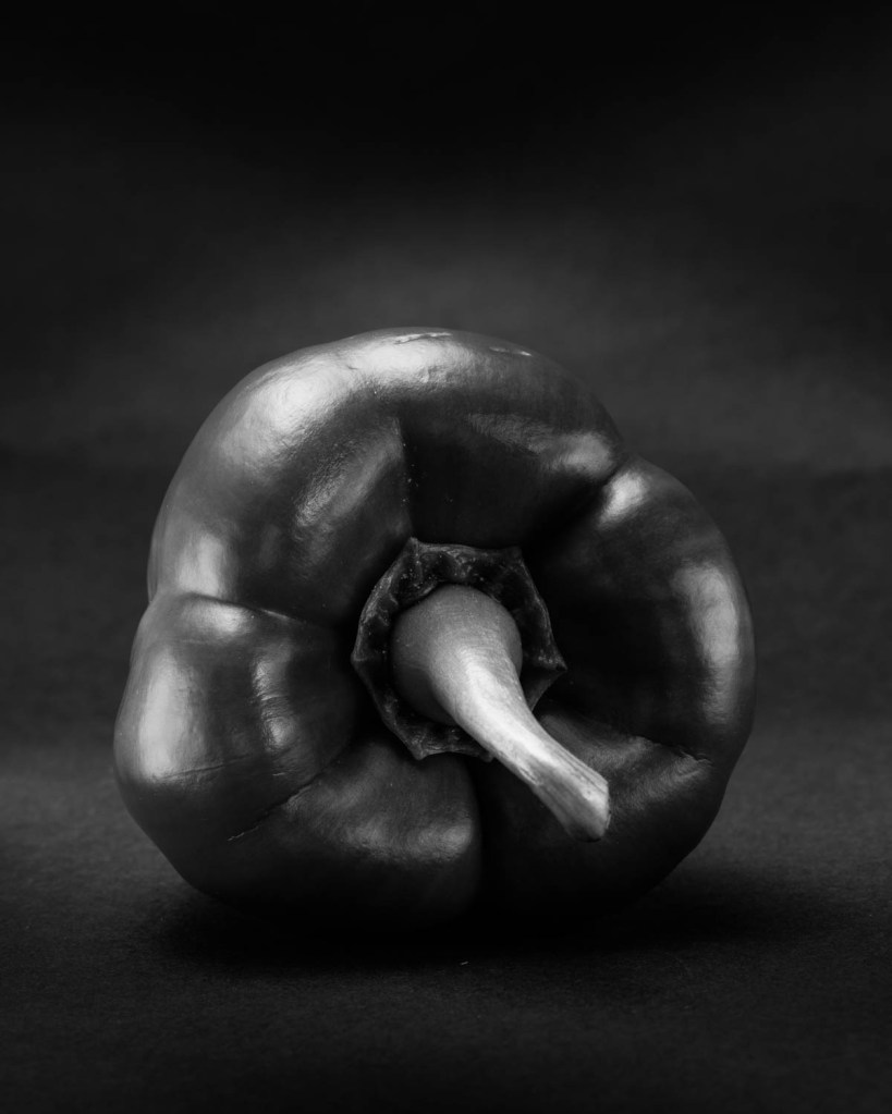
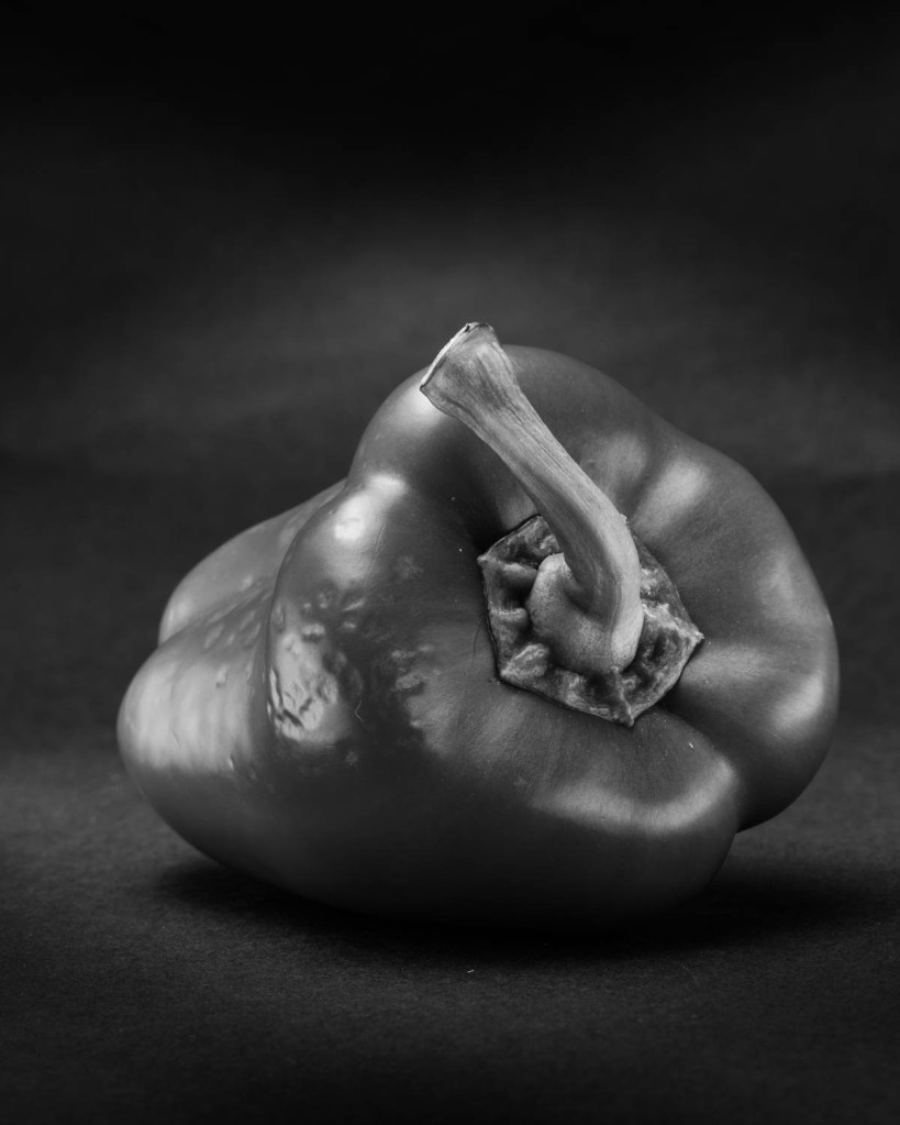
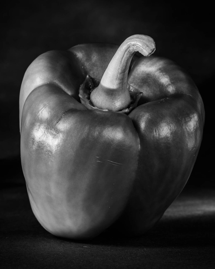
I chose these final images.
Pepper 241
Pepper 239
Pepper 227
Pepper 225
I am most pleased with this one, and think that it has captured the lighting effect Weston achieved.
Pepper 235
My images however all are readily seen as peppers and lack the abstraction achieved by Weston. I think that this may be because of the form of my peppers; they are classic pepper shaped and therefore acceptable to the supermarkets!
I have previously included in my learning log images in homage to Willy Ronis, Man Ray, Fay Godwin and Don McCullin. I have commented on these at the time of the post regarding my context for them.
References
References to the works cited in this post are found in my separate post “References”
“The camera for me is more a meter that measures the distance between myself and the other” Alexia Clorinda, quoted in the course notes.
On her website, Alexia Clorinda, describes herself as “an art historian, cultural critic, photographer, lecturer and independent researcher”. Her methods are described there as a “set of method and vocabularies informed and envisioned by collaborative work across chronologies, geographies and practices”(Alexia Clorinda, s.d.). My brief study of images and her projects indicate that her work involves valuing the contribution and experience of her subjects, regardless of their backgrounds.
The notes also cite the work of Ariella Azoulay, who describes the act of taking a photograph and relationship between photographer and subject as an “encounter… never entirely in the sole control of any one of them”.
I found this a key concept, and one I had become aware of but never articulated so clearly. I noticed this watching the TV video of Don McCullin at work, where he engages with his street subjects and they have some degree of choice in how they portray themselves. Similarly in his lecture, Peter Aitchison described also engaging with his subject and not “stealing the photograph” with telephoto lenses.
Brief
“Use your camera as a measuring device. This doesn’t refer to the distance scale on the focus ring. Rather, find a subject that you have an empathy with and take a sequence of shots to ‘explore the distance between you’. Add the sequence to your learning log, indicating which is your ‘select’ – your best shot.
Look critically at the work you did by including what you didn’t mean to do. Include the mistake, or your unconscious, or whatever you want to call it, and analyse it not from the point of view of your intention, but because it is there.”
My Subject
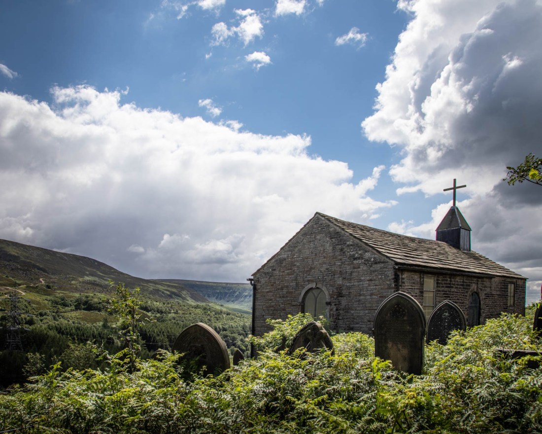
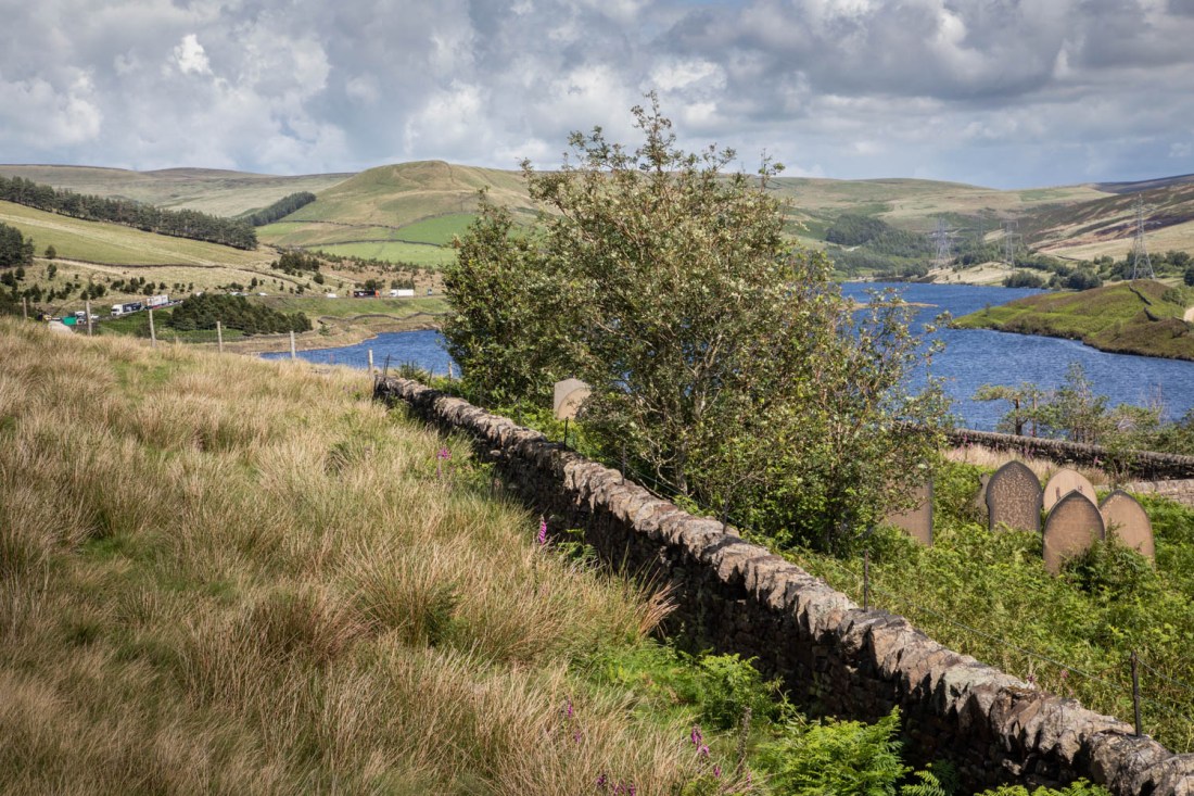
I have chosen to take photographs around St James’ Church, Woodhead. This is an isolated chapel, now only used very occasionally, situated near the trans-Pennine road over Woodhead pass. Nearby is the site of the first railway tunnel through the Pennines linking Manchester and Sheffield. Work began on it in 1839, and was carried out by itinerant labourers, many of whom were Irish immigrants. These labourers and their families lived in temporary huts high on the moors. There were many accidents during the building of the tunnel and many labourers died. There were also outbreaks of disease such as cholera in the camps, killing many of the families. These people were buried in unmarked graves in St James’ church yard, although it is rumoured that the Irish Catholics were buried in unconsecrated ground behind the church yard. (Higgins, 2017)
The original rail tunnel and two later parallel tunnels were closed in 1981, but the adjacent road has heavy use from lorries. Bizarrely, there are now calls to improve rail links across the Pennines although it is unlikely this tunnel will re-open as it is the route for electric cables.
I want to capture in this exercise some reminder of the labourers who built the trans-pennine link. They were poorly treated in life and now forgotten, although their construction seems to be what is now needed.
My Intention
I wanted to make images that captured the isolation of the chapel and graveyard. In addition, that it is largely forgotten and overlooked; yet it is adjacent to a busy road, which today takes the traffic that would otherwise go through the nearby disused rail tunnels.
My initial thoughts are that this may be a suitable subject for conversion to monochrome, as this will be reminiscent of old photographs, but also distance the viewer from the real subject and landscape.
Methods
I shot this using my DSLR, on a day with sunny intervals and showers. As a result the images are all quite brightly lit.
I have made a contact sheet of all the images I shot, and have selected a number for post-processing. I based this selection on the technical quality of the image and the composition, as well as how closely the image demonstrated the qualities I had aimed for.
Post processing was done with Lightroom and involved cropping and local adjustment of exposure. For the monochrome images I adjusted the contrast to result in a satisfying image.
My Images
My initial selection was these colour images.
Woodhead-10Woodhead-28-2Woodhead-13
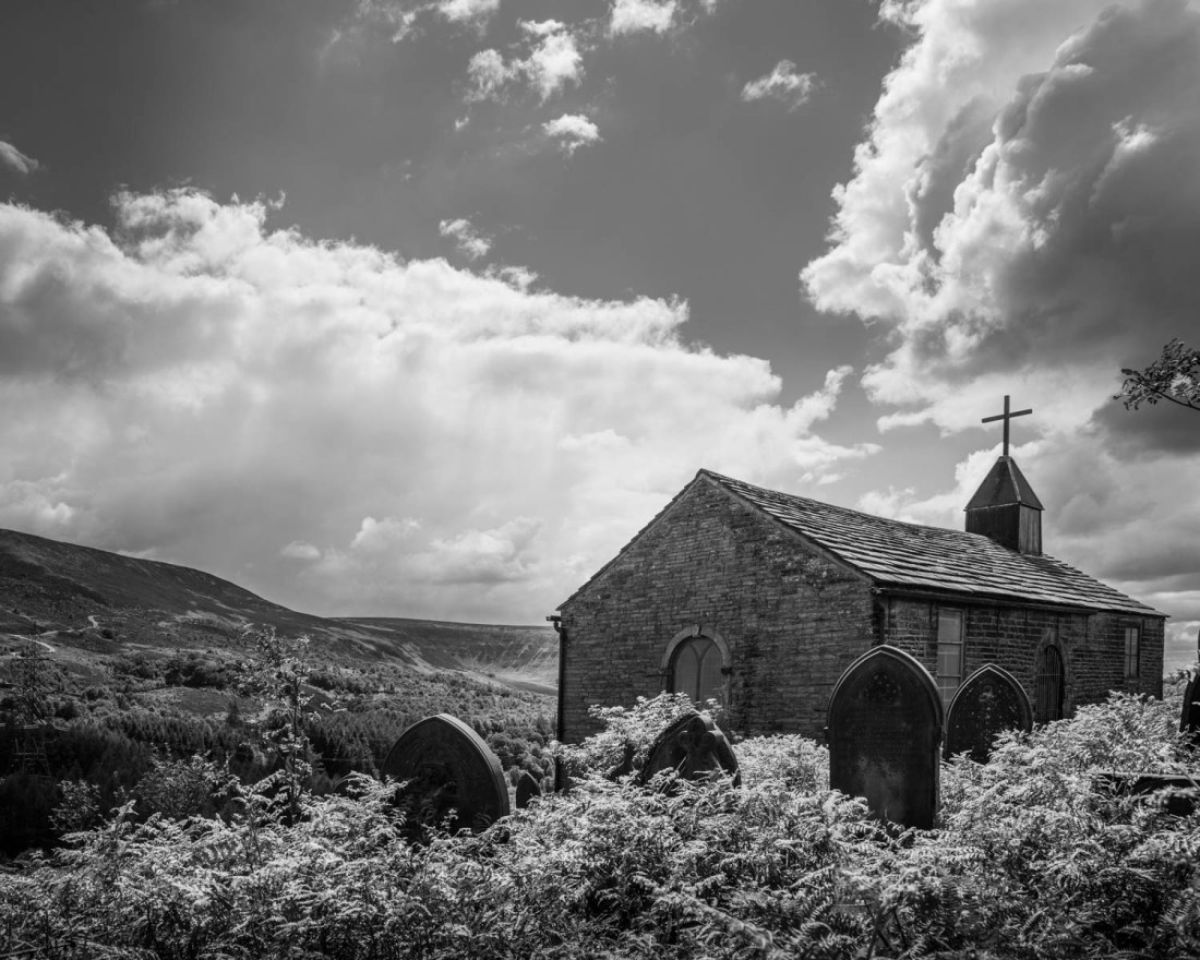
I had tried to include the busy road, and this is the only one which seemed to work.
Woodhead-18
However overall, to me this seems to be too fussy and the road is too distant to be of significance.
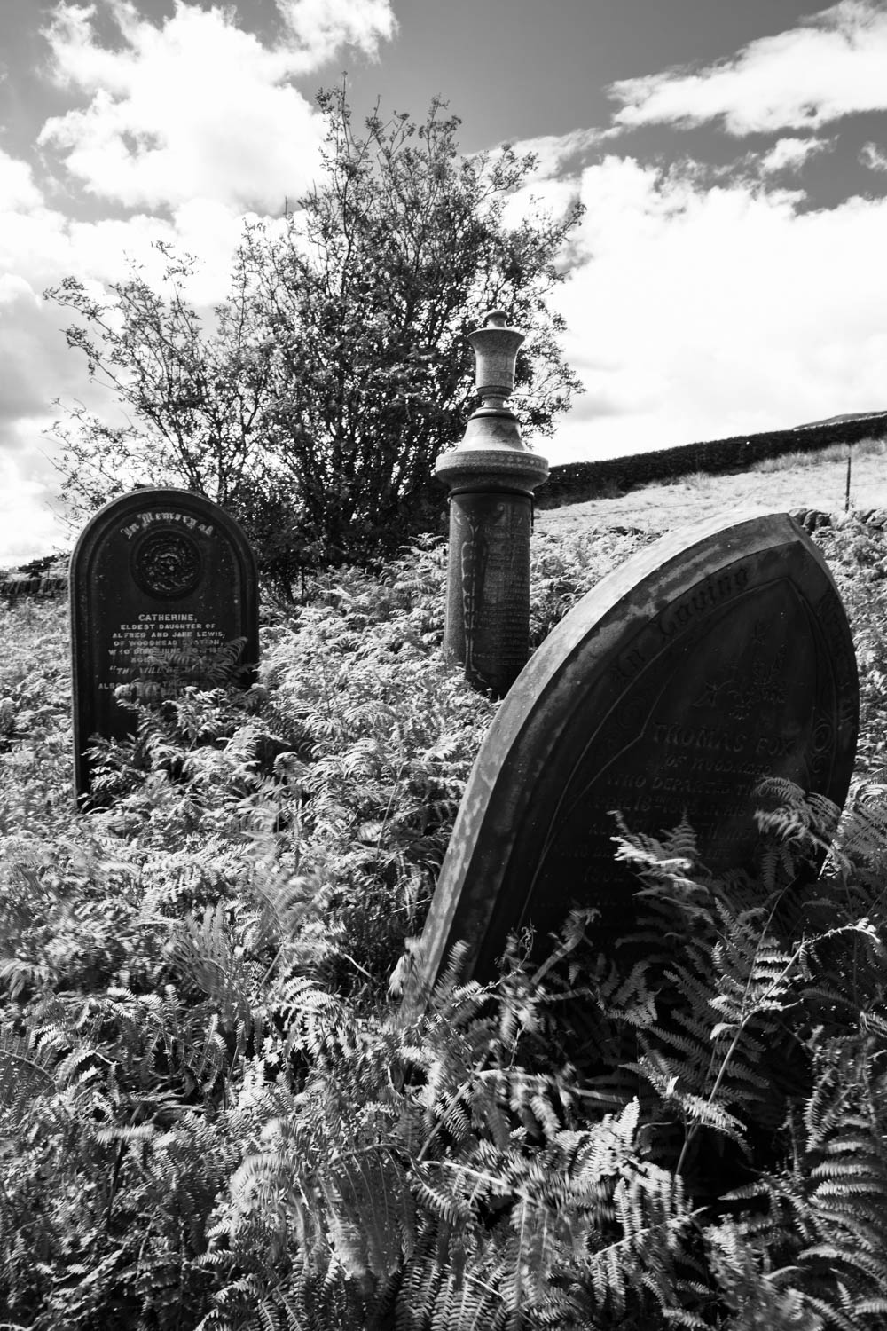
The graveyard is very overgrown and all the graves are difficult to find. I did not find any gravestones of the labourers (apparently marked as from “Woodhead Tunnel”) but most are probably unmarked. All the graves are overgrown and look untended and forgotten, and it is this aspect which I think altered my approach to the exercise. If the graves of people who had been local residents with friends and families in the area are so forgotten, how can we expect anything more for those of the temporary residents with different cultural backgrounds.
Woodhead-36Woodhead-28Woodhead-13-2Woodhead-10-2
The monochrome images remove the bright colours of the sunny day and add to the atmosphere of neglect and decay. While this is obvious in the images of the church, my select is this of the overgrown graves of local residents.
Woodhead-30
(note added 26/7/20) I have had further thoughts about this exercise and added a further post in light of later exercises and discussions with my tutor.
References
References to the works cited in this post are found in my separate post “References”
The course notes cite a quotation from Flusser (Flusser, 2000) “Ideology is the insistence on a single viewpoint thought to be perfect”
The course notes say “any photograph as defined by a point of view: both in the sense of where the photographer stood to take the photograph, but also as saying something particular about the world that could also be said in a different way, from a different point of view.”
I found this an important concept, one with which on reflection I have been struggling for some time and I think is part of my major motivation to enroll on this course. The suggested dichotomy between “where the photographer stood” and “saying something particular about the world” is at the core of what I want to better understand.
I have found over the years that it is easy to get preoccupied with the technical side of photography, and once I felt I was reasonably competent have been seeking new motivation and understanding of the work of photographers whose work I have come across. I have opinions about the subjects of much of the work I have shown in the earlier parts of this course; the difficulty I have is in knowing how to express that in the image. This section of the course will, I think, present interesting and difficult challenges.
References
References to the works cited in this post are found in my separate post “References”
Robert gave a presentation expanding on the concept of “improbable images” as described in the course notes. This is based on the principles outlined by Vilem Flusser in “The Philosophy of Photography”.
That is, the concept of the photograph alters from that of the memento (“people who look at a photograph naively photographs represent the world”) to a more generalised unique type of image (“representation of the world no longer depends on direct experience but on interpretation of previous images or representations that already exist”).
As a result of this meeting and the works discussed my objectives are
Read Flusser’s book “The Philosophy of Photography”
Examine the works of the artists discussed
Steele-Perkins
Tomasz Windland
Re-examine Hokusai’s work
Later thoughts on the meeting
Overnight I thought more about the meeting and some of the issues Robert had raised.
Some of the images Robert showed included areas of white, lacking detail, and he emphasised the importance of these in the composition, adding a sense of ambiguity to the overall image. This reminded me of the concept of “kindly vacancies” introduced by John Ruskin in his work “On Modern Painters” and referred to by Rachael Talibard in the talk I heard her give.
Robert had made many of his images with film and he emphasised the ability of film to enable the photographer to make images other than those which are our original intention. With digital cameras we are able to review the image immediately and may discard those that do not meet our plan, whereas some of these discarded images may have features making them of significance. This to me was reminiscent of the principle employed in the “Nine Eyes of Google Street View” by Jon Rafman, whereby captured images become art works because of the selection process by the artist.