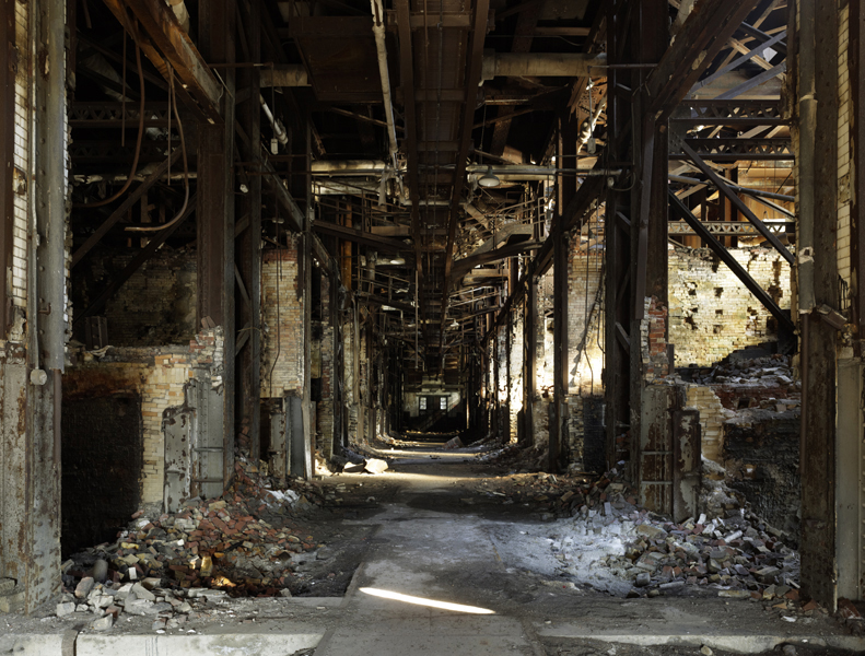
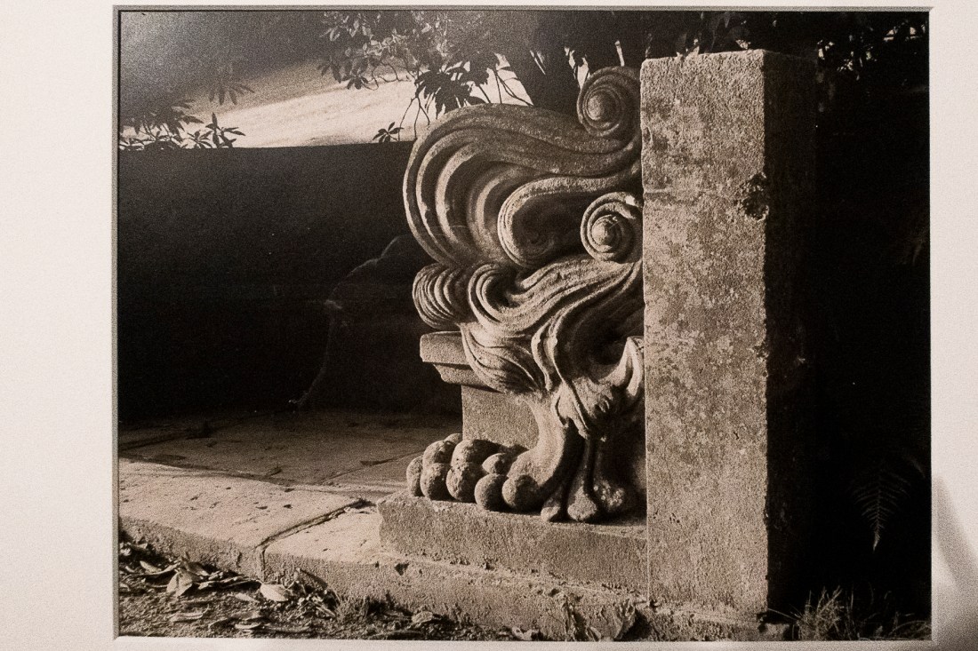
Looking around Glossop for images for my “Square Mile” assignment, I visited the derelict site of the Howard Town Mills and the Hawkshead Mill in Old Glossop, and took a number of photographs while I was there and it is only on re-examining these images and re-reading my post on Drosscapes that I realised how similar some of my images are to those I referred to in this post.
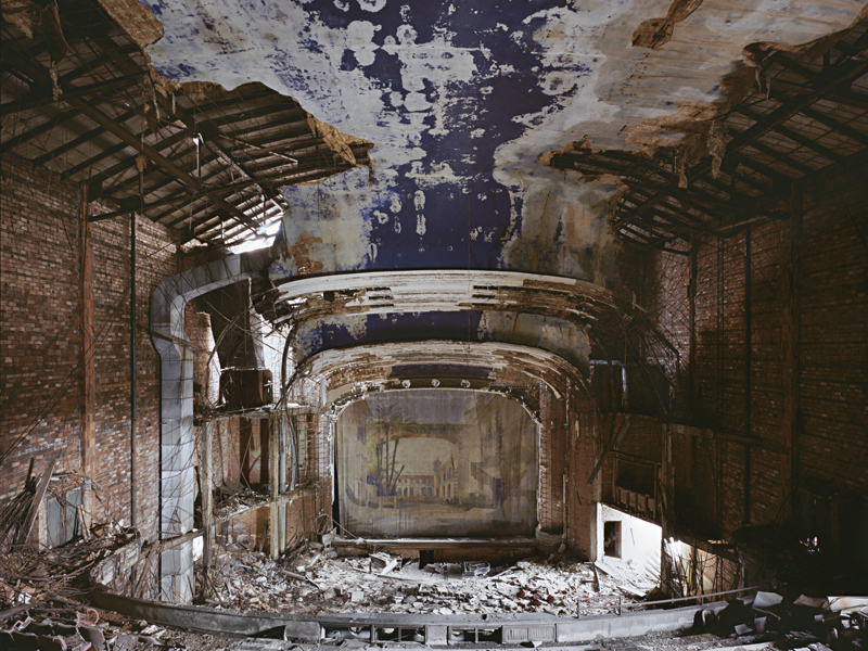
The most striking similarity is between the compostion used by Katherine Westerhout, in her images of Yonkers Power Station and Palace Theater.
Yonkers Power Station 2. Katherine Westerhout
Palace Theater Gary. Katherine Westerhout
and some of these of the derelict mills:
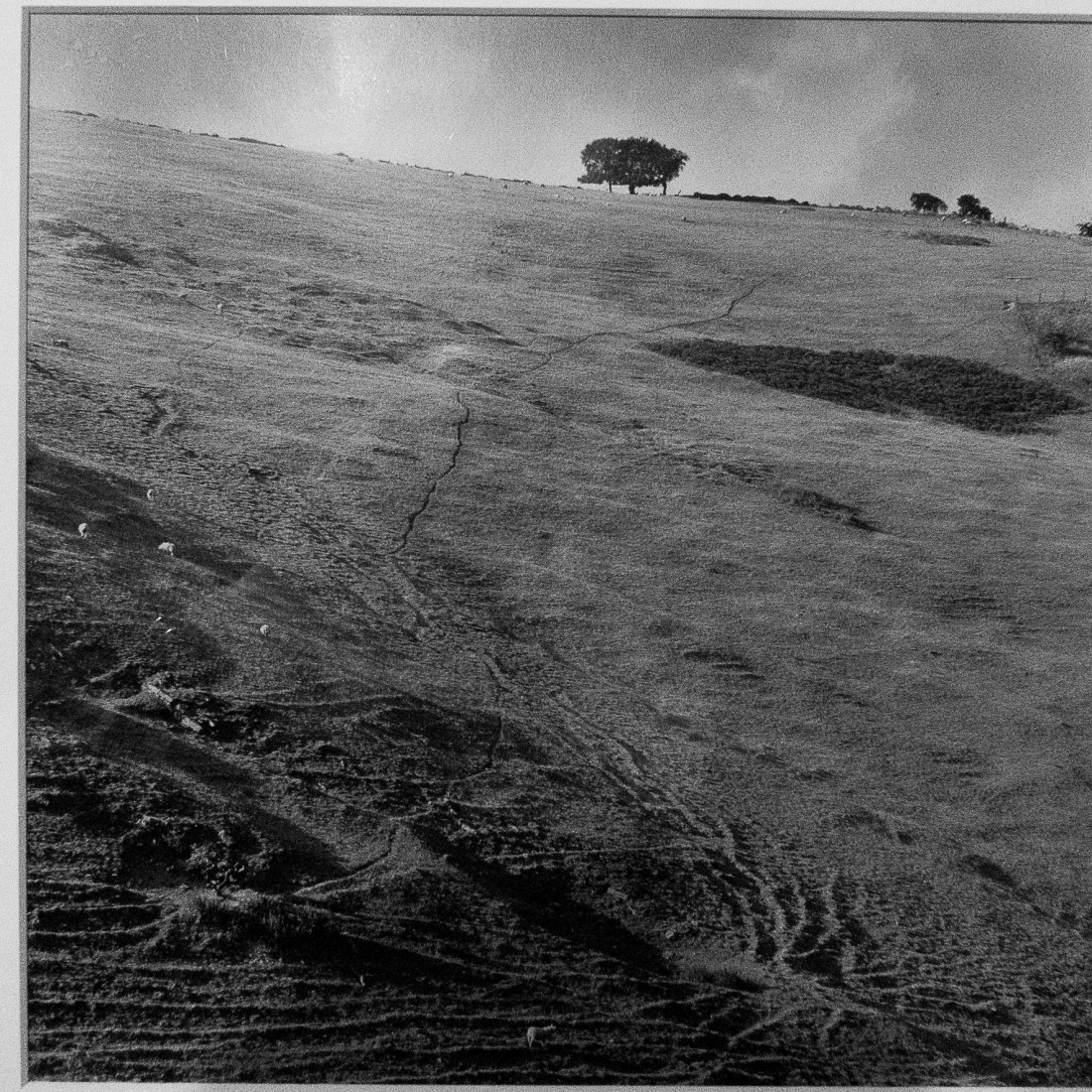
Howard Town Mills 2
Howard Town Mills 1
Hawkshead Mill, Old Glossop
All the images look into the derelict spaces and have strong lines of vertical and horizontal drawing the viewer into the space. I had seen Westerhout’s images before taking these, but only now have been aware of how I was influenced by them.
I had been directed towards examining the work of Fay Godwin by my tutor and then later in Part 2, Project 2 of EYV.
My research of her biographical details and published works is in my written notes and I will not reproduce here for conciseness.
Fay Godwin was a photographer who started her career photographing her children and then making portraits of literary figures in the 1970’s and 80’s. However her first published works were of landscapes, and it is in this genre she is most regarded.
In my research for this element, I have examined:
“Remains of Elmet” (1979), her collaboration with Ted Hughes
“Our Forbidden Land” (1990)
I also made a research visit to the Museum of Science and Media, Bradford (15 February 2019) and examined the archive material there. This material includes that displayed in the exhibition of her work “Land Revisited” which closed on 27 March 2011. It includes material included in her publication “Land” (1985) as well as other material. I have been able to photograph some of these images and they are reproduced here for study purposes.
I have several thoughts about the work, regarding what I have learned from this exercise.
Use of depth of field
All the images I viewed in Bradford had deep depth of field such that no part of any image was out of focus.
This was obvious in wide landscape images such as “Markerstone on the old London to Harlech road 1976”
Markerstone on the old London to Harlech Road. Fay Godwin (NSMM 1994/5015/52)
In this image the foreground grass is shown in precise focus and detail. I assume that a small aperture was used to take the image to give such a deep depth of field, and therefore a long exposure. In other images this results in blurring of those parts of the subject which move during the exposure. This is obvious in “Stream and Birch, Glen Bheinn Sutherland” (National Science and Media Museum, 1994/5015/87) where the branches of the tree have moved and are depicted as a blur.
Stream and Birch, Glen Bheinn. Fay Godwin (NSMM 1994/5015/87)
Detail- Stream and Birch, Glen Bheinn. Fay Godwin (NSMM 1994/5015/87)
Godwin also used this technique in other images where other artists might has used a shallow depth of field to emphasise part of the subject. I saw this in “Carved Bench, Stourhead” (National Science and Media Museum, 1994/5015/70) where both the foreground grass and the leaves in the background are in sharp focus.
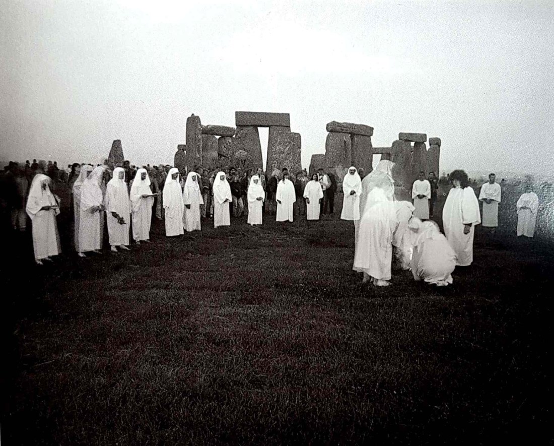
She also uses a long exposure in what might be a more documentary image “Free the Stones”. The foreground and background are in sharp focus, but the people photographed have clearly moved during the exposure. I am unclear what her aim was in producing this image, but it remains atmospheric and the blurring of the people captures their movement.
Free the Stones. Fay Godwin
In terms of this exercise, our course notes suggest that “depth of field was also a political decision for… Fay Godwin”. She appears to use a deep depth of field in virtually all her images. In this way she depicts the entire scene and does not emphasise any one part. I would suggest that this is consistent with her answer to a question put in an interview in 2002:
“Interviewer: Your photographs are often seen as being politically active. Is there a hidden agenda in your photography? Godwin: The viewer must bring their own view to a photograph.”
Godwin sets out the scene in her image and allows the observer to make of it what they will. Nonetheless her choice on subject and viewpoint determine what she wants to show to the observer.
Compositional technique
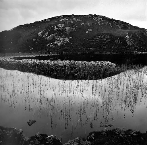
The wide depth of field she uses allows the use of foreground objects and features to contribute to the composition. This is the case in images such as “Reedy Loch” where the detail of the reeds attracts the eye to the foreground.
Reedy Loch. Fay Godwin (NSMM 1994/5015/95)
Other compositional techniques I was aware of was the use of patterns in the landscape revealed by the lighting which make an interesting image of a wide panorama of moorland. Examples of this include “View from Duffdefiance, Glen Buchat” (National Science and Media Museum, 1994/5015/74) where patterns in the vegetation provide light and dark on the otherwise featureless moor.
View from Duffdefiance, Glen Buchat. Fay Godwin (NSMM 1994/5015/74)
Similarly in “Haven Hill, Bradbourne” (National Science and Media Museum, 1994/5015/72) the angle of the light has emphasised the path erosion and provided lines across the hillside.
Haven Hill, Bradbourne. Fay Godwin (NSMM 1994/5015/72)
Sparse use of darkening of the sky
Godwin presents her images with a very naturalistic feel. The tonal quality of the skies is very natural and with a few exceptions is not darkened. These exceptions provide dramatic contrasts such as in the image of “Abel Cross” (National Science and Media Museum, 1994/5015/2)
“Where Land meets Sea” 11/05/2019 Royal Photographic Society meeting “Where Land meets Sea – A Talk about Coastal Photography by Rachael Talibart
Prior to the meeting I searched for Rachael Talibard’s work on the internet and found her website: https://rtalibart.photium.com/about.html (accessed 1/05/2019)
Her website describes her biography:
About: One of ‘the best outdoor photographers working in the UK today’ Outdoor Photography Magazine June 2016
Rachael grew up on the south coast of England. Her first career was as a solicitor in the City of London. During the City years, Rachael’s friends and colleagues were used to seeing her return from trips with bags full of exposed film; the developing sometimes cost more than the trip! In 2008, she converted to digital and she says that is when the obsession really set in. In 2000, Rachael left her City career and, after obtaining two more degrees, she now works full-time on her photography.
Much of Rachael’s early childhood was spent at sea. This has left her with a life-long fascination for the ocean in all its forms, but especially in stormy weather. For Rachael, nothing beats a day on an empty shore, the wilder the weather the better. This is reflected in her work.
Rachael’s photographs have been published in books and both print and online magazines, have been exhibited widely in the UK as well as Barcelona, New York, and Massachusetts, and they feature in private collections in the UK and USA. She is owner of f11 Workshops, providing photography day workshops in the South of England and runs residential photography workshops for international, fine art photography business, Ocean Capture. Rachael is an experienced public speaker and writes for photography magazines. A member of Parhelion Group.
I also looked at the published portfolios on her website: Sirens, Ocean, Coast, Ice, Chalk/Sand, Freshwater, Black and White, Traces, Perigee
On reviewing the work on her website I formed the impression that there are two predominant styles to her work.
The first is of images of the sea, either in a calm, tranquil setting such as this
Evening Shore by Rachael Talibard
Or more stormy
Lilith by Rachael Talibard
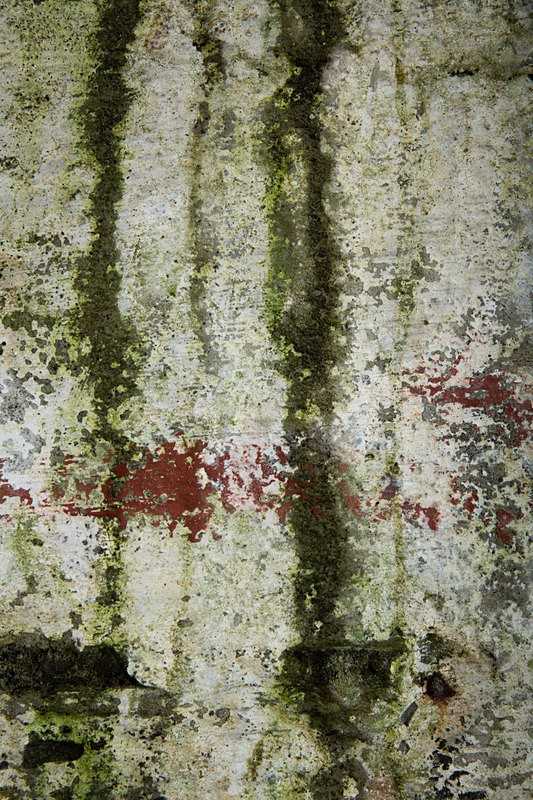
The other major style is of almost abstract images of detail from her surroundings, perhaps best exemplified by those in “Traces”, images of the walls of a derelict fish factory in Iceland
(Read about Traces: “In a forgotten corner of Iceland’s remote West Fjords stands an abandoned herring factory. In this unlikely place, beautiful works of art have formed. The concrete was mixed using sand from local beaches, and the minerals and organisms within have emerged through the structure leaving traces that are abstract yet also seem strangely to echo the landscape beyond the factory walls. Thus I feel that these photographs have two authors, myself and the sea.”)
Images such as
Vulcan by Rachael Talibard
But she also finds abstract images in the sea and shore like those in “Chalk/Sand”
Magic mountains II by Rachael TalibardShoreleaf I by Rachael Talibard
Her talk:
Rachael spoke for over two hours in all and presented a great deal of material. Her talk concentrated, as the title would suggest, on coastal photography, exemplified by her portfolios “Sirens” as well as images from “Ocean”, “Coast” and many others.
In addition to describing the technical aspects of her work, from the visualisation of the planned image, through the techniques of shooting the image (often in challenging environments) to the processing of the RAW files and printing the image and her selection of paper stock for various types of image.
I learned many things from this comprehensive presentation, but will attempt to concentrate on three major learning points, as I have done for other experiences like this in the past.
Photography as Art
Rachael Talibart describes herself and colleagues in the Parhelion Group, as “artists”. She desscrbed a conversation with a visitor to an exhibition who was surprised to see the photographer described as the “artist”. She then had a brief discussion about her view of photography as art. She suggested that as photography as a technique is well suited to produce documentary representations of reality, it is often seen primarily as this rather than a art medium which may be used to represent the artist’s own expression.
She suggested that as soon as an image is presented in black and white it becomes an art form. She suggests that because humans do not see in black and white, such a representation is not a representation of our perception of the scene but is influenced by the artist’s interpretation.
She went on to describe how the black and white image can be used to assist composition and be removing potentially distracting colour, can allow other underlying attributes of the image to be better seen.
Techniques
Rachael Talibard described a number of techniques she uses in the production of her images.
Ones which I found particularly interesting and valuable suggestions were the use of black and white visualisation of the scene at the time of shooting to help composition and the focussing of attention.
Others included some Lightroom and post-processing techniques such split toning, and the use of linear gradients for vignetting. The other technique is the manipulation of individual colour channels in transforming a black and white image.
I will explore these more in later posts.
Use of video
During her presentation she had a number of slide shows, these included video clips.
The use of video is a learning theme which has interested me over the last year, but this is a subject for future posts.
I was interested to see how she interspersed still images with video clips. Her clips were generally taken with a static camera position, so they appeared “moving pictures”.
I think my interest in this was to see how the two media can be used in juxtaposition, and the final presentation justifies the use of video.
My Future Work as a Result of this Talk:
She mentioned the concept of “kindly vacancies” in composition, introduced by John Ruskin in his work “On Modern Painters”. I plan to look at this work.
Other artists she mentioned who I will research include: Warren Keelan( https://www.warrenkeelan.com/) a seascape and ocean photographer using waterproof housings for his camera to get a different perspective on the ocean than that of Talibart.
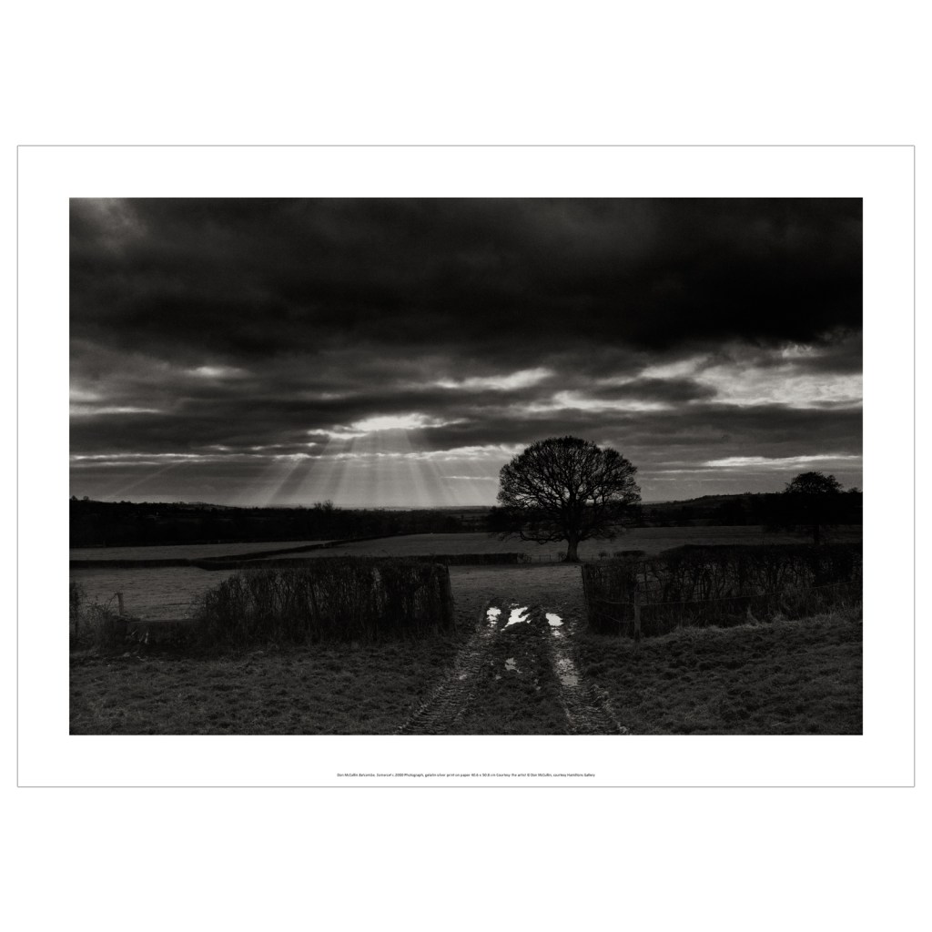
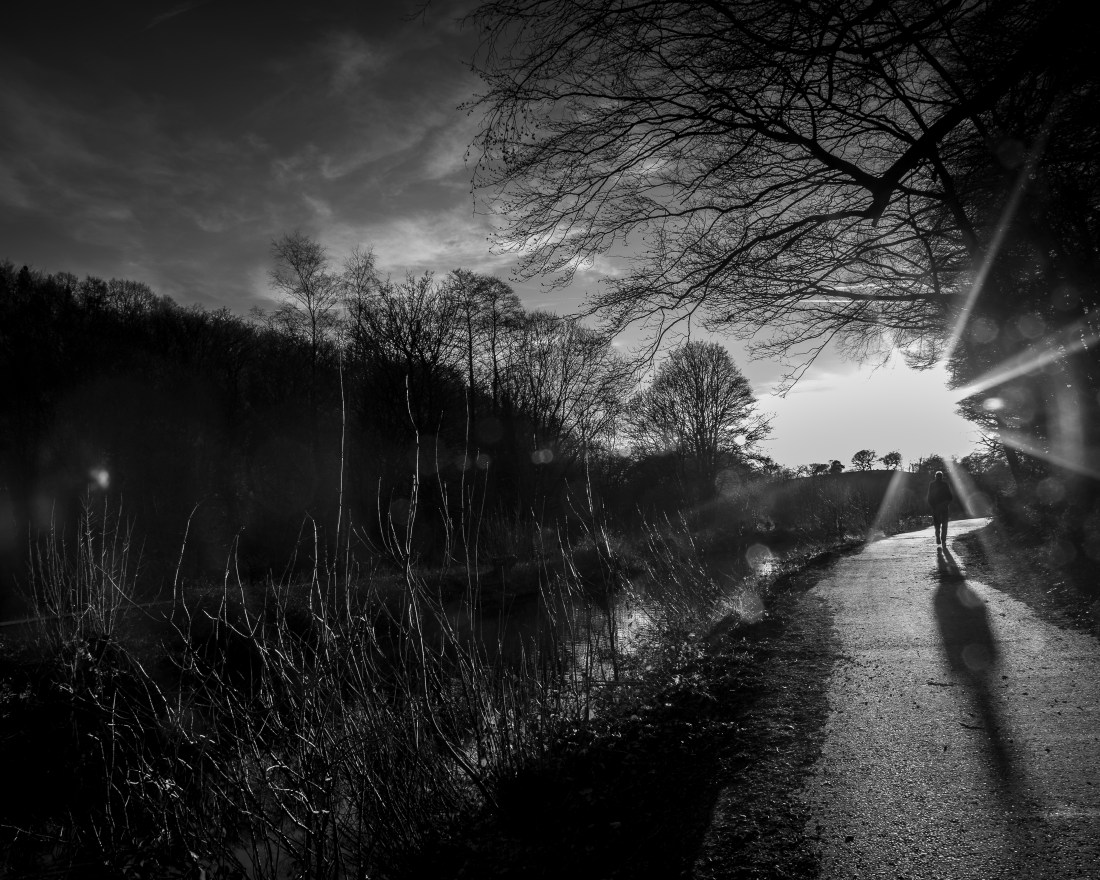
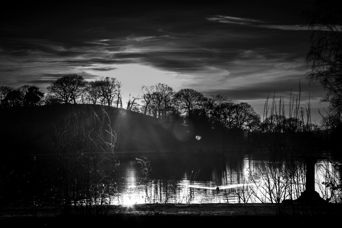
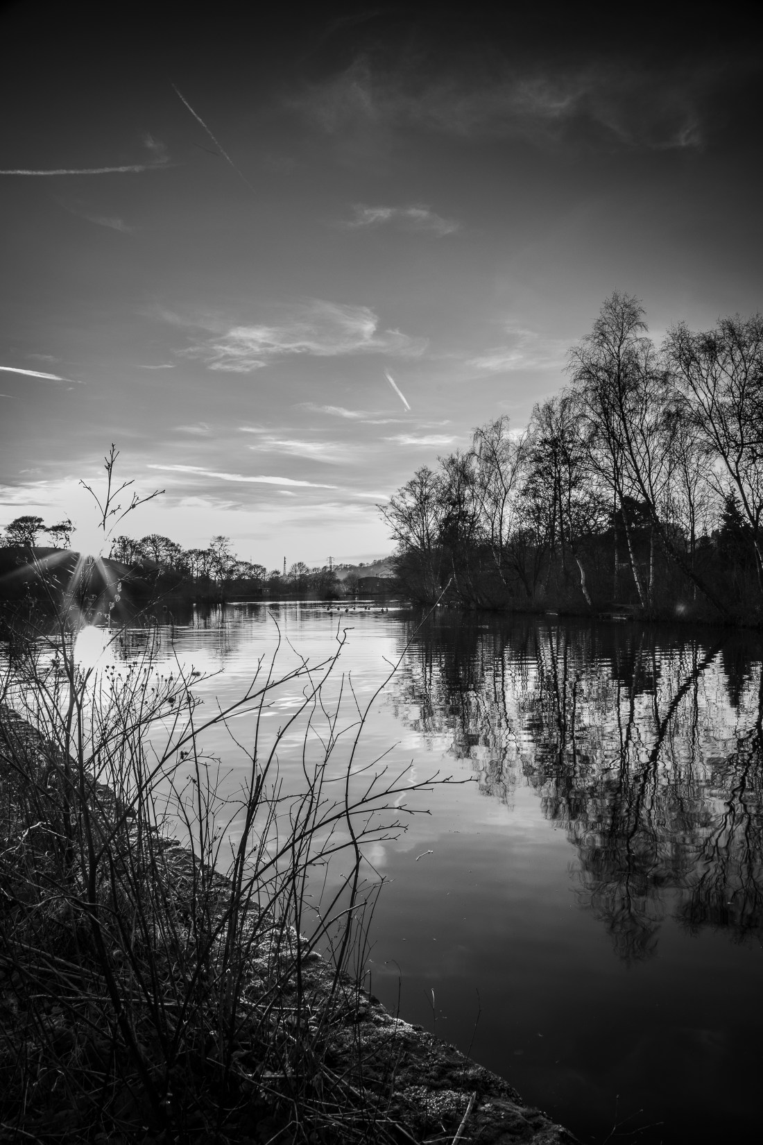
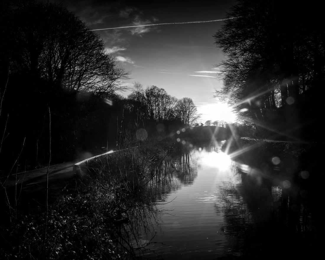
Having seen the exhibition of Don McCullin’s work at Tate Britain, Don McCullin – Tate Britain. Feb 2019, I tried to produce some images in his style. In the absence of a local war zone, I decided to use landscapes to do this. I completed Exercises 2.6 and 2.7 with that intention, and selected a site where I could photograph into the setting sun to try and get the effect McCullin has achieved in these images.
Somerset 2004. Don McCullin
Batcombe, Somerset. Don McCullin
My attempts shown here are Black and white versions of the images in my exercise 2.7.
Etherow Country Park 1Etherow Country Park 2Etherow Country Park 4Etherow Country Park 5Mill Brow 1Mill Brow 2
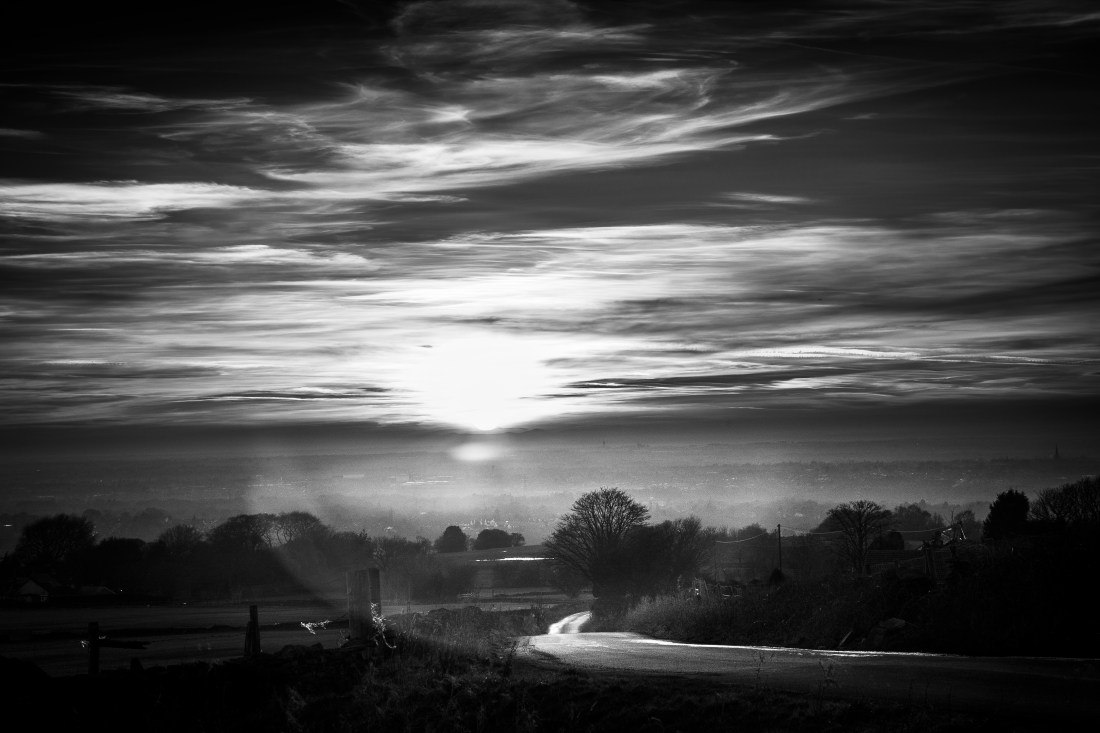
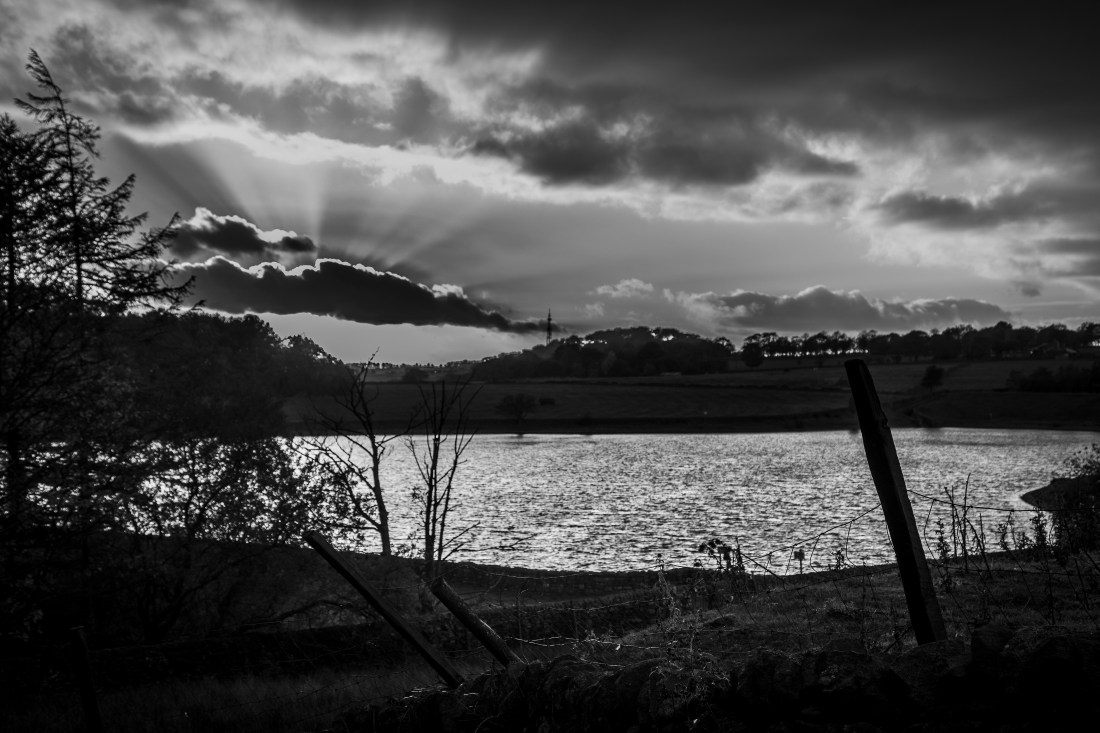
The cloud formations on the evening I chose were not really suitable to get this effect I was trying to achieve, however I remembered this image from exercise 1
Swineshaw Reservoir
and rendered it into black and white and adjusted the exposure locally to emulate McCullin’s landscapes.
Swineshaw Reservoir
Overall I think that this image achieves what I was trying to do.
I initially rejected this one as the lens flare makes it quite confused, but I do think it has some qualities in common with the abstract landscapes of John Virtue.
I include this post as an appendix to other posts I have made which relate to the psychological effects of witnessing (and maybe photographing) stressful events.
The International Classification of Diseases is developed by the World Health Organisation and describes and defines characteristic features of diseases. These are defined for research and epidemiological studies to have consistency across the world in diagnoses. Chapter V of this relates to mental disorders and describes several types of reaction to stress. Of note in the context of my studies here are:
Extracts from
International Classification of Diseases 10 (ICD-10), WHO, Geneva
F43.0 Acute stress reaction
“A transient disorder of significant severity which develops in an individual without any other apparent mental disorder in response to exceptional physical and/or mental stress and which usually subsides within hours or days. The stressor may be an overwhelming traumatic experience involving serious threat to the security or physical integrity of the individual or of a loved person(s) (e.g. natural catastrophe, accident, battle, criminal assault, rape), or an unusually sudden and threatening change in the social position and/or network of the individual, such as multiple bereavement or domestic fire. The risk of this disorder developing is increased if physical exhaustion or organic factors (e.g. in the elderly) are also present.
Individual vulnerability and coping capacity play a role in the occurrence and severity of acute stress reactions, as evidenced by the fact that not all people exposed to exceptional stress develop the disorder. The symptoms show great variation but typically they include an initial state of “daze”, with some constriction of the field of consciousness and narrowing of attention, inability to comprehend stimuli, and disorientation. This state may be followed either by further withdrawal from the surrounding situation (to the extent of a dissociative stupor – see F44.2), or by agitation and over-activity (flight reaction or fugue). Autonomic signs of panic anxiety (tachycardia, sweating, flushing) are commonly present. The symptoms usually appear within minutes of the impact of the stressful stimulus or event, and disappear within 2-3 days (often within hours). Partial or complete amnesia (see F44.0) for the episode may be present.”
F44.2 Dissociative stupor
“The individual’s behaviour fulfils the criteria for stupor, but examination and investigation reveal no evidence of a physical cause. In addition, as in other dissociative disorders, there is positive evidence of psychogenic causation in the form of either recent stressful events or prominent interpersonal or social problems. Stupor is diagnosed on the basis of a profound diminution or absence of voluntary movement and normal responsiveness to external stimuli such as light, noise, and touch. The individual lies or sits largely motionless for long periods of time. Speech and spontaneous and Purposeful movement are completely or almost completely absent. Although some degree of disturbance of consciousness may be present, muscle tone, posture, breathing, and sometimes eye-opening and coordinated eye movements are such that it is clear that the individual is neither asleep nor unconscious.”
F43.1 Post-traumatic stress disorder
“This arises as a delayed and/or protracted response to a stressful event or situation (either short- or long-lasting) of an exceptionally threatening or catastrophic nature, which is likely to cause pervasive distress in almost anyone (e.g. natural or man-made disaster, combat, serious accident, witnessing the violent death of others, or being the victim of torture, terrorism, rape, or other crime). Predisposing factors such as personality traits (e.g. compulsive, asthenic) or previous history of neurotic illness may lower the threshold for the development of the syndrome or aggravate its course, but they are neither necessary nor sufficient to explain its occurrence.
Typical symptoms include episodes of repeated reliving of the trauma in intrusive memories (“flashbacks”) or dreams, occurring against the persisting background of a sense of “numbness” and emotional blunting, detachment from other people, unresponsiveness to surroundings, anhedonia, and avoidance of activities and situations reminiscent of the trauma. Commonly there is fear and avoidance of cues that remind the sufferer of the original trauma. Rarely, there may be dramatic, acute bursts of fear, panic or aggression, triggered by stimuli arousing a sudden recollection and/or re-enactment of the trauma or of the original reaction to it.
There is usually a state of autonomic hyperarousal with hypervigilance, an enhanced startle reaction, and insomnia. Anxiety and depression are commonly associated with the above symptoms and signs, and suicidal ideation is not infrequent. Excessive use of alcohol or drugs may be a complicating factor. The onset follows the trauma with a latency period which may range from a few weeks to months (but rarely exceeds 6 months). The course is fluctuating but recovery can be expected in the majority of cases. In a small proportion of patients the condition may show a chronic course over many years and a transition to an enduring personality change (see F62.0).”
Extracts from: International Classification of Diseases 10 (ICD-10), WHO, Geneva
I visited this exhibition of McCullin’s work soon after it opened. The Tate website describes the exhibition as:
“Spanning sixty years of photography and world events, this exhibition begins in and around the London neighbourhoods where McCullin was raised. It moves into his coverage of conflict abroad, interspersed, as his life has been, with sections covering his trips back to the UK. The exhibition ends with his current and longstanding engagement with traditions of still life and landscape photography.”
There is a huge amount of material presented in this exhibition. The subjects are varied from his early work in around his family home in London, his coverage of conflict abroad and in Northern Ireland, the urban conditions in the industrial UK, and his still life and landscape images in the UK and overseas.
As I have done with other exhibitions, I have summarised here my key impressions and learning points, rather than try and encompass the whole exhibition. Some of these expand on ideas I already raised in my account of the TV programme, Looking for England.
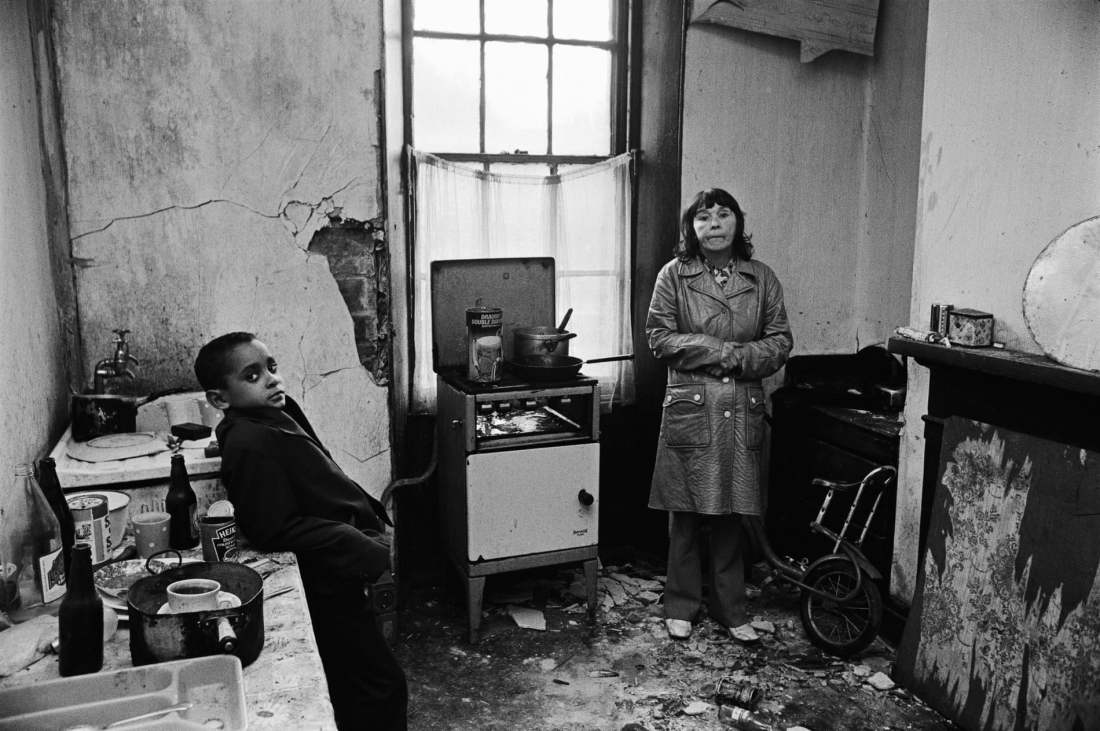
1. Motivation
The exhibition of images from Bradford and the east end of London show McCullin’s concern with social inequalities and the conditions of the urban poor. I described this in my reaction to the “Looking for England” documentary.
In the exhibition notes is a quote from McCullin summarising his concern.
‘There are social wars that are worthwhile. I don’t want to encourage people to think photography is only necessary through the tragedy of war.’
While this is obvious in his documentary depictions of the living conditions of people in Bradford and the East End.
Bradford, 1978. Don McCullinHomeless Men, Early morning in Spitalfields Market, London 1970. Don McCullin
I thought his early work also showed this concern.
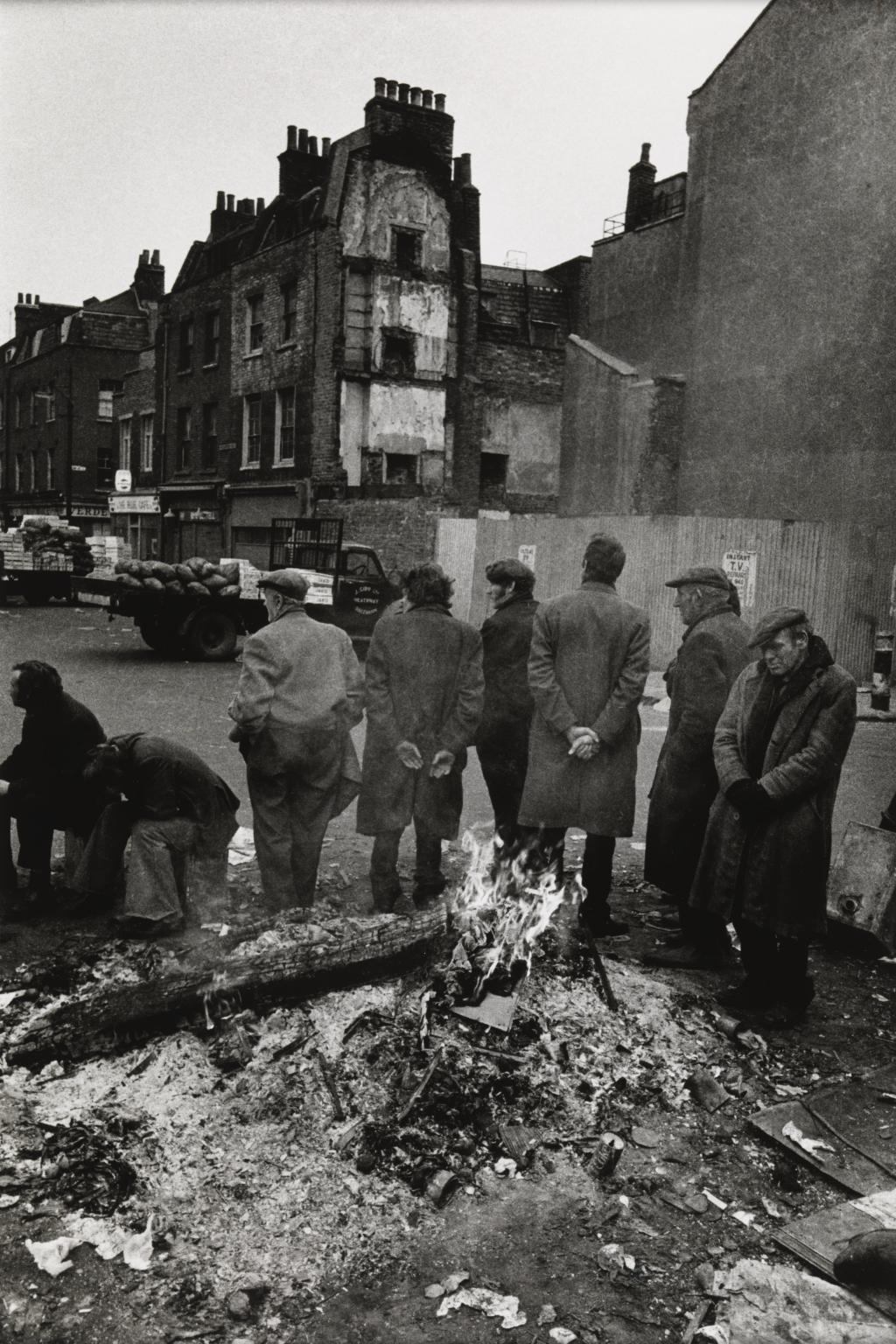
Boys Boxing near Caledonian Road. Don McCullin
This image of boys boxing puts the title subjects in the distance. Predominance in the image is the accumulation of rubbish in the road seen in the foreground. McCullin appears to be showing that boys play in the street here surrounded by this squalor.
Although he clearly has these views about inequality, he has throughout his career covering conflict McCullin has insisted on his own neutrality. In the exhibition was his statement of his position:
“No one was my enemy, by the way. There was no enemy in war for me. I was totally neutral passing-through person.”
2. Darkness in his images
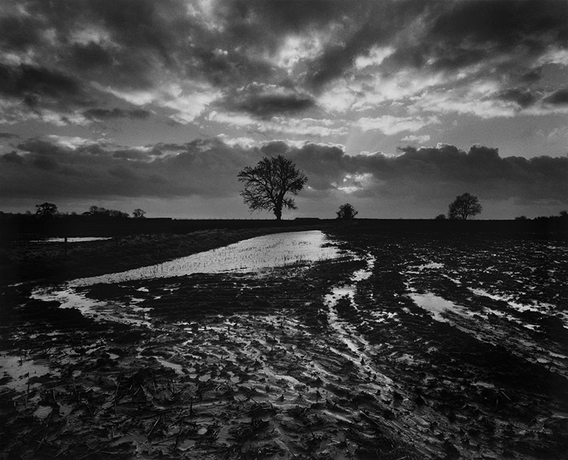
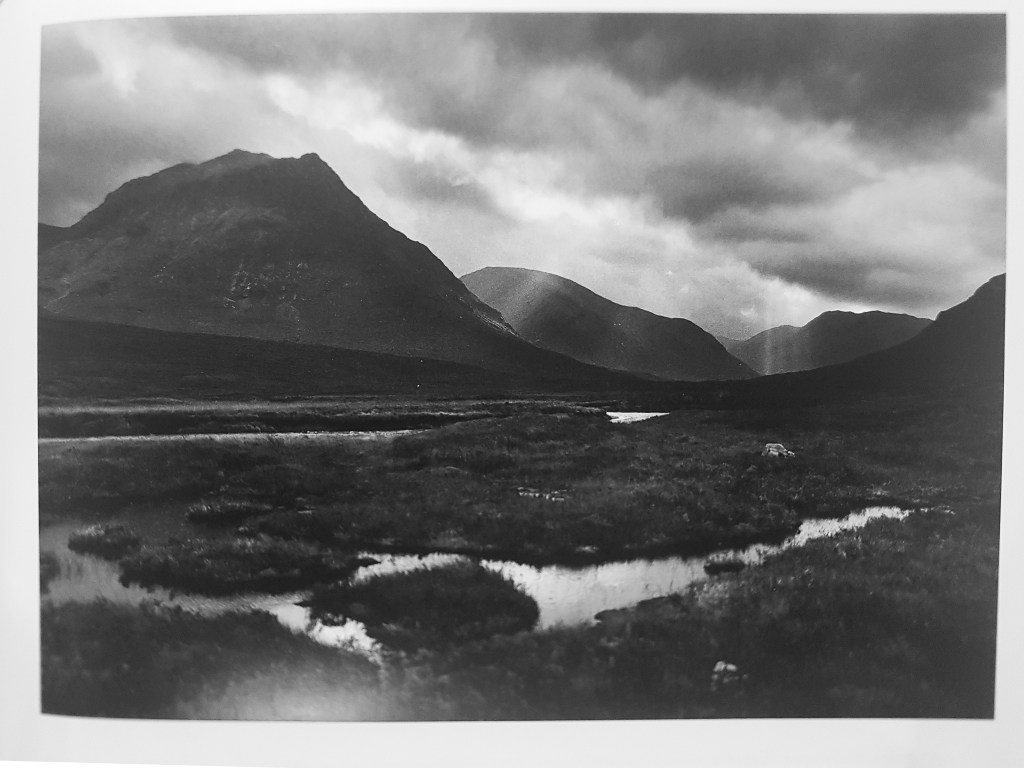
In “Looking for England” McCullin says “I cannot help taking my prints darker and darker and darker, I don’t know what makes me do it”. His images of English and Scottish Landscapes are dark – the skies are darker than would be the case in life. This gives a brooding threatening sky and land.
Somerset 2004. Don McCullin
Batcombe, Somerset. Don McCullin
North of Glen Coe 1992. Don McCullin
McCullin himself compares these to war zones.
“You can see in my landscapes the dark Wagnerian clouds, which I darken even more in my printing, the nakedness of the trees and the emptiness, which make the earth look as if it had been scorched or pulverised by shells.” (Don McCullin. Mehrez A Ed. Tate 2019. p155).
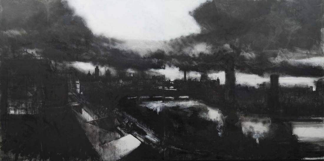
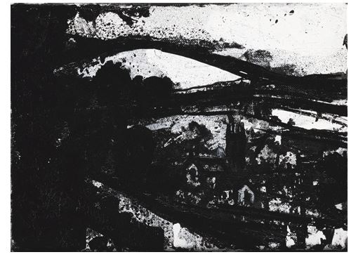
The large expanses of black in many of his images reminded me of the landscapes of John Virtue. I was directed to the work of John Virtue by my tutor. Virtue is a landscape artist who uses only black and white on his work; he uses shellac black ink and white paint.
Landscape 710. John VirtueLandscape 260. John Virtue
The landscapes become abstract in this medium but the quality of the image is very like that of the McCullin landscapes.
3. Emotional contact with subjects
In many of his images McCullin establishes contact with the subject by them making eye contact with the camera. This is in the same way as I commented about Willy Ronis’s work.
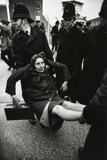
For example we can see this clearly in this image of the Aldermaston demonstrations in early 1960’s
Aldermaston, Don McCullin
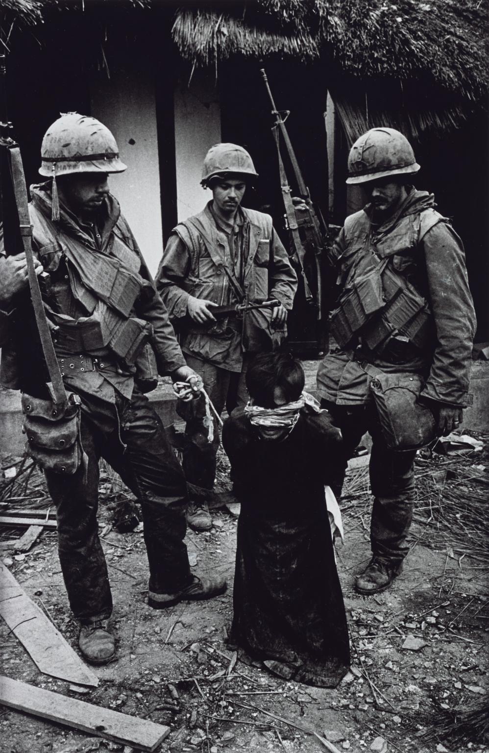
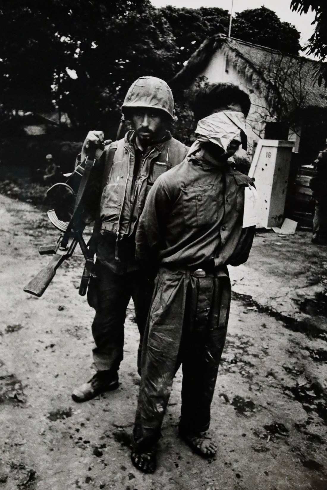
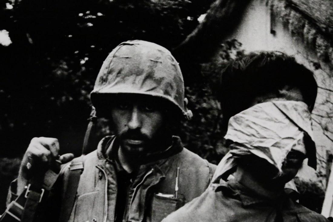
However I noted that in some of his war photography, it becomes more difficult to see the main subjects eyes and establish this same type of contact and I would suggest, empathy. These images from Vietnam taken in 1968 show the US marines’ eyes to be in the shadow of their helmets and difficult to see.
US Marines Tormenting an Old Vietnamese Civilian, Hue 1968,. Don McCullinUS Marine with captured North Vietnamese soldier, 1968. Don McCullinDetail – US Marine with captured North Vietnamese soldier, 1968. Don McCullin
This is in contrast to earlier images such as this taken three years earlier in 1965, where we can clearly see the eyes of the soldier.
ARVN patrol, South Vietnam 1965. Don McCullinDetail ARVN patrol, South Vietnam 1965. Don McCullin
This made me wonder if after three years of the Vietnam war, McCullin is in some way distancing himself from the emotional contact with his subjects. Having experienced the events of the war and witnessed the effect on the soldiers and civilians, I would be surprised if this did not have an effect on him.
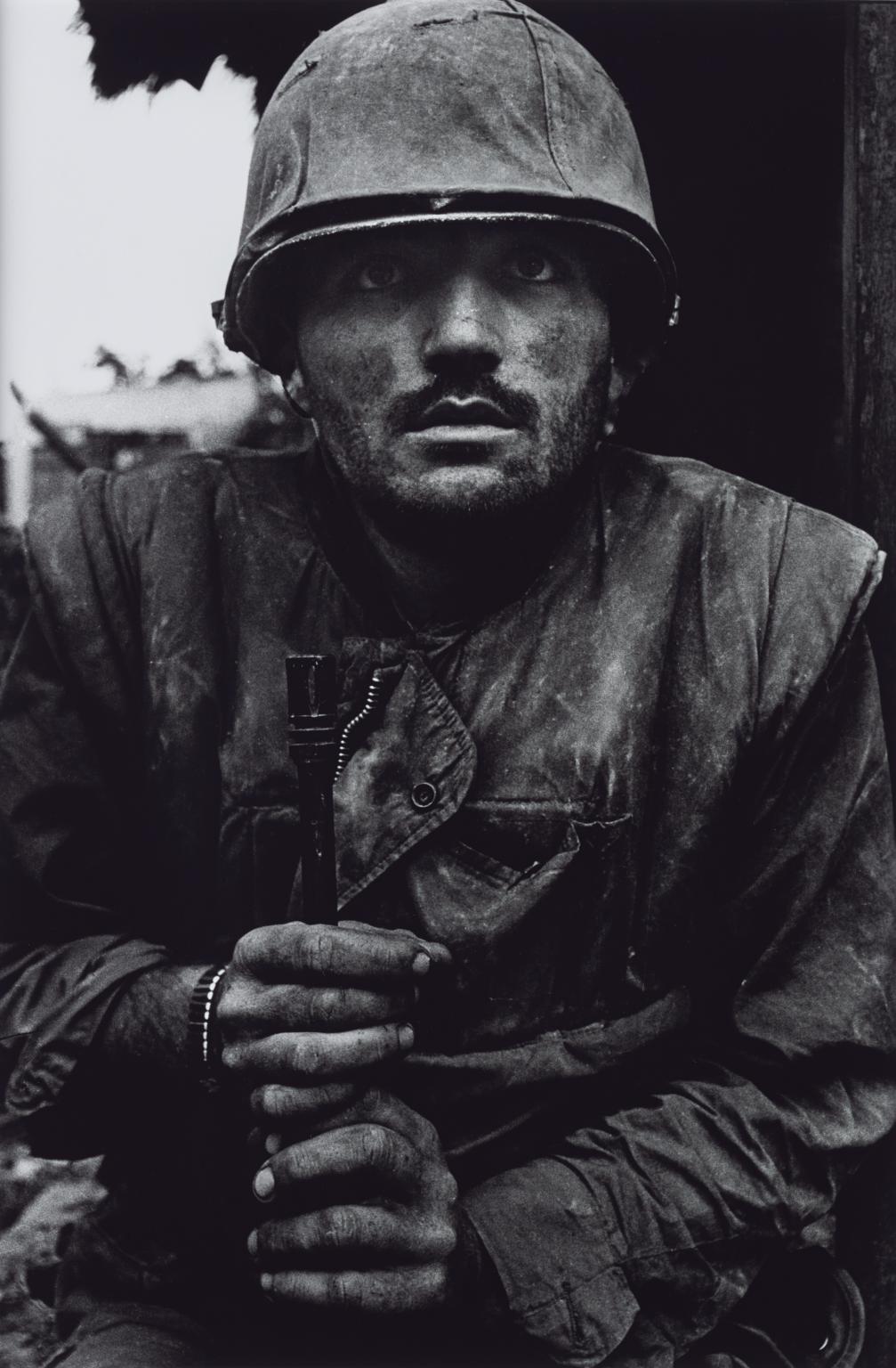
The effects of combat stress on military personnel is well known and McCullin records it in this image of a “shell-shocked” US marine (my italics).
Shell-shocked US Marine, Hue 1968. Don McCullin
Descriptions of this soldier’s condition made by people around him at the time are described in a newspaper article by Antony Loyd ( Shell-shocked: Anthony Loyd goes in search of the Vietnam War veterans photographed by Don McCullin. The Times, February 23 2018). Loyd summarises these:
“The Marine was swallowed by the night. When he was found he was mute, though in his eyes lay a stare best unmet while dreaming: a gaze that was part trance, part fear, but mostly horror. The men who had located him recall that he neither blinked nor uttered a single word.”
He quotes McCullin as saying
“I noticed he was moving not one iota. Not one eyelash was moving. He looked as though he had been carved out of bronze. I took five frames and I defy you to find any change or movement in those frames.”
and his colleagues
“He was in a state of shock. He had the classic thousand-yard stare, and was kind of frozen.”
“I thought someone had cut his throat, the way he looked. Because I’ve seen people with their throats cut and their eyes just wide open.”
The navy corpsman, a medic, who examined him is reported as saying to the sergeant in charge:
“Sarge, his mind is not there. We need to get him out of here.”
These are classic descriptions of recognised mental disorder, specifically Acute Stress Reaction (ICD-10 F43.0) followed by a Dissociative Stupor (ICD-10 F44.2) and I have included fuller descriptions of these in another post, International Classification of Diseases (ICD-10) – Reactions to Stress.
The effects of psychological stress on combatants is well recognised and steps are now taken by armed forces to mitigate these. However others who witness these events are also susceptible to stress reactions, and I wonder if McCullin himself has been affected by this.
The risks of physical harm to journalists covering conflict has been recognised in the film A Private War, 2018, describing the career and death of war correspondent, Marie Colvin. Indeed McCullin himself has been injured on several occasions and the Tate exhibition includes a camera body he was carrying, in which is embedded a bullet.
The psychological consequences of working in a war zone and/or witnessing massive humanitarian crises are less well recognised in journalists. What is even less recognised is the effect this then has on the types of image produced by photographers subject to this stress.
The Tate exhibition includes a quote from McCullin regarding him being asked to cover the Iran-Iraq war in 1991.
“I hadn’t covered a theatre of war for seven years since leaving the Sunday Times and felt mentally ill-equipped for the assignment I had suggested to the Independent newspaper. It felt like tempting providence once too often. I began to wish I wasn’t there when I saw the burnt and injured children and in some respects, I wish I hadn’t gone. The immorality of the situation seemed intolerable. Did I need to face all this yet again?.”
He is clearly describing mental distress at his situation and having to witness the events. Furthermore he describes longer-term sequelae.
“Sometimes when I’m walking over the Yorkshire moors or in Hertfordshire, the wind rushes through the grass and I feel as if I’m on the An Loc road in Vietnam hearing the moans of soldiers beside it. I imagine I can hear the 106-mm howitzers in the distance. I’ll never get that out of my mind” (Don McCullin. Mehrez A Ed. Tate 2019. p154).
These sound like episodes of “repeated reliving of the trauma in intrusive memories (‘flashbacks’)” a characteristic feature of Post Traumatic Stress Disorder (ICD-10 F43.1).
Is it this psychological reaction to what he has witnessed and his memories which initially made him want to distance himself emotionally from the protagonists as shown by lack of clarity of the soldiers faces in later images of Vietnam, and now make him produce such dark images of the British landscape?
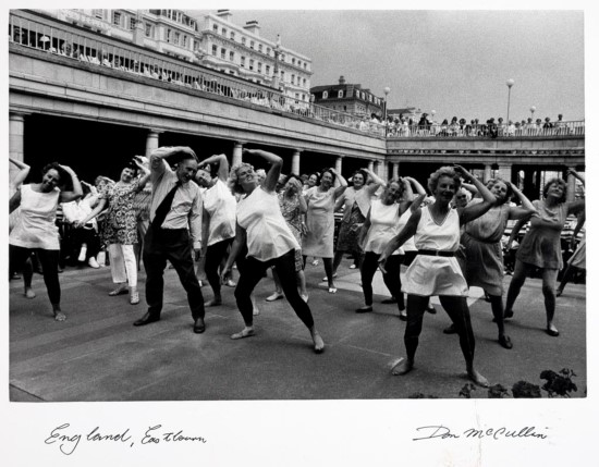
However it is easy to categorise McCullin’s work as dark and harrowing. There is a lighter side to his work perhaps exemplified by this image of a dance class in Eastobourne.
Dancing, Eastbourne. Don McCullin
In the documentary, Looking for England, he revisits this site of this image and clearly enjoys the incongruity of the sight of people enjoying a brass band in the pouring rain.
He makes jokes about people going to the beach in the wind and rain. Overall, he does not seem a overly preoccupied with the horrors he has seen over the years, but is enjoys his interest in people and their activities. I wonder if it is from this that his sense of justice stems, when he sees inequalities or brutality to which he needs to draw wider attention.
The BBC introduction to this programme describes it as:
Travelogue that follows photographer Don McCullin, now 83, documenting his country from inner cities to seaside towns, on a journey in search of his own nation. Sixty years after starting out as a photographer, McCullin returns to his old haunts in the East End of London, Bradford, Consett, Eastbourne and Scarborough. Along the way he encounters an array of English characters at the Glyndebourne Festival and Goodwood Revival and photographs a hunt and a group of saboteurs aiming to disrupt them. McCullin’s journey is punctuated by scenes in his darkroom, a place he is allowing cameras into for the first time.
Sir Don McCullin is a British photojournalist, particularly recognized for his war photography and images of urban strife. His career, which began in 1959, has specialised in examining the underside of society, and his photographs have depicted the unemployed, downtrodden and the impoverished. (Wikipaedia accessed 09/03 2019).
The documentary covered a lot of material and in order to concentrate what I regarded as the main points I have learned, I tried here to record three main things I have learned from this.
1. McCullin’s motivations
Early in the programme he said that early in his career he was “not just taking photographs, it had a statement to make. Society we were living in was very unbalanced – haves and have nots. Photography is a powerful tool”.
However he also demonstrated in the programme that he maintains a professional impartiality in his images. He attempts to become an impartial recorder of what he sees. This is best illustrated in a sequence where he visits a hunt and takes images of the members of the hunt. There are also protesters and he tries unsuccessfully to engage them in dialogue to establish their motivations, and to show these people also.
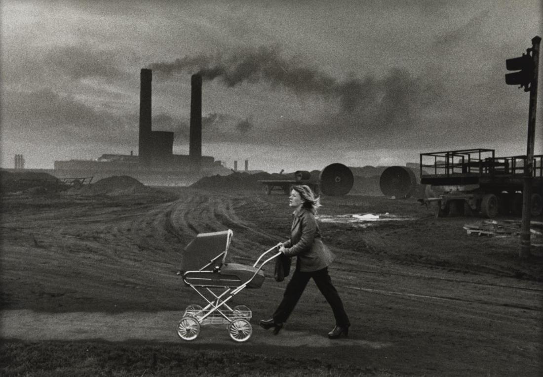
He later visited Consett, a former industrial town which he has visited to photograph in 1980. He described that time, saying “that world had to go, people deserved better”. His austere images of the 1980s show a bleak landscape, and his portrayal of the town led to a complaint by the council.
Consett, County Durham 1974. Don McCullin
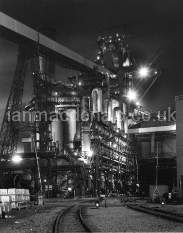
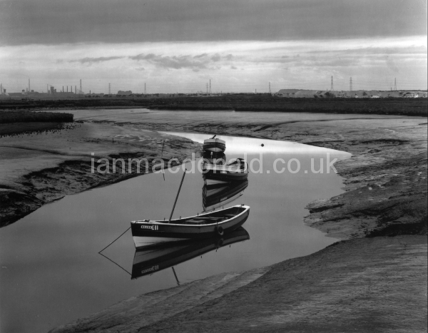
His depiction of the industrial North-East around this time, is very different from that of Ian MacDonald, from nearby Teesside who photographed the area a few years earlier. These show industry as clean and bright and the countryside around a bright and rural.
Heavy Industry – Plant. Ian MacDonald
Greatham Creek – boats. Ian MacDonald
While this might reflect the sudden decline of industry in the intervening years, however I wonder if this is more to do with the difference in perception of a local person (MacDonald) as opposed to that of McCullin who was not from that area and saw the landscape with fresh eyes.
2. McCullin’s interaction with his subjects
In the documentary, we see McCullin photographing people in various settings. I was interested to watch his interaction and conversation with them. To some extent this was assisted by his use of a camera with a waist level view finder, the camera did not come between him and his subject. On viewing the resulting images, while some are clearly posed like this from Glyndebourne:
Glyndebourne Opera Festival 2018. Don McCullin
others are less obviously posed.
A man eats fish and chips on Eastbourne pier, 2018. Don McCullin
Watching McCullin work, we learn more about the subject. For example why this man is eating his lunch on a very windy pier. McCullin knows more about his subjects than is obvious from the image.
My own attempts at street photography have been more discrete, not engaging the subject and trying not to obviously be taking photographs. However, a more direct approach may be necessary to get the impression of emotional connectivity on which I commented in the work of Willy Ronis, but also seen in McCullin’s work.
3. Some technical points
This image of an elderly lady watching a brass band engages the observer with her eyes immediately.
Eastbourne Bandstand 2018, Don McCullin
One’s gaze is directed to her face, in spite of the rest of the image having a lot of detail and being potentially quite distracting. This is probably because she is looking directly at the camera and is herself engaged in the image. My own approach to this would have involved severe cropping which would have lost the context and setting in which she was, or the use of narrow depth of field to emphasise her face. From this image I learned that that approach is not necessary and is limiting. What is necessary is that engagement with the subject that can then be portrayed in the final image.
Other aspects of McCullin’s technical approach is his use of film with medium and large format cameras. While his earlier work was in 35mm (particularly the war photography), his use of larger format enables high definition prints.
He is very committed to film – “some subjects demand film”. Although I do tend to disagree with him slightly on his statement that the photographer can “press the button on digital and its all done for you”
4. Other points
There are some other points that I intend to develop further in later posts.
These include his comment that “I cannot help taking my prints darker and darker and darker, I don’t know what makes me do it”.
During my brief stay in Venice I visited the Peggy Guggenheim Collection. This is a museum of modern art principally based on the personal collection of Peggy Guggenheim who collected the artworks mostly between 1938 and 1946. Works on display include those of American and European artists largely working in the first half of the 20th century, and include works of Cubism, Surrealism and abstract expressionism.
I am not familiar with this style of art and I hoped my visit would extend my knowledge and expose me to different forms and styles of visual expression.
There was a lot of material in the collection and I made notes as I visited. To try and put this experience into a manageable form I have decided to write here three things I believe I learned from this visit. I am sure that there were more, and I may recognise these as I progress through my OCA course, however I will add to that account from my notes as I need.
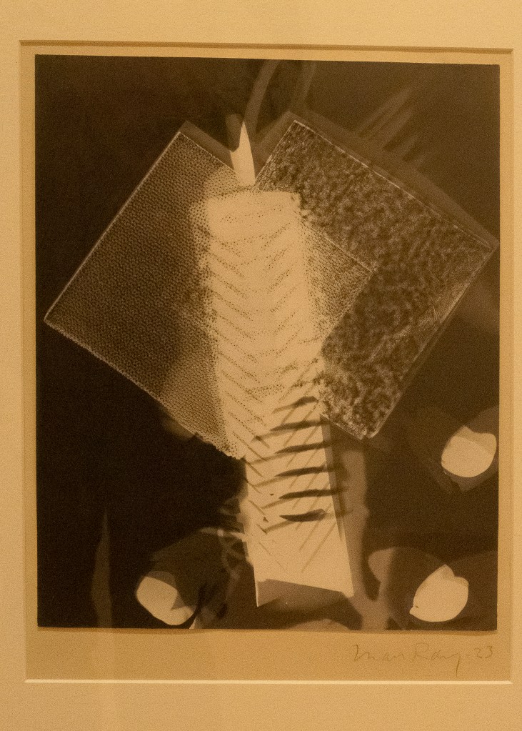
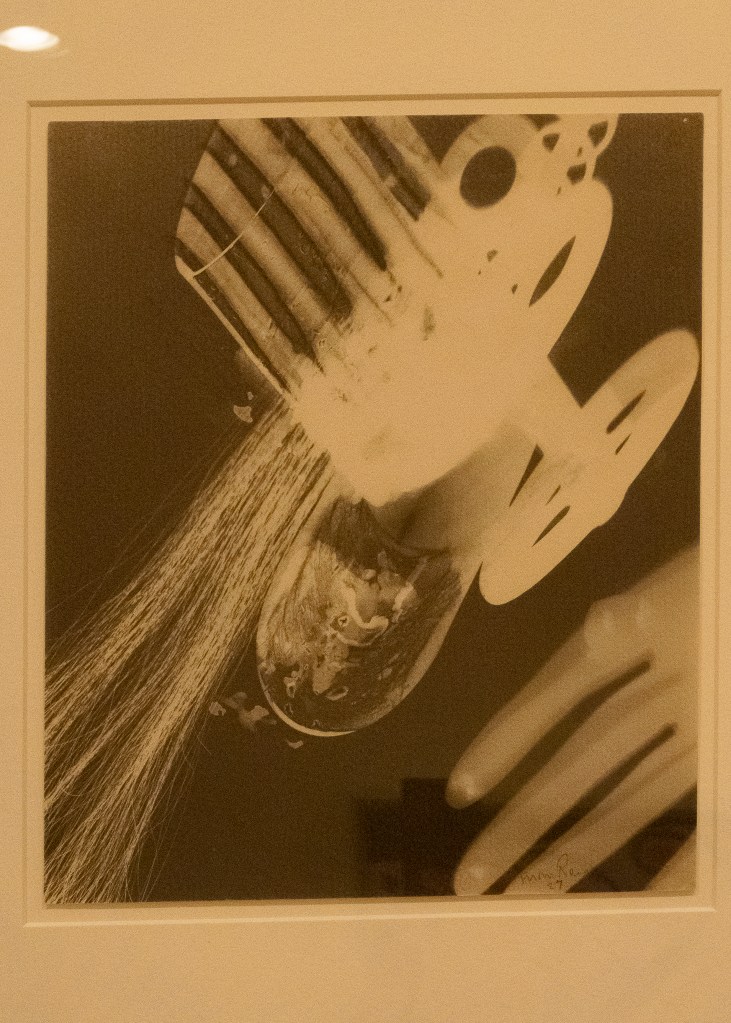
1. Rayographs by Man Ray
The collection includes two examples of Rayographs made by Man Ray.
Man Ray is described as a painter, filmmaker, photographer and sculptor, active in Paris from 1921. His work is considered influential in the development of Surrealism. As a photographer he is also noted for technical experimentation with techniques such as solarisation, grain enlargement and the production of camera-less prints, “Rayographs” (Photography the Whole Story (2012) Hacking J (Ed.) Thames and Hudson.)
These rayographs were made by placing objects directly on a sheet of photosensitized paper and exposing it to light. The resulting image becomes more abstract and representational.
Rayograph, untitled. Man Ray. Peggy Guggenheim Collection
Rayograph, untitled. Man Ray. Peggy Guggenheim Collection
2. Abstract art and Surrealism
I had never really considered the massive differences in styles of “modern art”. Going round the gallery I could see how the styles evolved through Cubism to abstract. The work of the surrealist artists I found particularly interesting as these employed imagery based on the principles of psycho-analysis. Symbolism is widely used based on classical Freudian theory and later artists such as Max Ernst, employing Jungian principles.
3. The work of Jackson Pollack
I have never understood the work of this artist. However the notes from the collection helped me to begin to do so.
The concepts of line, form and colour in creating an image began to be explored in our coursework, exercises 1. However seeing the abstract images in this collection made me understand to what extent these can be separated and function independently. Pollack takes this to an extreme and does not appear to depict any realistic description.
The exhibition notes also referred to the principle that some of the key feature of some of these works is the process of creating the image, rather than the image itself.
These are relatively new concepts for me, but I think this visit has started me on a different path of understanding art works.
This section of my learning log really documents my development of different visual appreciation and understanding.
Following viewing the Ronis exhibition I took some photographs around Venice and tried to emulate the style and spirit of some of those I had seen in the exhibition.
In addition to the images I have shown in my account of my visit to the exhibition there were some images of Venice taken by Ronis. These and his images of the people of Paris influenced my selection of subjects.
Venice Willy Ronis 1959
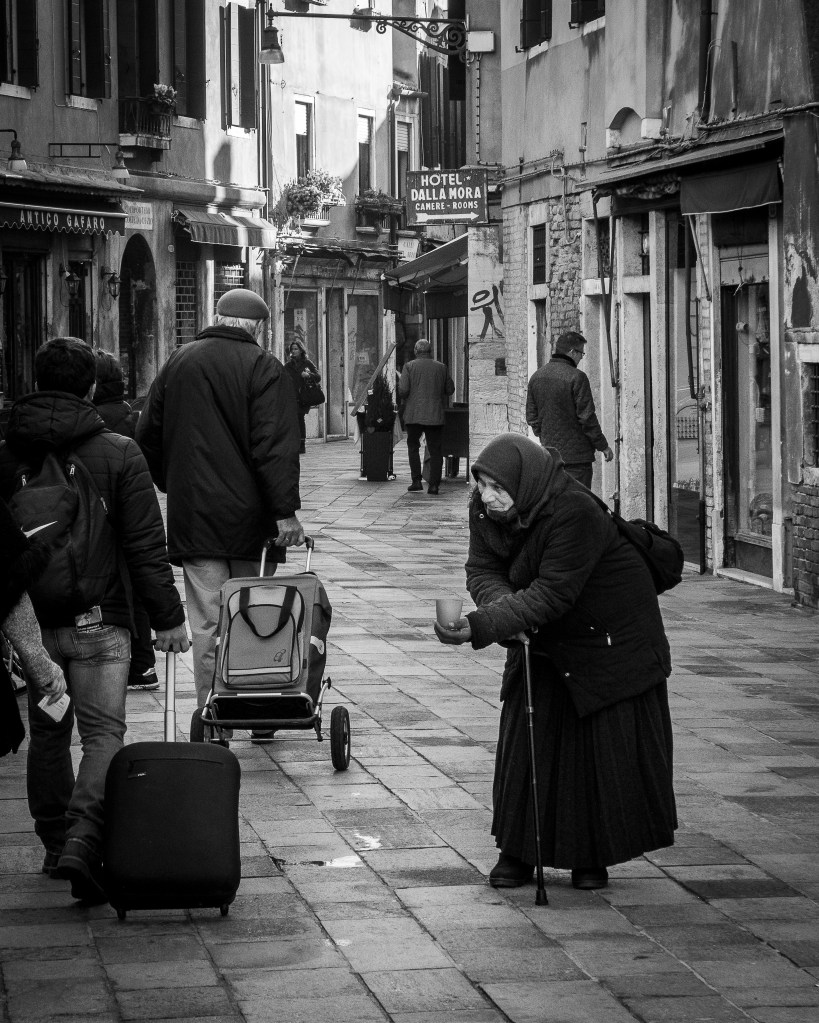
I tried a number of images of people in the street – particularly the gondoliers who were in their winter clothes of thick jackets!
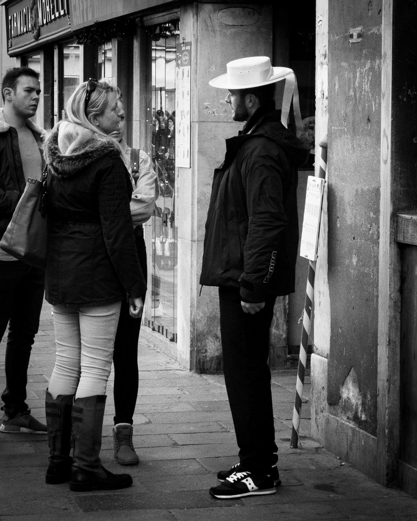
Gondolier and tourists
Gondoliers
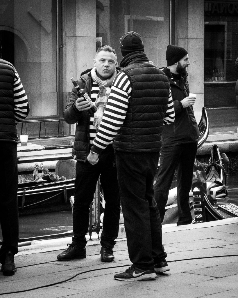
Gondolier and wine
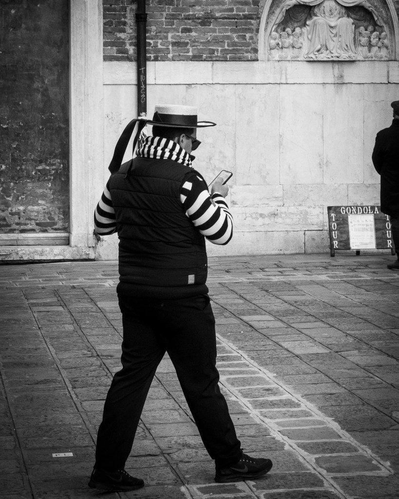
Gondolier and mobile phone
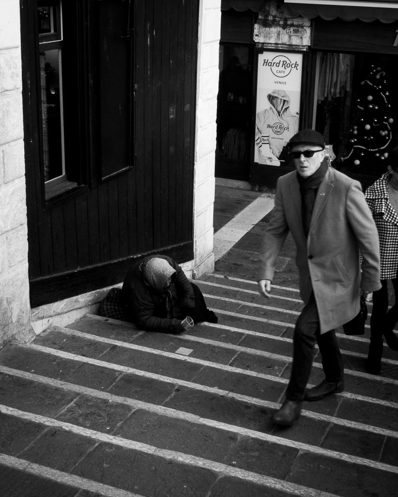
As well as these, Ronis’s sense of social justice inspired these images highlighting social inequality in this city.
Venice resident and tourists
Rialto Bridge 1
Rialto Bridge 2
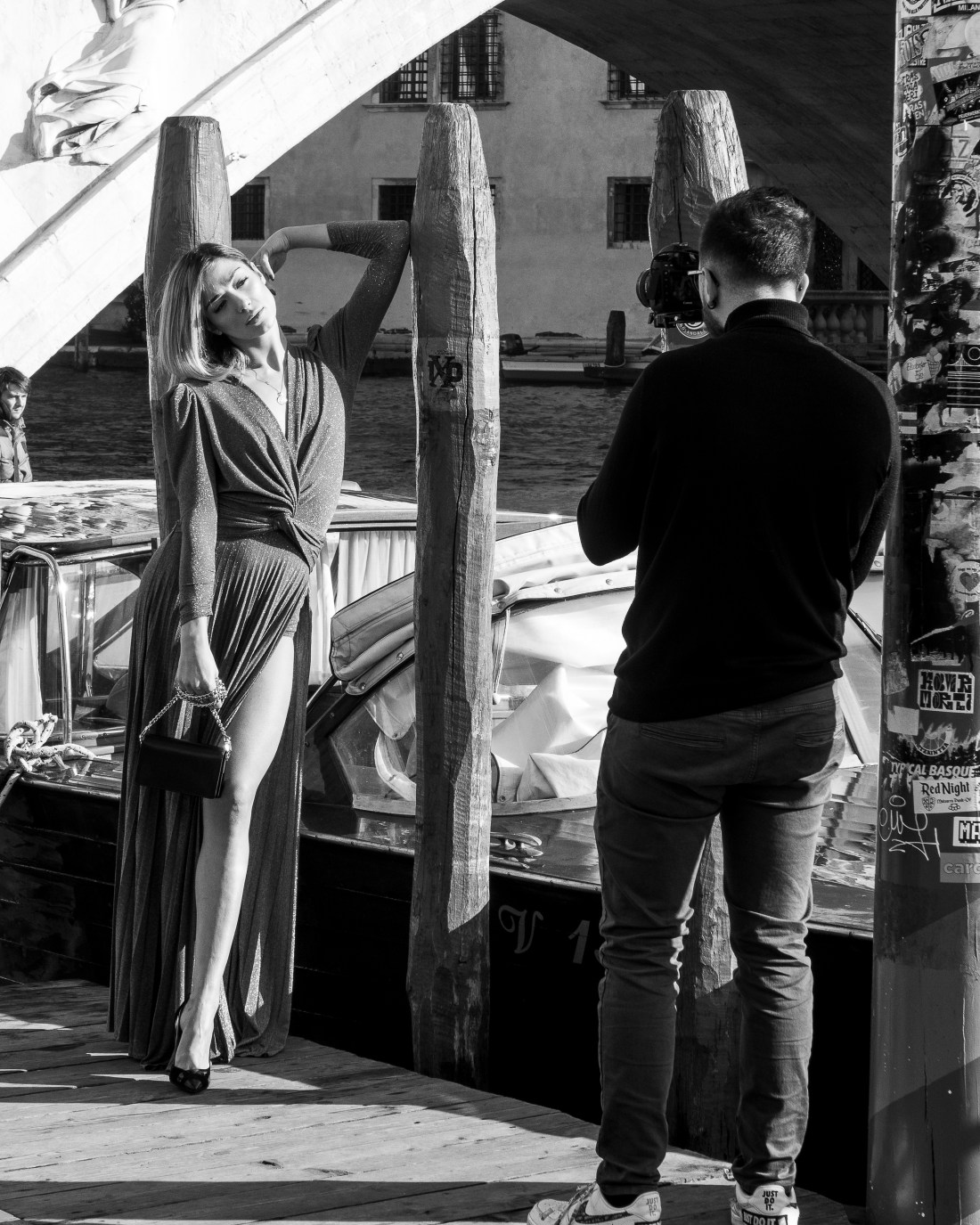
The glamour was highlighted by a video shoot
Video shoot near the Rialto
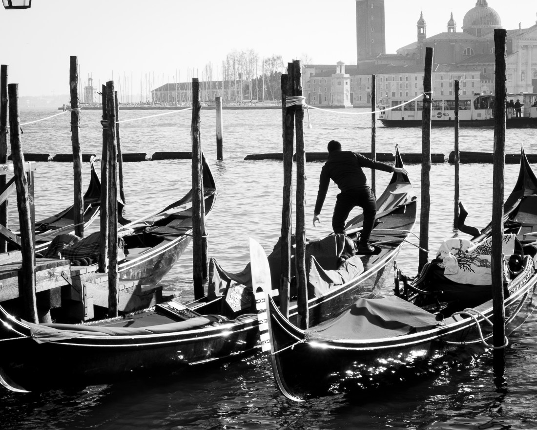
The last of my images I include has a similar silhouette effect to this one by Ronis
Venice. Willy Ronis 1959
Again taken with the light on the water providing a marked silhouette.
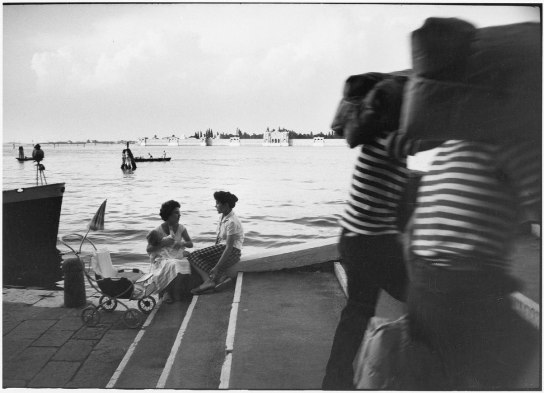
Gondolas and gondolier near San Marco
I may use this image as a link to the Decisive Moment assignment – as every time he places his foot on the deck of a wet and moving gondola is a decisive moment!
Willy Ronis: Photographies 1934-1998 Casa dei Tre Oci, Venice
I visited this exhibition while on a short visit to Venice in December 2018.
The exhibition was described as “the most complete retrospective of the great French photographer to be held in Italy, featuring 120 vintage images, among which about ten previously un-exhibited ones devoted to Venice, together with documents, books, and letters never previously shown… The exhibition ranges over the whole career of one of the major interpreters of twentieth century photography and a protagonist of the French humanist tradition.”
The notes accompanying the exhibition indicate that Willy Ronis was born in 1910 and died in 2009. His mother was a piano instructor and his father had a photography studio in Montmartre, Paris. Ronis was interested in music and initially planned a career in music. However in 1932 on completing his compulsory military service, he was needed to run his father’s photography studio as his father was suffering from cancer. After the death of his father the business closed and Ronis began working as a freelance photojournalist until 1940 when he left Paris to escape the German invasion. He returned to Paris in 1946 and he joined the Rapho photo agency (an agency specializing in humanist photography). In the early 1950s, he became known internationally for his commissions for Life and other magazines.
The exhibition included 120 images made by Ronis over a 64 year period. As such there was a great deal of content for me to assimilate.
I have made extensive notes about the exhibits, but to focus my learning will describe here three aspects which I regard as my key learning points from visiting this exhibition.
1. Editorial Control of Output and use of images
Ronis had strong views about the use of his images and the depiction of his subject matter in publication. He resigned from Rapho for a period when he objected to the captioning by The New York Times to his photograph of a strike (“Willy Ronis” by Peter Hamilton, in The Oxford Companion to the Photograph, ed. Robin Lenman Oxford: Oxford University Press, 2005; ISBN 0-19-866271-8).
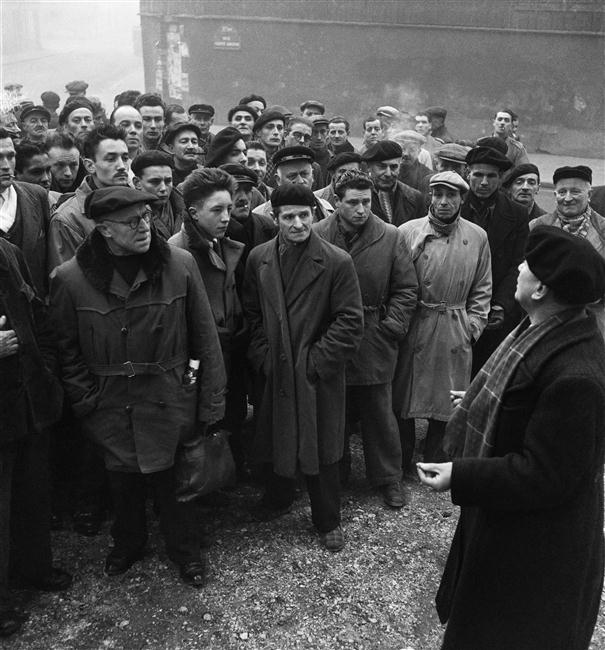
Of note also is that he objected to the cropping of one of his images for publication in a British journal. The image “The delegate, strike at the Charpentiers de Paris, Paris” (below) shows a trades union representative addressing strikers in 1950. However when published the right hand side of the image was cropped, removing the delegate. This changes the image and what it appears to show. Before cropping it showed strikers listening attentively to their representative; cropping it appears to show a mob without that direction and leadership.
The delegate, strike at the Charpentiers de Paris, Paris. Willy Ronis 1950
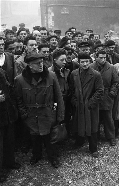
The delegate, Willy Ronis – as cropped by publisher
I found this very clear and stark example of how simple changes to an image alter its interpretation and therefore, meaning. As photographers we need to be explicit about any such manipulation of the image to create the effect and meaning we want. When this is outside our control we have to be wary our work still shows what we intend. 2. Emotional contact with his subjects
Many of the photographs made by Ronis in Paris show his subjects facial expressions very clearly. This in turn appears to show some emotional contact with them which is communicated through the image.
Examples of this which stand out to me are:
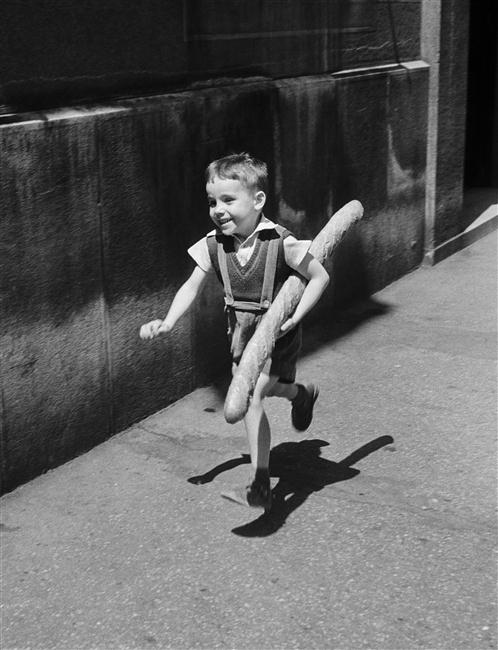
Le petit Parisien, 1952. The boy is smiling broadly, we can sense his happiness from his expression.
Le Petit Parisien Willy Ronis 1952
Conversely the man pictured in the Christmas shopping, Semaine de Noel, place du Palais Royale 1954, is clearly not enjoying himself unlike the others around him.
Christmas week, Place du Palais-Royal. Willy Ronis 1954
A third image, of a Miner Suffering with Silicosis, Lens 1951, shows a clearly sad man. However Ronis has chosen to photograph him through a window. It seems as if this barrier represents a separation of the miner from his work and colleagues because of his illness.
Miner with silicosis, Lens Willy Ronis 1951
What I think I learned from these and other images is the importance of capturing the facial expression in these informal portraits and thereby communicating some emotional contact with the subject to the observer.
3. Ronis’s self-perception as shown by self-portraits
There were five images in the exhibition which were self-portraits by Willy Ronis taken at different stages in his career. I thought these images depicted aspects of himself which he wanted to emphasise at these different stages. They appear to show his interests and activities at various stages in his career.
I was unfamiliar with all the work of Willy Ronis when I went to the exhibition, but writing up these notes I became aware of many other self portraits. This made me realise that the exhibition was curated and the views opinions and attitudes of the curator influence the choice of exhibits. Thus my perception of Ronis as I learn it from this exhibition is coloured by what the curator chooses to show me. It is with this caution that I describe what I think I learned about Ronis’s self-perception and how he chooses to show himself to the world.
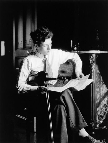
The earliest image was from 1929 and shows a young Willy Ronis in the dining room of the family apartment. He is studying a music score and has his violin under his arm and his bow in his hand. It is a very formally composed image: he is smartly dressed, looking studious, and on a side table behind him is a water jug and glass.
Self portrait Willy Ronis 1929
The reports of his life story indicate that at this stage in his life he was serious about music and intended to pursue this as a career. I interpreted this image as him showing this interest and wonder if he took this for posterity so that when as a successful musician it would show his early interest and activity in this area. It is ironic that this is however the early image of a great photographer – rather than a musician.
The second image in the exhibition is from 1935 and shows Ronis in the window of what had been his father’s studio which he now ran.
Self Portait Willy Ronis 1935
He is smartly dressed in a suit and looking out of the window. He has a confident stance, erect and looking straight ahead. He is now businessman running an established business premises. The appears to present himself as well-to-do successful and respectable businessman.
I was struck by the composition in this image. Because the image is taken from inside looking out of the window, notices in the window become black shapes, the left side of the image is also black with little detail and the body of Ronis in his dark suit provides a dark shape to the right side of the image. I am probably over interpreting this, but during the same weekend I visited the Peggy Guggenheim collection and saw Miro’s Femme Assise II, 1939 (below). The Miro is composed of shapes of black with small areas of detail.
Femme Assise II. Miro 1939
Although painted after Ronis made this image, I wonder if the influence of some of Miro’s earlier works had led Ronis to compose this image with blocks of black.
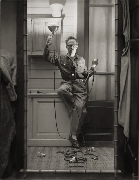
The third image, Self Portrait with Flash (1951) shows Ronis in a different light. At this stage in his career he had worked as a freelance photojournalist. He had covered workers disputes and had developed a strong self of social justice. He is quoted in the exhibition “We must work to change this world and make it better”.
Self portrait with flash. Willy Ronis 1951
This image shows Ronis in his studio holding a flash. He is now dressed in clothes suggestive of a working man, rather than the suit of the previous image. He also adopts a quirky pose on one leg and it is this that adds a sense of light heartedness to the image compared to the seriousness of the two previous ones. Does this reflect the greater self confidence of an established freelancer with international publication – he chooses how he wants to show himself, rather than how he thinks others want to see him.
The fourth image, Self-portrait L’Isle sur la Sorgue 1978, continues this theme of him portraying himself as the established successful photographer.
Self Portrait, L’Isle sur La Sorgue Willy Ronis 1979
He is sat at his desk, studying a negative. The desk appears to be covered in the clutter associated with this position. I suspect it is carefully arranged and selected to show different aspects he wants to show. His diary is open in front of him – a diary of appointments will determine his activities and has a great importance in his life. There are collections of negatives and mounted slides, documents and journals in foreign languages reflecting his international status. A large treble clef is drawn on a page, part covered by other clutter – is this a memory of his original career plan, it appears incongruous otherwise.
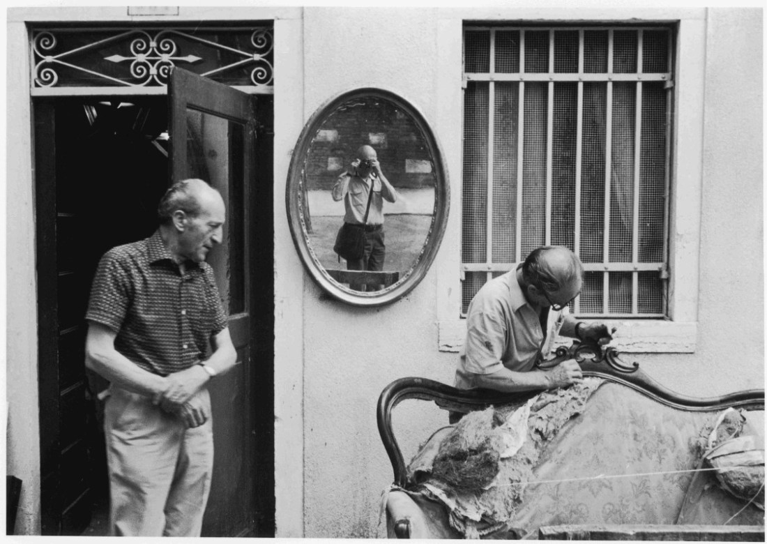
The final image is from Giudecca, Venice in 1981. He describes it as a “discrete self-portrait” as the image appears to be of upholsterers outside their workshop, but Ronis can be seen clearly in the centre of the image, reflected in a mirror on the wall.
Self Portrait, Giudecca Venice. Willy Ronis 1981
Ronis is seen, casually dressed, with his camera bag and small camera. He appears as what he started out as, a street photographer. He is not taking a large part in this image, which remains that of the upholsterers and otherwise looks like one of his early images from Paris. His presence is discrete – as it needs to be for a street photographer. I consider that this reflects Ronis portraying himself as how he started and how he wanted to be seen towards the end of his career.
4. Other learning points
There were many other aspects to this exhibition which influenced how I looked at these images. Many of them made me consider the “Decisive Moment” and I will refer to these in my account of Assignment 3 “The Decisive Moment”.
A further aspect to many of Ronis’s works is the sense of humour. I have mentioned this in relation to his Self-Portrait with Flash, however there are many more images which one cannot look at without smiling.