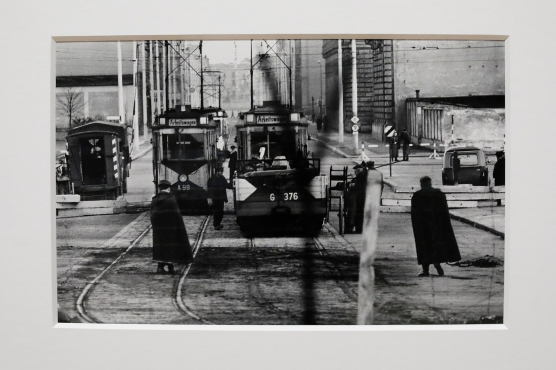
I recently visited the exhibition of the work on Don McCullin and saw this image in which McCullin uses the technique of focussing through foreground structures to the distance. This image was taken while McCullin was in Berlin at the time of the building of the Berlin Wall.
Looking into East Berlin Don McCullin 1961
While the notes for this exercise suggest that it is usually preferable to focus in the foreground, what McCullin has achieved here is to show a scene in East Berlin of “normal” life, but the blurred image of the wire and barrier remind us that as the Wall was built so this was now cut off from our view point.
Following viewing the Ronis exhibition I took some photographs around Venice and tried to emulate the style and spirit of some of those I had seen in the exhibition.
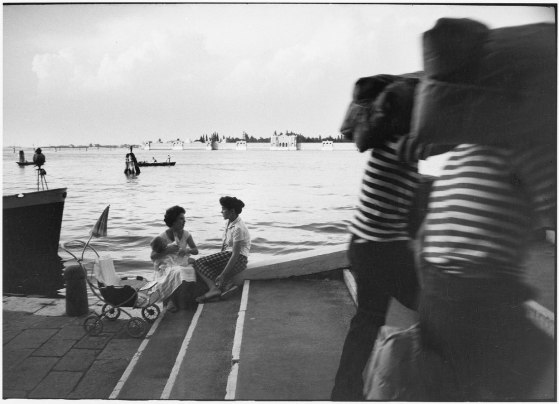
In addition to the images I have shown in my account of my visit to the exhibition there were some images of Venice taken by Ronis. These and his images of the people of Paris influenced my selection of subjects.
Venice Willy Ronis 1959
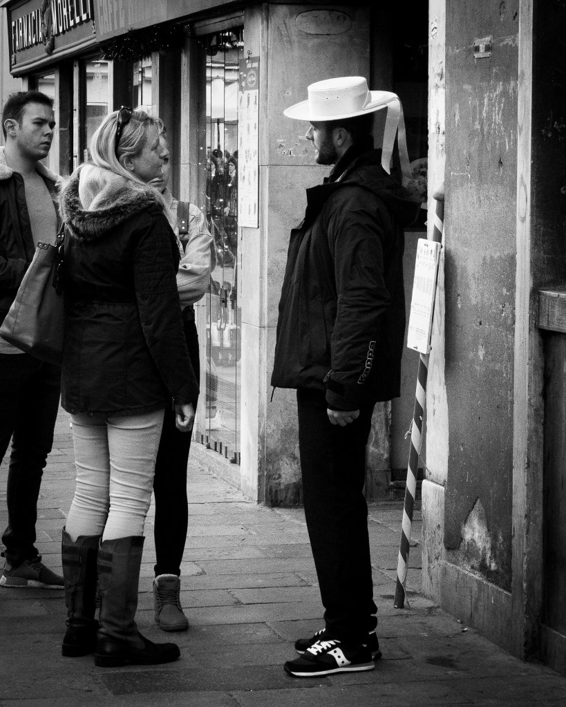
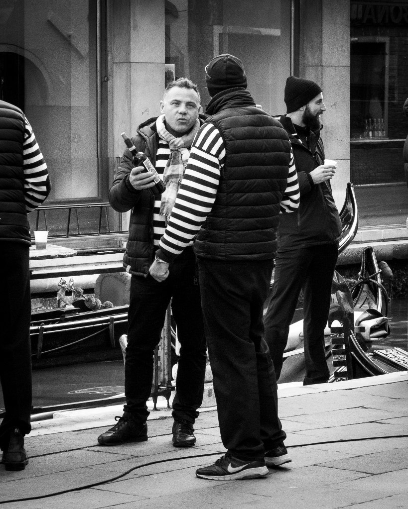
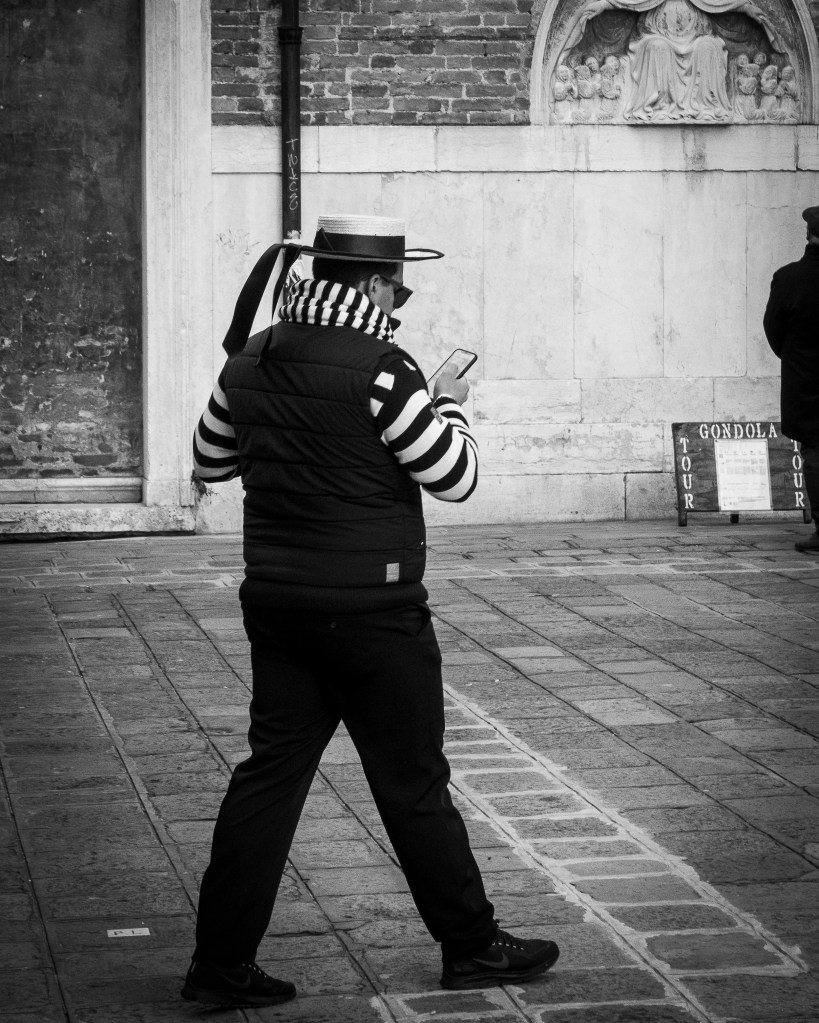
I tried a number of images of people in the street – particularly the gondoliers who were in their winter clothes of thick jackets!
Gondolier and tourists
Gondoliers
Gondolier and wine
Gondolier and mobile phone
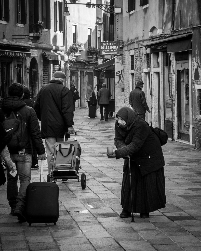
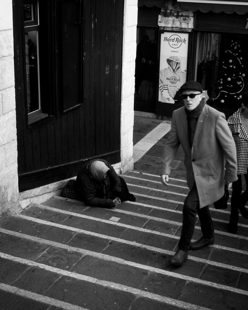
As well as these, Ronis’s sense of social justice inspired these images highlighting social inequality in this city.
Venice resident and tourists
Rialto Bridge 1
Rialto Bridge 2
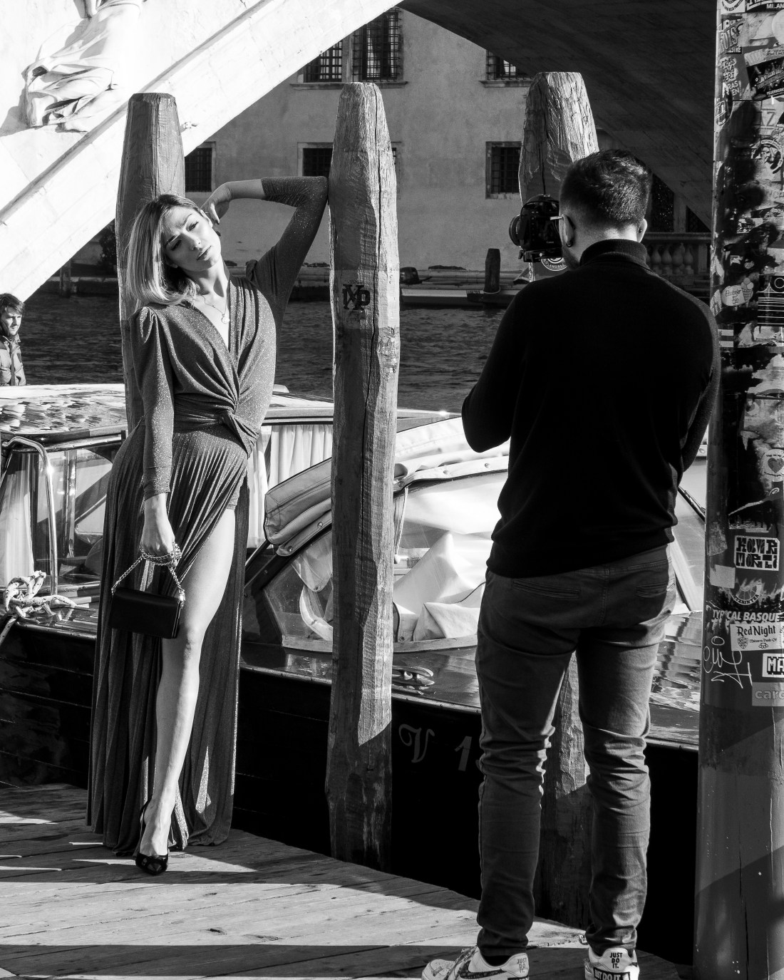
The glamour was highlighted by a video shoot
Video shoot near the Rialto
The last of my images I include has a similar silhouette effect to this one by Ronis
Venice. Willy Ronis 1959
Again taken with the light on the water providing a marked silhouette.
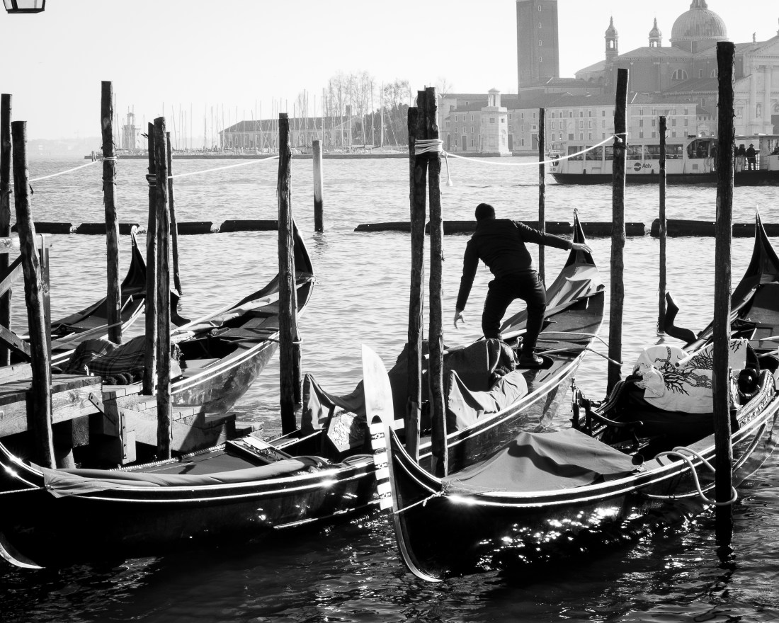
Gondolas and gondolier near San Marco
I may use this image as a link to the Decisive Moment assignment – as every time he places his foot on the deck of a wet and moving gondola is a decisive moment!
Willy Ronis: Photographies 1934-1998 Casa dei Tre Oci, Venice
I visited this exhibition while on a short visit to Venice in December 2018.
The exhibition was described as “the most complete retrospective of the great French photographer to be held in Italy, featuring 120 vintage images, among which about ten previously un-exhibited ones devoted to Venice, together with documents, books, and letters never previously shown… The exhibition ranges over the whole career of one of the major interpreters of twentieth century photography and a protagonist of the French humanist tradition.”
The notes accompanying the exhibition indicate that Willy Ronis was born in 1910 and died in 2009. His mother was a piano instructor and his father had a photography studio in Montmartre, Paris. Ronis was interested in music and initially planned a career in music. However in 1932 on completing his compulsory military service, he was needed to run his father’s photography studio as his father was suffering from cancer. After the death of his father the business closed and Ronis began working as a freelance photojournalist until 1940 when he left Paris to escape the German invasion. He returned to Paris in 1946 and he joined the Rapho photo agency (an agency specializing in humanist photography). In the early 1950s, he became known internationally for his commissions for Life and other magazines.
The exhibition included 120 images made by Ronis over a 64 year period. As such there was a great deal of content for me to assimilate.
I have made extensive notes about the exhibits, but to focus my learning will describe here three aspects which I regard as my key learning points from visiting this exhibition.
1. Editorial Control of Output and use of images
Ronis had strong views about the use of his images and the depiction of his subject matter in publication. He resigned from Rapho for a period when he objected to the captioning by The New York Times to his photograph of a strike (“Willy Ronis” by Peter Hamilton, in The Oxford Companion to the Photograph, ed. Robin Lenman Oxford: Oxford University Press, 2005; ISBN 0-19-866271-8).
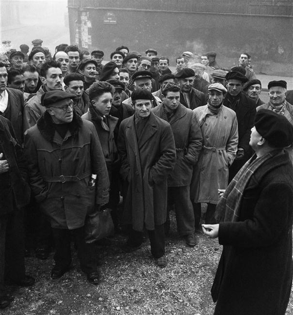
Of note also is that he objected to the cropping of one of his images for publication in a British journal. The image “The delegate, strike at the Charpentiers de Paris, Paris” (below) shows a trades union representative addressing strikers in 1950. However when published the right hand side of the image was cropped, removing the delegate. This changes the image and what it appears to show. Before cropping it showed strikers listening attentively to their representative; cropping it appears to show a mob without that direction and leadership.
The delegate, strike at the Charpentiers de Paris, Paris. Willy Ronis 1950
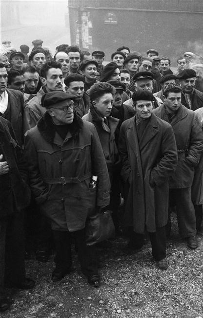
The delegate, Willy Ronis – as cropped by publisher
I found this very clear and stark example of how simple changes to an image alter its interpretation and therefore, meaning. As photographers we need to be explicit about any such manipulation of the image to create the effect and meaning we want. When this is outside our control we have to be wary our work still shows what we intend. 2. Emotional contact with his subjects
Many of the photographs made by Ronis in Paris show his subjects facial expressions very clearly. This in turn appears to show some emotional contact with them which is communicated through the image.
Examples of this which stand out to me are:
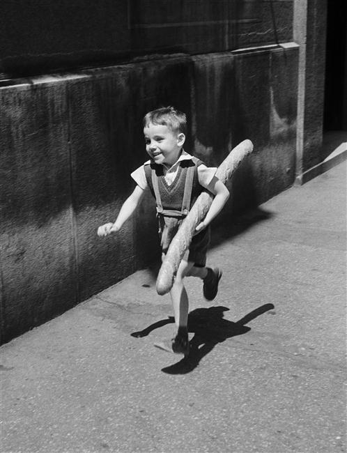
Le petit Parisien, 1952. The boy is smiling broadly, we can sense his happiness from his expression.
Le Petit Parisien Willy Ronis 1952
Conversely the man pictured in the Christmas shopping, Semaine de Noel, place du Palais Royale 1954, is clearly not enjoying himself unlike the others around him.
Christmas week, Place du Palais-Royal. Willy Ronis 1954
A third image, of a Miner Suffering with Silicosis, Lens 1951, shows a clearly sad man. However Ronis has chosen to photograph him through a window. It seems as if this barrier represents a separation of the miner from his work and colleagues because of his illness.
Miner with silicosis, Lens Willy Ronis 1951
What I think I learned from these and other images is the importance of capturing the facial expression in these informal portraits and thereby communicating some emotional contact with the subject to the observer.
3. Ronis’s self-perception as shown by self-portraits
There were five images in the exhibition which were self-portraits by Willy Ronis taken at different stages in his career. I thought these images depicted aspects of himself which he wanted to emphasise at these different stages. They appear to show his interests and activities at various stages in his career.
I was unfamiliar with all the work of Willy Ronis when I went to the exhibition, but writing up these notes I became aware of many other self portraits. This made me realise that the exhibition was curated and the views opinions and attitudes of the curator influence the choice of exhibits. Thus my perception of Ronis as I learn it from this exhibition is coloured by what the curator chooses to show me. It is with this caution that I describe what I think I learned about Ronis’s self-perception and how he chooses to show himself to the world.
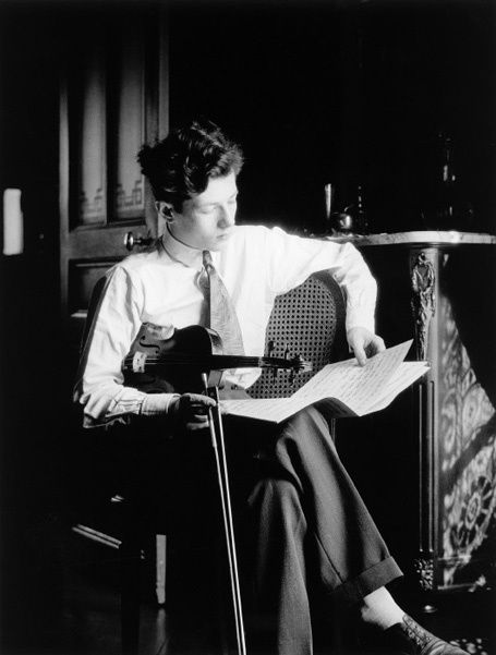
The earliest image was from 1929 and shows a young Willy Ronis in the dining room of the family apartment. He is studying a music score and has his violin under his arm and his bow in his hand. It is a very formally composed image: he is smartly dressed, looking studious, and on a side table behind him is a water jug and glass.
Self portrait Willy Ronis 1929
The reports of his life story indicate that at this stage in his life he was serious about music and intended to pursue this as a career. I interpreted this image as him showing this interest and wonder if he took this for posterity so that when as a successful musician it would show his early interest and activity in this area. It is ironic that this is however the early image of a great photographer – rather than a musician.
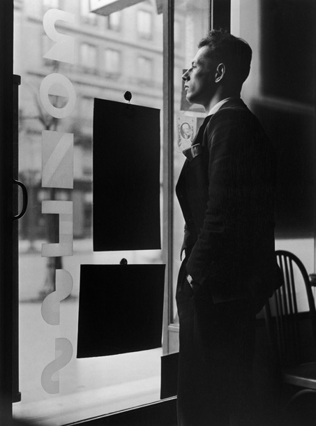
The second image in the exhibition is from 1935 and shows Ronis in the window of what had been his father’s studio which he now ran.
Self Portait Willy Ronis 1935
He is smartly dressed in a suit and looking out of the window. He has a confident stance, erect and looking straight ahead. He is now businessman running an established business premises. The appears to present himself as well-to-do successful and respectable businessman.
I was struck by the composition in this image. Because the image is taken from inside looking out of the window, notices in the window become black shapes, the left side of the image is also black with little detail and the body of Ronis in his dark suit provides a dark shape to the right side of the image. I am probably over interpreting this, but during the same weekend I visited the Peggy Guggenheim collection and saw Miro’s Femme Assise II, 1939 (below). The Miro is composed of shapes of black with small areas of detail.
Femme Assise II. Miro 1939
Although painted after Ronis made this image, I wonder if the influence of some of Miro’s earlier works had led Ronis to compose this image with blocks of black.
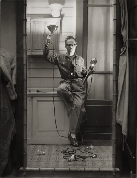
The third image, Self Portrait with Flash (1951) shows Ronis in a different light. At this stage in his career he had worked as a freelance photojournalist. He had covered workers disputes and had developed a strong self of social justice. He is quoted in the exhibition “We must work to change this world and make it better”.
Self portrait with flash. Willy Ronis 1951
This image shows Ronis in his studio holding a flash. He is now dressed in clothes suggestive of a working man, rather than the suit of the previous image. He also adopts a quirky pose on one leg and it is this that adds a sense of light heartedness to the image compared to the seriousness of the two previous ones. Does this reflect the greater self confidence of an established freelancer with international publication – he chooses how he wants to show himself, rather than how he thinks others want to see him.
The fourth image, Self-portrait L’Isle sur la Sorgue 1978, continues this theme of him portraying himself as the established successful photographer.
Self Portrait, L’Isle sur La Sorgue Willy Ronis 1979
He is sat at his desk, studying a negative. The desk appears to be covered in the clutter associated with this position. I suspect it is carefully arranged and selected to show different aspects he wants to show. His diary is open in front of him – a diary of appointments will determine his activities and has a great importance in his life. There are collections of negatives and mounted slides, documents and journals in foreign languages reflecting his international status. A large treble clef is drawn on a page, part covered by other clutter – is this a memory of his original career plan, it appears incongruous otherwise.
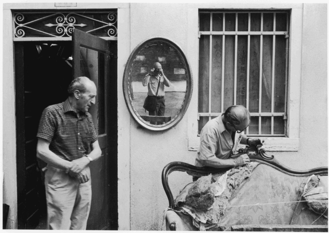
The final image is from Giudecca, Venice in 1981. He describes it as a “discrete self-portrait” as the image appears to be of upholsterers outside their workshop, but Ronis can be seen clearly in the centre of the image, reflected in a mirror on the wall.
Self Portrait, Giudecca Venice. Willy Ronis 1981
Ronis is seen, casually dressed, with his camera bag and small camera. He appears as what he started out as, a street photographer. He is not taking a large part in this image, which remains that of the upholsterers and otherwise looks like one of his early images from Paris. His presence is discrete – as it needs to be for a street photographer. I consider that this reflects Ronis portraying himself as how he started and how he wanted to be seen towards the end of his career.
4. Other learning points
There were many other aspects to this exhibition which influenced how I looked at these images. Many of them made me consider the “Decisive Moment” and I will refer to these in my account of Assignment 3 “The Decisive Moment”.
A further aspect to many of Ronis’s works is the sense of humour. I have mentioned this in relation to his Self-Portrait with Flash, however there are many more images which one cannot look at without smiling.
Brief Find a subject in front of a background with depth. Take a close viewpoint and zoom in; you’ll need to be aware of the minimum focusing distance of your lens. Focus on the subject and take a single shot. Then, without changing the focal length, set the focus to infinity and take a second shot.
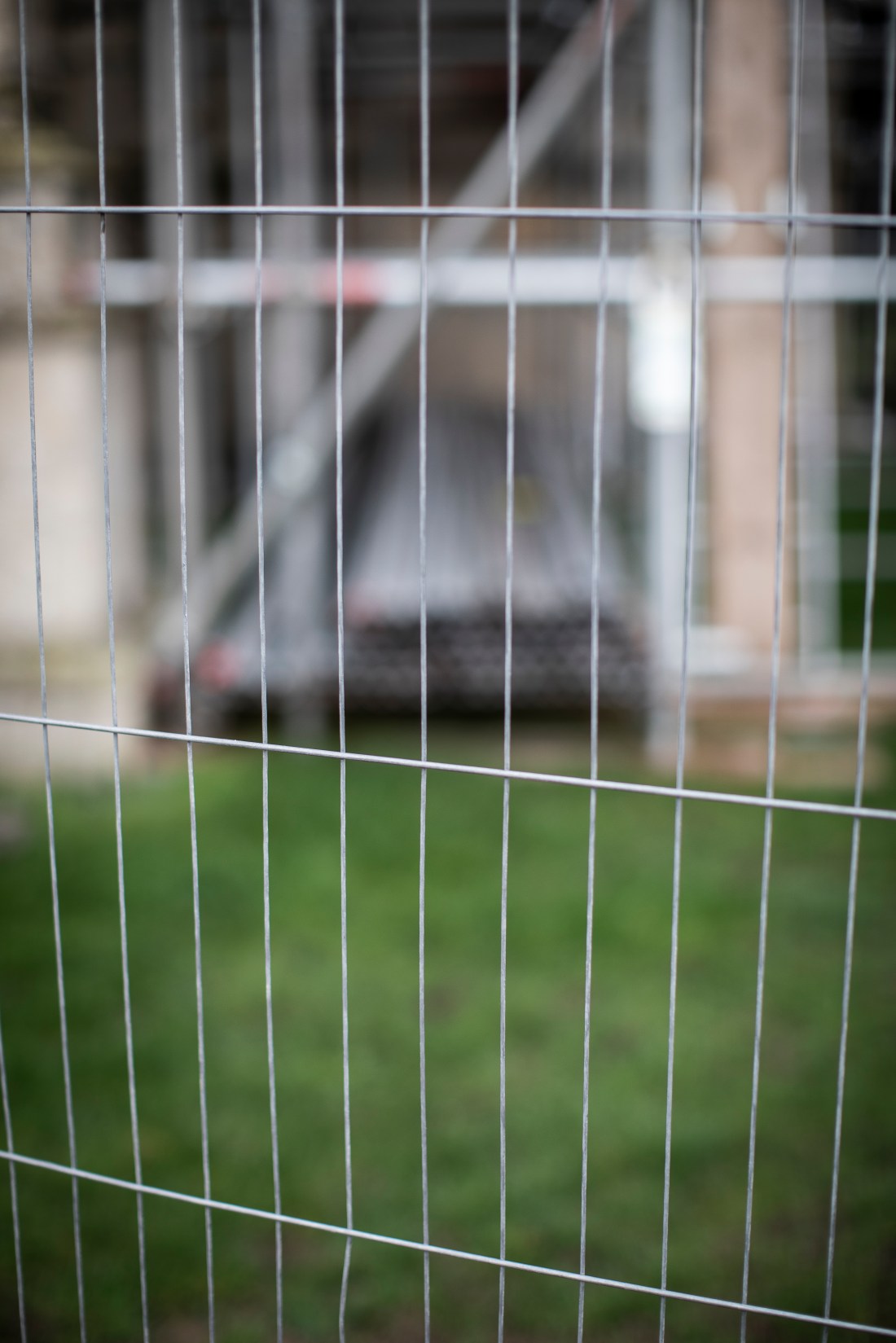
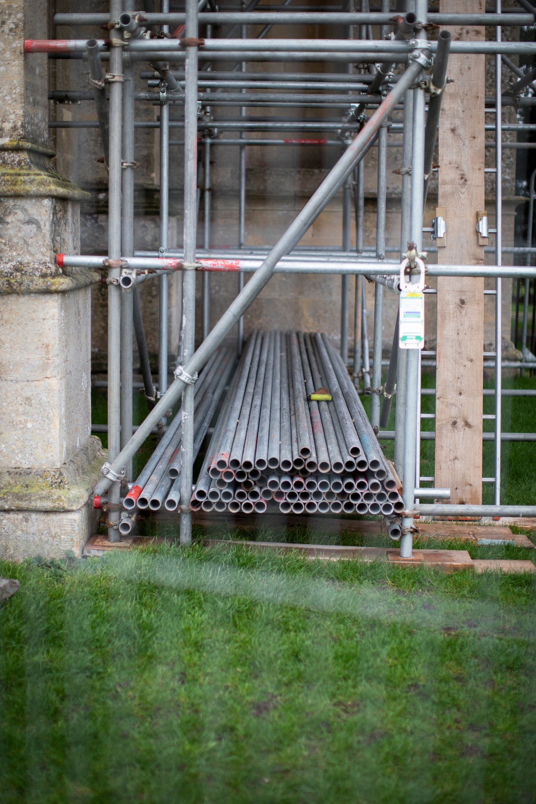
I took these two images on a visit to a National Trust property undergoing restoration. The work area was surrounded by fencing and I used the fencing as the foreground for my focus.
Croome Church 2Croome Church 1
I do not find these images particularly helpful in this exercise. The fencing in made of very narrow wire and once out of focus, becomes so indistinct as to be more like artefact or noise in the image, rather than contributing to the image itself. As a result of this the images do not help me consider the rest of the brief:
As you review the two shots, how does the point of focus structure the composition? With a shallow depth of field the point of focus naturally draws the eye, which goes first of all to the part of the image that’s sharp. It generally feels more comfortable if the point of focus is in the foreground, although there’s nothing wrong with placing the point of focus in the background.
This is a work in progress and I think I will need to find other subject matter for this exercise.
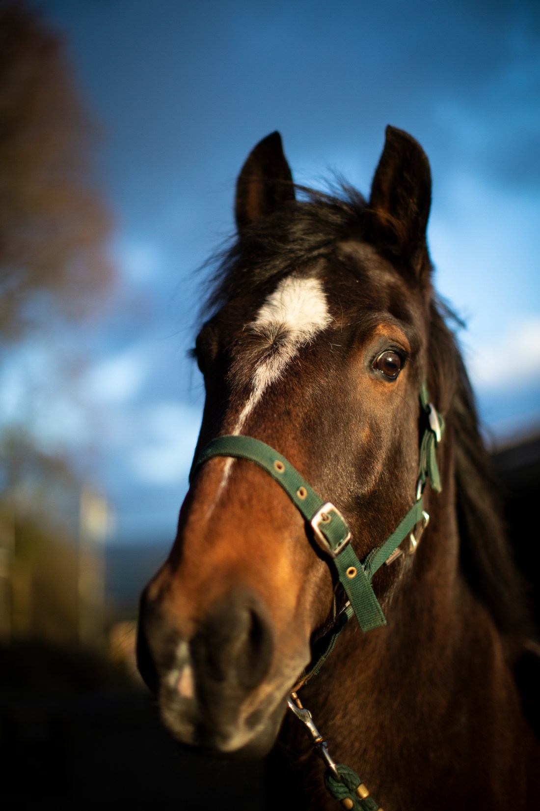
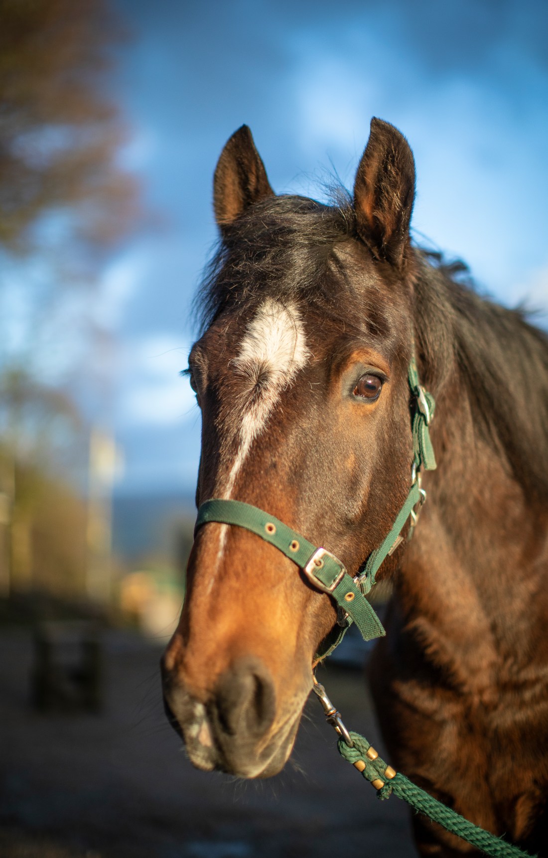
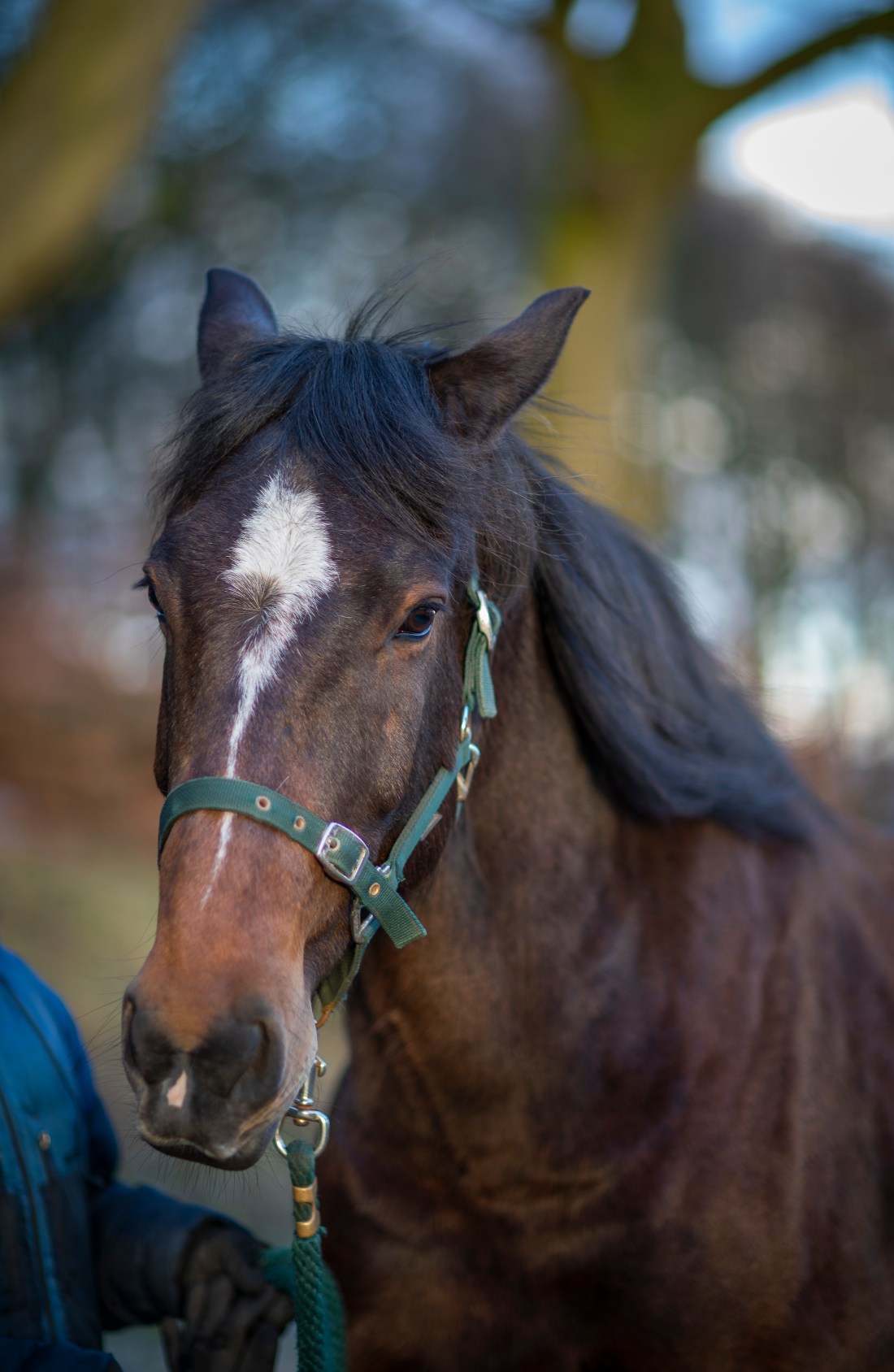
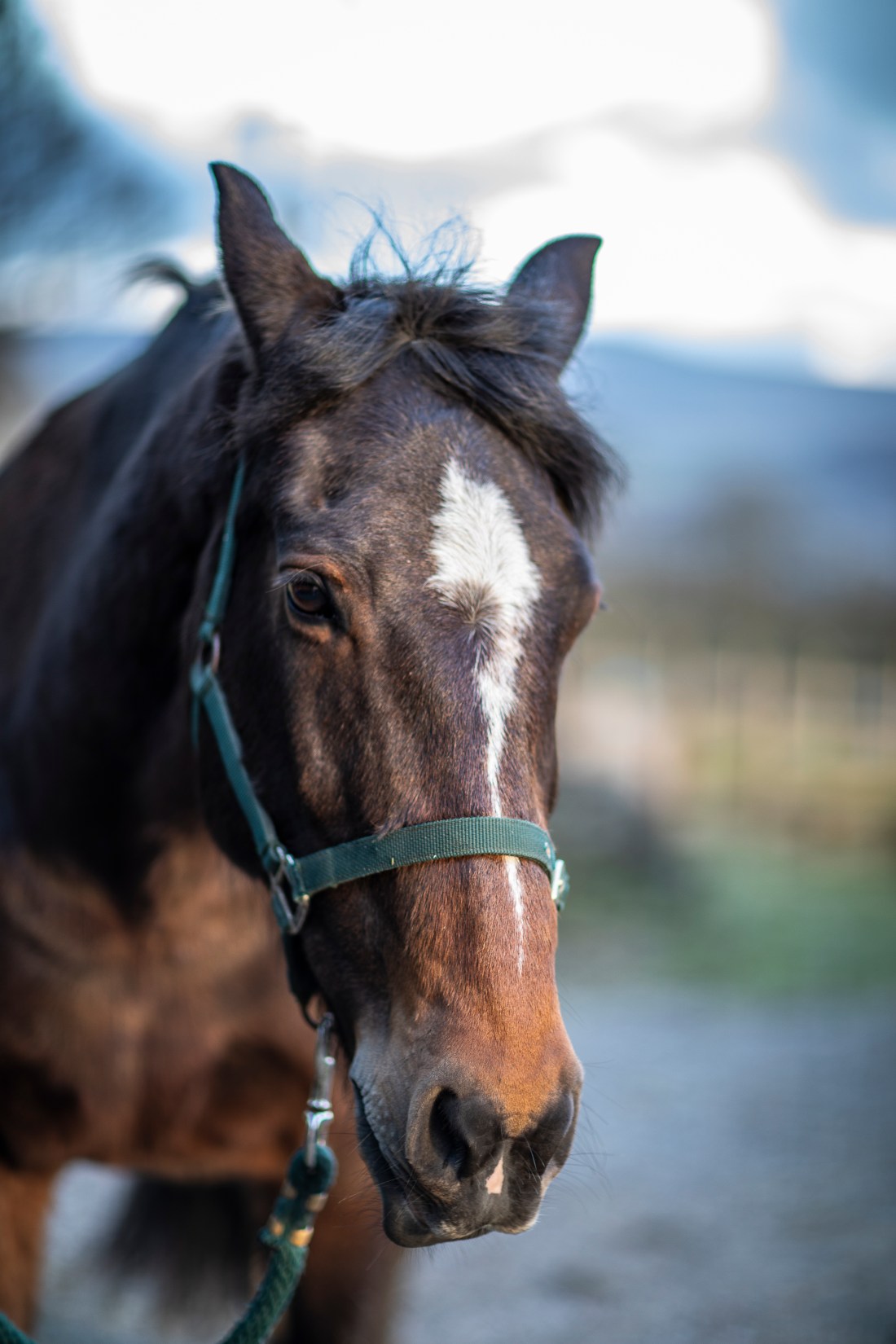
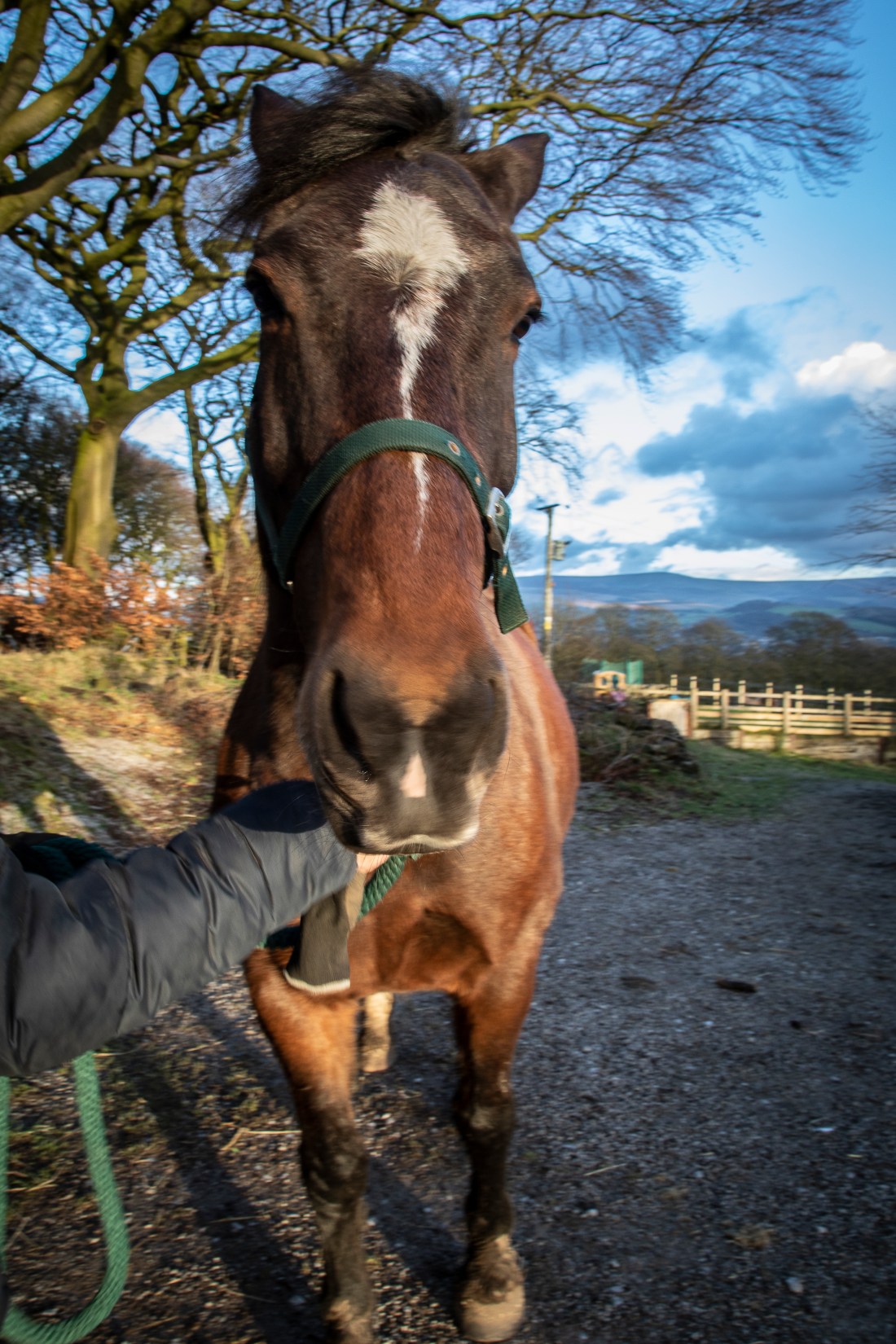
Brief: Find a location with good light for a portrait shot. Place your subject some distance in front of a simple background and select a wide aperture together with a moderately long focal length such as 100mm on a 35mm full-frame camera (about 65mm on a cropped-frame camera). Take a viewpoint about one and a half metres from your subject, allowing you to compose a headshot comfortably within the frame. Focus on the eyes and take the shot.
I used the same subject for this as for the previous exercise and took these shots on the same occasion.
I used two lenses for this – an 85mm and a 50mm prime lens, both with largest aperture of f1.2. I initially used the longer 85mm lens and later shots were with the 50mm lens. I have found that although an 85mm lens gives a natural looking perspective for portraits of humans, to fit the head of a horse into the frame I need to stand at a distance from the subject and therefore get a flattened perspective. For this reason I used the 50mm lens for later shots to be able to get the entire head in frame from a position where one would normally look at a horse like this. I used these lenses for this exercise as the very large aperture gives a very narrow depth of field; much narrower than my 24-105mm zoom with f4. At times this is so narrow that the horse’s nose is out of focus if the eye is focussed, however the sharp eye draws the observer’s gaze and this seems less important.
The contact sheet of all the images from this shoot are at:
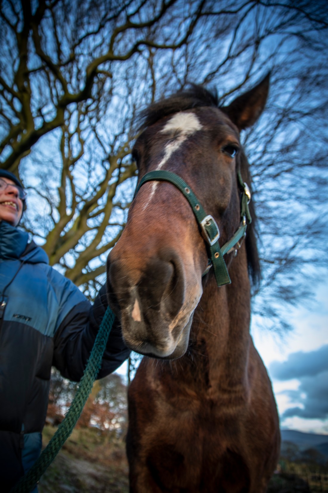
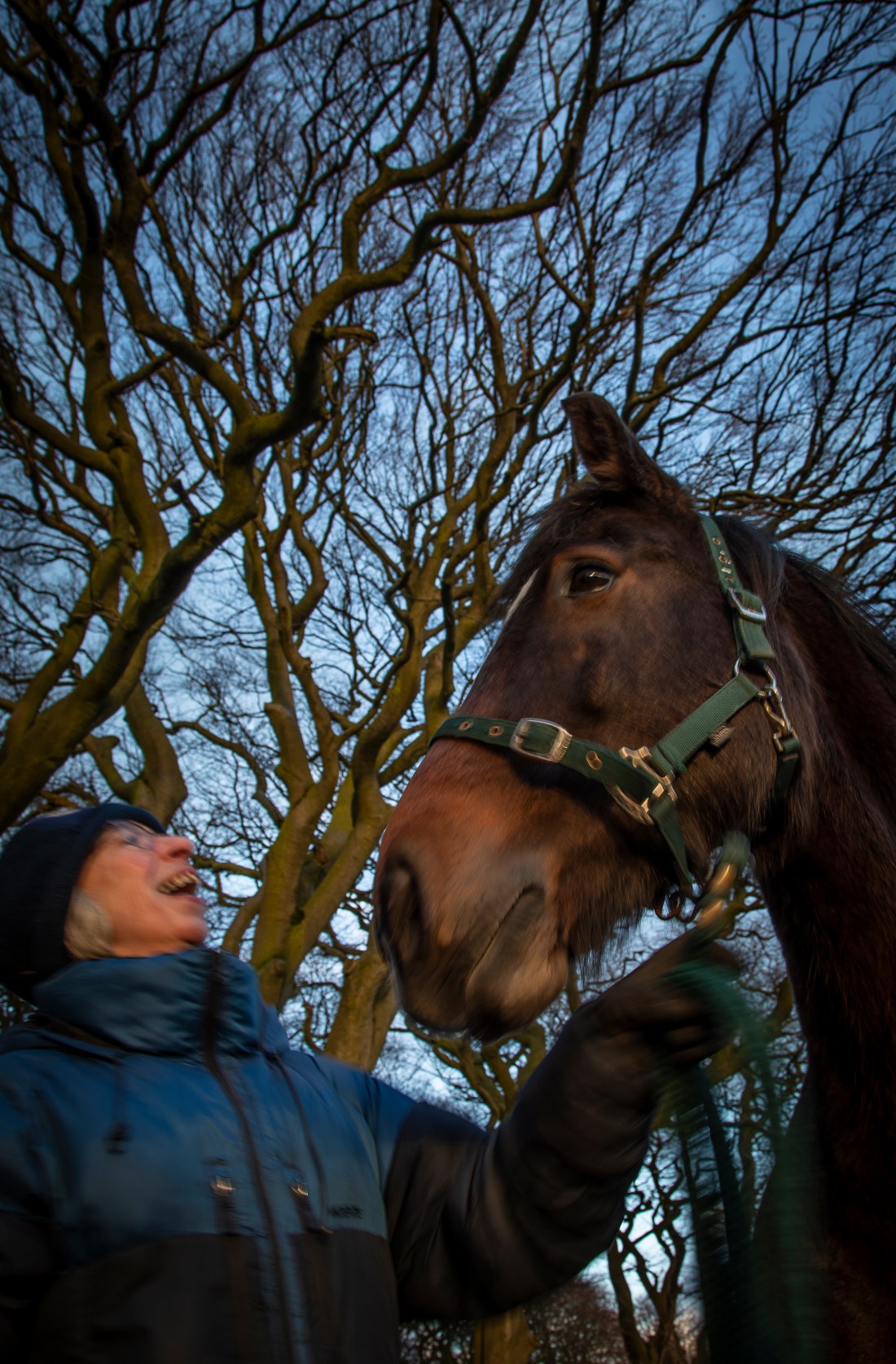
Brief: Choose a subject in front of a background with depth. Select your shortest focal length and take a close low viewpoint, below your subject. Find a natural point of focus and take the shot. You’ll see that a very wide lens together with a close viewpoint creates extreme perspective distortion. Gently receding lines become extreme diagonals and rounded forms bulge towards the camera. Space appears to expand. The low viewpoint adds a sense of monumentality, making the subject seem larger than it is, and tilting the camera adds to the effect as vertical lines dramatically converge. Not the ideal combination for a portrait shot!
I chose to do this exercise with the following one, Exercise 2.4, and used the same subject, my wife and her horse, Tigger. I chose to do these exercises in the evening as the sun was setting so as to take advantage of the warm light of the sun which makes Tigger’s coat look richly coloured. I use the “Sun Surveyor” app on my phone to assess the position of the sun and the likely lighting conditions for a shoot like this. I used a small aperture to try and get a deep depth of field, but kept the ISO at 100 so there is some camera and subject movement in some of the images.
The contact sheet for all the images I shot for this particular exercise are at:
I have slightly cropped and made development adjustments in terms of local exposure adjustments to a selection.
In these images the effect of extreme perspective is readily apparent – Tigger’s nose expands and appears disproportionate to his head. However when adopting this close position to a horse my camera was in danger of being eaten and his mouth and nose while looking big actually assume a size proportionate to their importance in self- and camera- preservation.
The following is a summary of what I have already set out in more detail in my learning log at aprocter231.wordpress.com
Background
Shipwrecks as archaeological sites provide valuable insights into the past. They have been considered as “time capsules” containing objects being used at the time of the sinking. Because of the precipitous nature of the sinking there was often no opportunity to remove objects and they remain as they were while in use at that time.
Wooden wrecks such as the Mary Rose (flagship of Henry VIII’s Vice Admiral of the Fleet, sank July 1545) may be preserved for many years allowing recovery and interpretation of artefacts. The systematic exploration of such an archaeological site depends on the careful recording of where precisely each object was found. In this way the spatial relationship of one object to another is recorded and from that spatial information, function may be inferred. The Mary Rose has revealed huge number of artefacts and a unique insight into Tudor life because of this.
Iron and steel wrecks are not preserved in seawater and decay much more rapidly and as a result there will not be a similar archaeological record for these. Amateur divers regularly dive the wrecks of iron and steel vessels in relatively shallow, coastal waters. Some of them do this as part of systematic investigations of the wreck, but most are informal almost “sightseeing” trips to the wreck. These latter divers often take objects from the wrecks as souvenirs and build up small, unsystematic collections. For many wrecks these collections may soon be all that remain as the iron and steel decay.
These objects recovered by amateur divers lack contextual information and therefore are unable to contribute to knowledge about their use or the wrecksite more generally.
It is the lack of contextual information about the objects in these collections and their isolation and separation from their origins which I want to try and capture in my Project. By so doing I hope to highlight the importance of recording finds so that an effective record of this aspect of nautical history can be recorded.
Approaches
I have obtained a number of objects recovered by amateur divers and I considered several ways of photographing them.
I explored images of the objects as items of interior design, as museum exhibits and as “trophies”. However I believe none of these approaches encapsulated the lack of contextual information about them.
I adopted an approach used by Robert Enoch in his image of cyanide and by Lisa Draycot in images of taxidermied animals. These photographers showed their subjects against a black background removing contextual cues and thereby enabling the observer to bring their own preconceptions to the image. Technical aspects
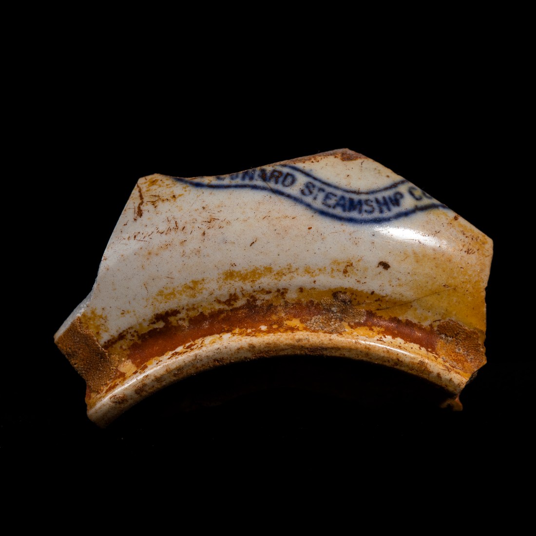
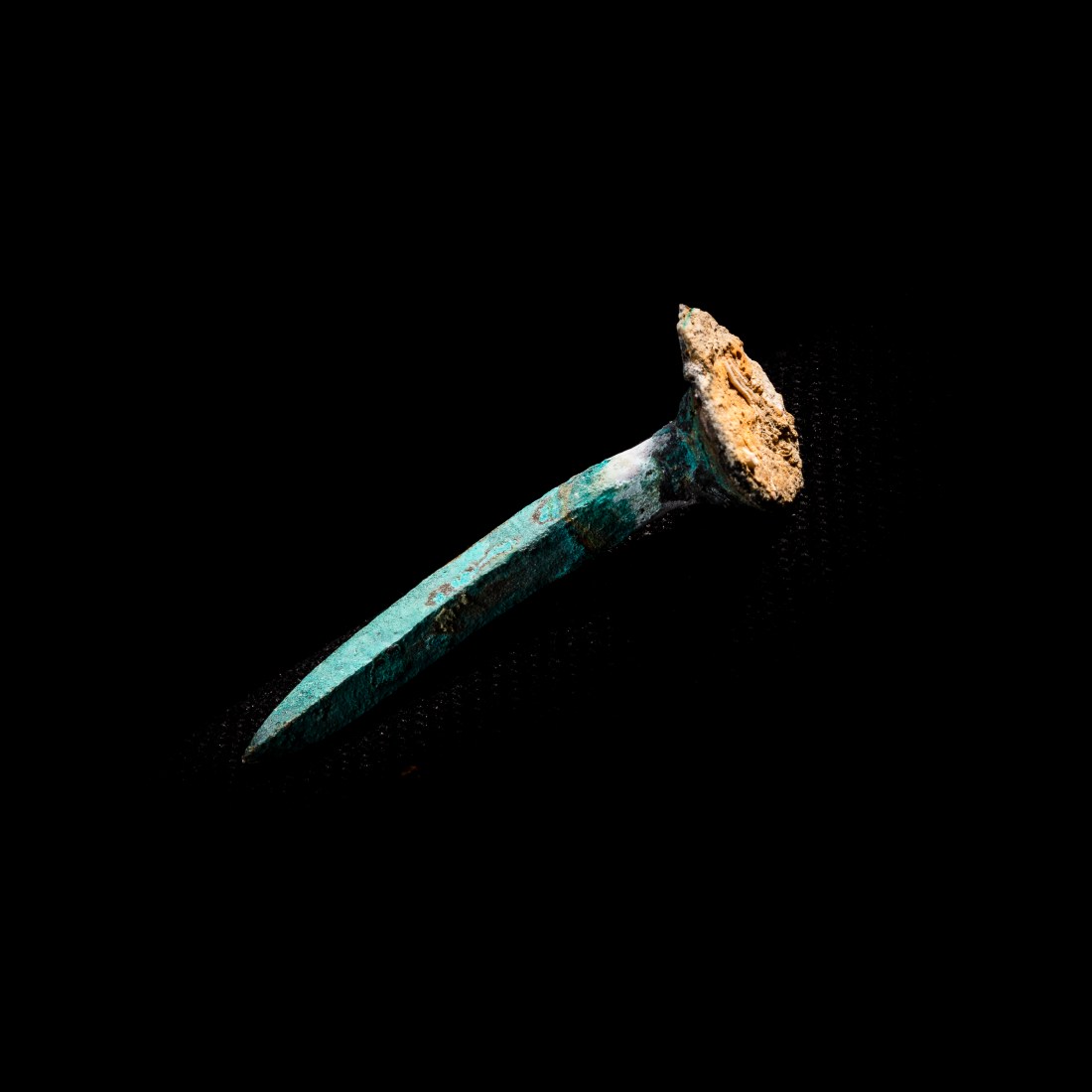
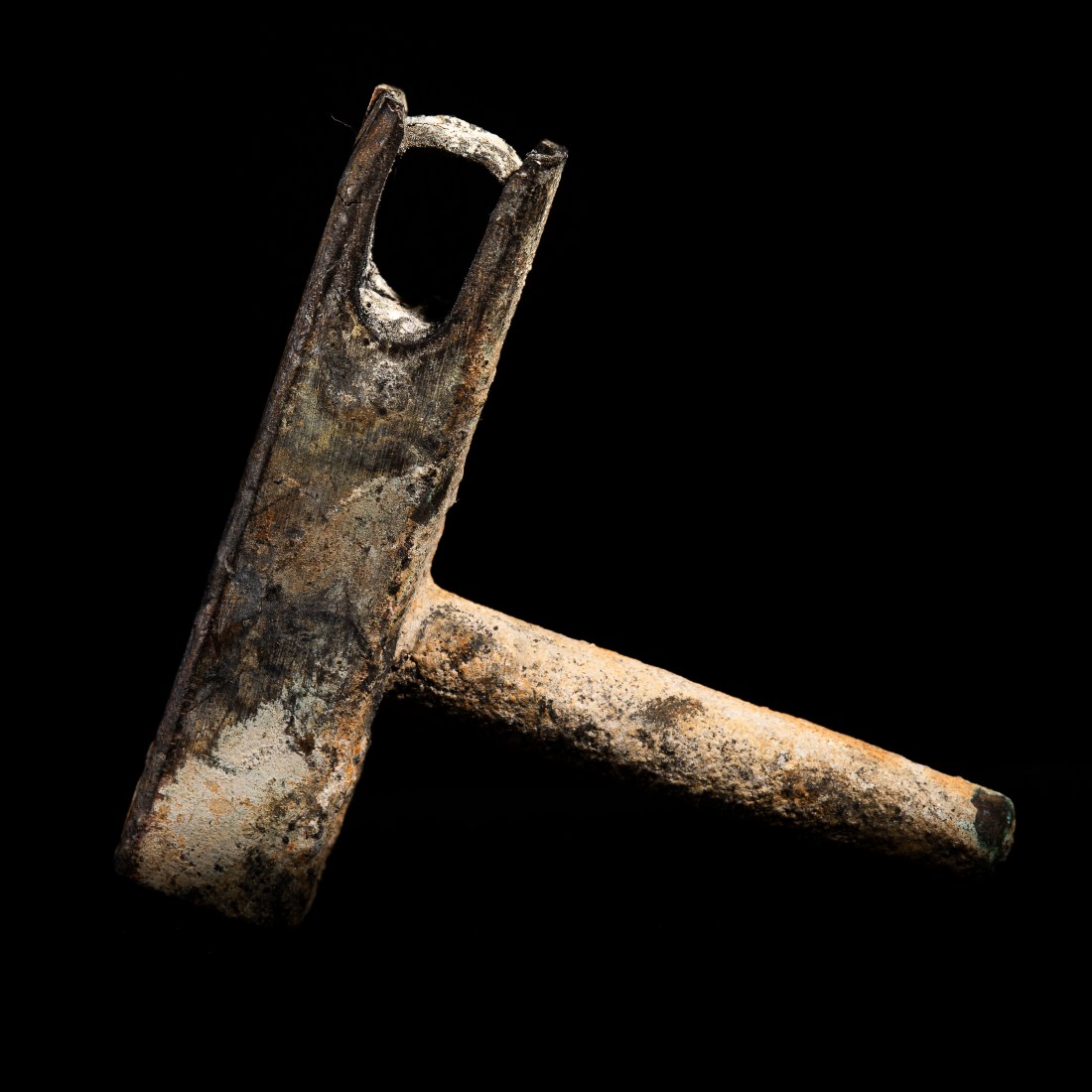
I adopted a view-point (ie camera position) as if the observer had the object in their hand. This enabled viewing of the object with a “normal” perspective, regardless of the size of the object. The objects vary in size, but are all presented in the images as filling the same amount of the frame. I used small aperture to give a depth of field to have the entire object in focus.
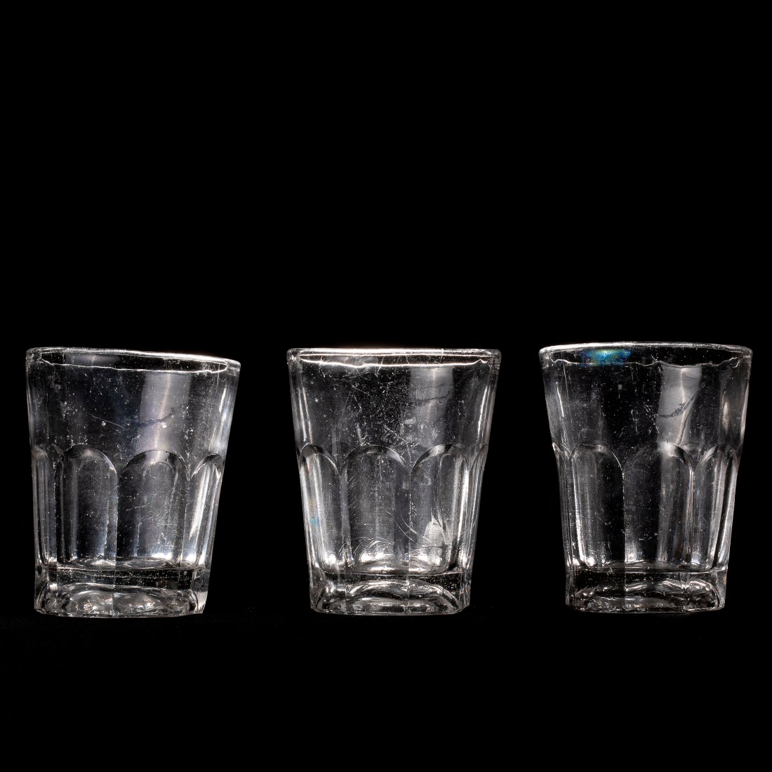
I positioned the objects some distance from a black background and on a black surface. I used two flashes with softboxes to light the objects and minimise the light on the background. Some detail can be seen of the surface on which the objects sit, but I have minimised this with exposure adjustments in Lightroom.
Evaluation What Worked Well
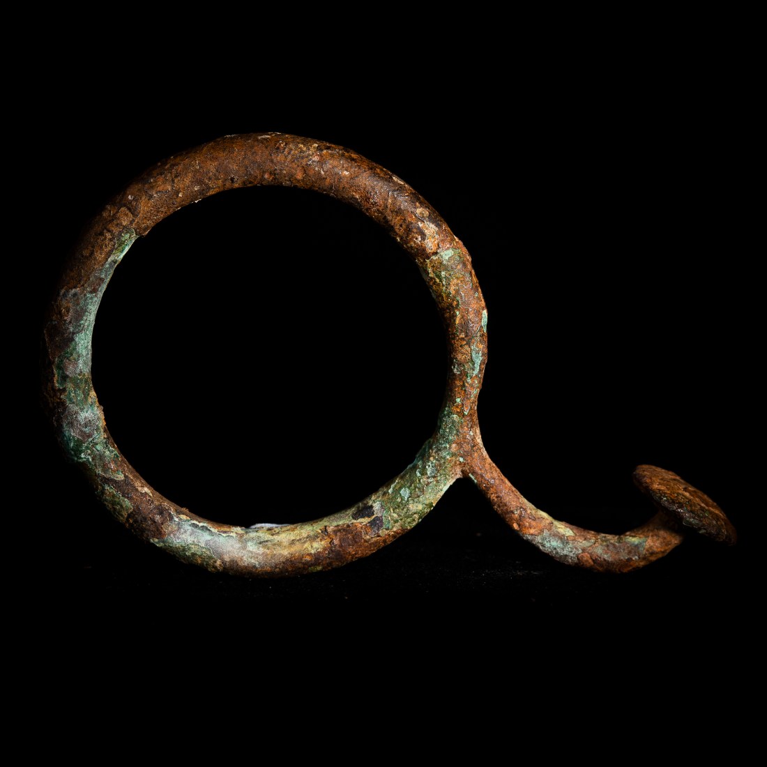
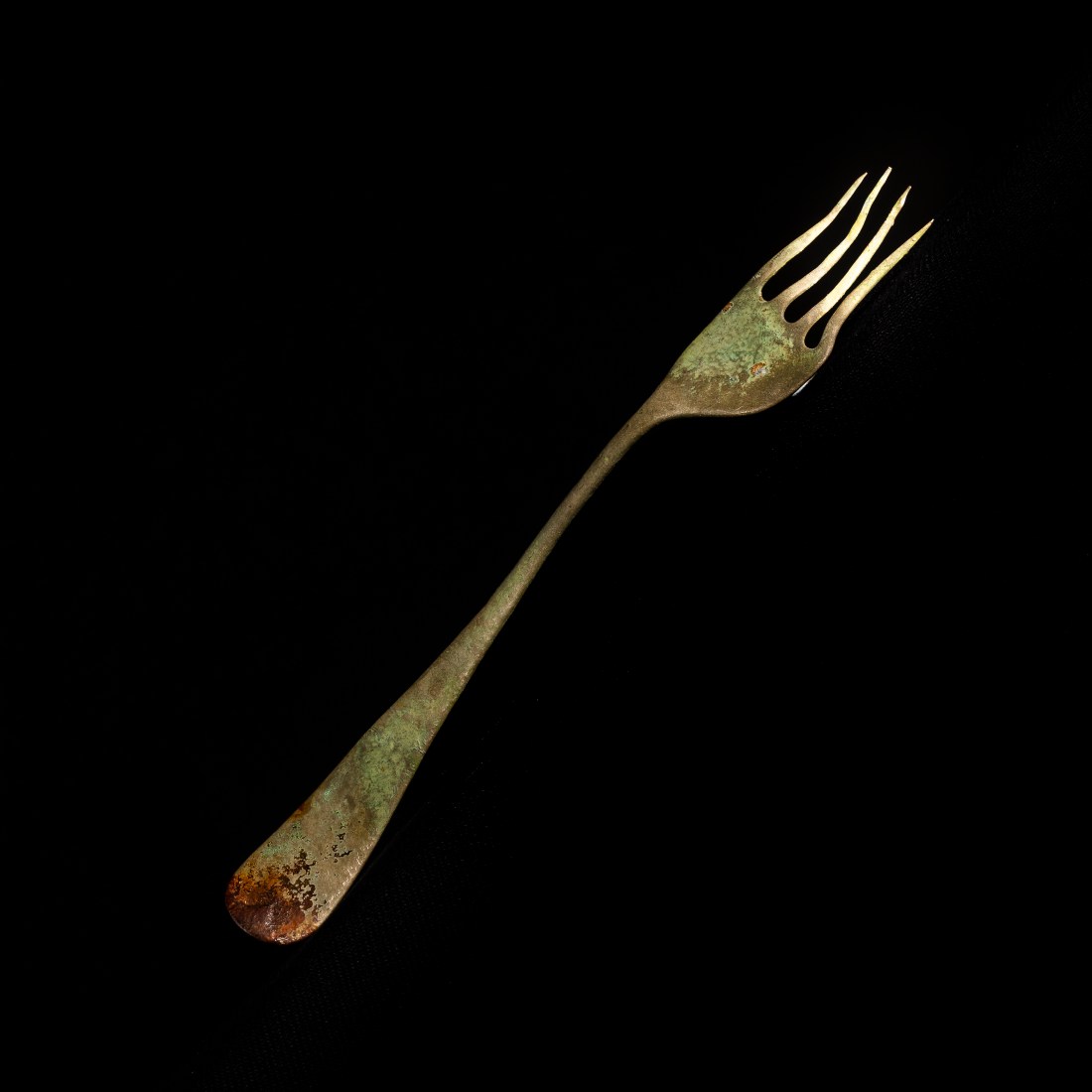
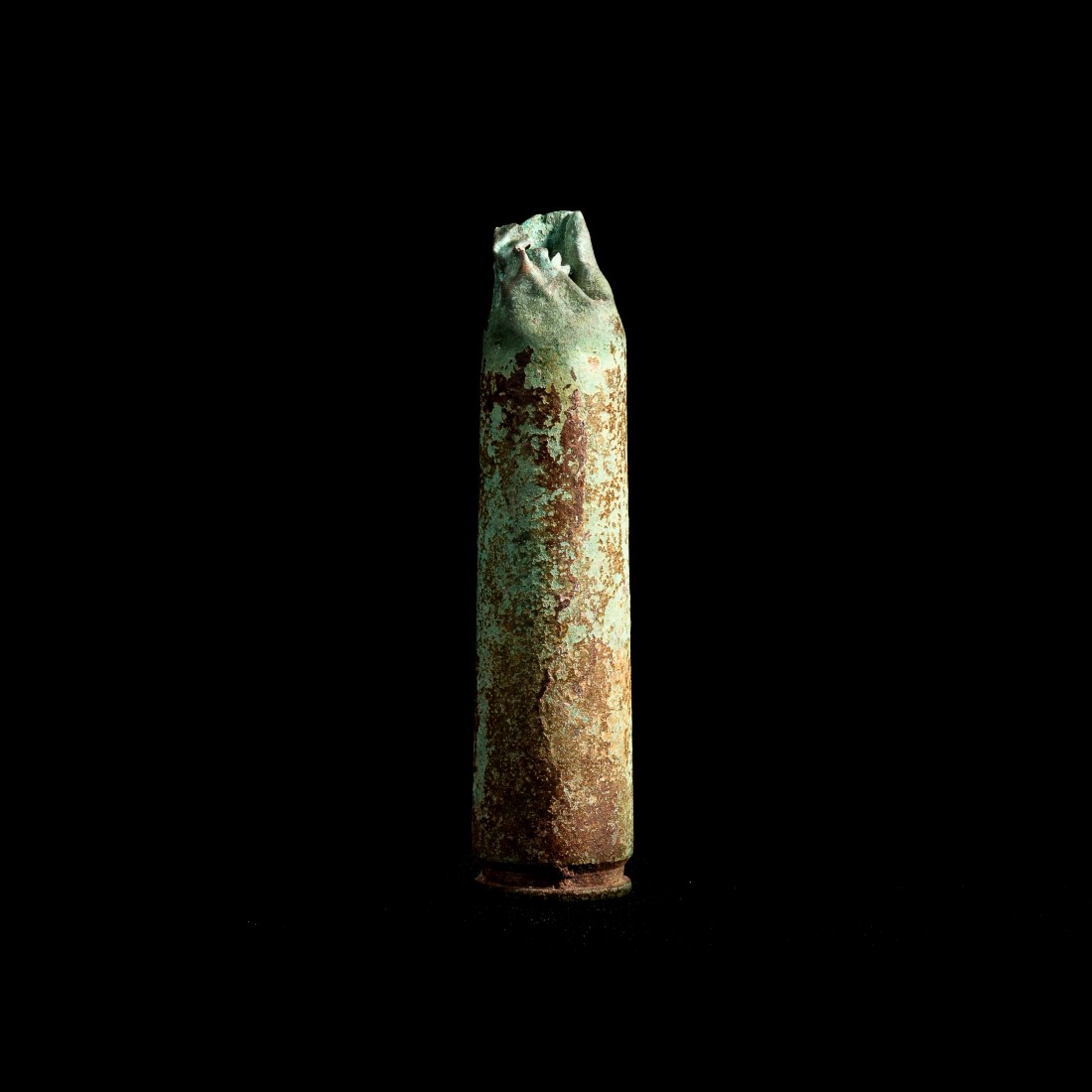
The final images I have made show artefacts recovered by amateur divers on a black surface against a black background. This was the effect I tried to achieve and in general has worked well.
The objects are appropriately lit and focussed.
What didn’t work so well
There are elements of the background apparent in some of the images and in those arranged along the diagonal of the frame may appear somewhat strange. (I composed the image on the diagonal by tilting the camera so as to maximise the size of the image).
In some images traces of a support (“Blutack”) can be seen.
I am not sure that the images in the series are linked in any way, any one image could be removed without it affecting the overall series. These are a random set of objects which were available to me. What I Would do in the Future to Improve This
The major improvement would be to somehow make the objects linked to each other. However, as the whole point of this series is that the objects are now isolated, removed from their original context it is hard to see how this could be achieved and not affect the overall aim of the series.
The other thing I would do is explore more ways of photographing such objects and the technique of displaying, mounting and lighting the objects to most effectively show them separate from their background.
I have tried to analyse the work against the assessment criteria points for the course. • Demonstration of technical and visual skills – Materials, techniques, observational skills, visual awareness, design and compositional skills.
I believe that the images in this series, and those I took in the development of my approach show sound technical skills. I chose a viewpoint to model that of an observer with the object in their hand so as not to distort the perspective. I have photographed the objects in a setting where they are isolated from their backgrounds. I have lit the subjects so that detail is shown and the images are appropriately exposed and in focus.
I could have achieved a separation from the surroundings using post-processing with Photoshop or similar, but have been able to achieve this effect with the setting and lighting. There are images where it is clear the object is sitting on a surface (most obvious in Artefact #2) however I am not sure if this detracts or enhances the effect – what can be seen of the surface lacks any contextual detail, and serves to demonstrate that I have not used a post-processing manipulation of the image.
In terms of composition – I chose a square format to avoid giving any cue as to the orientation of the object. The composition is of its nature very simple.
• Quality of outcome – Content, application of knowledge, presentation of work in a coherent manner, discernment, conceptualisation of thoughts, communication of ideas.
In my blog I have explained the background to the work, and the effect I have tried to achieve. I have not yet sought other people’s views on this, but will be doing so.
• Demonstration of creativity – Imagination, experimentation, invention.
I have not used these techniques of lighting and composition in a “studio” before – so for me this was quite experimental. I cite similar works in my influences, but do not know the techniques those photographers used to achieve their result. The initial approach I had to the subjects of images of the objects in their normal locations and as museum displays is perhaps an obvious way to show these, but I believe fails to highlight the lack of important context which characterise these objects.
• Context – Reflection, research, critical thinking.
I have tried to reflect on my project as I developed it and looked at some other types of image of these types of collections.
What Worked Well
The final images I have made show artefacts recovered by amateur divers on a black surface against a black background. This was the effect I tried to achieve and in general has worked well.
The objects are appropriately lit and focussed.
What didn’t work so well
There are elements of the background apparent in some of the images and in those arranged along the diagonal of the frame may appear somewhat strange. (I composed the image on the diagonal by tilting the camera so as to maximise the size of the image). In some images traces of a support (“Blutack”) can be seen.
I am not sure that the images in the series are linked in any way, any one image could be removed without it affecting the overall series. These are a random set of objects which were available to me.
What I Would do in the Future to Improve This
The major improvement would be to somehow make the objects linked to each other. However, as the whole point of this series is that the objects are now isolated, removed from their original context it is hard to see how this could be achieved and not affect the overall aim of the series.
The other thing I would do is explore more ways of photographing such objects and the technique of displaying, mounting and lighting the objects to most effectively show them separate from their background.
The image of cyanide by Robert Enoch appears that of an anonymous white powder. As such it is then open to the observer to put his or her own interpretation and expectations onto that image. There are no clues in this image as to what the substance is. It is on a black base with a black background with no other detail than the powder itself.
Cyanide. Image by Robert Enoch, screenshot from his OCA Lecture: “Key Ideas in Photography – part 4, Art as Licence”
The work of Liza Dracup in her work “Re Collections” is of taxidermied birds and animals. These are also set on a black background with no context included. As I have previously cited critic Michael Prodger as describing Lisa Dracup’s work as “not about capturing a particular moment in time but about timelessness.” In this case the lack of context relates not only to what something is and where it is from, but also when it was in existence.
‘Stoat’ – Liza Dracup
‘Greenfinch and Weasel’ – Liza Dracup
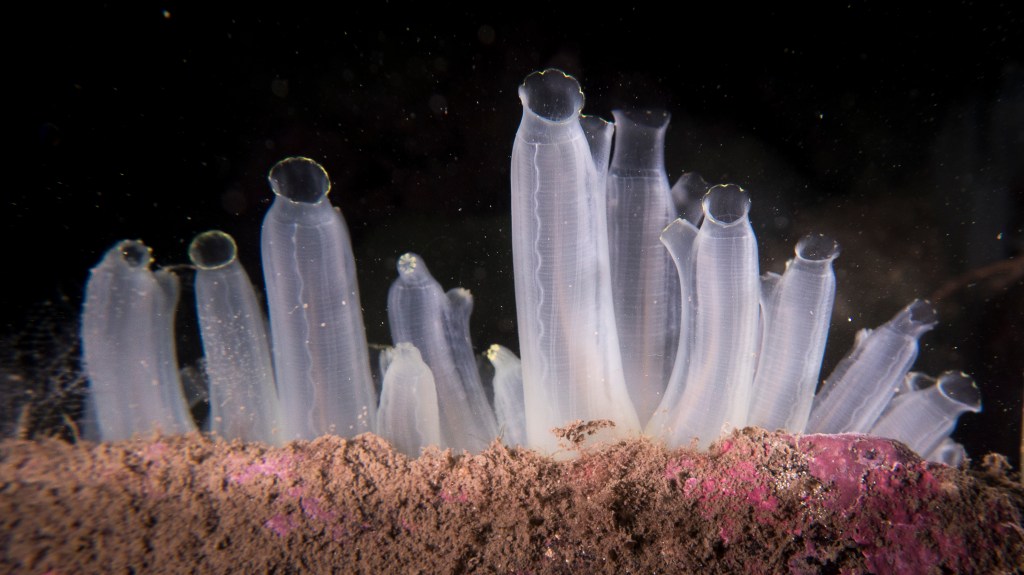
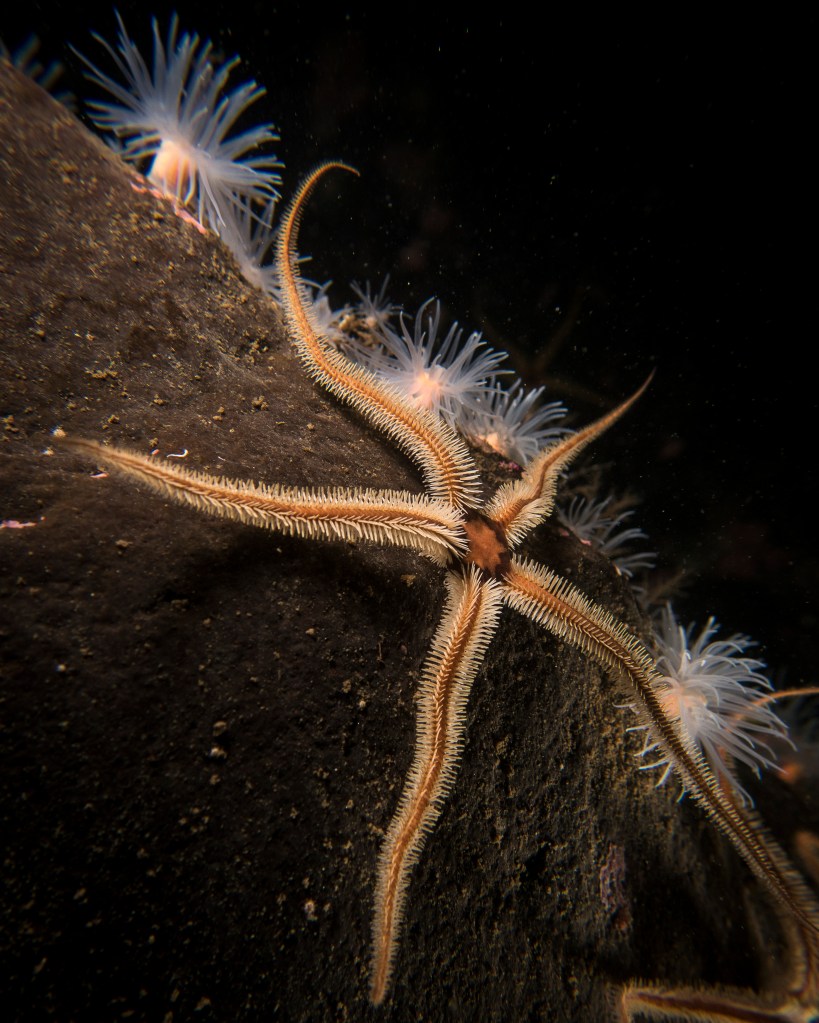
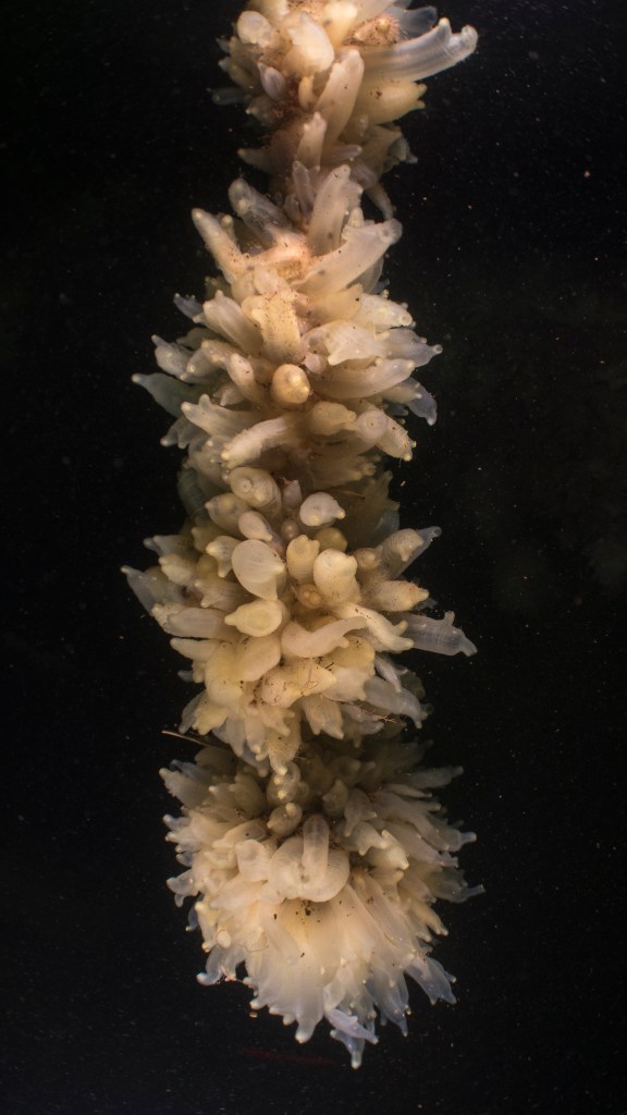
Setting the subject against a plain dark background takes away some of the contextual cues for the observer. I have used this technique in other photographs I have taken of marine life underwater.
Sea Squirts, Loch Nevis
Brittle Star, Loch Duich
Loch Duich
Sea Squirts, Port Napier – Kyle of Lochalsh
Thus it is my aim to replicate aspects of these images in a studio with the artefacts. This approach will not only take them out of any context, but model the appearance of a subject underwater. Technical Details
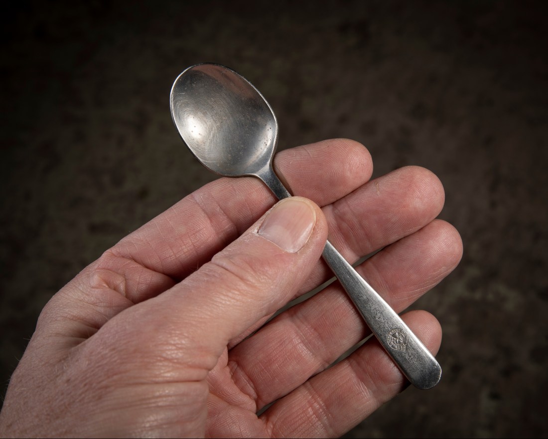
I have chosen a subject to camera distance to make the object look as if it is in the observer’s hand – like this.
Spoon – D Macbrayne Ltd.
That is about 500mm, so have adjusted the focal length accordingly to compose the shot. I have also used an aperture to keep all the subject in focus, but render the background out of focus.
I have set up a black background some distance behind my subject and photographed the subjects on a black cloth. I have lit the subject with flash, and modelled the two flash arrangement I used in the underwater images. For the glasses I used a combination of direct light and some back light. To minimise shadows I have used softboxes on my flashes. The arrangement is shown below.
My garage “studio”
The images are shot in RAW and processed in Lightroom with minor adjustments of local exposure. I have chosen a square format for all the images as this seems deliberately ambiguous and removes any clues about orientation.